|
|
|
|
|
|
| |
| |
|
|
|
|
| |
| |
|
|
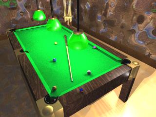
It looks like the server rejects too-large images, which is good.
I think It's not bad for a first serious attempt. If you could zoom in
you'd see the chalk has the brand name and the balls are properly numbered.
The only problem is that it's kinda style-less. The code is also pretty
bad, but it works. Comments?
Post a reply to this message
Attachments:
Download 'Pool2.jpg' (15 KB)
Preview of image 'Pool2.jpg'

|
|
| |
| |
|
|
|
|
| |
| |
|
|
I would make the lampshades a different color, they get lost in the table
itself. The perspective seems a little strange too, the way it is forced. I
like the walls, great pattern.
Josh
CreeD wrote:
> It looks like the server rejects too-large images, which is good.
>
> I think It's not bad for a first serious attempt. If you could zoom in
> you'd see the chalk has the brand name and the balls are properly numbered.
> The only problem is that it's kinda style-less. The code is also pretty
> bad, but it works. Comments?
>
> [Image]
--
Josh English
eng### [at] spiritone com
"May your hopes, dreams, and plans not be destroyed by a few zeros." com
"May your hopes, dreams, and plans not be destroyed by a few zeros."
Post a reply to this message
|
|
| |
| |
|
|
|
|
| |
| |
|
|
Nice!
I think, the green of the felt (?) should be darker.
Try to make the wooden sides of the Table as separate pieces, and apply the
texture before rotating (or rotate the texture) . Now it looks like you take
a solid block and cut a hole in it,because all the grain is oriented in the
same direction.
What's up with the floor on the left? It looks like the walls - perhaps it's
to reflective?
Give us a nice close up of one corner, two or three balls, the chalk an one
of this sticks you play the game with (my dictionary refuses to give me the
right world :-)).
Marc-Hendrik
CreeD schrieb in Nachricht <01bfdac8$b6c76b20$9f1ba1d0@mk>...
>It looks like the server rejects too-large images, which is good.
>
>I think It's not bad for a first serious attempt. If you could zoom in
>you'd see the chalk has the brand name and the balls are properly numbered.
> The only problem is that it's kinda style-less. The code is also pretty
>bad, but it works. Comments?
>
>
Post a reply to this message
|
|
| |
| |
|
|
|
|
| |
| |
|
|
> I would make the lampshades a different color, they get lost in the table
> itself. The perspective seems a little strange too, the way it is forced.
I
> like the walls, great pattern.
>
> Josh
That's probably good advice, but every pool hall I've ever been to has
green shades like that =) But I have advice to change the cloth color, so
maybe I'll darken the cloth up a bit and see if that helps, or even try one
of the ugly new wave colors (Cyan, Red, etc.)
I wanted to get a little of everything in with the perspective, maybe I'll
move the rack and do a side view or something.
Post a reply to this message
|
|
| |
| |
|
|
|
|
| |
| |
|
|
Marc-Hendrik Bremer <Mar### [at] t-onlinede> wrote in article
<394f91a5@news.povray.org>...
> Nice!
> I think, the green of the felt (?) should be darker.
That's my next mission (felt is right by the way)
> Try to make the wooden sides of the Table as separate pieces, and apply
the
> texture before rotating (or rotate the texture) . Now it looks like you
take
> a solid block and cut a hole in it,because all the grain is oriented in
the
> same direction.
Good point, that should be easy to five (they're already separated)
> What's up with the floor on the left? It looks like the walls - perhaps
it's
> to reflective?
All the light is coming from the right that isn't going to the table's
surface, so that's all shadow. I did that on purpose, but if it looks ugly
I'll throw in lights.
> Give us a nice close up of one corner, two or three balls, the chalk an
one
> of this sticks you play the game with (my dictionary refuses to give me
the
> right world :-)).
Cue stick is the word, but most players just call it a 'stick' :)
Post a reply to this message
|
|
| |
| |
|
|
|
|
| |
| |
|
|
"CreeD" <meshe@nqi.net> wrote in message news:01bfdac8$b6c76b20$9f1ba1d0@mk...
| I think It's not bad for a first serious attempt. If you could zoom in
| you'd see the chalk has the brand name and the balls are properly numbered.
| The only problem is that it's kinda style-less. The code is also pretty
| bad, but it works. Comments?
I'd say that's a "decent" pool table scene alright. Having made one myself I
know the trouble it can be to put one together. The floor on the left seems
odd to me too, as was already mentioned, and the green felt cloth being
bright-green, I agree. Texturing and modeling otherwise looks fine (aside
from the woodgrain direction at the ends too), I think there are so many
variations among pooltables that a person could make most any kind look okay
as long as the modeling works for it.
I can't see in this image whether there is a brand name emblem at the far end
or not; I put one onto mine, a Brunswick pool table. Also I don't see any
marker diamonds along the sides, a necessity I would think. I can just manage
to see a cue-stick tip on there though. The lights seem very near the table
to me, difficult to tell, but about the camera perspective I know it's not
easy to get a table into view along with any part of a room as well and still
see the things on the table fairly good also.
Anyway, I hope you didn't have nearly as much trouble as I did getting the
parts made and together.
Bob
Post a reply to this message
|
|
| |
| |
|
|
|
|
| |
| |
|
|
> > I think, the green of the felt (?) should be darker.
>
> That's my next mission (felt is right by the way)
<nitpick>
IIRC it's baize, not felt, as felt wouldn't have enough strength to last
very long. Felt isn't a woven fabric, and baize is.
</nitpick>
Of course not being a regular patron of pool halls I may may be wrong :)
Bye for now,
Jamie.
Post a reply to this message
|
|
| |
| |
|
|
|
|
| |
| |
|
|
nice ...
prop the stick up against one of the edges ...
that might give the feel someone has just left and will be returning
shortly...?
CreeD wrote:
> It looks like the server rejects too-large images, which is good.
>
> I think It's not bad for a first serious attempt. If you could zoom in
> you'd see the chalk has the brand name and the balls are properly numbered.
> The only problem is that it's kinda style-less. The code is also pretty
> bad, but it works. Comments?
>
> [Image]
Post a reply to this message
|
|
| |
| |
|
|
|
|
| |