 |
|
|
|
|
|
| |
| |
|
|
|
|
| |
| |
|
|
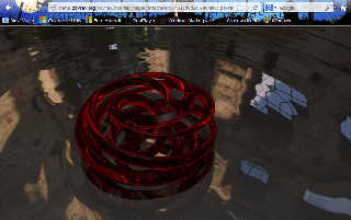
On 14-2-2013 17:12, James Holsenback wrote:
> messing around with a blender torus knot plug-in ... i tried several
> other materials (wood, metal, ceramic) but the glass looked best. the
> ground plane has waves for now ... facets ain't bad either!
The red of the glass is fascinating and attractive.
Like Stephen suggested, there are some small artefacts still visible.
Thomas
Post a reply to this message
|
|
| |
| |
|
|
|
|
| |
| |
|
|
James Holsenback <nom### [at] none com> wrote:
> messing around with a blender torus knot plug-in ...
I'm always leery of .png images and how they show up in web browsers (a legacy
of the past, I guess; can't shake that feeling.) As your post looks a bit dark
on my end, I was wondering if I'm seeing what you see. Of course, the look may
be just as you intended; but here's a screenshot (as seen in latest Firefox on
my Windows XP machine) and saved as a .jpeg. com> wrote:
> messing around with a blender torus knot plug-in ...
I'm always leery of .png images and how they show up in web browsers (a legacy
of the past, I guess; can't shake that feeling.) As your post looks a bit dark
on my end, I was wondering if I'm seeing what you see. Of course, the look may
be just as you intended; but here's a screenshot (as seen in latest Firefox on
my Windows XP machine) and saved as a .jpeg.
Post a reply to this message
Attachments:
Download 'screenshot.jpg' (97 KB)
Preview of image 'screenshot.jpg'
|
|
| |
| |
|
|
|
|
| |
| |
|
|
On 02/14/2013 03:16 PM, Stephen wrote:
> On 14/02/2013 4:12 PM, James Holsenback wrote:
>> messing around with a blender torus knot plug-in ... i tried several
>> other materials (wood, metal, ceramic) but the glass looked best. the
>> ground plane has waves for now ... facets ain't bad either!
>
> I like this. I especially like the red of the torus knot. Although I
> wonder if max_trace_level should be a bit higher.
>
i've got a wee bit of normal on the glass ... maybe that's it
(max_trace_level already at it's upper limit 256)
Post a reply to this message
|
|
| |
| |
|
|
|
|
| |
| |
|
|
On 02/15/2013 06:03 AM, Kenneth wrote:
> James Holsenback <nom### [at] nonecom> wrote:
>> messing around with a blender torus knot plug-in ...
>
> I'm always leery of .png images and how they show up in web browsers (a legacy
> of the past, I guess; can't shake that feeling.) As your post looks a bit dark
> on my end, I was wondering if I'm seeing what you see. Of course, the look may
> be just as you intended; but here's a screenshot (as seen in latest Firefox on
> my Windows XP machine) and saved as a .jpeg.
>
hmmm ... thanks for the feedback on darkness you guy's. i'm fooling
around with a back-lit approach and obviously it still needs help. one
thing i /did/ change this morning was to bump up the fade_distance on
the glass material. where i'd like to end up with this is glass that has
some zing to it while muting the background ... maybe a fools errand :-)
btw: the screen shot doesn't look overly dark to me
Post a reply to this message
|
|
| |
| |
|
|
|
|
| |
| |
|
|
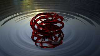
On 02/15/2013 07:21 AM, James Holsenback wrote:
> On 02/15/2013 06:03 AM, Kenneth wrote:
>> James Holsenback <nom### [at] nonecom> wrote:
>>> messing around with a blender torus knot plug-in ...
>>
>> I'm always leery of .png images and how they show up in web browsers
>> (a legacy
>> of the past, I guess; can't shake that feeling.) As your post looks a
>> bit dark
>> on my end, I was wondering if I'm seeing what you see. Of course, the
>> look may
>> be just as you intended; but here's a screenshot (as seen in latest
>> Firefox on
>> my Windows XP machine) and saved as a .jpeg.
>>
>
> hmmm ... thanks for the feedback on darkness you guy's. i'm fooling
> around with a back-lit approach and obviously it still needs help. one
> thing i /did/ change this morning was to bump up the fade_distance on
> the glass material. where i'd like to end up with this is glass that has
> some zing to it while muting the background ... maybe a fools errand :-)
>
> btw: the screen shot doesn't look overly dark to me
here's a much better rendition ... changed hdr background and aligned
the sun in the image with the key light. changing fade_distance on the
glass helped some, but ended up having to add a fill light 180 and much
lower than the key light, it's also (the fill light) the same color as
the glass. i also added photons (excluded the fill light) ... oh and
removed the normal from the glass
Post a reply to this message
Attachments:
Download 'torusknot.png' (1168 KB)
Preview of image 'torusknot.png'
|
|
| |
| |
|
|
|
|
| |
| |
|
|
> On 02/15/2013 06:03 AM, Kenneth wrote:
>> James Holsenback <nom### [at] nonecom> wrote:
>>> messing around with a blender torus knot plug-in ...
>>
>> I'm always leery of .png images and how they show up in web browsers
>> (a legacy
>> of the past, I guess; can't shake that feeling.) As your post looks a
>> bit dark
>> on my end, I was wondering if I'm seeing what you see. Of course, the
>> look may
>> be just as you intended; but here's a screenshot (as seen in latest
>> Firefox on
>> my Windows XP machine) and saved as a .jpeg.
>>
>
> hmmm ... thanks for the feedback on darkness you guy's. i'm fooling
> around with a back-lit approach and obviously it still needs help. one
> thing i /did/ change this morning was to bump up the fade_distance on
> the glass material. where i'd like to end up with this is glass that has
> some zing to it while muting the background ... maybe a fools errand :-)
>
> btw: the screen shot doesn't look overly dark to me
It looks as dark to me than the original. I wonder if it have anything
to do with my CTR monitor compared to the LCD ones... My display gamma
is at about 2.5. If I increase the brightness to correctly see the
image, my text becomes all blury.
Alain
Post a reply to this message
|
|
| |
| |
|
|
|
|
| |
| |
|
|
On 02/15/2013 12:54 PM, Alain wrote:
>> On 02/15/2013 06:03 AM, Kenneth wrote:
>>> James Holsenback <nom### [at] nonecom> wrote:
>>>> messing around with a blender torus knot plug-in ...
>>>
>>> I'm always leery of .png images and how they show up in web browsers
>>> (a legacy
>>> of the past, I guess; can't shake that feeling.) As your post looks a
>>> bit dark
>>> on my end, I was wondering if I'm seeing what you see. Of course, the
>>> look may
>>> be just as you intended; but here's a screenshot (as seen in latest
>>> Firefox on
>>> my Windows XP machine) and saved as a .jpeg.
>>>
>>
>> hmmm ... thanks for the feedback on darkness you guy's. i'm fooling
>> around with a back-lit approach and obviously it still needs help. one
>> thing i /did/ change this morning was to bump up the fade_distance on
>> the glass material. where i'd like to end up with this is glass that has
>> some zing to it while muting the background ... maybe a fools errand :-)
>>
>> btw: the screen shot doesn't look overly dark to me
>
> It looks as dark to me than the original. I wonder if it have anything
> to do with my CTR monitor compared to the LCD ones... My display gamma
> is at about 2.5. If I increase the brightness to correctly see the
> image, my text becomes all blury.
>
could be ... it looks the same in preview window, gwenview, gimp, t-bird
(this post) and f-fox (on my blog) ... sometime ago i went through all
the gymnastics of getting my display calibrated (gamma-wise) so i'm at a
loss. since the object is back-lit you'd expect the foreground to be
dark-ish right?
jim
Post a reply to this message
|
|
| |
| |
|
|
|
|
| |
| |
|
|
Am 15.02.2013 18:54, schrieb Alain:
> It looks as dark to me than the original. I wonder if it have anything
> to do with my CTR monitor compared to the LCD ones... My display gamma
> is at about 2.5. If I increase the brightness to correctly see the
> image, my text becomes all blury.
Unless your viewing software does actively compensate for your CRT's
gamma, then it /is/ an issue with your display: By default, both the
interwebs and your operating system (presuming it's Windows) will assume
a display gamma of around 2.2.
To view the image correctly:
- Set up an orthographic scene in POV-Ray to just render an input image.
- Set #version to 3.7, and assumed_gamma to 1.0.
- Render with option Display_Gamma=2.5
What you /then/ will see on your display will be (approximately) how
other people see that input image.
Post a reply to this message
|
|
| |
| |
|
|
|
|
| |
| |
|
|
On 15-2-2013 16:47, James Holsenback wrote:
> here's a much better rendition ... changed hdr background and aligned
> the sun in the image with the key light. changing fade_distance on the
> glass helped some, but ended up having to add a fill light 180 and much
> lower than the key light, it's also (the fill light) the same color as
> the glass. i also added photons (excluded the fill light) ... oh and
> removed the normal from the glass
Very nice. Looks all right to me.
Still love that red... ;-)
Thomas
Post a reply to this message
|
|
| |
| |
|
|
|
|
| |
| |
|
|
Thomas de Groot <tho### [at] degrootorg> wrote:
> On 15-2-2013 16:47, James Holsenback wrote:
> > here's a much better rendition ... changed hdr background and aligned
> > the sun in the image with the key light. changing fade_distance on the
> > glass helped some, but ended up having to add a fill light 180 and much
> > lower than the key light, it's also (the fill light) the same color as
> > the glass. i also added photons (excluded the fill light) ... oh and
> > removed the normal from the glass
>
> Very nice. Looks all right to me.
>
> Still love that red... ;-)
>
> Thomas
This looks great, nicely done :)
Post a reply to this message
|
|
| |
| |
|
|
|
|
| |


