|
|
|
|
|
|
| |
| |
|
|
|
|
| |
| |
|
|
Am 29.08.2012 13:04, schrieb Ive:
> Am 29.08.2012 12:11, schrieb clipka:
>> Am 29.08.2012 07:42, schrieb Ive:
>> 11 steps will do if you make use of three color channels per frame :)
>
> Of course [heading my forehead with my fist] thats brilliant. With only
> 11 animation frames a range from lets say 380nm to 700nm can be covered.
>
> BTW I'm aware that POV-Ray internally assumes sRGB primaries for
> iridescence and color->grayscale conversion. Is there anything else
> internally hard-coded that expects sRGB?
Dispersion springs to my mind.
Note that for iridescence you can override the assumed wavelengths.
Post a reply to this message
|
|
| |
| |
|
|
|
|
| |
| |
|
|
On 29-8-2012 13:33, Ive wrote:
> Am 29.08.2012 10:08, schrieb Thomas de Groot:
>> This going a bit beyond my mental capacities, but I find it fascinating
>> nonetheless. ;-)
>>
> Well, I'm not good in explaining, but all this is just about that within
> the sRGB color space "only" 35% of the colors an average can "see" and
> distinguish are represented. Within Adobe RGB this is already about 50%
> and lets say a high quality art print covers up to 90%.
I suppose one should be able to compare to see the differences. Could
you show a smaller image with both techniques side by side? Would that
be meaningful?
>
> In practice the 35% of sRGB are not as bad as it sounds as mainly
> high-saturated colors are effected and as long as nobody opens a
> New-Wave nightclub in Gancaloon it shouldn't be much of a problem ;)
I have received a few applications in fact, but refused. It's against
the Satrap's law ;-)
Thomas
Post a reply to this message
|
|
| |
| |
|
|
|
|
| |
| |
|
|
Am 29.08.2012 16:44, schrieb Thomas de Groot:
> On 29-8-2012 13:33, Ive wrote:
> I suppose one should be able to compare to see the differences. Could
> you show a smaller image with both techniques side by side? Would that
> be meaningful?
>
The image named "ymo - (Adobe RGB)" is the image where all colors are
defined within the Adobe RGB primaries and after rendering the image is
converted to linear sRGB (aka scRGB).
The one named "ymo - (sRGB)" uses already from Adobe RGB to sRGB
converted color definitions and no more color transformation on the
rendered output.
Both images did use linear gamma for color definitions and rendering,
output was 16bit IEEE floating point (using OpenEXR) and the final step
for both was reducing the bit-depth to 8bit/channel and applying the
sRGB transfer function.
To actually judge the difference it would be best to store them local
and use some image viewer that allows for browsing and setting a pitch
black background - I think.
I'm not saying that one or the other does look better (this kind of
scene makes it very hard to judge anyway) but it is interesting that
there *is* a difference.
My main goal was to render something for my own use and here it *does*
look much better - sadly I can share this only with people with a
similar high-end monitor but those will get cheaper and more common over
the years.
And I should also mention that using Adobe RGB as workspace for CGI
images IMO makes only sense when both monitor and graphics card do
support 10bit/channel as within the usual 8bit/channel color banding
becomes very prominent - the back-draw of the wider gamut. Not to
mention the need for appropriate software that does indeed support all
those features.
-Ive
Post a reply to this message
Attachments:
Download 'ymo crop2 (adobe rgb).png' (130 KB)
Download 'ymo crop2 (srgb).png' (144 KB)
Preview of image 'ymo crop2 (adobe rgb).png'
Preview of image 'ymo crop2 (srgb).png'

|
|
| |
| |
|
|
|
|
| |
| |
|
|
Thanks Ive. There is indeed a very slight difference. A worthwhile
experiment; preparing for the future :-)
Thomas
Post a reply to this message
|
|
| |
| |
|
|
|
|
| |
| |
|
|
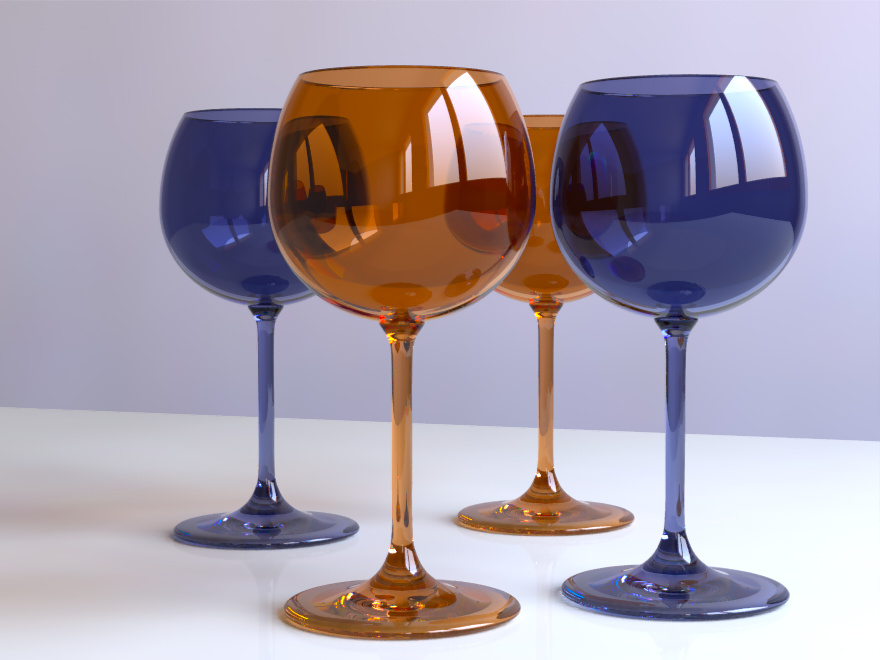
Am 29.08.2012 14:19, schrieb clipka:
> While that's certainly true, I guess even with rgb-specified colors it
> will already do some good to scenes with colored transparent objects, so
> that e.g. two orange filters in sequence won't necessarily exhibit a hue
> shift towards red, but could retain the orange hue while just gaining in
> saturation.
>
Hmm, could you give a simple example scene that shows this effect, as I
cannot reproduce it or maybe I do get you wrong.
Anyway I've created my spectral rendering rack and it is really fun. But
I didn't use the idea of rendering 3 subsequent wavelength at once as I
wanted also wavelength dependent IOR.
The only limitation is that image maps cannot be used, everything else
is almost as usual.
I'll publish the whole mess when I've cleaned it up a bit, collected
more wavelength data and have made a few more examples...
...and here is one of my test scenes, rendering time for all 36 passes
(I've decided to go from 380 to 730nm) about 1 hour and for the final
composite pass 15 seconds.
-Ive
Post a reply to this message
Attachments:
Download 'spectralcomposer_glasses.jpg' (129 KB)
Preview of image 'spectralcomposer_glasses.jpg'
|
|
| |
| |
|
|
|
|
| |
| |
|
|
Am 07.09.2012 19:08, schrieb Ive:
> Am 29.08.2012 14:19, schrieb clipka:
>> While that's certainly true, I guess even with rgb-specified colors it
>> will already do some good to scenes with colored transparent objects, so
>> that e.g. two orange filters in sequence won't necessarily exhibit a hue
>> shift towards red, but could retain the orange hue while just gaining in
>> saturation.
>>
> Hmm, could you give a simple example scene that shows this effect, as I
> cannot reproduce it or maybe I do get you wrong.
Well, take the amber glass in your scene for instance. I haven't tried,
but I'd take a bet that it would look pretty lame with any classic plain
RGB color model; however, I'm optimistic that you don't need real-life
spectral data for the material to get decent results, and that synthetic
spectra generated from sRGB triplets might suffice in many cases.
> Anyway I've created my spectral rendering rack and it is really fun. But
> I didn't use the idea of rendering 3 subsequent wavelength at once as I
> wanted also wavelength dependent IOR.
That's what dispersion is normally used for. With the proper settings
you could at least get 2 colors per pass even for the wildest
wavelength-to-ior mappings.
> The only limitation is that image maps cannot be used, everything else
> is almost as usual.
> I'll publish the whole mess when I've cleaned it up a bit, collected
> more wavelength data and have made a few more examples...
Looking forward to it.
> ....and here is one of my test scenes, rendering time for all 36 passes
> (I've decided to go from 380 to 730nm) about 1 hour and for the final
> composite pass 15 seconds.
Absolutely superb! This is what I'd call kick-ass colored glass :-)
Post a reply to this message
|
|
| |
| |
|
|
|
|
| |
| |
|
|
Ive <ive### [at] lilysoft org> wrote:
> The interesting and surprising thing is: I do even get more vibrant
> colors and a better preservation of subtle texture details when
> rendering within Adobe-RGB and converting the final image to sRGB (by
> using ICC profiles) compared to defining the colors already within sRGB
> and rendering within sRGB. This was something that I did not expect and
> after having rechecked my color management pipeline I think that indeed
> the diffuse radiosity bounces do produce more vibrant and maybe more
> realistic results within the wider gamut.
Hmmmm, does this mean that if one pushes the working color space to the limit
(say, using 700, 520, and 380 nm on the outer edge of the chromaticity diagram),
and then converts back to sRGB, one can get an even richer image in sRGB?
One issue with a restricted gamut is objects with an almost-but-not-quite
saturated pigment (which is essentially what you get in real life). An object
that is near-saturated green reflects a tiny bit of red and blue, and my
practice has been to include this in the pigment. With a restricted gamut, the
object will appear just right without the red and blue, but as your experience
seems to indicate, this will lead to unrealistic results with multiple
reflections. (It would also lead to rather unconvincing metallic highlights,
except that metals are never saturated enough to breach the sRGB gamut.) org> wrote:
> The interesting and surprising thing is: I do even get more vibrant
> colors and a better preservation of subtle texture details when
> rendering within Adobe-RGB and converting the final image to sRGB (by
> using ICC profiles) compared to defining the colors already within sRGB
> and rendering within sRGB. This was something that I did not expect and
> after having rechecked my color management pipeline I think that indeed
> the diffuse radiosity bounces do produce more vibrant and maybe more
> realistic results within the wider gamut.
Hmmmm, does this mean that if one pushes the working color space to the limit
(say, using 700, 520, and 380 nm on the outer edge of the chromaticity diagram),
and then converts back to sRGB, one can get an even richer image in sRGB?
One issue with a restricted gamut is objects with an almost-but-not-quite
saturated pigment (which is essentially what you get in real life). An object
that is near-saturated green reflects a tiny bit of red and blue, and my
practice has been to include this in the pigment. With a restricted gamut, the
object will appear just right without the red and blue, but as your experience
seems to indicate, this will lead to unrealistic results with multiple
reflections. (It would also lead to rather unconvincing metallic highlights,
except that metals are never saturated enough to breach the sRGB gamut.)
Post a reply to this message
|
|
| |
| |
|
|
|
|
| |
| |
|
|
Am 04.10.2012 04:51, schrieb Cousin Ricky:
> Hmmmm, does this mean that if one pushes the working color space to the limit
> (say, using 700, 520, and 380 nm on the outer edge of the chromaticity diagram),
Such a thing exists but with the primaries located at 700, 525, 450 nm
and is called Adobe Wide-Gamut RGB. And it has the advantage that ICC
profiles for it already exists - and making a *good* ICC profile (i.e.
one that is not just a matrix shaper) for a home brew color space is a
non-trivial task.
> and then converts back to sRGB, one can get an even richer image in sRGB?
>
I suspect so, yes - but this does greatly depend on the scene and in
most cases sRGB works pretty well, it has been designed in the way it is
for good reasons ;)
And you have absolute no visual control when you design your scene
within a color space your monitor is unable to reproduce.
> One issue with a restricted gamut is objects with an almost-but-not-quite
> saturated pigment (which is essentially what you get in real life). An object
> that is near-saturated green reflects a tiny bit of red and blue, and my
> practice has been to include this in the pigment.
Yes, but this can only by modeled with a spectral render engine. To
express an out-of-gamut color you have to make one or two components
negative but I guess this is not what you mean.
> (It would also lead to rather unconvincing metallic highlights,
> except that metals are never saturated enough to breach the sRGB gamut.)
>
Except i.e. for some gold-copper alloy, in a white room, lit by a
fluorescent lamp ;)
-Ive
Post a reply to this message
|
|
| |
| |
|
|
|
|
| |
| |
|
|
Ive <ive### [at] lilysoftorg> wrote:
> I suspect so, yes - but this does greatly depend on the scene and in
> most cases sRGB works pretty well, it has been designed in the way it is
> for good reasons ;)
I was under the impression that Microsoft and HP were trying to come up with
something reasonably similar to existing CRTs. Or were CRTs the way they were
because they worked pretty well (sort of a Darwinian selection thing)?
One thing that frustrates me about sRGB is that it's impossible to get a good,
rich cyan with it--although, looking at the PDF you referred me to last year,
the other color spaces probably can't do much better.
It just occurred to me that with our sensitivity to 380 nm and 700 nm so low,
those might not be practical values. Does an Adobe Wide-Gamut RGB monitor
actually exist, and if so, how do the blue (violet?) and red phosphors work out?
> And you have absolute no visual control when you design your scene
> within a color space your monitor is unable to reproduce.
Yeah, I thought about that.
Post a reply to this message
|
|
| |
| |
|
|
|
|
| |
| |
|
|
Am 04.10.2012 18:01, schrieb Cousin Ricky:
> Ive <ive### [at] lilysoftorg> wrote:
>> I suspect so, yes - but this does greatly depend on the scene and in
>> most cases sRGB works pretty well, it has been designed in the way it is
>> for good reasons ;)
>
> I was under the impression that Microsoft and HP were trying to come up with
> something reasonably similar to existing CRTs. Or were CRTs the way they were
> because they worked pretty well (sort of a Darwinian selection thing)?
>
Do not underestimate good old CRT's. Even my almost 20 years old EIZO
CRT monitor was better in terms of color reproduction than my current
high-end TFT - and for that I really miss this heavy 45kg monster.
An important design issues for sRGB was to get maximum quality while
using only 8bit/channel for encoding - color banding gets already much
more prominent within Adobe RGB and 8bit encoding.
Also sRGB takes an "ideal" viewing condition into account i.e. dim
daylight surrounding and images viewed on a dark gray background - what
Firefox meanwhile does but Thunderbird, Chrome, IE still do not.
> One thing that frustrates me about sRGB is that it's impossible to get a good,
> rich cyan with it--although, looking at the PDF you referred me to last year,
> the other color spaces probably can't do much better.
>
Well, as mentioned I can meanwhile switch to 10bit/AdobeRGB and do so
e.g. for viewing all the shots taken with my digital camera (always
using raw format output). And for some kind of images (e.g. a series of
night-life-shots taken in Tokyo) it makes a huge difference, especially
in the green-cyan to green-yellow range.
> It just occurred to me that with our sensitivity to 380 nm and 700 nm so low,
> those might not be practical values. Does an Adobe Wide-Gamut RGB monitor
> actually exist, and if so, how do the blue (violet?) and red phosphors work out?
>
Not to my knowledge. But I might be a bit out of business and do not
know the current state of e.g. OLED technologies - not using phosphors
at all ;)
-Ive
Post a reply to this message
|
|
| |
| |
|
|
|
|
| |
|
|