 |
|
|
|
|
|
| |
| |
|
|
|
|
| |
| |
|
|
"Carlo C." <nomail@nomail> wrote:
> "somebody" <x### [at] y com> wrote:
> > Very nice. But:
> >
> > 1. Blood is way too bright, even for a fresh stain (which this cannot be)
> > 2. Running pose seems unnatural for the dead body.
> > 3. Exit signs are usually red around here, I cannot remember seeing a green
> > one (but it might be a local thing)
> > 4. Police tape is at a very odd place (useless and/or trapping patrons),
> > unless there is also an exit/entrance behind the camera. But in that case,
> > I'd expect another tape at the far end too, especially since there seems to
> > be a perpendicular corridor in front of the exit.
>
> These are quibbles... ;-)
> I think that the scene is a WIP, and that the intentions are not to make it
> completely photorealistic.
> Bella imagen!
I agree. The outline/pose and the tape are just right. Yes they are staged, but
that's what I assume Jaime as going for in the first place.
And exit signs are green around here too :-)
Cheers,
Edouard. com> wrote:
> > Very nice. But:
> >
> > 1. Blood is way too bright, even for a fresh stain (which this cannot be)
> > 2. Running pose seems unnatural for the dead body.
> > 3. Exit signs are usually red around here, I cannot remember seeing a green
> > one (but it might be a local thing)
> > 4. Police tape is at a very odd place (useless and/or trapping patrons),
> > unless there is also an exit/entrance behind the camera. But in that case,
> > I'd expect another tape at the far end too, especially since there seems to
> > be a perpendicular corridor in front of the exit.
>
> These are quibbles... ;-)
> I think that the scene is a WIP, and that the intentions are not to make it
> completely photorealistic.
> Bella imagen!
I agree. The outline/pose and the tape are just right. Yes they are staged, but
that's what I assume Jaime as going for in the first place.
And exit signs are green around here too :-)
Cheers,
Edouard.
Post a reply to this message
|
|
| |
| |
|
|
|
|
| |
| |
|
|
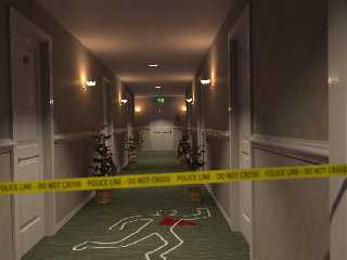
Jaime Vives Piqueres wrote:
> I was practicing with Chief Architect, and did this hotel corridor... it
> was
> so boring that I decided to have some fun adding some story to it.
>
> Regards,
>
> --
> Jaime
>
> ------------------------------------------------------------------------
>
Ah, the classical whodunit. I'm expecting Hercule Poirot to walk around
the corner any moment and solve the case.
-Ive
Post a reply to this message
|
|
| |
| |
|
|
|
|
| |
| |
|
|
New version, with some of the comments addressed:
+ Ricky: The "focal blur is wrong" thing always happens to me... I need
perhaps to try Edouard camera macros. But also this time there was a sort of
visual confusion, because the police tape was not properly located.
+ Ricky: Oops... I forgot to switch area lights on!
+ Ricky: Yes, the blood was too red... now I applied filtering to the
image_map, so it looks a bit more like if it was soaking into the carpet.
+ Edouard: You really nailed it on the lighting... it's just too perfect. I
remember someone patching POV-Ray for IES sometime ago, but can't remember
the details... I always had on my to-do list an experiment about using a
realistic light fixture with photons to see if it gives the same effect
(specially on spots).
+ Edouard: You're right, the plants leaves are too dark, and I tried hard to
get them shiny, but failed... I think it's because they are receiving too
little direct light, due to the placement of the lights.
+ Clipka: yes, my storytelling scenes always involve blood... strange
(remember "Travieso"?).
+ somebody: No, it's not a running pose, it's a "disco-dancing" pose: there
was a party at room 13. :)
+ somebody: Around here exit signs are also red, but I've seen some green
too... anyhow, it was just the default exit sign from Chief Architect.
+ somebody: totally correct about the tape, it was badly placed, and yes, I
forgot to put another one at the other end of the corridor! ...I take note
for the next WIP, thanks!
+ Carlo: yes, it's a WIP, but no, the intention WAS to be photorealistic...
anyhow, somebody comments where more about the realism of the situation
rather than the realism of the image itself.
Thanks to all for the comments!
--
Jaime
Post a reply to this message
Attachments:
Download 'hotelca-06c.jpg' (47 KB)
Preview of image 'hotelca-06c.jpg'
|
|
| |
| |
|
|
|
|
| |
| |
|
|
Nice idea!
I would suggest to make the blood much darker, use a dark red or reddish
black. Mostly it would look like a wet carpet, from the distance. So a dark,
very dark color should look realistic.
But otherwise it is a great, impressive and realistic work. Well done!
Sven
Post a reply to this message
|
|
| |
| |
|
|
|
|
| |
| |
|
|
Ive <"ive### [at] lilysoftorg"> wrote:
> Ah, the classical whodunit. I'm expecting Hercule Poirot to walk around
> the corner any moment and solve the case.
Unlikely. They didn't yet have plastic tape back in his time ;)
Post a reply to this message
|
|
| |
| |
|
|
|
|
| |
| |
|
|
clipka wrote:
> Unlikely. They didn't yet have plastic tape back in his time ;)
>
Umm, err, right Dr. Watson.
Post a reply to this message
|
|
| |
| |
|
|
|
|
| |
| |
|
|
The blood is still too red.... should be almost black, imo.
Great scene!
Thomas
Post a reply to this message
|
|
| |
| |
|
|
|
|
| |
| |
|
|
Jaime Vives Piqueres wrote:
> the intention WAS to be photorealistic...
In that respect I think what gives it away is: the lamps (especially the
ones in the ceiling) do look too dim compared to the amount of light
they emit. Perhaps some spheres around them with emissive media and
spherical density to simulate color bleeding would do the trick.
And I cannot imagine that any *real* plant could survive within this
environment, so by assuming thay are made of plastic, some specular
highlights on them would be a nice touch.
-Ive
Post a reply to this message
|
|
| |
| |
|
|
|
|
| |
| |
|
|
Jaime Vives Piqueres wrote:
> I was practicing with Chief Architect, and did this hotel corridor... it
> was
> so boring that I decided to have some fun adding some story to it.
>
> Regards,
>
> --
> Jaime
>
> ------------------------------------------------------------------------
>
Very nice!
Others have already commented on the blood color, but I'd like to add
that the chair rail seems to be exceedingly shiny, at least compared to
the amount of normal bump. It seems almost like it was really rough and
covered in cellophane; I think turning down the highlight or shallow
reflection would help. That really applies to all the white paint, it
just seems plastic-y
Exit signs are red in the USA, but I have seen green signs other places.
Post a reply to this message
|
|
| |
| |
|
|
|
|
| |
| |
|
|
> Exit signs are red in the USA, but I have seen green signs other places.
In Washington State they are almost always green. It'd be interesting to
see real statistics on exit sign colors.
Post a reply to this message
|
|
| |
| |
|
|
|
|
| |


