 |
 |
|
 |
|
 |
|  |
|  |
|
 |
|
 |
|  |
|  |
|
 |
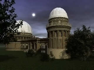
This is a scene I put together for the IRTC several years ago and was never
really thrilled with how it looked. Been attempting to convert it to a mcpov
scene off and on for several weeks, which has proven difficult with how many
different textures and objects involved. This is the result of about 17
hours rendering. While it looks quite a bit better than the original I am
still not really happy with it. The biggest challenge has been getting the
textures to look the same. The bottom of the smaller tower should be about
the same color as the rest but as you can see it is quite a bit lighter.
Mike
Post a reply to this message
Attachments:
Download 'YERKES_mapov.jpg' (119 KB)
Preview of image 'YERKES_mapov.jpg'

|
 |
|  |
|  |
|
 |
|
 |
|  |
|  |
|
 |
> This is a scene I put together for the IRTC several years ago and was
> never really thrilled with how it looked. Been attempting to convert it to
> a mcpov scene off and on for several weeks, which has proven difficult
> with how many different textures and objects involved. This is the result
> of about 17 hours rendering. While it looks quite a bit better than the
> original I am still not really happy with it.
I'm very confused by the lighting and shadows. That looks like the moon in
the sky at night, but then there seems to be a big light source behind the
camera somewhere.
Post a reply to this message
|
 |
|  |
|  |
|
 |
|
 |
|  |
|  |
|
 |
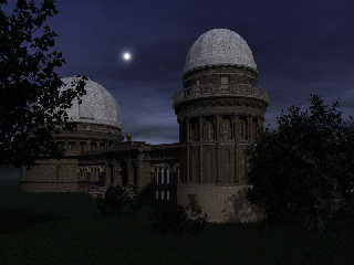
Was trying to make it look like it was sunrise but may have ruined it by
lightening the image in photoshop. This is the original image without any
post-processing, not that it is any better. The moon is just a glow object
so it doesn't show any phase.
"scott" <sco### [at] scott com> wrote in message
news:49ba16b3$1@news.povray.org...
>> This is a scene I put together for the IRTC several years ago and was
>> never really thrilled with how it looked. Been attempting to convert it
>> to
>> a mcpov scene off and on for several weeks, which has proven difficult
>> with how many different textures and objects involved. This is the result
>> of about 17 hours rendering. While it looks quite a bit better than the
>> original I am still not really happy with it.
>
> I'm very confused by the lighting and shadows. That looks like the moon
> in
> the sky at night, but then there seems to be a big light source behind the
> camera somewhere.
>
> com> wrote in message
news:49ba16b3$1@news.povray.org...
>> This is a scene I put together for the IRTC several years ago and was
>> never really thrilled with how it looked. Been attempting to convert it
>> to
>> a mcpov scene off and on for several weeks, which has proven difficult
>> with how many different textures and objects involved. This is the result
>> of about 17 hours rendering. While it looks quite a bit better than the
>> original I am still not really happy with it.
>
> I'm very confused by the lighting and shadows. That looks like the moon
> in
> the sky at night, but then there seems to be a big light source behind the
> camera somewhere.
>
>
Post a reply to this message
Attachments:
Download 'YERKES_mapov2.jpg' (108 KB)
Preview of image 'YERKES_mapov2.jpg'

|
 |
|  |
|  |
|
 |
|
 |
|  |
|  |
|
 |
"Mike Hough" <nos### [at] nospam com> wrote:
> This is a scene I put together for the IRTC several years ago and was never
> really thrilled with how it looked. Been attempting to convert it to a mcpov
> scene off and on for several weeks, which has proven difficult with how many
> different textures and objects involved. This is the result of about 17
> hours rendering. While it looks quite a bit better than the original I am
> still not really happy with it. The biggest challenge has been getting the
> textures to look the same. The bottom of the smaller tower should be about
> the same color as the rest but as you can see it is quite a bit lighter.
>
> Mike
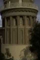
This part of the scene is very good (the whole scene, in truth): it seems an old
photography.
"Bella" scene!
--
Carlo com> wrote:
> This is a scene I put together for the IRTC several years ago and was never
> really thrilled with how it looked. Been attempting to convert it to a mcpov
> scene off and on for several weeks, which has proven difficult with how many
> different textures and objects involved. This is the result of about 17
> hours rendering. While it looks quite a bit better than the original I am
> still not really happy with it. The biggest challenge has been getting the
> textures to look the same. The bottom of the smaller tower should be about
> the same color as the rest but as you can see it is quite a bit lighter.
>
> Mike
This part of the scene is very good (the whole scene, in truth): it seems an old
photography.
"Bella" scene!
--
Carlo
Post a reply to this message
Attachments:
Download 'yerkes_mapov_cc.jpg' (14 KB)
Preview of image 'yerkes_mapov_cc.jpg'

|
 |
|  |
|  |
|
 |
|
 |
|  |
|  |
|
 |
> Was trying to make it look like it was sunrise but may have ruined it by
> lightening the image in photoshop. This is the original image without any
> post-processing, not that it is any better. The moon is just a glow object
> so it doesn't show any phase.
Ah ok, so the shadows from the trees are due to the sun? That makes more
sense as I think it was the shadows of the leaves on the front building that
was confusing me. Very good modelling and textures though!
Post a reply to this message
|
 |
|  |
|  |
|
 |
|
 |
|  |
|  |
|
 |
Mike Hough wrote:
> Was trying to make it look like it was sunrise but may have ruined it
> by lightening the image in photoshop. This is the original image
> without any post-processing, not that it is any better. The moon is
> just a glow object so it doesn't show any phase.
If it's supposed to be a full moon, then the sun would be behind the camera,
not as it looks here, where I think it's high and to the right.
Also, at full moon, generally the moon is setting at sunrise.
Ray
Post a reply to this message
|
 |
|  |
|  |
|
 |
|
 |
|  |
|  |
|
 |
Mike Hough nous illumina en ce 2009-03-12 20:41 -->
> This is a scene I put together for the IRTC several years ago and was never
> really thrilled with how it looked. Been attempting to convert it to a mcpov
> scene off and on for several weeks, which has proven difficult with how many
> different textures and objects involved. This is the result of about 17
> hours rendering. While it looks quite a bit better than the original I am
> still not really happy with it. The biggest challenge has been getting the
> textures to look the same. The bottom of the smaller tower should be about
> the same color as the rest but as you can see it is quite a bit lighter.
>
> Mike
>
>
>
The lighter base of the small tower looks very convincing to me. In fact, it's
the base of the large tower that look to dark.
The lighting and the sky are more troubling.
If the sun is just raising behing you, it should be lower, same for the moon.
Also, the sky near the horizon, under the moon, should be much darker, the
bright part is behind you. With the sun "on" the horizon, it's light should have
a redish cast.
--
Alain
-------------------------------------------------
You know you've been raytracing too long when you keep a blacklist of people who
ask questions about 3DFX products.
Alex McLeod a.k.a. Giant Robot Messiah
Post a reply to this message
|
 |
|  |
|  |
|
 |
|
 |
|  |


![]()