|
|
|
|
|
|
| |
| |
|
|
|
|
| |
| |
|
|
St. wrote:
>> http://www.normankoren.com/makingfineprints1A.html#gammachart
>
> Cool. Thanks, it says 2.2 or 1.8. I tried both of these in the
> povray.ini file and it's still too dark.
Use the test patterns provided on that page. Neither my laptop nor my
desktop's CRT have 1.8 or 2.2.
> ~Steve~
-Aero
Post a reply to this message
|
|
| |
| |
|
|
|
|
| |
| |
|
|
"Thomas de Groot" <tDOTdegroot@interDOTnlANOTHERDOTnet> wrote in message
news:49856b61$1@news.povray.org...
> Ah yes, this begins to look good. The colors are a bit too *primary* to my
> taste. You could try to use somewhat *off* reds, yellows, and blues; maybe
> even a very tiny bit different for each piece of glass. A bit darker too.
> Scale down the ambient too. Maybe a value around 0.5 will look nice. The
> opacity is allright I think.
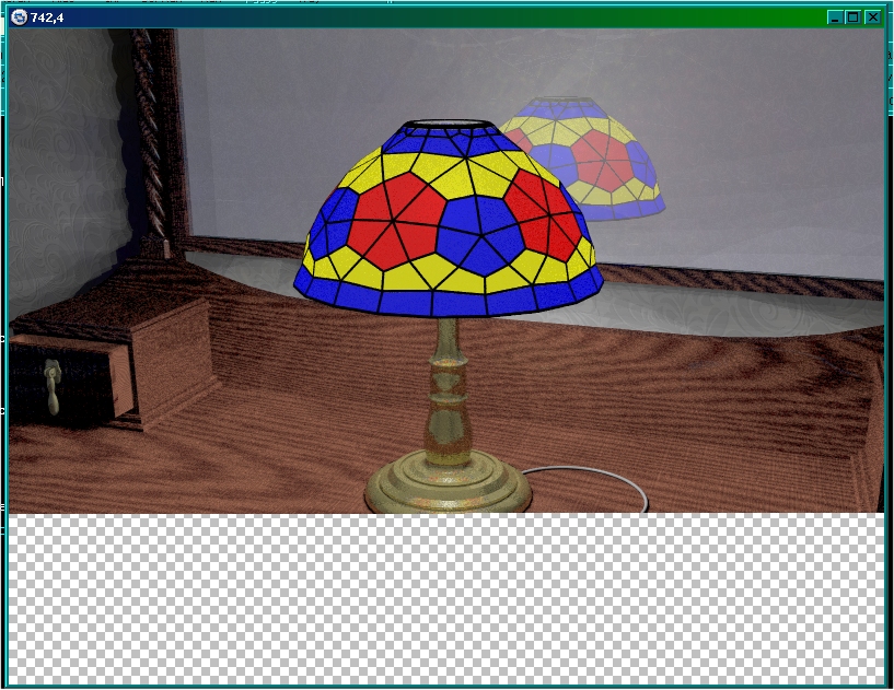
Here's the next one with AA and area_light on. Amazingly, this rendered
in only 58 minutes. I've used 0.5 on the coloured glass for the ambient in
this one, and diffused the glass colours by 25%. I'm not sure about it, so I
think I'll try 0.75 to see what that looks like, but what do you think? Ok
at 0.5?
>
> A bronze I use, but which might not be correct for your base, is the
> following, originally from Texture Magic:
>
> texture {
> pigment {
> colour rgb<0.549,0.467,0.137>
> }
> normal { granite 0.1 scale 0.01 }
> finish {
> ambient 0
> diffuse 0.7
> brilliance 2.0
> specular 0.3
> roughness 0.005
> metallic
> }
> }
Thanks Thomas! That's actually quite nice as it is, but it came out kind of
matt in appearance so I put the metallic in a reflection block and added
conserve_energy to give it some shine. I think it might have too much
reflection now though. The normals show a little too much but they should
look better when using better AA.
Oh, and added a switch. :)
~Steve~
> Thomas
>
>
>
Post a reply to this message
Attachments:
Download 'snapshot3.jpg' (230 KB)
Preview of image 'snapshot3.jpg'
|
|
| |
| |
|
|
|
|
| |
| |
|
|
"Eero Ahonen" <aer### [at] removethis zbxtnetinvalid> wrote in message
news:4985880d@news.povray.org...
> St. wrote:
>>> http://www.normankoren.com/makingfineprints1A.html#gammachart
>>
>> Cool. Thanks, it says 2.2 or 1.8. I tried both of these in the
>> povray.ini file and it's still too dark.
>
> Use the test patterns provided on that page.
I downloaded QuickGamma but it doesn't seem to do anything if I change
the numbers. I'm obviously doing something wrong. :/
Neither my laptop nor my
> desktop's CRT have 1.8 or 2.2.
Hmm, ok, so what are your settings then? Higher?
~Steve~
>
> -Aero zbxtnetinvalid> wrote in message
news:4985880d@news.povray.org...
> St. wrote:
>>> http://www.normankoren.com/makingfineprints1A.html#gammachart
>>
>> Cool. Thanks, it says 2.2 or 1.8. I tried both of these in the
>> povray.ini file and it's still too dark.
>
> Use the test patterns provided on that page.
I downloaded QuickGamma but it doesn't seem to do anything if I change
the numbers. I'm obviously doing something wrong. :/
Neither my laptop nor my
> desktop's CRT have 1.8 or 2.2.
Hmm, ok, so what are your settings then? Higher?
~Steve~
>
> -Aero
Post a reply to this message
|
|
| |
| |
|
|
|
|
| |
| |
|
|
St. wrote:
>> Neither my laptop nor my
>> desktop's CRT have 1.8 or 2.2.
>
> Hmm, ok, so what are your settings then? Higher?
My laptop's is 1.6 and IIRC desktop CRT's even lower, but since my
workstation broke over a year ago, I can't remember for sure :P.
> ~Steve~
-Aero
Post a reply to this message
|
|
| |
| |
|
|
|
|
| |
| |
|
|
"St." <dot### [at] dotcom> schreef in bericht news:49859f64@news.povray.org...
> Here's the next one with AA and area_light on. Amazingly, this rendered
> in only 58 minutes. I've used 0.5 on the coloured glass for the ambient in
> this one, and diffused the glass colours by 25%. I'm not sure about it, so
> I think I'll try 0.75 to see what that looks like, but what do you think?
> Ok at 0.5?
Yes, this looks much better. Just to be sure, try also 0.75 indeed, and make
your choice :-)
With this kind of testing, I am always reminded of woodworkers or
stomemasons (and jewellers too, of course): scratching here, taking off
there, polishing, chipping again, polishing again. It's a real artisanal
work. Like you said earlier: RL.
> Thanks Thomas! That's actually quite nice as it is, but it came out kind
> of matt in appearance so I put the metallic in a reflection block and
> added conserve_energy to give it some shine. I think it might have too
> much reflection now though. The normals show a little too much but they
> should look better when using better AA.
You are right! The reflection block works better here, but you can scale
that a bit down too. The same thing for the micro normals which can be
dimmed somewhat, but this depends on the aa. I took the example from a scene
I am working on, where the reflections should be virtually absent.
>
> Oh, and added a switch. :)
Nice one!
Thomas
Post a reply to this message
|
|
| |
| |
|
|
|
|
| |
| |
|
|
"St." <dot### [at] dotcom> wrote:
> > I keep having no idea (and can't seem to learn) which of all those gamma
> > settings to set to 1.0 and which to set to 2.2 - but I know for sure that
> > there
> > should *not* be a .75 *anywhere*...
>
> :) Why not? If I increase it, it gets darker.
If your scene is too dark, that's not necessarily the gamma's fault. Maybe it's
time to replace that 25W light bulb with a 60W one.
The gamma settings are *not* suitable for adjusting overall scene brightness,
because they do so nonlinearly, thereby messing up the saturation in a highly
brightness-dependent fashion. Exactly the type of "selective washing-out" of
colors seen in your shot.
Post a reply to this message
|
|
| |
| |
|
|
|
|
| |
| |
|
|
"St." <dot### [at] dotcom> wrote:
> "Thomas de Groot" <tDOTdegroot@interDOTnlANOTHERDOTnet> wrote in message
> > Ah yes, this begins to look good. The colors are a bit too *primary* to my
> > taste. You could try to use somewhat *off* reds, yellows, and blues; maybe
> > even a very tiny bit different for each piece of glass. A bit darker too.
> > Scale down the ambient too. Maybe a value around 0.5 will look nice. The
> > opacity is allright I think.
>
> Here's the next one with AA and area_light on. Amazingly, this rendered
> in only 58 minutes. I've used 0.5 on the coloured glass for the ambient in
> this one, and diffused the glass colours by 25%. I'm not sure about it, so I
> think I'll try 0.75 to see what that looks like, but what do you think? Ok
> at 0.5?
Nice work. Seems like the glass could use a bit more texture though. I'd
expect the overall tone of the image to be softer and warmer for a lamp like
this. Here's an example for reference:
http://styleglass.com/tiffanylamp.jpg
- Ricky
Post a reply to this message
|
|
| |
| |
|
|
|
|
| |
| |
|
|
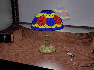
"St." <dot### [at] dotcom> wrote:
> I've just rendered this image now, it took 1 hour 22 minutes with
> area_light turned on and normal AA. I changed the colours of the glass to be
> less pale as per Thomas' suggestion, but are these colours too vivid now?
It *is* too vivid now. The problem wasn't the saturation per se, but the
difference in saturation between the lampshade and the shadows cast. Which most
likely is a gamma problem.
Post a reply to this message
|
|
| |
| |
|
|
|
|
| |
| |
|
|
"St." <dot### [at] dotcom> wrote:
> I downloaded QuickGamma but it doesn't seem to do anything if I change
> the numbers. I'm obviously doing something wrong. :/
Why the * use QuickGamma, when all you need to do is check what your *current*
gamma is, set your POV "Display_Gamma" .ini setting to that value, insert
"assumed_gamma 1.0" in your scene, and then go ahead to fix your scene's
lighting conditions...
Post a reply to this message
|
|
| |
| |
|
|
|
|
| |
| |
|
|
"Thomas de Groot" <tDOTdegroot@interDOTnlANOTHERDOTnet> wrote in message
news:4985c3c8$1@news.povray.org...
> Yes, this looks much better. Just to be sure, try also 0.75 indeed, and
> make
> your choice :-)
Ah, well, in this next image I used .7, and I think it looks ok. This
shot is with photons enabled and I stopped it at line 444 with 2pps showing.
(10PP's for someone who gets close to the render time of this image). :)
I can't see that it did much in the image so I don't think I'll use
photonsthankyouverymuch. :)
However, I think the glass is better now but still too vivid.
> With this kind of testing, I am always reminded of woodworkers or
> stomemasons (and jewellers too, of course): scratching here, taking off
> there, polishing, chipping again, polishing again. It's a real artisanal
> work. Like you said earlier: RL.
My Grandad was a good woodworker, making all kinds of weird and
wonderful things like turned bowls to 'what-nots' to corner cabinets and
coffee tables, usually in solid oak or mahogany.
> You are right! The reflection block works better here, but you can scale
> that a bit down too. The same thing for the micro normals which can be
> dimmed somewhat, but this depends on the aa. I took the example from a
> scene
> I am working on, where the reflections should be virtually absent.
Yes, the image attached was being rendered before I read this so they're
not applied as yet, but the funny thing is, with the lamp in its proper
place at the back of the room, the bronze looks so much better. So I think
I'll leave it as it is now.
>
>>
>> Oh, and added a switch. :)
>
> Nice one!
Hehe, there are more things now! :)
~Steve~
>
> Thomas
>
>
Post a reply to this message
Attachments:
Download 'snapshot4_phot_test.jpg' (307 KB)
Preview of image 'snapshot4_phot_test.jpg'
|
|
| |
| |
|
|
|
|
| |
|
|