|
 |
"Thomas de Groot" <tDOTdegroot@interDOTnlANOTHERDOTnet> wrote in message
news:49856b61$1@news.povray.org...
> Ah yes, this begins to look good. The colors are a bit too *primary* to my
> taste. You could try to use somewhat *off* reds, yellows, and blues; maybe
> even a very tiny bit different for each piece of glass. A bit darker too.
> Scale down the ambient too. Maybe a value around 0.5 will look nice. The
> opacity is allright I think.
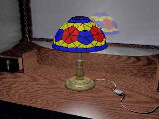
Here's the next one with AA and area_light on. Amazingly, this rendered
in only 58 minutes. I've used 0.5 on the coloured glass for the ambient in
this one, and diffused the glass colours by 25%. I'm not sure about it, so I
think I'll try 0.75 to see what that looks like, but what do you think? Ok
at 0.5?
>
> A bronze I use, but which might not be correct for your base, is the
> following, originally from Texture Magic:
>
> texture {
> pigment {
> colour rgb<0.549,0.467,0.137>
> }
> normal { granite 0.1 scale 0.01 }
> finish {
> ambient 0
> diffuse 0.7
> brilliance 2.0
> specular 0.3
> roughness 0.005
> metallic
> }
> }
Thanks Thomas! That's actually quite nice as it is, but it came out kind of
matt in appearance so I put the metallic in a reflection block and added
conserve_energy to give it some shine. I think it might have too much
reflection now though. The normals show a little too much but they should
look better when using better AA.
Oh, and added a switch. :)
~Steve~
> Thomas
>
>
>
Post a reply to this message
Attachments:
Download 'snapshot3.jpg' (230 KB)
Preview of image 'snapshot3.jpg'
|
|


