|
|
|
|
|
|
| |
| |
|
|
|
|
| |
| |
|
|
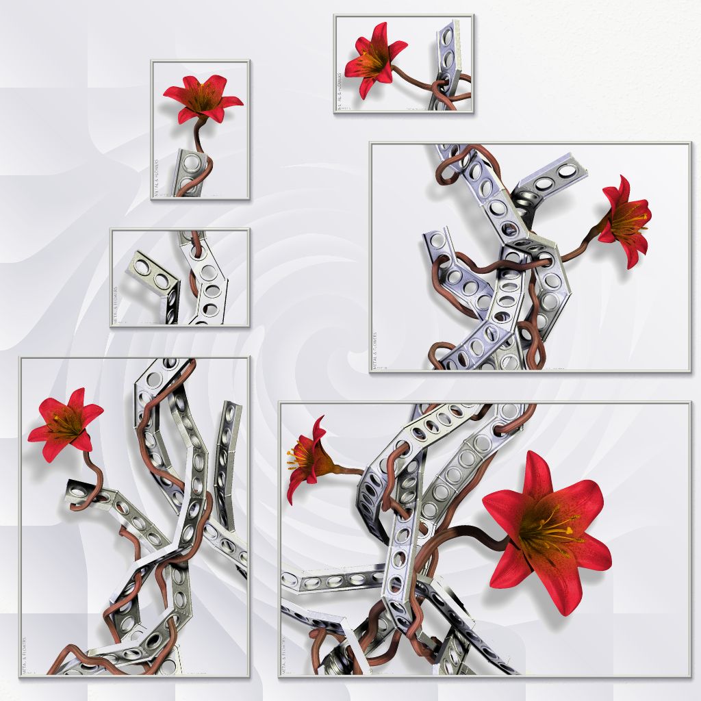
I made a little flash file where you can change the color of the wall and
see the posters on that color. You can also choose between the various
preset poster colors or even pick a color of your own choice.
http://runevision.com/3d/metalandflowers/
You can also share your findings, so if you want to show off how the posters
would look on your wall, or want to suggest a color for the posters that you
think look awsome, simply copy the url generated at the bottom and post
here.
Sorry for the very buggy color picker. I found it on the net and it was even
worse before I fixed a few (other) major issues it had. If anyone have been
able to find a free one that's better, please let me know. All the well
tested ones seem to cost money.
Rune
--
http://runevision.com
Post a reply to this message
|
|
| |
| |
|
|
|
|
| |
| |
|
|
Rune wrote:
> I made a little flash file where you can change the color of the wall and
> see the posters on that color. You can also choose between the various
> preset poster colors or even pick a color of your own choice.
>
> http://runevision.com/3d/metalandflowers/
>
Been playing with it for a bit and I must say that the only color that works
well on almost any wall color, in my view that is, is khaki. Even if you
had an of-khaki wall it works. White also works well because it's a neutral
color but it's not as forgiving. Other colors are far more picky. The dark
colors, black and brown, are just out of the question.
All this is obviously just my opinion.
And as an aside, I'm very pleasantly surprised by the lengths you go to get
a good end result. One doesn't see that nearly enough. :)
--
Ger
Post a reply to this message
|
|
| |
| |
|
|
From: Christian Froeschlin
Subject: Re: Metal & Flowers WIP? 5 - with new colors!
Date: 22 Aug 2007 16:03:37
Message: <46cc9699$1@news.povray.org>
|
|
|
| |
| |
|
|
Rune wrote:
> I've considered myself how this would look, though mostly as a curiosum.
> I've only just tried it now (see attached), and it actually looks worse than
> I thought.
Eew. Mental & Flowers ;)
Post a reply to this message
|
|
| |
| |
|
|
|
|
| |
| |
|
|
"Rune" <new### [at] runevision com> wrote:
> I made a little flash file where you can change the color of the wall and
> see the posters on that color. You can also choose between the various
> preset poster colors or even pick a color of your own choice.
>
> http://runevision.com/3d/metalandflowers/
>
> You can also share your findings, so if you want to show off how the posters
> would look on your wall, or want to suggest a color for the posters that you
> think look awsome, simply copy the url generated at the bottom and post
> here.
>
> Sorry for the very buggy color picker. I found it on the net and it was even
> worse before I fixed a few (other) major issues it had. If anyone have been
> able to find a free one that's better, please let me know. All the well
> tested ones seem to cost money.
>
> Rune
> --
> http://runevision.com
Well, the metal reflects both yellow and blue reflections, which
incidentally might explain the overwhelming support for both kakhi and blue
backgrounds, so I thought a light green could work. Something like
http://runevision.com/3d/metalandflowers/?wall=FFFFFF&poster=CBD4CB&frames=true
IMO, it sets off the red in the stems, which in turn make the red of the
flowers really stand out.
I also tried a non-uniform background, based on white and the blue
reflection #c8c8d3. Maybe a tad obvious. :-p com> wrote:
> I made a little flash file where you can change the color of the wall and
> see the posters on that color. You can also choose between the various
> preset poster colors or even pick a color of your own choice.
>
> http://runevision.com/3d/metalandflowers/
>
> You can also share your findings, so if you want to show off how the posters
> would look on your wall, or want to suggest a color for the posters that you
> think look awsome, simply copy the url generated at the bottom and post
> here.
>
> Sorry for the very buggy color picker. I found it on the net and it was even
> worse before I fixed a few (other) major issues it had. If anyone have been
> able to find a free one that's better, please let me know. All the well
> tested ones seem to cost money.
>
> Rune
> --
> http://runevision.com
Well, the metal reflects both yellow and blue reflections, which
incidentally might explain the overwhelming support for both kakhi and blue
backgrounds, so I thought a light green could work. Something like
http://runevision.com/3d/metalandflowers/?wall=FFFFFF&poster=CBD4CB&frames=true
IMO, it sets off the red in the stems, which in turn make the red of the
flowers really stand out.
I also tried a non-uniform background, based on white and the blue
reflection #c8c8d3. Maybe a tad obvious. :-p
Post a reply to this message
Attachments:
Download 'metal12_composition_1024_white_wirly.jpg' (143 KB)
Preview of image 'metal12_composition_1024_white_wirly.jpg'
|
|
| |
| |
|
|
|
|
| |
| |
|
|
Grassblade wrote:
> Well, the metal reflects both yellow and blue reflections, which
> incidentally might explain the overwhelming support for both kakhi
> and blue backgrounds, so I thought a light green could work.
> Something like
> http://runevision.com/3d/metalandflowers/?wall=FFFFFF&poster=CBD4CB&frames=true
> IMO, it sets off the red in the stems, which in turn make the red of
> the flowers really stand out.
I'm really surprised how a color so close to light gray actually sets off
the metal so nicely rather than blending in with it. It works very well, I
agree.
> I also tried a non-uniform background, based on white and the blue
> reflection #c8c8d3. Maybe a tad obvious. :-p
Hehe...
Rune
--
http://runevision.com
Post a reply to this message
|
|
| |
| |
|
|
|
|
| |
| |
|
|
Rune wrote:
>
> Colors with red
> in don't work well
??? I think orange is a good choice. Try <255, 150, 65>
Your khaki is greenish for my tastes. I prefer warmer, lighter <215,
205, 160>
Adjustment to your desaturated blue and teal backgrounds would "eat"
your flowers less <71, 112, 178> <71, 178, 155>
-Shay
Post a reply to this message
|
|
| |
| |
|
|
|
|
| |
| |
|
|
> You can also share your findings, so if you want to show off how the
> posters would look on your wall, or want to suggest a color for the
> posters that you think look awsome, simply copy the url generated at the
> bottom and post here.
Light blue doesn't look to bad.
http://runevision.com/3d/metalandflowers/?wall=FFFFFF&poster=DCEDED&frames=true
Post a reply to this message
|
|
| |
| |
|
|
|
|
| |
| |
|
|
Shay wrote:
> Rune wrote:
>> Colors with red
>> in don't work well
>
> ??? I think orange is a good choice. Try <255, 150, 65>
Ok:
http://runevision.com/3d/metalandflowers/?wall=FFFFFF&poster=FF9641&frames=true
I have to say that I think the flowers look flat and uninspired on the
orange background.
> Your khaki is greenish for my tastes. I prefer warmer, lighter <215, 205,
> 160>
http://runevision.com/3d/metalandflowers/?wall=FFFFFF&poster=D7CDA0&frames=true
Hmm, personally I like the green tint in the khaki, as it creates slightly
more contrast with the flowers.
> Adjustment to your desaturated blue and teal backgrounds would "eat"
> your flowers less <71, 112, 178> <71, 178, 155>
http://runevision.com/3d/metalandflowers/?wall=FFFFFF&poster=4770B2&frames=true
http://runevision.com/3d/metalandflowers/?wall=FFFFFF&poster=47B29B&frames=true
Hmm, I think we generally have different tastes in color. :)
(Or your screen is much darker than mine!)
Rune
--
http://runevision.com
Post a reply to this message
|
|
| |
| |
|
|
|
|
| |
| |
|
|
Tim Attwood wrote:
>> You can also share your findings, so if you want to show off how the
>> posters would look on your wall, or want to suggest a color for the
>> posters that you think look awsome, simply copy the url generated at
>> the bottom and post here.
>
> Light blue doesn't look to bad.
> http://runevision.com/3d/metalandflowers/?wall=FFFFFF&poster=DCEDED&frames=true
Being so close to the color of the metal, and more saturated too, it
flickers rather much in my eyes. :/
Rune
--
http://runevision.com
Post a reply to this message
|
|
| |
| |
|
|
|
|
| |
| |
|
|
Rune wrote:
>
> Hmm, I think we generally have different tastes in color. :)
> (Or your screen is much darker than mine!)
>
And goals. I don't care for any of the cools with your neutral red and
warm stamens. IMO, anything even leaning towards Vermillion looks best
with at least as warm as a slightly cool yellow. Red recedes against
cool, deep colors, which is why I desaturated and/or lightened your blue
and teal.
Orange pulls the stamens out of the flowers, IMO.
Nice image whichever you choose. Looking forward to seeing photos of the
finished project.
-Shay
Post a reply to this message
|
|
| |
| |
|
|
|
|
| |