|
|
|
|
|
|
| |
| |
|
|
|
|
| |
| |
|
|
Impressive...
Post a reply to this message
|
|
| |
| |
|
|
|
|
| |
| |
|
|
Uh, pretty nice! Pretty damn nice to be specific :)
As you ask for possible improvements: Personally I don't like seeing the
background where the table ends, I'd prefer some sort of ground. As a
minor thing I'd suggest adding a frame around the chessboard, I've never
seen one where the tiles start right at the edges.
Regards,
Florian
Post a reply to this message
|
|
| |
| |
|
|
|
|
| |
| |
|
|
> If you're using HDRI, I'm surprised that the shadow is so sharp. Are you
> using a light source as well? If you are, you might consider making it an
> area light.
Yeah it's a light source, with radiosity for the HDR. I was suffering nasty
artefacts with just radiosity and HDRI (hence my earlier HDR post using a
light dome) but evidently having 1 dominant light is enough to make the
radiosity look good.
You're right, it needs to be an area_light, I'll go fix that. I'll also
stick in a shadow from the trees.
Tone mapping is like a gamma curve but fancier, see the megapov
documentation on it's tone_mapping feature:
http://megapov.inetart.net/manual-1.2.1/global_settings.html#tone_mapping
--
Tek
http://evilsuperbrain.com
"Kirk Andrews" <kir### [at] hotmail com> wrote in message
news:web.461fbb1c1c29fca243f28d40@news.povray.org...
> Looks great! Very impressive.
>
> If you're using HDRI, I'm surprised that the shadow is so sharp. Are you
> using a light source as well? If you are, you might consider making it an
> area light.
>
> For my own taste, I would either move the camera a little closer or make
> the
> sphere bigger. But that's just my own opinion.
>
> I'm curious what you mean by "tone-mapping"--I've not heard of that
> before.
>
> -- Kirk
>
> com> wrote in message
news:web.461fbb1c1c29fca243f28d40@news.povray.org...
> Looks great! Very impressive.
>
> If you're using HDRI, I'm surprised that the shadow is so sharp. Are you
> using a light source as well? If you are, you might consider making it an
> area light.
>
> For my own taste, I would either move the camera a little closer or make
> the
> sphere bigger. But that's just my own opinion.
>
> I'm curious what you mean by "tone-mapping"--I've not heard of that
> before.
>
> -- Kirk
>
>
Post a reply to this message
|
|
| |
| |
|
|
|
|
| |
| |
|
|
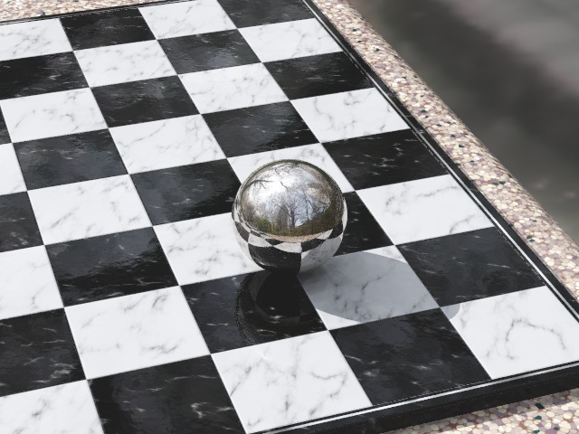
"Jim Charter" <jrc### [at] msncom> wrote in message
news:461fc4ef$1@news.povray.org...
> tres cool texture on the table edge
Thanks! Came up with that moments before posting
pigment {
crackle
form <1,-.5,0>
pigment_map {
[.2
crackle
solid
colour_map {
[.25 rgb 1]
[.25 rgb <.8,.7,.5>]
[.75 rgb <.15,.1,.15>]
[.75 rgb <0,.05,.05>]
}
]
[.4 rgb <.2,.1,.07>]
}
scale .1
}
--
Tek
http://evilsuperbrain.com
Post a reply to this message
|
|
| |
| |
|
|
|
|
| |
| |
|
|
I totally agree, though focal blur should help tie the blurry HDRI
background to the sharp foreground a bit better. But in any case I'm going
to experiment with some kind of ground.
Good suggestion regarding the board, I hadn't thought of that (and I don't
play it myself). I'll add one now.
--
Tek
http://evilsuperbrain.com
"Florian Brucker" <tor### [at] torfboldcom> wrote in message
news:461fc967$1@news.povray.org...
> Uh, pretty nice! Pretty damn nice to be specific :)
>
> As you ask for possible improvements: Personally I don't like seeing the
> background where the table ends, I'd prefer some sort of ground. As a
> minor thing I'd suggest adding a frame around the chessboard, I've never
> seen one where the tiles start right at the edges.
>
>
> Regards,
> Florian
Post a reply to this message
|
|
| |
| |
|
|
|
|
| |
| |
|
|
Here's a redesigned board, based loosely on a few boards google found. It
seems wood+marble don't usually appear on the same board so I went fully
marble, with a chrome line to outline the board. Not sure I like the chrome
line, I think I'll try an inverted version with white marble border and a
black line...
--
Tek
http://evilsuperbrain.com
"Tek" <tek### [at] evilsuperbraincom> wrote in message
news:461fd775$1@news.povray.org...
>I totally agree, though focal blur should help tie the blurry HDRI
> background to the sharp foreground a bit better. But in any case I'm going
> to experiment with some kind of ground.
>
> Good suggestion regarding the board, I hadn't thought of that (and I don't
> play it myself). I'll add one now.
>
> --
> Tek
> http://evilsuperbrain.com
>
> "Florian Brucker" <tor### [at] torfboldcom> wrote in message
> news:461fc967$1@news.povray.org...
>> Uh, pretty nice! Pretty damn nice to be specific :)
>>
>> As you ask for possible improvements: Personally I don't like seeing the
>> background where the table ends, I'd prefer some sort of ground. As a
>> minor thing I'd suggest adding a frame around the chessboard, I've never
>> seen one where the tiles start right at the edges.
>>
>>
>> Regards,
>> Florian
>
>
Post a reply to this message
Attachments:
Download 'before+after.1.jpg' (109 KB)
Preview of image 'before+after.1.jpg'
|
|
| |
| |
|
|
|
|
| |
| |
|
|
Tek wrote:
> Yes folks, it's time for Yet Another Reflective Sphere On Checkered Plane!
>
> This is a WIP for the Before+After round of the
> I-can't-believe-it's-not-the-IRTC contest. The concept here is rather
> obviously before + after I got my mad povray skillz. I'm gonna have a
> double-image with one side being the standard rsocp like I could do when I
> first used pov, and the other side being the most realistic rsocp I can do.
> This is, obviously, the latter.
>
> There's some tone-mapping in there already though I think it looks a little
> like a painting not a photo at the moment. So I'm gonna mess with that and
> add some lens effects (blur, dispersion). BTW, if it isn't obvious, the
> background's another HDR probe from http://unparent.com/
>
> Any suggestions on how I can make this more real?
Wow!
Now, I'm going to pick on every little thing though, since you want
suggestion to make it more real. Anything I wouldn't expect in a photograph.
What my eyes first noticed was the 'noise' just below and to the left of
the sphere. I don't know what AA settings you used, but changing that
could either soften and spread out the highlight and make it look more
real, or get rid of them completely which probably wouldn't look as nice.
The background is very blurry. My camera seems to think that to get the
background that faded would require a very narrow depth of field, if the
table is normal height off the ground for an outdoor chess table. A
little blur at the far side of the table would take care of that and
might even convince the photographers that this is a real picture.
Lastly, the table edge itself. I love the pigment, it looks just like
the composite stone I would expect to find in a park. My eyes say that
each chip in the stone seems too flat. I would suggest normals, but it's
the shadow that gives it away. The shadow of the board on the lower
right looks too crisp as it passes over each little chip. Similerly, the
green on the far top right looks just as bright as the near green
specks, something I wouldn't expect looking at that table. The little
bit of lens effects you mentioned might take care of all of that without
resorting to anything more complecated.
I linked the picture to a friend, fellow computer geek but not into
graphics. His response was, 'wow, wait, that's not real?' Personally,
I'd want this as a desktop, or a poster as is. I can't wait to see it
when you are finished.
Post a reply to this message
|
|
| |
| |
|
|
|
|
| |
| |
|
|
My reflective sphere over checkered plane didn't look this cool :(
--
Dan
GoofyGraffix.com
Post a reply to this message
|
|
| |
| |
|
|
|
|
| |
| |
|
|
"Sabrina Kilian" <ykg### [at] vtedu> wrote in message
news:461fea7c$1@news.povray.org...
> What my eyes first noticed was the 'noise' just below and to the left of
> the sphere.
Good point I hadn't noticed, I've upped my AA settings now.
> The background is very blurry. My camera seems to think that to get the
> background that faded would require a very narrow depth of field, if the
> table is normal height off the ground for an outdoor chess table. A
> little blur at the far side of the table would take care of that and
> might even convince the photographers that this is a real picture.
The picture actually has quite a zoomed lens so a real camera would need an
apeture of several centimetres to get that much blur, and that's just not
realistic! So I plan to build a detailed non-blurry floor to go there.
> Lastly, the table edge itself. I love the pigment, it looks just like
> the composite stone I would expect to find in a park. My eyes say that
> each chip in the stone seems too flat. I would suggest normals, but it's
> the shadow that gives it away. The shadow of the board on the lower
> right looks too crisp as it passes over each little chip. Similerly, the
> green on the far top right looks just as bright as the near green
> specks, something I wouldn't expect looking at that table. The little
> bit of lens effects you mentioned might take care of all of that without
> resorting to anything more complecated.
The table actually has a reflective sheen, though it's not obvious at this
angle, so it's supposed to be composite stone polished to a very smooth
finish. In any case I've added an area light which has now slightly softened
the edge of the shade so that should fix the problem. Do you think the green
specks are too bright or too dark? I put them in at the last minute and I'm
not sure I like them!
> I linked the picture to a friend, fellow computer geek but not into
> graphics. His response was, 'wow, wait, that's not real?' Personally,
> I'd want this as a desktop, or a poster as is. I can't wait to see it
> when you are finished.
Thanks for your comments!
--
Tek
http://evilsuperbrain.com
Post a reply to this message
|
|
| |
| |
|
|
|
|
| |
| |
|
|
Tek wrote:
> "Sabrina Kilian" <ykg### [at] vtedu> wrote in message
> news:461fea7c$1@news.povray.org...
>> Lastly, the table edge itself. I love the pigment, it looks just like
>> the composite stone I would expect to find in a park. My eyes say that
>> each chip in the stone seems too flat. I would suggest normals, but it's
>> the shadow that gives it away. The shadow of the board on the lower
>> right looks too crisp as it passes over each little chip. Similerly, the
>> green on the far top right looks just as bright as the near green
>> specks, something I wouldn't expect looking at that table. The little
>> bit of lens effects you mentioned might take care of all of that without
>> resorting to anything more complecated.
>
> The table actually has a reflective sheen, though it's not obvious at this
> angle, so it's supposed to be composite stone polished to a very smooth
> finish. In any case I've added an area light which has now slightly softened
> the edge of the shade so that should fix the problem. Do you think the green
> specks are too bright or too dark? I put them in at the last minute and I'm
> not sure I like them!
>
You are right, the table looked matte almost and the sheen did not show
up like it did for the chess board. I'm not used to seeing composite
stone brand new, so I was expecting the small pieces to be slightly
varied in height or angle which would break up the near side's shadow.
With the sheen being more obvious, or the shadow being softer, I think
it will look great.
I don't think the green specks are too bright or dark, I just can't
reconcile that the chips on the top right look to be almost the same
color as the ones on the nearest edge. It looks great on the near edge,
but it seems too colorful on the far edge.
All of this could be because I am picturing how this would look from a
camera up close with a wide angle lens, not a far off zoom. I'll put a
marble on my desk again, and find a telephoto lens, and see what I think
then.
>> I linked the picture to a friend, fellow computer geek but not into
>> graphics. His response was, 'wow, wait, that's not real?' Personally,
>> I'd want this as a desktop, or a poster as is. I can't wait to see it
>> when you are finished.
>
> Thanks for your comments!
And thank you for another wonderful picture.
Post a reply to this message
|
|
| |
| |
|
|
|
|
| |
|
|