|
|
|
|
|
|
| |
| |
|
|
|
|
| |
| |
|
|
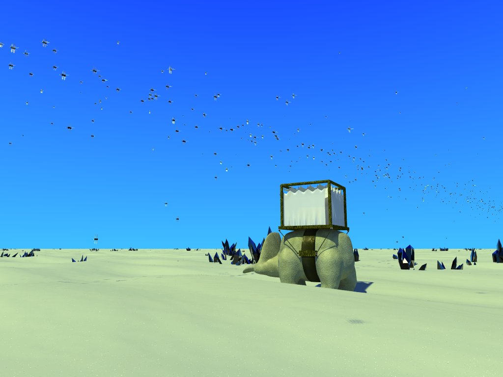
Hello. :-)
First off, I'd like to thank the people who took the time to comment on my
first embarassment. :-P I needed that kick in the pants to get this far.
;-)
Issues so far...
1. I'm not happy with the textures on the cupola-thing. I was aiming for a
sort of leathery look for the "waistband". I tried for a sort of
alien-looking wood on the various structures (really just a crummy wood
texture with lots of turbulence). Now I'm thinking that maybe that's not
what I wanted. My problem now is not so much that I don't know how to
create what I want, as that I don't know what I want. Suggestions are
welcome.
2. I'm not sure exactly how to place the creature. For one thing I
remembered the numbers for the golden section wrong :-P but I'm not sure
whether to center just the creature on the magic spot, or center the whole
creature-cupola unit on it. I tried it the first way, then the second, and
now I'm leaning toward centering just the creature on it. Comments?
3. What else is wrong that I don't see? :-) I'm starting to feel good about
this image again, which means that its time for someone to put me in my
place. ;-)
William
Post a reply to this message
Attachments:
Download 'aliendesert.jpg' (60 KB)
Preview of image 'aliendesert.jpg'
|
|
| |
| |
|
|
|
|
| |
| |
|
|
> First off, I'd like to thank the people who took the time to comment on my
> first embarassment. :-P I needed that kick in the pants to get this far.
I don't agree that it was an embarassement, I liked the idea that light was
shining through to cast a shadow of the person on the cloth. That was the
important thing about the image, imo. And although some commented about the
flat desert, I'm not quite sure they were right. And the sky was far more
interesting, as I remember it.
> 2. I'm not sure exactly how to place the creature. For one thing I
> remembered the numbers for the golden section wrong :-P but I'm not sure
> whether to center just the creature on the magic spot, or center the whole
> creature-cupola unit on it. I tried it the first way, then the second, and
> now I'm leaning toward centering just the creature on it. Comments?
The golden section is just one way of composing, but instead of using a
number, you should try to get a sense of how the components make a balanced
picture, or an interesting one, an expressive one ... No rulebook can tell
you what you feel or what you want to express.
One way of looking at it is to think that the animal is moving forward, so
it should have some room in front of it, and less room behind. It would be
nicer to see the whole figure, too (get rid of the sand on this side of the
animal).
Unless the vast landscape is important, I think I would zoom in on the
animal.
Good luck, William
Post a reply to this message
|
|
| |
| |
|
|
|
|
| |
| |
|
|
> I don't agree that it was an embarassement,
Well, thanks. :-) I looked at the original image again recently, and I
wasn't really impressed. It still had a ways to go.
> I liked the idea that light was
> shining through to cast a shadow of the person on the cloth. That was the
> important thing about the image, imo.
The sunset effect just wasn't working overall, and it's harder to get the
silhouette right with the sun high in the sky. I also decided that I
preferred having the near side of the animal lit up, to show the texture
better.
In fact, I would have had the curtain pulled back to show the figure, but I
was having some problems getting the interior of the cupola to look like I
wanted. That, and there's no really easy way to make the clothes on the
figure look like I wanted with POV-Person. :-P
> And although some commented about the
> flat desert, I'm not quite sure they were right.
I spent a long time working with the image and fighting that particular
suggestion before I finally had to admit they were right. :-) I still tried
to keep it relatively flat, but hilly enough to suggest sand dunes.
Actually, the flat desert looked OK with the sunset lighting, but not with
the sun overhead.
> And the sky was far more
> interesting, as I remember it.
> Unless the vast landscape is important, I think I would zoom in on the
> animal.
I'm trying to get a sense of a vast open space, which is also why I took the
clouds out--I felt they were working against that effect.
> The golden section is just one way of composing, but instead of using a
> number, you should try to get a sense of how the components make a balanced
> picture, or an interesting one, an expressive one ... No rulebook can tell
> you what you feel or what you want to express.
Well, the positioning doesn't feel quite "right", which is why I'm playing
with the numbers. :-) The general layout is like I want it; now I'm just
trying to nail down exacly where everything will go.
> One way of looking at it is to think that the animal is moving forward, so
> it should have some room in front of it, and less room behind. It would be
> nicer to see the whole figure, too (get rid of the sand on this side of the
> animal).
I never really liked the way the animal's legs looked. That, and this way I
don't have to fix the footprints. ;-)
> Good luck, William
Thanks! :-)
Post a reply to this message
|
|
| |
| |
|
|
|
|
| |
| |
|
|
"Afishionado" <afi### [at] gmail com> schreef in bericht
news:web.43e92d74109374333ef5a7570@news.povray.org...
> Hello. :-)
>
> First off, I'd like to thank the people who took the time to comment on my
> first embarassment. :-P I needed that kick in the pants to get this far.
> ;-)
>
> Issues so far...
>
> 1. I'm not happy with the textures on the cupola-thing. I was aiming for a
> sort of leathery look for the "waistband". I tried for a sort of
> alien-looking wood on the various structures (really just a crummy wood
> texture with lots of turbulence). Now I'm thinking that maybe that's not
> what I wanted. My problem now is not so much that I don't know how to
> create what I want, as that I don't know what I want. Suggestions are
> welcome.
>
> 2. I'm not sure exactly how to place the creature. For one thing I
> remembered the numbers for the golden section wrong :-P but I'm not sure
> whether to center just the creature on the magic spot, or center the whole
> creature-cupola unit on it. I tried it the first way, then the second, and
> now I'm leaning toward centering just the creature on it. Comments?
>
> 3. What else is wrong that I don't see? :-) I'm starting to feel good
about
> this image again, which means that its time for someone to put me in my
> place. ;-)
>
> William
>
Congratulations!!! These are big changes, and many for a better scene.
A few thoughts that come to mind:
Now that you focus on the animal, I think that you will have to detail it
some more. The texture is alright, but the body parts look a bit
"unfinished" now (tail, trunk, ears). I like the waistband though.
I do like the mystery of those closed curtains (could you make them move a
bit with the movement of the animal and/or a slight breeze?) although I miss
now the suggestion of the person inside.
The sand is really deep, and I wonder if the animal will not get exhausted
pretty soon :-) Make it a little less.
I believe there is a perturbing interference between the head of the animal
and the crystals behind it. Move those a bit to the left in order to "free"
the head. It might however be that a bit of fog would do the same job,
giving a sense of deepness to the scene.
Well, the sky would need a little more work indeed. Some grading effects at
least.
Don't worry to much about golden angles! Try to follow your instinct and
what appeals to you. That means a lot of experimental shifting, but it is
worthwhile. Look although carefully at ancient paintings and try to
reconstruct their proper geometry. You will be surprised!
.... and don't worry about criticisms from those newsgroup nitwits ;-)
Thomas com> schreef in bericht
news:web.43e92d74109374333ef5a7570@news.povray.org...
> Hello. :-)
>
> First off, I'd like to thank the people who took the time to comment on my
> first embarassment. :-P I needed that kick in the pants to get this far.
> ;-)
>
> Issues so far...
>
> 1. I'm not happy with the textures on the cupola-thing. I was aiming for a
> sort of leathery look for the "waistband". I tried for a sort of
> alien-looking wood on the various structures (really just a crummy wood
> texture with lots of turbulence). Now I'm thinking that maybe that's not
> what I wanted. My problem now is not so much that I don't know how to
> create what I want, as that I don't know what I want. Suggestions are
> welcome.
>
> 2. I'm not sure exactly how to place the creature. For one thing I
> remembered the numbers for the golden section wrong :-P but I'm not sure
> whether to center just the creature on the magic spot, or center the whole
> creature-cupola unit on it. I tried it the first way, then the second, and
> now I'm leaning toward centering just the creature on it. Comments?
>
> 3. What else is wrong that I don't see? :-) I'm starting to feel good
about
> this image again, which means that its time for someone to put me in my
> place. ;-)
>
> William
>
Congratulations!!! These are big changes, and many for a better scene.
A few thoughts that come to mind:
Now that you focus on the animal, I think that you will have to detail it
some more. The texture is alright, but the body parts look a bit
"unfinished" now (tail, trunk, ears). I like the waistband though.
I do like the mystery of those closed curtains (could you make them move a
bit with the movement of the animal and/or a slight breeze?) although I miss
now the suggestion of the person inside.
The sand is really deep, and I wonder if the animal will not get exhausted
pretty soon :-) Make it a little less.
I believe there is a perturbing interference between the head of the animal
and the crystals behind it. Move those a bit to the left in order to "free"
the head. It might however be that a bit of fog would do the same job,
giving a sense of deepness to the scene.
Well, the sky would need a little more work indeed. Some grading effects at
least.
Don't worry to much about golden angles! Try to follow your instinct and
what appeals to you. That means a lot of experimental shifting, but it is
worthwhile. Look although carefully at ancient paintings and try to
reconstruct their proper geometry. You will be surprised!
.... and don't worry about criticisms from those newsgroup nitwits ;-)
Thomas
Post a reply to this message
|
|
| |
| |
|
|
|
|
| |
| |
|
|
Afishionado wrote:
I'm impressed by your grit after the beating you took on that first
image ;)
THis is getting interesting now. The major change is that you are now
committed to a naturalistic portrayal. Before it was unclear where
"stylization" ended and "alien" began.
I believe that the gently rolling desert surface actually creates the
sense of vastness that you had noped for with the totally flat surface
earlier. It's change that never changes, a far more desolate concept to
the mind. Also, organizing the flying things into a flight stream is a
huge improvement. It also emphasizes the vastness, adds an orgaizing
element, and makes the scene seem more natural and real. It also
subtlely exploits that old trick of scifi depiction which is to bring us
into the alien world by suggesting to us something that is familiar.
Now that you have made the commitment to naturalism, that is what you
need to continue to improve in order to improve the picture. ie the
drapes need to hang more naturally, the animal needs some sort of
creasing in its flesh and so on.
Post a reply to this message
|
|
| |
| |
|
|
|
|
| |
| |
|
|
> I'm impressed by your grit after the beating you took on that first
> image ;)
Well, I asked for criticism, and I got what I asked for.
> THis is getting interesting now. The major change is that you are now
> committed to a naturalistic portrayal. Before it was unclear where
> "stylization" ended and "alien" began.
I think that's just the image being more complete now--I never made a
conscious decision to make one version stylistic and one photorealistic.
> Also, organizing the flying things into a flight stream is a
> huge improvement.
I find this comment interesting because the insects are still in the same
place they were before. The difference is that I moved the camera down, so
the insects aren't at "eye level", which seems to work much better.
Well, there's more of them now, so they're packed closer together, so that
makes a difference, too.
> Now that you have made the commitment to naturalism, that is what you
> need to continue to improve in order to improve the picture. ie the
> drapes need to hang more naturally, the animal needs some sort of
> creasing in its flesh and so on.
Umm, that sounds hard. :-) We'll see.
William
Post a reply to this message
|
|
| |
| |
|
|
|
|
| |
| |
|
|
> Now that you focus on the animal, I think that you will have to detail it
> some more. The texture is alright, but the body parts look a bit
> "unfinished" now (tail, trunk, ears). I like the waistband though.
I didn't really envision the animal having ears or a tail.
I should really post some pictures of the animal from different angles. It
actually has a duck bill, not a trunk. :-P I made the body elephant-like,
so I can see how people mistake it for a trunk.
> I do like the mystery of those closed curtains (could you make them move a
> bit with the movement of the animal and/or a slight breeze?) although I miss
> now the suggestion of the person inside.
>
> The sand is really deep, and I wonder if the animal will not get exhausted
> pretty soon :-) Make it a little less.
OK. :-)
> I believe there is a perturbing interference between the head of the animal
> and the crystals behind it. Move those a bit to the left in order to "free"
> the head. It might however be that a bit of fog would do the same job,
> giving a sense of deepness to the scene.
My experience is that in the desert on a still day the air is *very* clear
(which is why I took the clouds out), so I'm staying away from fog. You're
probably right that I should move the animal a bit, though.
Some heat ripples in the distance would be neat, but that's more than I want
to try right now.
> Well, the sky would need a little more work indeed. Some grading effects at
> least.
The gradient *is* there, but I guess I need to make it stronger. :-)
William
Post a reply to this message
|
|
| |
| |
|
|
|
|
| |
| |
|
|
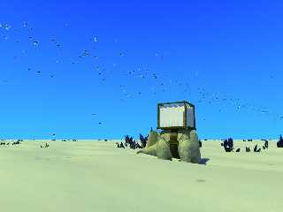
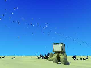
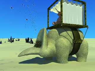
Here we go again! :-)
I went out on a limb a little with the composition in this render by pushing
the ground waaay down to the bottom of the image. Comments?
I think it's an improvement over having that empty space in the forground,
plus, by not having all the dunes and shadows up close, I can throttle the
area lights way back and speed up the render! :-)
It was either that or start putting more crystals in the foreground, and I'm
not sure if my crystals are good enough to put that close to the camera.
William
Post a reply to this message
Attachments:
Download 'aliendesert.jpg' (76 KB)
Preview of image 'aliendesert.jpg'
|
|
| |
| |
|
|
|
|
| |
| |
|
|
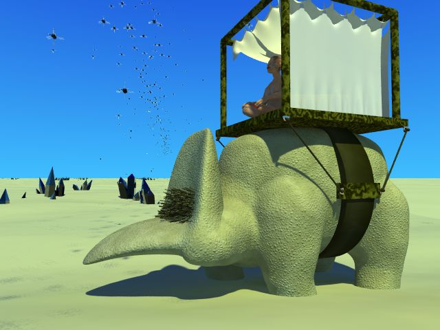
A closeup of the creature. Obviously, the model was never intended to be
rendered at this level of detail, but I wanted to show the group what it
really looks like. You can also see why I chose to put the creature at a
different angle in the scene. ;-) (Say "hi" to Silhouette Girl!) The
waistband also completely falls apart from this angle. At the same time, I
got an interesting composition with the insects at this angle completely by
accident!
I'm kind of aiming for a Triceratops-style neck frill on the head. I can't
really image putting ears on that thing. ;-) I think I did a decent job
blending the isosurface and blob objects, though the neck looks just a
little swollen from this angle. I'll fix it if I ever decide to use the
animal from this angle. :-P
To be honest, the creature was inspired by the desks in my school's math
department. The head would be one of the chairs, and the base of the cupola
is the surface of the desk behind. The chairs have this little cutout in
the middle of the back, and that area is where I put the "eyebrows" on the
creature. From there, I just started making stuff up.
So, I have no idea where the creature would have space for a brain of any
size, or how on earth its neck joins with its spinal cord, but it looks
cool. :-)
William
Post a reply to this message
Attachments:
Download 'aliendesert-dinoportrait.jpg' (45 KB)
Preview of image 'aliendesert-dinoportrait.jpg'
|
|
| |
| |
|
|
|
|
| |
| |
|
|
"Afishionado" <afi### [at] gmailcom> schreef in bericht
news:web.43ec156f5fabfc7da9fc69d80@news.povray.org...
> Here we go again! :-)
>
> I went out on a limb a little with the composition in this render by
pushing
> the ground waaay down to the bottom of the image. Comments?
>
> I think it's an improvement over having that empty space in the forground,
> plus, by not having all the dunes and shadows up close, I can throttle the
> area lights way back and speed up the render! :-)
>
> It was either that or start putting more crystals in the foreground, and
I'm
> not sure if my crystals are good enough to put that close to the camera.
>
> William
>
Excellent initiative! This certainly improves the image. Interestingly, the
flying insects become more meaningfull now.
Thomas
Post a reply to this message
|
|
| |
| |
|
|
|
|
| |
|
|