|
|
|
|
|
|
| |
| |
|
|
|
|
| |
| |
|
|
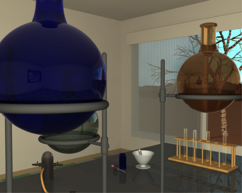
Hola,
after 18h6m20s render time on 2.4gz P4 512MB ram I believe she's a done deal
....
I used focal blur (i think gives better results than AA) and tweeked (not
much) the radiosity settings that I got from a tutorial, the tree was
generated with maketree macro and the hills in background is a height_field
made with world machine.
I really like how the glass turned out .... the reflections of other objects
in the scene and the slight distortion of objects seen through the flasks.
I wasn't much of a radiosity fan .... too much cpu time with not enough pay
back .... well I've changed my mind.
Cheers Jim
Post a reply to this message
Attachments:
Download 'Lab.png' (606 KB)
Preview of image 'Lab.png'
|
|
| |
| |
|
|
|
|
| |
| |
|
|
"Jim Holsenback" <jho### [at] hotmail com> wrote in message
news:4294515e@news.povray.org...
> Hola,
>
> after 18h6m20s render time on 2.4gz P4 512MB ram I believe she's a done
deal
> ....
>
> I used focal blur (i think gives better results than AA) and tweeked (not
> much) the radiosity settings that I got from a tutorial, the tree was
> generated with maketree macro and the hills in background is a
height_field
> made with world machine.
>
> I really like how the glass turned out .... the reflections of other
objects
> in the scene and the slight distortion of objects seen through the flasks.
>
> I wasn't much of a radiosity fan .... too much cpu time with not enough
pay
> back .... well I've changed my mind.
>
> Cheers Jim
>
Very nice,
I like it.
but if you've got a spare 18 hours or so :-)
Everything is too straight. I think you should rotate the bench by 2 degrees
in y, the flasks by a few degrees (each different) in y and very slightly
off vertical, the pipette by about 10 degrees in y, the test tube stand by
about 30 degrees (as it would end up if it was just placed on the bench by a
right handed person). The inverted test tube should be a little off centre
and the other three should be 3 or 4 degrees off vertical (the hole in the
stand is always a bit bigger than the tube).
I think almost any sort of subtle texture on the walls and the ground
outside would make a really big difference.
I'd recommend moving a fraction further back from the blue flask and maybe
turning the green flask so that it ends up as the focus of the picture
(which at the moment is an empty corner). You might also add a simple dark
shape a fraction behind the camera position to appear in the reflections -
maybe a cube and three cylinders to the floor to represent a camera on a
tripod.
Regards,
Chris. com> wrote in message
news:4294515e@news.povray.org...
> Hola,
>
> after 18h6m20s render time on 2.4gz P4 512MB ram I believe she's a done
deal
> ....
>
> I used focal blur (i think gives better results than AA) and tweeked (not
> much) the radiosity settings that I got from a tutorial, the tree was
> generated with maketree macro and the hills in background is a
height_field
> made with world machine.
>
> I really like how the glass turned out .... the reflections of other
objects
> in the scene and the slight distortion of objects seen through the flasks.
>
> I wasn't much of a radiosity fan .... too much cpu time with not enough
pay
> back .... well I've changed my mind.
>
> Cheers Jim
>
Very nice,
I like it.
but if you've got a spare 18 hours or so :-)
Everything is too straight. I think you should rotate the bench by 2 degrees
in y, the flasks by a few degrees (each different) in y and very slightly
off vertical, the pipette by about 10 degrees in y, the test tube stand by
about 30 degrees (as it would end up if it was just placed on the bench by a
right handed person). The inverted test tube should be a little off centre
and the other three should be 3 or 4 degrees off vertical (the hole in the
stand is always a bit bigger than the tube).
I think almost any sort of subtle texture on the walls and the ground
outside would make a really big difference.
I'd recommend moving a fraction further back from the blue flask and maybe
turning the green flask so that it ends up as the focus of the picture
(which at the moment is an empty corner). You might also add a simple dark
shape a fraction behind the camera position to appear in the reflections -
maybe a cube and three cylinders to the floor to represent a camera on a
tripod.
Regards,
Chris.
Post a reply to this message
|
|
| |
| |
|
|
|
|
| |
| |
|
|
I like it, but I would hesitate to call it final. If you like it the way it
is, then ignore me, but here are soem things I noticed:
Compositionally, it is weak. There is no line, no arrangement of objects or
colors that leads the eye through the scene. A great example is Gilles
Trans' The Wet Bird -- The skyline leades you down past the wet birt and
plops your eye smack on the ghostly figure. All the focal points of the
image, with somethign to lead you through them. Less obvious is
http://www.irtc.org/ftp/pub/stills/2002-08-31/golonls2.jpg , which has many
lines, but if you look for the strongest, longest diagonoal (bottom left
corner) it points straight to the lit window. Had the lit window been
somewhere else, the eye would not have found it so easily. I am not saying
all this is neccessarily conscious in the artist's mind. Many times it
comes out as trial and error with a final 'Ah! That's better!' But it helps
to know that it is there.
If you are going to put textures so close to the camera (namely, the stand)
THe need to have a little more interest. Add a normal, or just a tiny
variation in color. *Everything* has some texture, right? OTOH, you can
spend a lifetime tweaking textures for one image ;)
Finally, lighting. It is good. It lights the room, it gives interesting
glimpses through the flasks, but... I know you don't want to make radiosity
take too long, but if you can get the corners of the room a little darker,
to contrast with the walls, I think the scene will really pop. [I think, in
order to acheive this, lower the error_bound, and increase the count to
compensate, but I've never been excellent with radiosity tweaking.]
All that said, I really like it. It has the potential to be a really
interesting, moody piece, with just a little tweaking, a little
rearranging. As it is, if feels jumbled- even if it was a photo, I'd be
unsure of why you took it. The modelling is excellent. The textures and
lighting are good, but can be tweaked. The major problem is the
arrangement, which, if it does anything, leads your eye into the empty
corner.
-s
5TF!
Post a reply to this message
|
|
| |
| |
|
|
|
|
| |
| |
|
|
Jim
What a turnaround. This certainly makes the flasks the main thing. Nice!
DLM
"Jim Holsenback" <jho### [at] hotmailcom> wrote in message
news:4294515e@news.povray.org...
> Hola,
>
> after 18h6m20s render time on 2.4gz P4 512MB ram I believe she's a done
> deal ....
>
> I used focal blur (i think gives better results than AA) and tweeked (not
> much) the radiosity settings that I got from a tutorial, the tree was
> generated with maketree macro and the hills in background is a
> height_field made with world machine.
>
> I really like how the glass turned out .... the reflections of other
> objects in the scene and the slight distortion of objects seen through the
> flasks.
>
> I wasn't much of a radiosity fan .... too much cpu time with not enough
> pay back .... well I've changed my mind.
>
> Cheers Jim
>
>
Post a reply to this message
|
|
| |
| |
|
|
|
|
| |
| |
|
|
"Jim Holsenback" <jho### [at] hotmailcom> wrote:
> Hola,
>
> after 18h6m20s render time on 2.4gz P4 512MB ram I believe she's a done deal
> ....
>
> I used focal blur (i think gives better results than AA) and tweeked (not
> much) the radiosity settings that I got from a tutorial, the tree was
> generated with maketree macro and the hills in background is a height_field
> made with world machine.
>
> I really like how the glass turned out .... the reflections of other objects
> in the scene and the slight distortion of objects seen through the flasks.
>
> I wasn't much of a radiosity fan .... too much cpu time with not enough pay
> back .... well I've changed my mind.
>
> Cheers Jim
Focal blur is doing nothing for you in this image, except increase your
render time. If you use the proper AA settings, you can get pretty much the
same effect with a quicker render. What settings were you using?
- dan B hentschel
Post a reply to this message
|
|
| |
| |
|
|
|
|
| |
| |
|
|
"dan B hentschel" <dan### [at] alumritedu> wrote in message
news:web.4294e0f67a1a6d405f5848730@news.povray.org...
>
> Focal blur is doing nothing for you in this image, except increase your
> render time. If you use the proper AA settings, you can get pretty much
> the
> same effect with a quicker render. What settings were you using?
>
> - dan B hentschel
+am2 +a0.0 +r4 .... it kept leaving a jagged edge on the top of the window
valance. focul blur took it away.
Post a reply to this message
|
|
| |
| |
|
|
|
|
| |
| |
|
|
"dlm" <me### [at] addressinvalid> wrote in message
news:4294a305$1@news.povray.org...
> Jim
> What a turnaround. This certainly makes the flasks the main thing. Nice!
> DLM
hey thanks .... however as pointed out in one of the previous replies my eye
now goes to the reflection of the empty wall.
maybe something as simple as a push broom leaning againt the wall might
help. thanks again.
Post a reply to this message
|
|
| |
| |
|
|
|
|
| |
| |
|
|
"Chris B" <c_b### [at] btconnectcom> wrote in message
news:42945fe4$1@news.povray.org...
> Very nice,
> I like it.
>
thanks ....
> but if you've got a spare 18 hours or so :-)
played a couple games of spider solitare .... roto-tilled the garden and
made a run to local landfill and oh yeah .... had a nap ;-)
>
> Everything is too straight. I think you should rotate the bench by 2
> degrees
> in y, the flasks by a few degrees (each different) in y and very slightly
> off vertical, the pipette by about 10 degrees in y, the test tube stand by
> about 30 degrees (as it would end up if it was just placed on the bench by
> a
> right handed person). The inverted test tube should be a little off centre
> and the other three should be 3 or 4 degrees off vertical (the hole in the
> stand is always a bit bigger than the tube).
hey you wouldn't be makin fun of me being one of those neat freaks who likes
things just so would ya .... hey seriously I DO get that comment alot about
some of my other work ..... old habits die hard.
> I think almost any sort of subtle texture on the walls and the ground
> outside would make a really big difference.
the walls have .... normal {agate 0.0125 scale 0.5}
and the ringstand has .... normal {agate 0.1 scale 0.025}
maybe focul blur is killing that?
>
> I'd recommend moving a fraction further back from the blue flask and maybe
> turning the green flask so that it ends up as the focus of the picture
> (which at the moment is an empty corner). You might also add a simple dark
> shape a fraction behind the camera position to appear in the reflections -
> maybe a cube and three cylinders to the floor to represent a camera on a
> tripod.
>
> Regards,
> Chris.
>
>
>
>
Post a reply to this message
|
|
| |
| |
|
|
|
|
| |
| |
|
|
"stm31415" <sam### [at] cscom> wrote in message
news:web.42946dc47a1a6d40efd7d28f0@news.povray.org...
>I like it, but I would hesitate to call it final. If you like it the way it
> is, then ignore me, but here are soem things I noticed:
>
> Compositionally, it is weak. There is no line, no arrangement of objects
> or
> colors that leads the eye through the scene. A great example is Gilles
> Trans' The Wet Bird -- The skyline leades you down past the wet birt and
> plops your eye smack on the ghostly figure. All the focal points of the
> image, with somethign to lead you through them. Less obvious is
> http://www.irtc.org/ftp/pub/stills/2002-08-31/golonls2.jpg , which has
> many
> lines, but if you look for the strongest, longest diagonoal (bottom left
> corner) it points straight to the lit window. Had the lit window been
> somewhere else, the eye would not have found it so easily. I am not saying
> all this is neccessarily conscious in the artist's mind. Many times it
> comes out as trial and error with a final 'Ah! That's better!' But it
> helps
> to know that it is there.
>
hmmmm .... well yeah i still like but the feedback is good also.
>
> If you are going to put textures so close to the camera (namely, the
> stand)
> THe need to have a little more interest. Add a normal, or just a tiny
> variation in color. *Everything* has some texture, right? OTOH, you can
> spend a lifetime tweaking textures for one image ;)
yep .... i'm beginng to wonder if focal blur washed that out (so to speak)
the stand has .... normal {agate 0.1 scale 0.025}
the flasks have ... normal {granite 0.001 scale 0.01}
>
>
> Finally, lighting. It is good. It lights the room, it gives interesting
> glimpses through the flasks, but... I know you don't want to make
> radiosity
> take too long, but if you can get the corners of the room a little darker,
> to contrast with the walls, I think the scene will really pop. [I think,
> in
> order to acheive this, lower the error_bound, and increase the count to
> compensate, but I've never been excellent with radiosity tweaking.]
thanks ... besides the light from outside there is what I call a camlight x
and z are same as the camera and y is translated up sightly .... it has
0.025 fade distance and is shadowless
>
>
> All that said, I really like it. It has the potential to be a really
> interesting, moody piece, with just a little tweaking, a little
> rearranging. As it is, if feels jumbled- even if it was a photo, I'd be
> unsure of why you took it. The modelling is excellent. The textures and
> lighting are good, but can be tweaked. The major problem is the
> arrangement, which, if it does anything, leads your eye into the empty
> corner.
good feedback .... cheers
>
> -s
> 5TF!
>
>
>
>
Post a reply to this message
|
|
| |
| |
|
|
|
|
| |
| |
|
|
"Jim Holsenback" <jho### [at] hotmailcom> wrote in message
news:4294f97c@news.povray.org...
>
> "Chris B" <c_b### [at] btconnectcom> wrote in message
> news:42945fe4$1@news.povray.org...
> > I think almost any sort of subtle texture on the walls and the ground
> > outside would make a really big difference.
>
> the walls have .... normal {agate 0.0125 scale 0.5}
> and the ringstand has .... normal {agate 0.1 scale 0.025}
>
> maybe focul blur is killing that?
>
OK then , .. any sort of slightly less subtle texture .. :-)
Regards,
Chris.
Post a reply to this message
|
|
| |
| |
|
|
|
|
| |
|
|