|
|
|
|
|
|
| |
| |
|
|
From: Greg M Johnson
Subject: Ratty text, further explored, with superfluous big images
Date: 6 Jan 2005 21:50:26
Message: <41ddf8f2@news.povray.org>
|
|
|
| |
| |
|
|
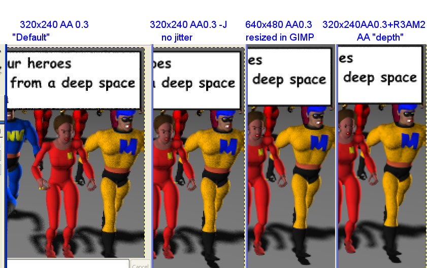
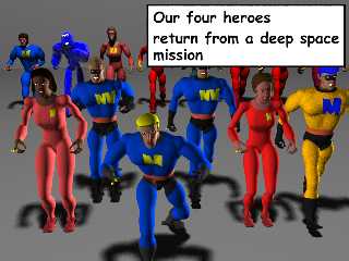
Please find enclosed two images. One is a 640x480 AA 0.3 rendering of an
image. The other are a series of images which are currently 320x240 in
size but were viewed in GIMP at 200%-- you're looking at a screen grab of
several open images lined up next to each other.
My goal is to have "captions" look crisp and neat which have been generated
in povray. Among the benefits of captioning images in povray are:
i) stubborn tradition/ too lazy to use other software
ii) it's animatable
iii) adding text to images in GIMP and CorelPhotoPaint is a royal PITA,
whereas it's perfectly controllable in pov, regardless of message length.
Left to right in the composite image, they are:
1) 320x240 AA 0.3. The original image, the way I had been doing things
before. There is a rattiness to the box which detracts from the
professionalness of the product.
2) 320x240 AA 0.3 -J. Anti-alias jittering turned off. The problems with
the box have gone away, but I believe it detracted from the quality of the
images, especially in showing of round edges. (Yeah, this image here seems
to make me a liar, but I started this when I saw a jagged edge on another
field of view.) The bumpy texture of the guy's yellow shirt looks off, and
I'm guessing this would be sloppy in animation.
3) 640x480 AA0.3, then resized in GIMP. The text box looks great, and the
characters aren't hurting. The nusiance of this approach is of course that
it requires an image resizing.
4) 320x240 AA 0.3 +R3 +AM2, increased AA depth with antialias method 2. Text
box is great, but we've "erased" the poor lady's eyebrows!!
Any advice here?
A) Has anyone explored with the +R and +AM parms-- did you find erased
eyebrows, too-- any cliffs or good things to try? I'm wondering if there's
a way to turn of the "intelligence" of the supersampling. In thinking how
the resizing of 640 pixels turned out great, I'm wondering if pov's AA were
being too intelligent for me.
B) What are the possibilities of a pov feature that turns off AA for
specific objects:
i) yeah right, you supply the code, dweeb
ii) a worthwhile endeavor
iii) an eclectic use of raytracer with limited audience-- you should instead
be making photorealistic trees, mon, dontcha know.
iv) woefully impractical because you don't understand ____________ about
raytracers.
Post a reply to this message
Attachments:
Download 'captiontrix640ish.png' (224 KB)
Download 'captiontrix.png' (113 KB)
Preview of image 'captiontrix640ish.png'
Preview of image 'captiontrix.png'
|
|
| |
| |
|
|
From: Slime
Subject: Re: Ratty text, further explored, with superfluous big images
Date: 6 Jan 2005 22:18:05
Message: <41ddff6d@news.povray.org>
|
|
|
| |
| |
|
|
> 1) 320x240 AA 0.3. The original image, the way I had been doing things
> before. There is a rattiness to the box which detracts from the
> professionalness of the product.
> 2) 320x240 AA 0.3 -J. Anti-alias jittering turned off. The problems with
> the box have gone away, but I believe it detracted from the quality of the
> images, especially in showing of round edges. (Yeah, this image here seems
> to make me a liar, but I started this when I saw a jagged edge on another
> field of view.) The bumpy texture of the guy's yellow shirt looks off, and
> I'm guessing this would be sloppy in animation.
Although turning off jittering slightly decreases the quality of a still
image (since randomness is good for our eyes), it will *increase* the
quality of an animation. Ever seen an animation of a checkered plane? Look
at the horizon: even if the camera is still, if anti-alias jittering is on,
it will look like static. This is because the random jittering changes from
frame to frame. So, if animation is what you're heading towards, try it in
an animation before you write it off as a bad idea.
Besides, the guy's shirt looks almost exactly the same to me in the first
two images.
> 3) 640x480 AA0.3, then resized in GIMP. The text box looks great, and
the
> characters aren't hurting. The nusiance of this approach is of course
that
> it requires an image resizing.
Except for color clipping (which is irrelevant in a scene without very
bright objects), this is equivalent to 320x240 with +A0.3 +R6. (The default
is +R3, +R6 is like that, four times, averaging the result - which is just
what you did in GIMP.)
> 4) 320x240 AA 0.3 +R3 +AM2, increased AA depth with antialias method 2.
Text
> box is great, but we've "erased" the poor lady's eyebrows!!
+AM2 starts by sampling the *corners* of pixels instead of the centers.
Probably her eyebrows pass through the center of pixels but not the corners,
so they're missed. This is a common problem (happens a lot with ropes or
other thin objects in the distance) that happens with *both* AA methods, and
has no good solution at this time.
> Any advice here?
Based on what you were happy with and on my experience, I'd suggest going
with +A0.3 -J and something between +R3 to +R6.
> B) What are the possibilities of a pov feature that turns off AA for
> specific objects:
Personally, I think it would be more convenient to have an object property
that forces *higher* AA (more subsamples) for the current pixel when it's
intersected. This could be used to solve the eyebrow issue.
- Slime
[ http://www.slimeland.com/ ]
Post a reply to this message
|
|
| |
| |
|
|
|
|
| |
| |
|
|
On Thu, 06 Jan 2005 22:18:02 -0500, Slime wrote:
> +AM2 starts by sampling the *corners* of pixels instead of the centers.
> Probably her eyebrows pass through the center of pixels but not the
> corners, so they're missed. This is a common problem (happens a lot with
> ropes or other thin objects in the distance) that happens with *both* AA
> methods, and has no good solution at this time.
Cone tracing. Instead of sending out rays, send out conical areas (one per
pixel), with no gap between them, and see which objects intersect the
cone and where. Now you know each object that should show in the color of
the pixel, and thus can ensure that you send rays to each and every one of
them (and that you won't be sending rays to empty space).
Of course, all this is likely to make current antialiasing methods seem
like greased lightning in comparison :(.
> Personally, I think it would be more convenient to have an object property
> that forces *higher* AA (more subsamples) for the current pixel when it's
> intersected. This could be used to solve the eyebrow issue.
Which, unfortunately, doesn't help with small objects, since the problem
is that the ray never intersects them...
...Unless, of course, this property would be numerical, and allow one to
make the bounding box of the object bigger (and simply intersecting the
objects bouding box would be enough to trigger higher AA).
Doesn't AA method 2 already do something like this ? It triggers more rays
when it finds a color edge. This new method 3 would need to trigger more
rays whenever it gets near a marked object (or all objects, with proper
scene settings or command line options).
Post a reply to this message
|
|
| |
| |
|
|
From: GrimDude
Subject: Re: Ratty text, further explored, with superfluous big images
Date: 7 Jan 2005 10:44:43
Message: <41deae6b$1@news.povray.org>
|
|
|
| |
| |
|
|
Greg, I think your time would be better spent coming up with a macro that
would resize the bubble to the text in a 'best fit' approach, so all that
wonderful art isn't covered up (a problem comic books share I'm sure). Of
course, the text is the last thing I'd be interested in, so tkae what I say
with a pile of salt.
- Grim
Post a reply to this message
|
|
| |
| |
|
|
|
|
| |
| |
|
|
"GrimDude" <a36### [at] bellsouth net> wrote:
> Greg, I think your time would be better spent coming up with a macro that
> would resize the bubble to the text in a 'best fit' approach, so all that
> wonderful art isn't covered up (a problem comic books share I'm sure). Of
> course, the text is the last thing I'd be interested in, so tkae what I say
> with a pile of salt.
>
> - Grim
Thanks for the advice all.
The macro I have now does an automatic resize to the length of the longest
line. It's no prob whatsoever in doing all the typing *in povray* to make
these line up just right. For this example I just threw an existing
caption at it from an anim never completed.
>> +A0.3 -J and something between +R3 to +R6.
Okay, good fodder for next experiment.
--greg. net> wrote:
> Greg, I think your time would be better spent coming up with a macro that
> would resize the bubble to the text in a 'best fit' approach, so all that
> wonderful art isn't covered up (a problem comic books share I'm sure). Of
> course, the text is the last thing I'd be interested in, so tkae what I say
> with a pile of salt.
>
> - Grim
Thanks for the advice all.
The macro I have now does an automatic resize to the length of the longest
line. It's no prob whatsoever in doing all the typing *in povray* to make
these line up just right. For this example I just threw an existing
caption at it from an anim never completed.
>> +A0.3 -J and something between +R3 to +R6.
Okay, good fodder for next experiment.
--greg.
Post a reply to this message
|
|
| |
| |
|
|
From: "Jérôme M. Berger"
Subject: Re: Ratty text, further explored, with superfluous big images
Date: 7 Jan 2005 16:44:24
Message: <41df02b8@news.povray.org>
|
|
|
| |
| |
|
|
-----BEGIN PGP SIGNED MESSAGE-----
Hash: SHA1
Slime wrote:
|>3) 640x480 AA0.3, then resized in GIMP. The text box looks great,
and the
|>characters aren't hurting. The nusiance of this approach is of
course that
|>it requires an image resizing.
|
| Except for color clipping (which is irrelevant in a scene without very
| bright objects), this is equivalent to 320x240 with +A0.3 +R6. (The
default
| is +R3, +R6 is like that, four times, averaging the result - which
is just
| what you did in GIMP.)
|
Not exactly, since the "0.3" in "+A0.3" means that pov will stop
supersampling before having sent all the rays if it doesn't make too
much difference.
Greg, In answer to your question I would go with +A0.2 +AM2 +R4 and
try lowering the "0.2" if it doesn't work.
What would be nice is an option to force a *minimum* level of
supersampling to occur before taking the threshold into account. This
would be equivalent to rendering at higher resolution with lower AA
settings then resizing, without needing the "resize" step...
Jerome
- --
******************************
* Jerome M. Berger *
* mailto:jbe### [at] ifrancecom *
* http://jeberger.free.fr/ *
******************************
-----BEGIN PGP SIGNATURE-----
Version: GnuPG v1.2.4 (GNU/Linux)
iD8DBQFB3wK2qIYJdJhyixIRApv/AJ9R+ob93nFFucAH71ruB2MAtGd9IwCfSNcv
ZesKj+TNuTU6miQPRAi2sJ8=
=KKwM
-----END PGP SIGNATURE-----
Post a reply to this message
|
|
| |
| |
|
|
From: Slime
Subject: Re: Ratty text, further explored, with superfluous big images
Date: 7 Jan 2005 17:15:51
Message: <41df0a17@news.povray.org>
|
|
|
| |
| |
|
|
> > This is a common problem (happens a lot with
> > ropes or other thin objects in the distance) that happens with *both* AA
> > methods, and has no good solution at this time.
>
> Cone tracing.
Er, I meant, that is currently implemented in POV-Ray. =)
> > Personally, I think it would be more convenient to have an object
property
> > that forces *higher* AA (more subsamples) for the current pixel when
it's
> > intersected. This could be used to solve the eyebrow issue.
>
> Which, unfortunately, doesn't help with small objects, since the problem
> is that the ray never intersects them...
The idea is that the flagged object wouldn't be drawn, it would only be
noticed, causing higher AA. Then you could manually surround tiny objects
with larger, flagged objects, to cause higher AA in the vicinity of the tiny
objects. (For instance, a thin cylinder rope could be surrounded by a thick
cylinder with the flag.)
- Slime
[ http://www.slimeland.com/ ]
Post a reply to this message
|
|
| |
| |
|
|
From: Slime
Subject: Re: Ratty text, further explored, with superfluous big images
Date: 7 Jan 2005 17:22:51
Message: <41df0bbb$1@news.povray.org>
|
|
|
| |
| |
|
|
> Not exactly, since the "0.3" in "+A0.3" means that pov will stop
> supersampling before having sent all the rays if it doesn't make too
> much difference.
Good point; my suggestion will be a little slower then.
> Greg, In answer to your question I would go with +A0.2 +AM2 +R4 and
> try lowering the "0.2" if it doesn't work.
+R4 is *really high* for +AM2. See the picture at
http://www.povray.org/documentation/view/3.6.1/223/ (towards the end). +R2
should almost always be sufficient when used with +AM2.
- Slime
[ http://www.slimeland.com/ ]
Post a reply to this message
|
|
| |
| |
|
|
From: "Jérôme M. Berger"
Subject: Re: Ratty text, further explored, with superfluous big images
Date: 8 Jan 2005 04:34:29
Message: <41dfa925@news.povray.org>
|
|
|
| |
| |
|
|
-----BEGIN PGP SIGNED MESSAGE-----
Hash: SHA1
Slime wrote:
|>Greg, In answer to your question I would go with +A0.2 +AM2 +R4 and
|>try lowering the "0.2" if it doesn't work.
|
|
| +R4 is *really high* for +AM2. See the picture at
| http://www.povray.org/documentation/view/3.6.1/223/ (towards the
end). +R2
| should almost always be sufficient when used with +AM2.
|
Yes, sorry for the typo, I usually use +R2 too.
Jerome
- --
******************************
* Jerome M. Berger *
* mailto:jbe### [at] ifrancecom *
* http://jeberger.free.fr/ *
******************************
-----BEGIN PGP SIGNATURE-----
Version: GnuPG v1.2.4 (GNU/Linux)
iD8DBQFB36kkqIYJdJhyixIRAjWWAJ9Nza6Rv7cZVHCVkSAj3VRSwCWQbACgsE2G
eA4lTm1C++LfyREgLVynh/o=
=a6l1
-----END PGP SIGNATURE-----
Post a reply to this message
|
|
| |
| |
|
|
|
|
| |
|
|