|
|
|
|
|
|
| |
| |
|
|
|
|
| |
| |
|
|
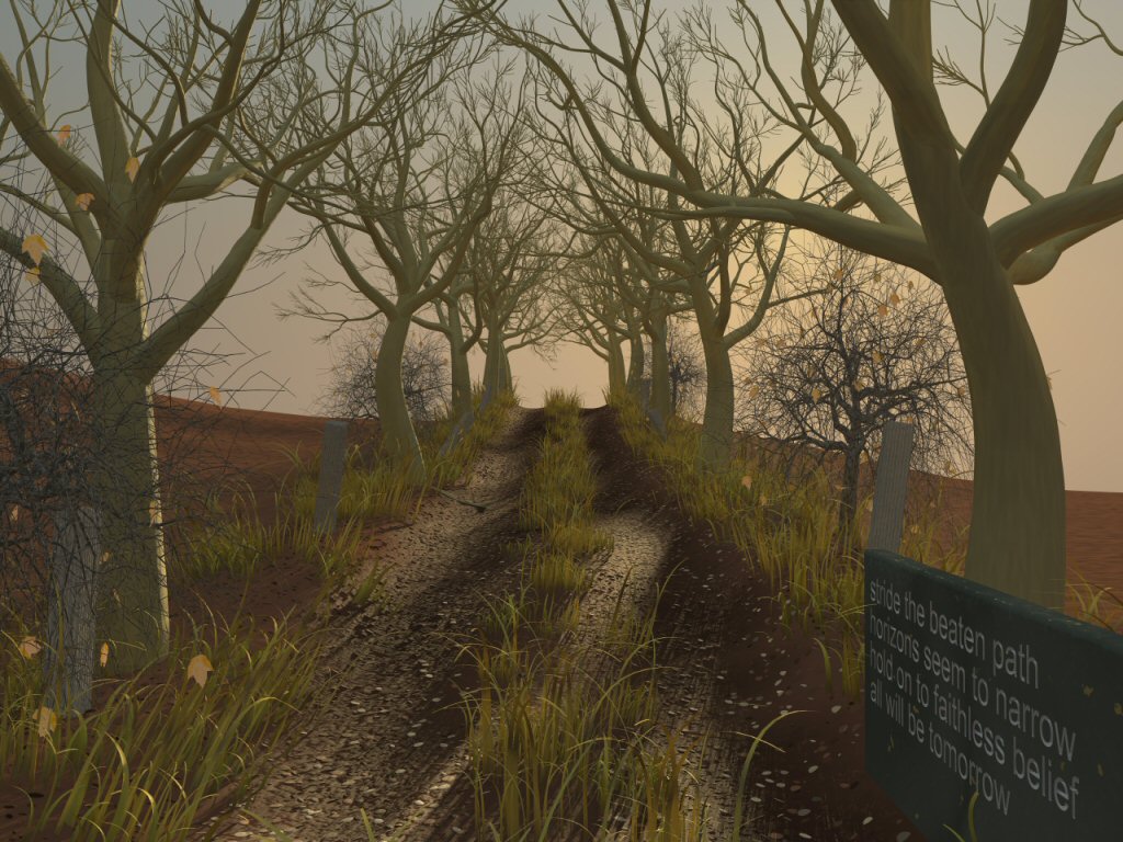
Update of a previously posted image.
Post a reply to this message
Attachments:
Download 'Horizon1024x768_20030901.jpg' (188 KB)
Preview of image 'Horizon1024x768_20030901.jpg'
|
|
| |
| |
|
|
|
|
| |
| |
|
|
Wow, very nice image! I must have missed the first one, gonna go back and
find it.
--
Doug Eichenberg
www.getinfo.net/douge
dou### [at] nls net
Darren Hewson <dar### [at] hotmailcom> wrote in message
news:3f5359a3@news.povray.org...
> Update of a previously posted image.
>
>
> net
Darren Hewson <dar### [at] hotmailcom> wrote in message
news:3f5359a3@news.povray.org...
> Update of a previously posted image.
>
>
>
Post a reply to this message
|
|
| |
| |
|
|
|
|
| |
| |
|
|
Darren Hewson wrote:
Beautiful. It's nice to see a post on this news group develop into fully
formed image. The fallen leaves, fence posts, smaller trees, and other
details bring this past the stage of a gimmicky "technique" picture into
something which reflects a lot of work and care in addition to whatever
feeling the arrangement is meant to evoke.
-Shay
Post a reply to this message
|
|
| |
| |
|
|
|
|
| |
| |
|
|
Very nice update of the older image. I'm still
longing for objects to the right and left of the
path, where there's currently only brown
earth looking at me. And the trees do look
a little too smooth to be, perhaps some
normals / bumpmapping would help here.
Aside of that, the only think I really DON'T
like is the dark grey tree/bush in the lower
left. Not because the tree sucks, but because
the twigs are too much angled. Some more
roundness would be fitting. But I don't expect
that to be cured, since it would be very memory
intensive.
But at least do something about the "bald" areas
to the right and left. At least some texture would
do justice, and something to crack the smooth
horizon there.
But aside of all the critic and comments (meant
to enhance the picture, not spoil it!), its a very
nice and moody image. I like it.
Regards,
Tim
--
Tim Nikias v2.0
Homepage: http://www.digitaltwilight.de/no_lights
> Update of a previously posted image.
>
>
>
---
Outgoing mail is certified Virus Free.
Checked by AVG anti-virus system (http://www.grisoft.com).
Version: 6.0.512 / Virus Database: 309 - Release Date: 20.08.2003
Post a reply to this message
|
|
| |
| |
|
|
|
|
| |
| |
|
|
> Update of a previously posted image.
Simply astounding!
Post a reply to this message
|
|
| |
| |
|
|
|
|
| |
| |
|
|
> Aside of that, the only think I really DON'T
> like is the dark grey tree/bush in the lower
> left. Not because the tree sucks, but because
> the twigs are too much angled. Some more
> roundness would be fitting. But I don't expect
> that to be cured, since it would be very memory
> intensive.
I disagree. I think those tree's look ok. I've seen trees like this. Not
all tree's are nicely rounded. :)
Post a reply to this message
|
|
| |
| |
|
|
|
|
| |
| |
|
|
Hi Darren,
this looks very good! Esp. the colors, the sky and the shadows on the
path are really a big improvement.
I've only one major and some minor suggestions:
= We are looking at the unlit side of the trees and the grey wooden
posts, so they should be much darker (and perhaps a little bit
rougher?) The dark parts of the rightmost tree look right to me.
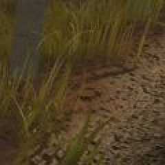
- Some of the white stones on the path seem to float slightly above
the ground. Unfortunately I neither know the reason for this (mis-)
perception nor what can be done against it.
- The ploughed fields should show parallel strikes/groves from the
ploughing and should be clearly separated from the unploughed areas
between the path and the fields. I suggest to add short grass to
the unploughed areas on the left side (or simply make them green as
in your first post) and a somewhat larger groove for separation.
The right side looks O.K. because the grass is hiding the border
between ploughed and unploughed areas.
- I wonder if the grass would look even more convincing if the blades
were less wide, but there were more of them; for example half the
width, but twice the number (at least for the grass in the fore-
ground).
- There seems to be a very abrupt change of slope from the uphill part
of the path to the (invisible) downhill part. I would expect the path
to be more horizontal near its peak.
- The ground between path and wooden post (see attached image) should
have the color of the path, not the color of the fields.
- I liked the old stone more. The position at the right side is better,
but the stone should not stand on the path (else add some strikes
from cars scratching along it! :D ) Maybe the old stone with the new
stone as inlay on its tilted top looks good.
As said above: great image, only minor nit-picking suggestions.
Sputnik
P.S. As I have 2 monitors available here (1152*864 each), I would like
to have a special version of your final scene: 864 pixels high,
2570 pixels wide; containing ploughed fields in the first 1152
pixels (for the icons on the left monitor), more ploughed fields
in the middle 266 pixels (for the gap between the monitors; I
would cut away this, but it must be present in the image for
correct perspective), then your current scene in the 1152 pixels
for the right monitor. 1152:266:1152 = 32.5cm (left monitor) :
7.5cm (gap) : 32.5cm (right monitor). Of course I would do it
myself if the code is available ...
A more universal approach would be to make an approx. 2700*864
picture with your current scene in the rightmost 1152 pixels.
This can be cropped to fit many different arrangements of moni-
tors.
--
----------------------------
fr### [at] computermuseumfh-kielde
----------------------------
Post a reply to this message
Attachments:
Download 'Horizon_Detail.jpg' (4 KB)
Preview of image 'Horizon_Detail.jpg'
|
|
| |
| |
|
|
|
|
| |
| |
|
|
I love this!
I'm a big fan of natural settings. The path itself looks great! Want to
share an overview of some of the processes involved?
--
Jeremy
"Darren Hewson" <dar### [at] hotmailcom> wrote in message
news:3f5359a3@news.povray.org...
> Update of a previously posted image.
>
>
>
Post a reply to this message
|
|
| |
| |
|
|
|
|
| |
| |
|
|
Thanks for comments and encouragement.
I think I'll work on some of the suggested minor improvements over the next
week or two. I'll post any satisfacory results here. (If I have time Frank
I'll attempt a two monitor render :-)).
Some credits are due, since I used some other peoples macros here:
Gilles Trans makegrass
Will Woodhull patchWork macro
Andrew Clinton splinetree (1.3)
Philippe Debar skylight (0.6b)
I may have made some minor changes to some of these but I can't remember
exactly what.
Cheers
"Darren Hewson" <dar### [at] hotmailcom> wrote in message
news:3f5359a3@news.povray.org...
> Update of a previously posted image.
>
>
>
Post a reply to this message
|
|
| |
| |
|
|
|
|
| |
| |
|
|
Darren Hewson wrote:
> Update of a previously posted image.
>
>
>
Very nice.
It reminds me of SR-91 in western VA. I biked that road many years ago.
Post a reply to this message
|
|
| |
| |
|
|
|
|
| |