|
|
|
|
|
|
| |
| |
|
|
|
|
| |
| |
|
|
"JWV" <jwv|at|planet.nl> wrote in message news:3f01f3c0@news.povray.org...
> The image looks great, especialy the flock of birds in the distance, it
> seems to have some motion in it, like it should have.
I acheived that by applying turbulence to position them (which makes them clump
together in natural looking patterns) and then using a second turbulence
function to choose theit direction. This means birds that are close together
tend to point in a similar direction, giving a natural impression of movement.
Then I just had to tweak the focal blur so you can only just see which way
they're pointing. I'm very pleased with the effect and I'm glad you like it :)
> - The flowers need some work, since they will be annoyingly simple when
> rendered at Zazzle resolution.
Agreed, and since Andrew Wilcox mentioned it yesterday I've already done that.
They're now mapped onto spherical shapes, giving just a subtly curve to them.
> - i didn't recognise the fish due to the refraction of the water, maybe you
> should use smaller fish.
Hmm... well I'd tend to agree with you only most other people seem to think
they're recognisable enough. I'll try smaller fish and see how they look but I
think I prefer them this size.
> The title is very good, it suits the image.
Cool. I think I'll keep it :)
--
Tek
http://www.evilsuperbrain.com
Post a reply to this message
|
|
| |
| |
|
|
|
|
| |
| |
|
|
Thank you! I'm glad you like it :)
(hopefully with all this positive response I might actually manage to sell some
posters when this image is finished!)
--
Tek
http://www.evilsuperbrain.com
"Martin Belair" <bad### [at] hotmail DOTcom> wrote in message
news:Xns### [at] 204213191226...
> "Tek" <tek### [at] evilsuperbraincom> wrote in news:3f00a1b2@news.povray.org:
>
> >
> > All other comments, criticisms, and suggestions are welcome as always.
> >
>
>
> Well, I have followed the evolution of this work since the first version.
> Never gave a comment. Now, I'll change that:
>
> Perfect!
>
> You're an artist. Your "Marvellous Julia" bring peace of mind. It's a
> wonderfull place to be. Calm and relax. To me it's perfect.
>
> Thank you for sharing your work with us.
>
> Ciao!
>
> Mart
>
> DOTcom> wrote in message
news:Xns### [at] 204213191226...
> "Tek" <tek### [at] evilsuperbraincom> wrote in news:3f00a1b2@news.povray.org:
>
> >
> > All other comments, criticisms, and suggestions are welcome as always.
> >
>
>
> Well, I have followed the evolution of this work since the first version.
> Never gave a comment. Now, I'll change that:
>
> Perfect!
>
> You're an artist. Your "Marvellous Julia" bring peace of mind. It's a
> wonderfull place to be. Calm and relax. To me it's perfect.
>
> Thank you for sharing your work with us.
>
> Ciao!
>
> Mart
>
>
Post a reply to this message
|
|
| |
| |
|
|
|
|
| |
| |
|
|
:)
Thanks
--
Tek
http://www.evilsuperbrain.com
"Tom Galvin" <tom### [at] imporg> wrote in message
news:Xns### [at] 204213191226...
> "Tek" <tek### [at] evilsuperbraincom> wrote in news:3f00a1b2@news.povray.org:
>
>
> > welcome then I'll pick my favourite :) My own suggestion is "a holiday
> > with Julia".
> >
> >
>
> I think you do not need any suggestions. That title is perfect. I love
> this image.
Post a reply to this message
|
|
| |
| |
|
|
|
|
| |
| |
|
|
news:3f00f016$1@news.povray.org...
> I enjoyed following the evolution of this beautiful picture!
Thank you :)
> What about giving the clouds a less "brute" white and making
> them a tiny little more transparent?
I find clouds look more sunny if they really saturate out to white in places.
I've already toned them down a bit from the early test renders, and if I make
them any darker they start to look like they don't match the lighting in the
scene.
When you say make them transparent do you mean all over or just at the edge?
I tried softer edges a while ago but found they lost the "fluffy" look of summer
clouds.
--
Tek
http://www.evilsuperbrain.com
Post a reply to this message
|
|
| |
| |
|
|
|
|
| |
| |
|
|
1. Well I have to admit I don't really know anything about fish, I was just
thinking of Coy Carp in a pond!
I'll try smaller fish and see how they look.
2. Yeah I realise the grass should grow more vertically, but I tried that and
like you say this just looks so much nicer :)
3. I've actually tweaked it a little just after posting this image, in the
earlier shots it went off the right side of the picture implying it was part of
some large mainland, and in this one it looks more like an island. I've
rectified that now so it once again definitely looks like mainland.
4. Both good suggestions, I'll add them to my list of possible titles...
5. Thanks!
--
Tek
http://www.evilsuperbrain.com
"Chris Amshey" <my last name at thecia dot net> wrote in message
news:web.3f011a148816855e61b99e900@news.povray.org...
> 1. I would have put a school of small fish rather than a few big fish; it's
> uncommon to see big fish near the surface.
>
> 2. When I was up in Vermont this weekend, I spent a lot of time staring at
> grassy
> hills and thinking about Grassy Julia... grass grows straight up, regardless
> of
> the angle of the slope; however, I wouldn't change it... the subtle weird
> grass is
> part of the 'fantastic' element of the scene. (Here's hoping analyzing that
> doesn't spoil it for anyone! ;))
>
> 3. I liked the distant background 'mainland' ...
>
> 4. I would call it 'Julia's Isle' or 'Julia's Escape' ...
>
> and, finally, 5. Great image! Love it in all its incarnations! (some more
> than
> others, but, I think, this one the most!)
>
>
> --Chris
>
>
Post a reply to this message
|
|
| |
| |
|
|
|
|
| |
| |
|
|
Phew, for a minute there I thought you meant that this is actually a better
picture! I don't think I'm that good (yet)! Gilles' Family picture is great, but
I can see how mine could make a nicer backdrop :)
--
Tek
http://www.evilsuperbrain.com
"Florian Pesth" <fpe### [at] compuservede> wrote in message
news:3f01bfc8$1@news.povray.org...
> Hi!
> Great Image! This will replace Gilles Trans "Family" Image as my
> background (it has a nice summer feeling and "Family" makes me a little
> claustrophobic now)
>
> Tek wrote:
> > My own suggestion is "a holiday with Julia".
> I like that one.
>
> Florian
>
Post a reply to this message
|
|
| |
| |
|
|
|
|
| |
| |
|
|
"Tek" <tek### [at] evilsuperbraincom> wrote in news:3f021635$1@news.povray.org:
> Thank you! I'm glad you like it :)
>
> (hopefully with all this positive response I might actually manage to
> sell some posters when this image is finished!)
Well, that might be the reason I needed to start buying things out @
Zazzle!!
Post a reply to this message
|
|
| |
| |
|
|
|
|
| |
| |
|
|
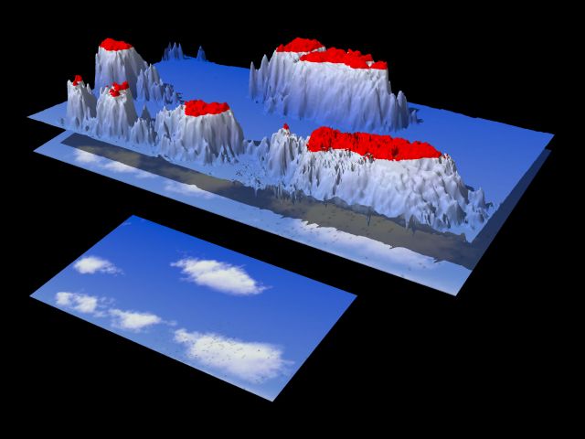
Hi Tek!
The "problem" with the clouds is of course only a very minor point.
> I find clouds look more sunny if they really saturate out to white in places.
Yes, but in my opinion the saturated area shouldn't be too large, their
uniformity diminishes the 3D appearance. I've made a height_field from
some of the clouds, "pigmented" with original colors, but the (almost)
saturated upper 10% painted red: I think this area is a bit too large
and suppose a cloud with smaller "red plateaus" will look more "3D".
Perhaps it is impossible to make such summer clouds because reality has
a *much* higher contrast than a monitor.
My first idea for a name was "LAWN MOWER CHALLENGE" -- O.K., probably
not what you are looking for ...
You could name it "Oh, island in the sun", put it on the desktop and
replace the windows startup melody by Harry Belafonte's song (although
he surely hasn't meant *this* island :)
I don't think anyone looking at this picture is interested in a name,
even something like "PIC00738" can't ruin this nice scene.
Sputnik
<SDL for height field>
// height field of clouds of grassy julia
// provide "grassy_final_clouds.png",
// adjust declarations of W, H and camera location
// +SP8 +EP8 +A0.1 +AM2 +R2 +FN
#declare H = 309; // height of image for HF
#declare W = 533; // width of image for HF
height_field { png "grassy_final_clouds.png" smooth
texture {
pigment { gradient y
pigment_map {
[ .9 image_map { png "grassy_final_clouds.png" } rotate 90*x ]
[ .9 red 1 ]
}
}
finish { ambient .4 diffuse .6 }
}
translate <-0.5, 0, -0.5>
scale <W, 100, H>
}
#macro Pic()
box { -y, x+z
texture {
pigment { image_map { png "grassy_final_clouds.png" } rotate 90*x }
finish { ambient .4 diffuse .6 }
}
// no "}" for box
#end
Pic() translate <-0.5, 0, -0.5> scale <W, 1, H> }
Pic() translate <-0.5, 0, -0.5> scale <W, 1, H>/2
translate <0.1*W, 0, -0.9*H>
}
light_source { <-1, 3, -2>*10000, rgb 1 }
camera {
right 4*x up 3*y direction 6*z sky y
location -1100*z look_at 0
rotate <35, -30, 0>
translate -100*y
}
// END
Post a reply to this message
Attachments:
Download 'grassy_julia_cloud_HF.jpg' (32 KB)
Preview of image 'grassy_julia_cloud_HF.jpg'

|
|
| |
| |
|
|
|
|
| |
| |
|
|
Well the clouds were based on this photo:
http://groups.msn.com/XPCenter/windowsxp.msnw?action=ShowPhoto&PhotoID=42
But then I softened them slightly. I have tried some differently lit versions,
with the light a bit further away so we get less saturation of the whites, but
it just looked too dark for the sunny feel I want in this scene.
--
Tek
http://www.evilsuperbrain.com
news:3f025276@news.povray.org...
> Hi Tek!
>
> The "problem" with the clouds is of course only a very minor point.
>
> > I find clouds look more sunny if they really saturate out to white in
places.
>
> Yes, but in my opinion the saturated area shouldn't be too large, their
> uniformity diminishes the 3D appearance. I've made a height_field from
> some of the clouds, "pigmented" with original colors, but the (almost)
> saturated upper 10% painted red: I think this area is a bit too large
> and suppose a cloud with smaller "red plateaus" will look more "3D".
> Perhaps it is impossible to make such summer clouds because reality has
> a *much* higher contrast than a monitor.
>
> My first idea for a name was "LAWN MOWER CHALLENGE" -- O.K., probably
> not what you are looking for ...
> You could name it "Oh, island in the sun", put it on the desktop and
> replace the windows startup melody by Harry Belafonte's song (although
> he surely hasn't meant *this* island :)
> I don't think anyone looking at this picture is interested in a name,
> even something like "PIC00738" can't ruin this nice scene.
>
> Sputnik
>
>
> <SDL for height field>
>
> // height field of clouds of grassy julia
> // provide "grassy_final_clouds.png",
> // adjust declarations of W, H and camera location
>
> // +SP8 +EP8 +A0.1 +AM2 +R2 +FN
>
> #declare H = 309; // height of image for HF
> #declare W = 533; // width of image for HF
>
> height_field { png "grassy_final_clouds.png" smooth
> texture {
> pigment { gradient y
> pigment_map {
> [ .9 image_map { png "grassy_final_clouds.png" } rotate 90*x ]
> [ .9 red 1 ]
> }
> }
> finish { ambient .4 diffuse .6 }
> }
> translate <-0.5, 0, -0.5>
> scale <W, 100, H>
> }
>
> #macro Pic()
> box { -y, x+z
> texture {
> pigment { image_map { png "grassy_final_clouds.png" } rotate 90*x }
> finish { ambient .4 diffuse .6 }
> }
> // no "}" for box
> #end
>
> Pic() translate <-0.5, 0, -0.5> scale <W, 1, H> }
>
> Pic() translate <-0.5, 0, -0.5> scale <W, 1, H>/2
> translate <0.1*W, 0, -0.9*H>
> }
>
> light_source { <-1, 3, -2>*10000, rgb 1 }
>
> camera {
> right 4*x up 3*y direction 6*z sky y
> location -1100*z look_at 0
> rotate <35, -30, 0>
> translate -100*y
> }
>
> // END
>
>
>
Post a reply to this message
|
|
| |
| |
|
|
|
|
| |
| |
|
|
Right, I'm happy with the scene now. I've made a couple more tweaks following
suggestions here:
-Smaller fish and more of them, with some nice "flocking" (shoaling?) behaviour.
-The mainland in the distance goes of the side of the picture, to suggest it is
mainland and not a distant island.
-The flowers now have a subtle curve to them.
So I've set my old PC going on a zazzle sized (colossal) 7800 x 5200 image.
Unfortunately my old PC is just a PIII 550, whereas my main machine is an Athlon
XP 2400. And it was taking the faster machine 8 hours to render the version of
the image shown here. Which, according to my rough mental arithmetic, means the
picture will take approximately 26 DAYS to render!!! I'll post the final version
(at reduced size of course!) when it's ready.
So I guess I'll just leave that whirring away in the corner while I work on an
IRTC entry. :)
Thanks again to everyone for the criticism and ideas you've contributed to this
image!
--
Tek
http://www.evilsuperbrain.com
"Tek" <tek### [at] evilsuperbraincom> wrote in message news:3f00a1b2@news.povray.org...
> I think I've done just about as much as I can on this image. Plus the new
stills
> topic should be announced tomorrow, so I want to finish this and move on.
>
>
> I thought I'd do a quick review of some of the good ideas that weren't used:
>
> - People/robots, deckchair, boats and any other man-made presence - the idea
> with these things was that this is a nice place to chill out and relax, so to
> show this someone should be in the scene doing just that, or implied by the
> presence of objects associated with that (an empty deck chair, boat, etc.).
Now
> the image is at this stage I feel the objects and scene serve a more immediate
> purpose, it is not a nice place to -be-, it's a nice place to -see-! I don't
> want any human occupation in the scene because you are the human who comes
here
> to enjoy it. If I put someone in the picture it will only make the viewer
> jealous! Well, that's pretentious but I think it works better like this.
>
> - 3D media clouds - I've stayed with the 2D clouds because I like their
ethereal
> apearance and media clouds rarely look as soft as this, plus the render time
> would become much worse with media.
>
> - The empty right side of the image, too much sky etc. - Obviously these
things
> are a matter of opinion and I know some people like the way this shot is laid
> out and others prefer the earlier versions. I could go into lengthy details
bout
> why I think it works like this, but I don't see much point, you will either
like
> it or not and frankly I'd be very worried if everyone agreed about this! So
I'll
> just say this layout feels right to me, every tweak I made in this direction
> improved the feeling I got from it, and every time I tried something else it
got
> worse.
>
>
> Just a couple of specific questions:
> - What do you think of the fish, does the water surface distort them too much
or
> do they look right?
> - What should I call this picture? "grassy julia" was just a description of
what
> I first created, but then maybe I should keep that title since that's what
> people here know it as. All suggestions welcome then I'll pick my favourite :)
> My own suggestion is "a holiday with Julia".
>
> All other comments, criticisms, and suggestions are welcome as always.
>
>
> Oh, and finally, in case I forget to say this later: Many thanks to everyone
who
> left comments on the earlier wips, you've helped to create one of my best
images
> ever.
>
> Cheers,
> --
> Tek
> http://www.evilsuperbrain.com
>
>
>
Post a reply to this message
|
|
| |
| |
|
|
|
|
| |
|
|