|
|
|
|
|
|
| |
| |
|
|
|
|
| |
| |
|
|
"_Light_Beam_" <s.f### [at] tiscali fr> wrote in message
news:3eee4b03@news.povray.org...
> little flowered apple tree on the right side of the montain... (6 or 7 years
> old little tree)
Yay! you're the first person to suggest a tree but I've been thinking the same
thing for a while :)
I've noticed there seem to be natural steps climbing from the right side up and
to the left. I'm thinking the right most narrow step is the way in, so I might
put a ladder from there down to the water, the next step -the large flat area in
the middle- would be where a deck chair would go, then the step above that could
have a small tree exactly like you suggest.
The thing I'm wondering now is do I put the tree in a central position to
suggest it was planted there, or put it off to one side slightly to suggest it's
naturally grown there?
hmm...
This image is growing in a very satisfying way :)
--
Tek
http://www.evilsuperbrain.com fr> wrote in message
news:3eee4b03@news.povray.org...
> little flowered apple tree on the right side of the montain... (6 or 7 years
> old little tree)
Yay! you're the first person to suggest a tree but I've been thinking the same
thing for a while :)
I've noticed there seem to be natural steps climbing from the right side up and
to the left. I'm thinking the right most narrow step is the way in, so I might
put a ladder from there down to the water, the next step -the large flat area in
the middle- would be where a deck chair would go, then the step above that could
have a small tree exactly like you suggest.
The thing I'm wondering now is do I put the tree in a central position to
suggest it was planted there, or put it off to one side slightly to suggest it's
naturally grown there?
hmm...
This image is growing in a very satisfying way :)
--
Tek
http://www.evilsuperbrain.com
Post a reply to this message
|
|
| |
| |
|
|
|
|
| |
| |
|
|
I'll try to explain this with my very poor english...
I think the tree can be pushed by the wind and naturally gown...
Post a reply to this message
|
|
| |
| |
|
|
|
|
| |
| |
|
|
"Apache" <apa### [at] yahoocom> wrote in message
news:3eee449b$1@news.povray.org...
> Ah, neat! But some desperate need to make remarks forces me to say that the
> grass looks a bit too soft/furry... :)
Well I did ask for your comments so I don't mind :)
That's partly due to the fact I reduced the image resolution. Here's a section
at the original resolution for comparison. In addition to that I do use a
texture on them which has a soft edge, it's easy to adjust this so I'll tweak it
when I have some solid objects intruding into the grass.
--
Tek
http://www.evilsuperbrain.com
Post a reply to this message
Attachments:
Download 'grassy_seg.jpg' (10 KB)
Preview of image 'grassy_seg.jpg'
|
|
| |
| |
|
|
|
|
| |
| |
|
|
"_Light_Beam_" <s.f### [at] tiscalifr> wrote in message
news:3eee51c5$1@news.povray.org...
> I'll try to explain this with my very poor english...
> I think the tree can be pushed by the wind and naturally gown...
>
Hmm, yeah. I think I know what you mean. In fact now I look at the image I could
place a tree almost out of site at the furthest part of the large flat area,
then maybe have a smaller tree in the forground on the higher level to suggest
they're naturally growing there...
I think I'll have to try this idea and see how it looks :)
--
Tek
http://www.evilsuperbrain.com
Post a reply to this message
|
|
| |
| |
|
|
|
|
| |
| |
|
|
And if you add just a little bit of "transmit" or "filter" to the grass
texture or also "double_illuminate"... It can helps ?
Post a reply to this message
|
|
| |
| |
|
|
|
|
| |
| |
|
|
It already has transmit and double illuminate, that's what makes it look so nice
and soft :)
Though it also means I need max_trace_level set really high, it's currently set
to 100.
--
Tek
http://www.evilsuperbrain.com
"_Light_Beam_" <s.f### [at] tiscalifr> wrote in message
news:3eee538a$1@news.povray.org...
> And if you add just a little bit of "transmit" or "filter" to the grass
> texture or also "double_illuminate"... It can helps ?
>
>
Post a reply to this message
|
|
| |
| |
|
|
|
|
| |
| |
|
|
How about jet trails in the sky and a little boy/girl/robot lying down
(possibly under the tree) flying a kite.
Post a reply to this message
|
|
| |
| |
|
|
|
|
| |
| |
|
|
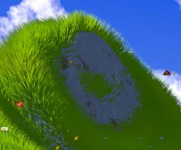
Near the top of the julia you have a little circle of grass that almost
looks like a yin yang. You could take it that way, but I also think there is
just enough room for a hobbit-esque door instead.
Corey
Post a reply to this message
|
|
| |
| |
|
|
|
|
| |
| |
|
|
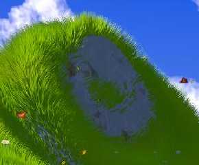
On Mon, 16 Jun 2003 23:26:12 +0100, "Tek" <tek### [at] evilsuperbraincom>
wrote:
Sorry, but I liked the first version much better.
I liked the perspective better. The viewpoint was much closer to the
fractal structure and helped focus attention on the fractal. (Exactly
where I think attention should be focused in this image.)
The new details you've added to the water and the distant mountains
merely serve to distract one's attention away from the fractal. I
liked the look of the original scene's water just fine. It looked
soft, like a slightly out of focus depth-of-field effect. This
softness helped to direct attention to the more detailed fractal
object (the subject of this image.)
As for your flowers, bees, and butterflies; they are too difficult to
recognize. They could just as well be pieces of yellow litter left
laying in the grass. At the current image resolution, and with your
current scaling for these objects, I think they are best left out of
the image.
Finally, there was more grass and less rock in the first image. The
grass looks nice and the rock looks somewhat ugly, at least if it
occupies large areas of the image. I would keep the amount of grass
coverage you had in the first image.
Sorry if this all sounds harsh; but remember, while I'm criticizing
this image, I'm also praising your first one. :)
later,
Glen Berry
Post a reply to this message
|
|
| |
| |
|
|
|
|
| |
| |
|
|
I agree that the softness was nicer in the first image, like I said this
test render had no focal blur (depth of field) so obviously things don't
look as soft as they will in a final render. I too like the softness. Also
the small details are because this is a test render at lower res than I plan
to use. I'm thinking of making it into a poster, so it will be 7800 pixels
resolution which should be enough :)
I understand what you're saying about the perspective, I'm still playing
with that. Once I have a more complete image I'll be more sure where I want
the camera. But I do want to shift focus away from the julia slightly, I
want there to be more things in the scene and for the julia to just be part
of that.
I have to disagree about the water though, the colour of the water at the
bottom of the first version of the image was completely unrelated to the
colours used elswhere in the scene, it had far too much green in it and
appeared almost opaque. The colours I'm using now add depth and clarity to
the water, and also feel a lot more "watery" because the reflection is more
distinct from the water colour, which makes it seem shinier.
The grass and rock... I kinda like the grass pattern as it is now, it felt
wrong having grass grow on vertical slopes. But I totally agree that the
rock texture isn't good enough to fill that much of the scene. Plus the
transition between grass and rock appears too harsh in places (particularly
the closest area), so I may find some way to soften that.
Thanks for your comments. It would get boring if everyone was agreeing with
me :)
--
Tek
http://www.evilsuperbrain.com
"Glen Berry" <7no### [at] ezwvcom> wrote in message
news:77itev49fvu1e7tfluo3h16trjj4mrmtuv@4ax.com...
> On Mon, 16 Jun 2003 23:26:12 +0100, "Tek" <tek### [at] evilsuperbraincom>
> wrote:
>
> Sorry, but I liked the first version much better.
>
> I liked the perspective better. The viewpoint was much closer to the
> fractal structure and helped focus attention on the fractal. (Exactly
> where I think attention should be focused in this image.)
>
> The new details you've added to the water and the distant mountains
> merely serve to distract one's attention away from the fractal. I
> liked the look of the original scene's water just fine. It looked
> soft, like a slightly out of focus depth-of-field effect. This
> softness helped to direct attention to the more detailed fractal
> object (the subject of this image.)
>
> As for your flowers, bees, and butterflies; they are too difficult to
> recognize. They could just as well be pieces of yellow litter left
> laying in the grass. At the current image resolution, and with your
> current scaling for these objects, I think they are best left out of
> the image.
>
> Finally, there was more grass and less rock in the first image. The
> grass looks nice and the rock looks somewhat ugly, at least if it
> occupies large areas of the image. I would keep the amount of grass
> coverage you had in the first image.
>
> Sorry if this all sounds harsh; but remember, while I'm criticizing
> this image, I'm also praising your first one. :)
>
>
> later,
> Glen Berry
>
>
>
Post a reply to this message
|
|
| |
| |
|
|
|
|
| |