|
|
|
|
|
|
| |
| |
|
|
|
|
| |
| |
|
|
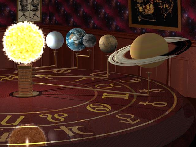
I've taken this as far as I can on my own, hoping for some
suggestions and comments.
It looks better at a higher res,
see http://thyme.homelinux.net/Orrery.jpg
--
I would've gotten away with it too, if it wasn't for those pesky kids!
Post a reply to this message
Attachments:
Download 'orrery-med.jpg' (44 KB)
Preview of image 'orrery-med.jpg'

|
|
| |
| |
|
|
|
|
| |
| |
|
|
Bill Hails wrote:
> I've taken this as far as I can on my own, hoping for some
> suggestions and comments.
>
> It looks better at a higher res,
> see http://thyme.homelinux.net/Orrery.jpg
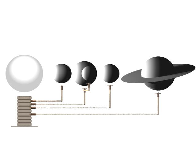
I like the concept, but just a question: how do they pass each other?
Post a reply to this message
|
|
| |
| |
|
|
|
|
| |
| |
|
|
Arthur Flint wrote:
> I like the concept, but just a question: how do they pass each other?
Only just :-), see attached figure.
I had to squeeze them as close as possible to maximize the resolution.
--
I would've gotten away with it too, if it wasn't for those pesky kids!
Post a reply to this message
Attachments:
Download 'mechanism.jpg' (14 KB)
Preview of image 'mechanism.jpg'
|
|
| |
| |
|
|
|
|
| |
| |
|
|
The planets look very smooth to me. Perhaps a bumpmap
would improve this. If you'll take a look at my v2.0 Gallery,
I've used a bumpmap for the moon, which makes it appear
much more planet-like, to me at least. Since you're trying
to depict a model, some exhagerated bumps on the planets
won't harm. For a "real" planet, the bumps wouldn't be that
visible, I guess.
Also, the moon, Mars and Saturn look slighty too "soft" to me,
not a shiny little highlight, but more a spread out, sort of silk-highlight.
Aside of that, very nice!
--
Tim Nikias v2.0
Homepage: http://www.digitaltwilight.de/no_lights
Email: Tim### [at] gmx de
> I've taken this as far as I can on my own, hoping for some
> suggestions and comments.
>
> It looks better at a higher res,
> see http://thyme.homelinux.net/Orrery.jpg
>
> --
> I would've gotten away with it too, if it wasn't for those pesky kids! de
> I've taken this as far as I can on my own, hoping for some
> suggestions and comments.
>
> It looks better at a higher res,
> see http://thyme.homelinux.net/Orrery.jpg
>
> --
> I would've gotten away with it too, if it wasn't for those pesky kids!
Post a reply to this message
|
|
| |
| |
|
|
|
|
| |
| |
|
|
I think this is great as is! But since you are asking for comments...
Have you tried a lighter colored wood in the wainscotting? I'd like to see
what it would look like with a wood of about the same tone as the picture
frames (maybe keeping the chair rail the same as it is now).
The wallpaper is too distracting for my taste. Partly I think it isn't flat
enough: it seems to have depth of its own. Partly I think it's too busy and
colorful-- it really deserves to be the centerpiece of its own picture--
here it seems to be trying to steal the show.
Can something be done with the edges of the planets with dense atmospheres?
That could make a nice distinction between the Moon and Earth.
Is the Moon's appearance accurate for the face that we're seeing? I'm just
curious about that.
Again, I like this very much as is. But you did ask!
--
Will Woodhull
Thornhenge, SW Oregon, USA
willl.at.thornhenge.net
"Bill Hails" <bil### [at] europeyahoo-inccom> wrote in message
news:3e903fce@news.povray.org...
> I've taken this as far as I can on my own, hoping for some
> suggestions and comments.
>
> It looks better at a higher res,
> see http://thyme.homelinux.net/Orrery.jpg
>
> --
> I would've gotten away with it too, if it wasn't for those pesky kids!
Post a reply to this message
|
|
| |
| |
|
|
|
|
| |
| |
|
|
Bill Hails wrote:
>I've taken this as far as I can on my own, hoping for some
>suggestions and comments.
>
>It looks better at a higher res,
>see http://thyme.homelinux.net/Orrery.jpg
>
>
>
What a wonderful image! What was your technique for making the Sun? I've
made some experiments with using media for the sun, but I've never
gotten anything that looks as good as that. On the other hand, the sun
could be somewhat less bright and it might be good to make the grains
more visible. Although this is propably a fake-color image, here's a
good example of how grainy the sun is:
http://www.phy.duke.edu/courses/313/table-images/soho-image-of-sun.jpg .
Also it might look good if you included some solar prominences like seen
in the bottom left of the image (and share the code ;-) .
I'm not sure if the orrery is supposed to contain all the planets, but
Mercury is the first planet in the solar system, not Venus. As far as I
know, Mercury would have been well known when orreries were made. And
Jupiter is the fifth in the solar system, not Saturn. On the other hand
the rings of Saturn are absolutely wonderfully implemented, and it would
be a shame to remove Saturn from the image. Also, the relative sizes of
the planets seem a bit off - the radius of Mars is just 0.54 times the
radius of Earth, and Venus about 0.95.
The color of the athmosphere of Venus doesn't seem quite right, either.
While Venus does look almost when viewed through a telescope, I'm not so
sure if the actual color of the athmosphere would be as white when
viewed from space. Here's an image:
http://perso.wanadoo.fr/youpie/systsol/venus1.jpg . I couldn't find info
on whether or not that image has fake colour, so you propably should ask
someone else about that. :-)
The wooden paneling in the back wall has a very similiar colour to the
table, and because of that, the table "blends" with the wall. Also, the
frames of the pictures in the backround seem quite flat. Have you
considered adding glass panels in front of the pictures? The reflections
might look quite nice (but admittedly slow down render times). Also, how
about dimming the general lighting and allowing the Sun to light most of
the image? That might give the image some more athmosphere.
Hopefully I'm not too "harsh" in my critizism. ;-)
Post a reply to this message
|
|
| |
| |
|
|
|
|
| |
| |
|
|
Tim Nikias v2.0 wrote:
> The planets look very smooth to me. Perhaps a bumpmap
> would improve this. If you'll take a look at my v2.0 Gallery,
> I've used a bumpmap for the moon, which makes it appear
> much more planet-like, to me at least. Since you're trying
> to depict a model, some exhagerated bumps on the planets
> won't harm. For a "real" planet, the bumps wouldn't be that
> visible, I guess.
> Also, the moon, Mars and Saturn look slighty too "soft" to me,
> not a shiny little highlight, but more a spread out, sort of
> silk-highlight.
>
> Aside of that, very nice!
>
Thanks!
I'd hoped the sun, at least, would make the case for these
*not* being models, but I suspect that it's reflection in
the table spoils the effect somewhat. I'm not using an area
light but I believe that only affects shadows anyway.
As I'm aiming towards making the planets and sun look
as "real" as possible, to contrast them with the mechanism,
I need to move further in that direction. Maybe dust and/or
scratches on the hardware might help, but it's such a nice
table :-)
I'm much less happy with the room itself, admittedly I've
not spent as much time on it as on the orrery itself.
--
I would've gotten away with it too, if it wasn't for those pesky kids!
Post a reply to this message
|
|
| |
| |
|
|
|
|
| |
| |
|
|
My first impression was 'waaaw'
it has something wonderfull, it even makes me think of tomb raider in some
way. it actuates the same mood in me.
To be honest, i thought it was a shiny floor with the mechanic in the center
of the room. but when i took a closer look i saw it was a table.
mabye a larger view can fix this.
very nice overal image!! finish it :-)
Post a reply to this message
|
|
| |
| |
|
|
|
|
| |
| |
|
|
Will W wrote:
> I think this is great as is! But since you are asking for comments...
>
> Have you tried a lighter colored wood in the wainscotting? I'd like to see
> what it would look like with a wood of about the same tone as the picture
> frames (maybe keeping the chair rail the same as it is now).
Actually I'd thought darker, to kind of echo the portrait on the wall,
fading to black in the shadows.
> The wallpaper is too distracting for my taste. Partly I think it isn't
> flat enough: it seems to have depth of its own. Partly I think it's too
> busy and colorful-- it really deserves to be the centerpiece of its own
> picture-- here it seems to be trying to steal the show.
Yes, now you mention it. I'd thought of calling the picture "God's Orrery"
but that might have caused offence, maybe, esp with the connotations of
"Gods Drawing Room", "God's Wallpaper" etc :-)
Anyway that was the idea. I just don't know what to replace it with.
> Can something be done with the edges of the planets with dense
> atmospheres? That could make a nice distinction between the Moon and
> Earth.
Maybe, but in the planetary images I've looked at I don't see that
distinction.
> Is the Moon's appearance accurate for the face that we're seeing? I'm just
> curious about that.
well it's just an orthographic image_map onto a sphere, the main
problem then being keeping the sphere facing the camera. Of course
since the image is taken from Earth the moon is therefore facing the
wrong way, but I haven't found any Mercator projections of the moon
I could use for a uv_mapping.
> Again, I like this very much as is. But you did ask!
Thanks very much! It's only my 3rd real attempt with Pov.
> --
> Will Woodhull
> Thornhenge, SW Oregon, USA
> willl.at.thornhenge.net
>
--
I would've gotten away with it too, if it wasn't for those pesky kids!
Post a reply to this message
|
|
| |
| |
|
|
|
|
| |
| |
|
|
Jouni Pousi wrote:
> What a wonderful image!
thank you :-)
> What was your technique for making the Sun?
Please find attached, then say light_source { ... looks_like Sun }
> I've
> made some experiments with using media for the sun, but I've never
> gotten anything that looks as good as that. On the other hand, the sun
> could be somewhat less bright and it might be good to make the grains
> more visible. Although this is propably a fake-color image, here's a
> good example of how grainy the sun is:
> http://www.phy.duke.edu/courses/313/table-images/soho-image-of-sun.jpg .
Yes, I guess I tried to go halfway between the false-color Soho type
images and the real thing.
> Also it might look good if you included some solar prominences like seen
> in the bottom left of the image (and share the code ;-) .
I'll make a try for some prominences, probably some fractal approach,
I remember seeing some fractal concrete that looked close in shape,
I need to look around a bit.
> I'm not sure if the orrery is supposed to contain all the planets, but
> Mercury is the first planet in the solar system, not Venus. As far as I
> know, Mercury would have been well known when orreries were made. And
> Jupiter is the fifth in the solar system, not Saturn. On the other hand
> the rings of Saturn are absolutely wonderfully implemented, and it would
> be a shame to remove Saturn from the image. Also, the relative sizes of
> the planets seem a bit off - the radius of Mars is just 0.54 times the
> radius of Earth, and Venus about 0.95.
An Orrery would contain all the planets, if you look closely at the
central pillar you'll see spare bands for Mercury, Jupiter, Uranus,
Neptune and even Pluto; I was thinking of running rods in various
directions out of frame (Mercury would be behind the sun) to hint
at their presence, but it might get cluttered, also there's all
the moons of Saturn to consider...
I really just wanted to get a selection of the most interesting
planets in the picture, and Jupiter lost out to Saturn :-)
As for scale, I'd tried lots of approaches: log, sqrt and cube roots
of the actual distances and diameters, none of them worked very well.
In the end I just settled for "X is bigger than Y" and left it at that.
> The color of the athmosphere of Venus doesn't seem quite right, either.
> While Venus does look almost when viewed through a telescope, I'm not so
> sure if the actual color of the athmosphere would be as white when
> viewed from space. Here's an image:
> http://perso.wanadoo.fr/youpie/systsol/venus1.jpg . I couldn't find info
> on whether or not that image has fake colour, so you propably should ask
> someone else about that. :-)
hmm, maybe it is true colour, I'd always thought of it as a blue-ish
white though, and that has a better contrast with the other planets.
> The wooden paneling in the back wall has a very similiar colour to the
> table, and because of that, the table "blends" with the wall. Also, the
> frames of the pictures in the backround seem quite flat. Have you
> considered adding glass panels in front of the pictures? The reflections
> might look quite nice (but admittedly slow down render times). Also, how
> about dimming the general lighting and allowing the Sun to light most of
> the image? That might give the image some more athmosphere.
Yes, thanks for pointing that out, I'm least happy about the room itself.
I'll experiment.
> Hopefully I'm not too "harsh" in my critizism. ;-)
Not at all, thank you for your suggestions.
--
I would've gotten away with it too, if it wasn't for those pesky kids!
Post a reply to this message
Attachments:
Download 'us-ascii' (2 KB)
|
|
| |
| |
|
|
|
|
| |
|
|