|
|
|
|
|
|
| |
| |
|
|
|
|
| |
| |
|
|
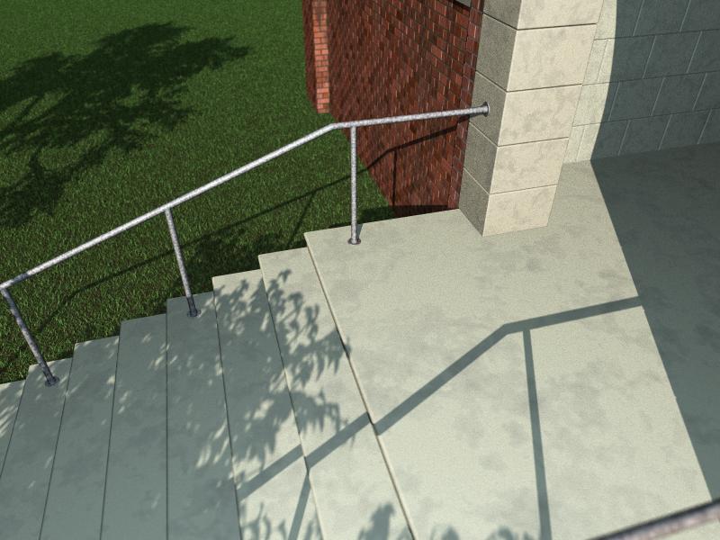
Hi,
Well I've been playing with those steps that I posted a few days ago and it
all seems to be getting there now. Still a bit of tweaking needed for the
textures and a lot more to be done, especially in the background and in the
entrance area. Focal blur has been added by recommendation of TonyB to try
and rid some of the flatness that was present. Grass and Trees by Gilles'
macros as usual, all other stuff (the simple bits) coded by me. Now to try
and do something about the border between grass and wall..............
Comments and criticisms more than welcome (as usual)
Kev
Post a reply to this message
Attachments:
Download 'temple.jpg' (66 KB)
Preview of image 'temple.jpg'
|
|
| |
| |
|
|
|
|
| |
| |
|
|
Hi there!
Well, at first I want to say that the image looks really good, though I do
have some suggestions.
For one, the entrance area looks just too clean for me. Doesn't a crack
show up at some point of an entrance's history? ;)
And perhaps a metal door just in view (like in the upper right corner
of this image) would be nice, though I don't really know the style of
the building...
For the grass near the wall, you could try and decrease the amount of
blades successively, showing more and more of some irregular (iso-
surface or heightfield) brownisch dirt. Or perhaps you put some
rectangular stones, placed like 20 cm away from the wall, and in that
space you add some pebbles (an easy method of keeping that edge
looking well-kept ;).
And in my oppinion, the light should be more "area-lightish". The shadow of
the bars just look a little too crisp...
But, as said in the beginning, it looks great (especially that off-scene tree
throwing
a shadow, gives reality-feel to it).
Tim
--
Tim Nikias
Homepage: http://www.digitaltwilight.de/no_lights/index.html
Post a reply to this message
|
|
| |
| |
|
|
|
|
| |
| |
|
|
Kevin Ellis wrote:
>
> Hi,
>
> Well I've been playing with those steps that I posted a few days ago and it
> all seems to be getting there now. Still a bit of tweaking needed for the
> textures and a lot more to be done, especially in the background and in the
> entrance area. Focal blur has been added by recommendation of TonyB to try
> and rid some of the flatness that was present. Grass and Trees by Gilles'
> macros as usual, all other stuff (the simple bits) coded by me. Now to try
> and do something about the border between grass and wall..............
>
> Comments and criticisms more than welcome (as usual)
>
The handrail looked better in the last version i think, it seems very
bright here, maybe the highlights are too strong.
In total it looks very clean which isn't necessarily bad, but there are
some things that could be done about it i think. The textures in the
foreground could have more irregularities and the grass directly at the
wall is usually higher unless the gardener is really working hard. In
addition you could place a line of stones between the wall and the grass.
Christoph
--
Christoph Hormann <chr### [at] gmx de>
IsoWood include, radiosity tutorial, TransSkin and other
things on: http://www.schunter.etc.tu-bs.de/~chris/ de>
IsoWood include, radiosity tutorial, TransSkin and other
things on: http://www.schunter.etc.tu-bs.de/~chris/
Post a reply to this message
|
|
| |
| |
|
|
|
|
| |
| |
|
|
"Tim Nikias" <tim### [at] gmxde> wrote in message
news:3C4DBEB4.7F5FD5ED@gmx.de...
> Well, at first I want to say that the image looks really good, though I do
> have some suggestions.
Thankyou.
> For one, the entrance area looks just too clean for me. Doesn't a crack
> show up at some point of an entrance's history? ;)
> And perhaps a metal door just in view (like in the upper right corner
> of this image) would be nice, though I don't really know the style of
> the building...
Ditying up is in progress, rather hard to do purely procedurally, but I'm
trying. I am planning on putting the edge of a door in view too.
> For the grass near the wall, ...
I've coded some shrubs to go along the wall and I think I'll put a path in
or somehting as well.
> And in my oppinion, the light should be more "area-lightish". The shadow
of
> the bars just look a little too crisp...
Done.
> But, as said in the beginning, it looks great (especially that off-scene
tree
> throwing
> a shadow, gives reality-feel to it).
Thanks again.
Kev
Post a reply to this message
|
|
| |
| |
|
|
|
|
| |
| |
|
|
"Christoph Hormann" <chr### [at] gmxde> wrote in message
news:3C4E83FA.904C560A@gmx.de...
> The handrail looked better in the last version i think, it seems very
> bright here, maybe the highlights are too strong.
I agree, I've darkened it up now.
> In total it looks very clean which isn't necessarily bad, but there are
> some things that could be done about it i think. The textures in the
> foreground could have more irregularities and the grass directly at the
> wall is usually higher unless the gardener is really working hard. In
> addition you could place a line of stones between the wall and the grass.
I'm working on the dirtying up, trying to keep the steps dirtier towards the
far edges and cleaner in the middle, not too easy to do but I've got it
working, I think I may go for a path and some bushes by the wall (test ones
coded, based on my hedge code).
Kev
Post a reply to this message
|
|
| |
| |
|
|
|
|
| |
|
|