|
|
|
|
|
|
| |
| |
|
|
|
|
| |
| |
|
|
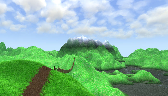
Still lots of work to do, but I've gotten the grass more or less how I want
it (perhaps the grass_map could use some work). I've been adapting the
textures to work with ambient_light 0 (any suggestions in this regard are
welcome). I've also started testing how it likes radiosity (like in this
render). It sort of flattens the image out a bit, could someone help me with
tips on how to avoid/control this? The water currently sucks. I'm going to
fix that soon, I hope. The clouds are looking better than when I first put
them in, but they still need work. Please let me know if you think the scale
is correct. I think I will be changing the color_map a bit, to keep them
from clumping together. The bridge textures have not been modified, I still
have to work on them. The mountains are too bright at the top. I don't know
if I should fix this by reducing diffuse or by decreasing the strength of
the light_source (which would mean changing extinction of the clouds a bit).
I have lots of ideas that I want to put into action. I would like to add a
tree to the foreground (perhaps with a sign welcoming you there), and a
castle to the mountain to give the bridge a purpose (design suggestions
welcome). I also need to work more on the mountain textures to differenciate
certain areas from each other, say I could add a wood to left, so I'd have
to make the dirt browner there, and a rockier mountain to the right, so I'd
have to add rocks, and make them grayer. I'm still not quite sure about all
of this. I would love to add some characters here and there, if anyone has
any good Poser models they would like to contribute please send a picture to
my e-mail and I'll consider them. Just think "Would Tolkien have put this
character in his stories?". I really would like a Legolas-like wood-elf in
the foreground, arriving to this mannish kingdom
PS: I would like to thank Mark Wagner a lot for introducing me to HF_Lab,
which has proved a very useful tool for getting the heightfield to work
properly. Thanks, Mark! You rule!
PPS: If you can translate the name of this file to English (minus the
extension, of course), I'll try to add some reference to you in the image.
Post a reply to this message
Attachments:
Download '' (79 KB)
Preview of image ''
|
|
| |
| |
|
|
|
|
| |
| |
|
|
Hi Tony,
I actually preferred the path as it was in your previous render.. it was my
favourite thing about the image to be honest. Right now it doesn't look
walked on at all.. looks like someone has come along and lifted a line of
turf off, revealing a rich looking topsoil that looks freshly dug.. not at
all compacted as I would expect it to look. I really think you'd got it just
about right in your previous attempt.
I think the clouds should be 'larger', with fewer little inbetween clouds,
and more importantly they need to really recede into the distance, to help
give a sense of scale.
I'm not sure about the texturing of the rest of the landscape at all... it
just doesn't look detailed enough.. the kind of 'dirtying up' that Gilles
Tran does so well on his images... hinting at complexity rather than trying
to show it in detail. It just looks like you've used CRAND. However, I
honestly wouldn't have a clue as to how to go about it and getting it to
look any better then you have. Maybe moving the sun away from behind the
camera would help to give depth and detail.
Also, I'd sharpen up the ridges on the height_field... it's all a little too
rounded for my tastes. This might help add the necessary complexity.
Hope I haven't seemed too harsh... I'm sure you'll end up with a fine pic...
many of my suggestions/comments are purely down to my own preference.
All the best
Andy Cocker
Post a reply to this message
|
|
| |
| |
|
|
|
|
| |
| |
|
|
> I actually preferred the path as it was in your previous render.
That was my thought too.
--
Phil
...coffee?...yes please! extra sugar,extra cream...Thank you.
Post a reply to this message
|
|
| |
| |
|
|
|
|
| |
| |
|
|
I much like the clouds and the foreground, the path could maybe be
slightly more grey and less brown.
The water needs reflection, maybe varying, might have a look at:
http://www.schunter.etc.tu-bs.de/~chris/waterf.html
The shape of the mountains IMO looks too uniformly smooth. Since you said
you are using HF-Lab, i suppose you used fourier synthesis for generating
it. You might try some procedural patterns instead, but that of course
would mean building the whole scene new from scratch.
From the shadows of the bridges i conclude that the light comes from
nearly straight above, maybe also try some other positions.
Christoph
--
Christoph Hormann <chr### [at] gmx de>
IsoWood include, radiosity tutorial, TransSkin and other
things on: http://www.schunter.etc.tu-bs.de/~chris/ de>
IsoWood include, radiosity tutorial, TransSkin and other
things on: http://www.schunter.etc.tu-bs.de/~chris/
Post a reply to this message
|
|
| |
| |
|
|
|
|
| |
| |
|
|
I really like the grass in the foreground and the puffy clouds. I don't know
about the colour. It seems to be a bit too bright green, but that might be part
of the story.
The mountain tops aren't really to bright, it's more the region just below that
seems to be a bit too dark.
My main suggestion would be to make the hills a bit less uniform in colour.
Remco
"Tony[B]" wrote:
>
> Still lots of work to do, but I've gotten the grass more or less how I want
> it (perhaps the grass_map could use some work). I've been adapting the
> textures to work with ambient_light 0 (any suggestions in this regard are
> welcome). I've also started testing how it likes radiosity (like in this
> render). It sort of flattens the image out a bit, could someone help me with
> tips on how to avoid/control this? The water currently sucks. I'm going to
> fix that soon, I hope. The clouds are looking better than when I first put
> them in, but they still need work. Please let me know if you think the scale
> is correct. I think I will be changing the color_map a bit, to keep them
> from clumping together. The bridge textures have not been modified, I still
> have to work on them. The mountains are too bright at the top. I don't know
> if I should fix this by reducing diffuse or by decreasing the strength of
> the light_source (which would mean changing extinction of the clouds a bit).
> I have lots of ideas that I want to put into action. I would like to add a
> tree to the foreground (perhaps with a sign welcoming you there), and a
> castle to the mountain to give the bridge a purpose (design suggestions
> welcome). I also need to work more on the mountain textures to differenciate
> certain areas from each other, say I could add a wood to left, so I'd have
> to make the dirt browner there, and a rockier mountain to the right, so I'd
> have to add rocks, and make them grayer. I'm still not quite sure about all
> of this. I would love to add some characters here and there, if anyone has
> any good Poser models they would like to contribute please send a picture to
> my e-mail and I'll consider them. Just think "Would Tolkien have put this
> character in his stories?". I really would like a Legolas-like wood-elf in
> the foreground, arriving to this mannish kingdom
>
> PS: I would like to thank Mark Wagner a lot for introducing me to HF_Lab,
> which has proved a very useful tool for getting the heightfield to work
> properly. Thanks, Mark! You rule!
>
> PPS: If you can translate the name of this file to English (minus the
> extension, of course), I'll try to add some reference to you in the image.
>
> [Image]
Post a reply to this message
|
|
| |
| |
|
|
|
|
| |
| |
|
|
Remco de Korte wrote:
>
> I really like the grass in the foreground and the puffy clouds. I don't know
> about the colour. It seems to be a bit too bright green, but that might be part
> of the story.
That was the thing that sprang to my mind as well. It looks like
green 1 was used. I would tone it down to something like green .6.
--
Ken Tyler - 1400+ POV-Ray, Graphics, 3D Rendering, and Raytracing Links:
http://home.pacbell.net/tylereng/index.html http://www.povray.org/links/
Post a reply to this message
|
|
| |
| |
|
|
|
|
| |
| |
|
|
I wouldn't bother with radiosity- if you want light illuminating under
the bridge from the water below (only place I can imagine it) then I
suggest you fake it.
Grass texture is too detailed for the entire scene. It should blend
together in the background.
good effort!
Post a reply to this message
|
|
| |
| |
|
|
|
|
| |
| |
|
|
Try using more than one HF - separate ones scaled down for rock outcrops and
mountain tops.
MIck
Post a reply to this message
|
|
| |
| |
|
|
|
|
| |
| |
|
|
If you could write me a tutorial explaining how to go about this, I would be
greatful. I cannot, with my current skill level, do this properly.
Post a reply to this message
|
|
| |
| |
|
|
|
|
| |
| |
|
|
> I wouldn't bother with radiosity- if you want light illuminating under
> the bridge from the water below (only place I can imagine it) then I
> suggest you fake it.
Perhaps. I guess I should just leave it as-is. I'll see what I can do.
> Grass texture is too detailed for the entire scene. It should blend
> together in the background.
I don't follow you... Please elaborate.
> good effort!
Thank you. This is really hard (for me). It's not like I'm a Hazelgrove or a
Tran or anything.
Post a reply to this message
|
|
| |
| |
|
|
|
|
| |