|
|
|
|
|
|
| |
| |
|
|
|
|
| |
| |
|
|
And so you did...
Post a reply to this message
|
|
| |
| |
|
|
From: vaihtoehto
Subject: my logo competition entry (not too late i hope :)
Date: 17 Mar 2000 08:32:29
Message: <38d233ed@news.povray.org>
|
|
|
| |
| |
|
|
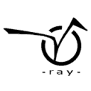
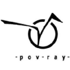
circle is Persistence, joined with Vision. (lame, yes?)
i tried to make it smooth, easy to remember and recognize.
bw -version is not very finished. i was in hurry as i found whole
competition yesterday :)
any comments?
-alt
Post a reply to this message
Attachments:
Download 'vpov128true.png' (6 KB)
Download 'vpov64bwaa.png' (2 KB)
Download 'vpov64bwnoaa.png' (1 KB)
Preview of image 'vpov128true.png'

Preview of image 'vpov64bwaa.png'

Preview of image 'vpov64bwnoaa.png'
|
|
| |
| |
|
|
|
|
| |
| |
|
|
vaihtoehto wrote:
>
> circle is Persistence, joined with Vision. (lame, yes?)
No. I like it.
Post a reply to this message
|
|
| |
| |
|
|
From: Rune
Subject: Re: my logo competition entry (not too late i hope :)
Date: 17 Mar 2000 15:31:23
Message: <38d2961b@news.povray.org>
|
|
|
| |
| |
|
|
"vaihtoehto" wrote:
> circle is Persistence, joined with Vision. (lame, yes?)
>
> i tried to make it smooth, easy to remember and recognize.
>
> bw -version is not very finished. i was in hurry as i found whole
> competition yesterday :)
>
> any comments?
It's nice!
I'll put it on the webpage soon:
http://rsj.mobilixnet.dk/povlogos/
You say the b/w version isn't very finished.
If you want to improve it you are welcome to send me a new versions in one
of the next couple of days :-)
Greetings,
Rune
---
Updated January 24: http://rsj.mobilixnet.dk
Containing 3D images, stereograms, tutorials,
The POV Desktop Theme, 350+ raytracing jokes,
miscellaneous other things, and a lot of fun!
Post a reply to this message
|
|
| |
| |
|
|
From: TonyB
Subject: Re: my logo competition entry (not too late i hope :)
Date: 17 Mar 2000 20:16:31
Message: <38d2d8ef@news.povray.org>
|
|
|
| |
| |
|
|
I see a lot of potential, but I'll have to see a P to mentally associate it
to POV-Ray. I really dig the "V", it's kinda like the one in Virgin. What do
they make? Games? I forgot.
Post a reply to this message
|
|
| |
| |
|
|
From: Rune
Subject: Re: my logo competition entry (not too late i hope :)
Date: 17 Mar 2000 20:25:22
Message: <38d2db02@news.povray.org>
|
|
|
| |
| |
|
|
"vaihtoehto" wrote:
> circle is Persistence, joined with Vision. (lame, yes?)
>
> i tried to make it smooth, easy to remember and recognize.
>
> any comments?
I think your logo is very professional looking!
I think it has more "design" than the others.
However, I have some suggestions.
You say that the logo sort of "means" "persistence of vision".
While that's a nice idea, it is not very easy to tell when you haven't been
told.
I think that doesn't matter, the logo is fine. But the text underneath
saying "ray" suggests that the word "pov" or "persistence of vision" is to
be found in the logo above the text. As I said, one will maybe not find
this, and thus be confused that the first part of "POV-Ray" is missing.
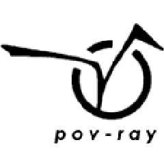
I suggest that you place the whole "pov-ray" underneath the logo. That way
it doesn't require any special knowledge to understand the logo, but if you
have the special knowledge you will see an extra dimension in the logo.
Also, I think the text could be bigger and italic and placed a little
different, but that's just my personal taste.
You could also make the logo slightly bigger because there's some unused
space to the left and right of the logo.
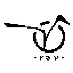
Compare the attached logos...
Any comments?
Greetings,
Rune
---
Updated January 24: http://rsj.mobilixnet.dk
Containing 3D images, stereograms, tutorials,
The POV Desktop Theme, 350+ raytracing jokes,
miscellaneous other things, and a lot of fun!
Post a reply to this message
Attachments:
Download 'original.gif' (2 KB)
Download 'myversion.gif' (2 KB)
Preview of image 'original.gif'

Preview of image 'myversion.gif'
|
|
| |
| |
|
|
From: vaihtoehto
Subject: Re: my logo competition entry (not too late i hope :)
Date: 18 Mar 2000 10:08:31
Message: <38d39bef@news.povray.org>
|
|
|
| |
| |
|
|
Rune wrote:
>You say that the logo sort of "means" "persistence of vision".
>While that's a nice idea, it is not very easy to tell when you haven't been
>told.
yes, i am aware of that. i planned that after a while people would associate
text "persistance of vision" with logo.
and so i avoided text "pov".
but i will try if it looks good with text "pov-ray".
>I think that doesn't matter, the logo is fine. But the text underneath
>saying "ray" suggests that the word "pov" or "persistence of vision" is to
>be found in the logo above the text. As I said, one will maybe not find
>this, and thus be confused that the first part of "POV-Ray" is missing.
i thought there would be some text around the logo mentioning "pov-ray" or
"persistence of vision" and so i didn't included it.
>You could also make the logo slightly bigger because there's some unused
>space to the left and right of the logo.
text is small because logo is fat. it's about contrast.
on low resolutions it get's unclear, though.
i'll try to fix it :)
i just found this news-place and this program does not let me see older
messages.. so i'm not sure what is this competition all about.
could someone kind enough explain?
-alt
Post a reply to this message
|
|
| |
| |
|
|
From: David Fontaine
Subject: Re: my logo competition entry (not too late i hope :)
Date: 18 Mar 2000 16:29:42
Message: <38D3F456.E2F21A8F@faricy.net>
|
|
|
| |
| |
|
|
I like it! But I agree with Rune about the layout.
--
___ _______________________________________________
| \ |_ <dav### [at] faricy net> <ICQ 55354965>
|_/avid |ontaine http://www.faricy.net/~davidf/
"The only difference between me and a madman is that I'm not mad." -Dali net> <ICQ 55354965>
|_/avid |ontaine http://www.faricy.net/~davidf/
"The only difference between me and a madman is that I'm not mad." -Dali
Post a reply to this message
|
|
| |
| |
|
|
From: Rune
Subject: Re: my logo competition entry (not too late i hope :)
Date: 19 Mar 2000 05:41:06
Message: <38d4aec2@news.povray.org>
|
|
|
| |
| |
|
|
> i just found this news-place and this program does not let me see older
> messages.. so i'm not sure what is this competition all about.
> could someone kind enough explain?
This is from my original message:
I think POV-Ray should have a real logo.
Almost all major products, companies, organizations, etc., have their own
logo so they can be easily recognized. It strengthens the product (or
whatever) that they have both a name and a logo. The logo can be seen on the
products, in commercials for the product, on the product's website, maybe in
articles about the product, etc...
POV-Ray doesn't have a logo.
If POV-Ray got a logo it could be placed in the program, users can put it in
the corner of their images if they want to, on the website, in articles
about POV-Ray, plus in desktop themes and other things...
My opinions about logos:
Logos must be concrete. POV-Ray is known for the checkered plane and
reflective sphere. However, that alone doesn't make it POV-RAY's logo. A
logo must be an actual image. A little, very simple image that always look
the same way.
Logos must be simple. I would say a rule of thumb is that the logo must be
easily recognized in black and white (with no shades of gray), and in a very
little resolution.
And now to the point:
I've set up a competition about making the best logo for POV-Ray. It's not
official in any way (I'm not in charge of that), I just thought it would be
fun and interesting. The competition is held in povray.binaries.images. That
is also where you can read about the rules. I thought at some point a survey
could be made, where people could vote for their favorite logo.
Greetings,
Rune
---
Updated March 15: http://rsj.mobilixnet.dk
Containing 3D images, stereograms, tutorials,
The POV Desktop Theme, 350+ raytracing jokes,
miscellaneous other things, and a lot of fun!
Post a reply to this message
|
|
| |
| |
|
|
From: vaihtoehto
Subject: Re: my logo competition entry: new versions
Date: 19 Mar 2000 06:44:30
Message: <38d4bd9e@news.povray.org>
|
|
|
| |
| |
|
|
>If you want to improve it you are welcome to send me a new versions in one
>of the next couple of days :-)
so here you go.. :)
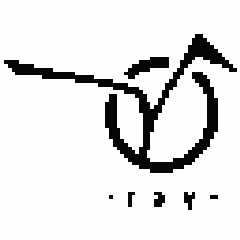
notes:
1.
i tried bigger font, but it draws attention away from logo itself (and looks
ugly too :)
2.
i tried italic, but that looked somewhat crappy and more like a
lufthansa/finnair/whatever logo than persistence of vision raytracer.
propably because computer fonts are often cheap fakes of real world fonts
and their italic versions are done against typographic rules. (or something
like that) so it's not my fault.
3.
i made two versions.
both with slightly altered "Vision".
nobody will see the difference, but i told it anyway :)
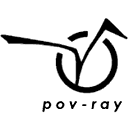
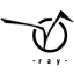
other one says "pov-ray" and the other "ray". i personally like
"ray" -version more because it's cleaner and it has "joke(?)" inside.
instead of reading "pov-ray" people have to figure it out. and so they will
remember it :)
i was thinking that it could be possible to create "house type" (i don't
know english term): same theme (circle and V in my entry) but different
versions. with text "ray" / "pov-ray" / "persistence of Vision raytracer" /
without text at all and so on..
so instead of creating one logo for all purposes could one create several
versions for paper prints / web-pages / start logo etc.
this is how logo-stuff is done in big firms i believe.
comments / suggestions?
-alt
Post a reply to this message
Attachments:
Download 'povray128true.png' (3 KB)
Download 'povray64aa.png' (2 KB)
Download 'povray64noaa.png' (1 KB)
Download 'ray128true.png' (3 KB)
Download 'ray64aa.png' (2 KB)
Download 'ray64noaa.png' (1 KB)
Preview of image 'povray128true.png'
Preview of image 'povray64aa.png'

Preview of image 'povray64noaa.png'

Preview of image 'ray128true.png'

Preview of image 'ray64aa.png'
Preview of image 'ray64noaa.png'
|
|
| |
| |
|
|
|
|
| |