|
 |
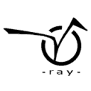
"vaihtoehto" wrote:
> circle is Persistence, joined with Vision. (lame, yes?)
>
> i tried to make it smooth, easy to remember and recognize.
>
> any comments?
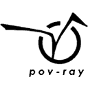
I think your logo is very professional looking!
I think it has more "design" than the others.
However, I have some suggestions.
You say that the logo sort of "means" "persistence of vision".
While that's a nice idea, it is not very easy to tell when you haven't been
told.
I think that doesn't matter, the logo is fine. But the text underneath
saying "ray" suggests that the word "pov" or "persistence of vision" is to
be found in the logo above the text. As I said, one will maybe not find
this, and thus be confused that the first part of "POV-Ray" is missing.
I suggest that you place the whole "pov-ray" underneath the logo. That way
it doesn't require any special knowledge to understand the logo, but if you
have the special knowledge you will see an extra dimension in the logo.
Also, I think the text could be bigger and italic and placed a little
different, but that's just my personal taste.
You could also make the logo slightly bigger because there's some unused
space to the left and right of the logo.
Compare the attached logos...
Any comments?
Greetings,
Rune
---
Updated January 24: http://rsj.mobilixnet.dk
Containing 3D images, stereograms, tutorials,
The POV Desktop Theme, 350+ raytracing jokes,
miscellaneous other things, and a lot of fun!
Post a reply to this message
Attachments:
Download 'original.gif' (2 KB)
Download 'myversion.gif' (2 KB)
Preview of image 'original.gif'

Preview of image 'myversion.gif'
|
|