>If you want to improve it you are welcome to send me a new versions in one
>of the next couple of days :-)
so here you go.. :)
notes:
1.
i tried bigger font, but it draws attention away from logo itself (and looks
ugly too :)
2.
i tried italic, but that looked somewhat crappy and more like a
lufthansa/finnair/whatever logo than persistence of vision raytracer.
propably because computer fonts are often cheap fakes of real world fonts
and their italic versions are done against typographic rules. (or something
like that) so it's not my fault.
3.
i made two versions.
both with slightly altered "Vision".
nobody will see the difference, but i told it anyway :)
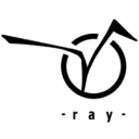
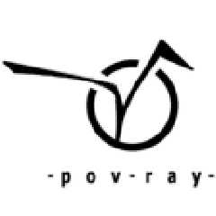
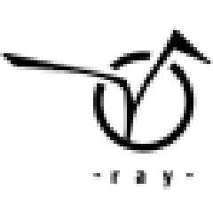
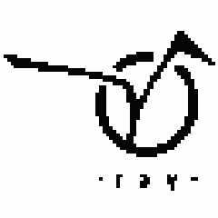
other one says "pov-ray" and the other "ray". i personally like
"ray" -version more because it's cleaner and it has "joke(?)" inside.
instead of reading "pov-ray" people have to figure it out. and so they will
remember it :)
i was thinking that it could be possible to create "house type" (i don't
know english term): same theme (circle and V in my entry) but different
versions. with text "ray" / "pov-ray" / "persistence of Vision raytracer" /
without text at all and so on..
so instead of creating one logo for all purposes could one create several
versions for paper prints / web-pages / start logo etc.
this is how logo-stuff is done in big firms i believe.
comments / suggestions?
-alt
Post a reply to this message
Attachments:
Download 'povray128true.png' (3 KB)
Download 'povray64aa.png' (2 KB)
Download 'povray64noaa.png' (1 KB)
Download 'ray128true.png' (3 KB)
Download 'ray64aa.png' (2 KB)
Download 'ray64noaa.png' (1 KB)
Preview of image 'povray128true.png'
Preview of image 'povray64aa.png'

Preview of image 'povray64noaa.png'

Preview of image 'ray128true.png'

Preview of image 'ray64aa.png'
Preview of image 'ray64noaa.png'
|