 |
|
|
|
|
|
| |
| |
|
|
|
|
| |
| |
|
|
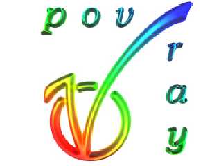
While browsing the vote for the POV-logo, I noticed that some of the
proposed logos were not raytraced but designed with softwares like
Free-Hand or Adobe best-selling programs. I think that's a shame for
POV.
with Photoshop, added some wording. I cooked the lot with a zest of
raytracing in a height_field sauce-pan for 5 minutes.
Thanks for the author of logo Number 13. That's a nice one.
Post a reply to this message
Attachments:
Download '13d.jpg' (29 KB)
Preview of image '13d.jpg'
|
|
| |
| |
|
|
|
|
| |
| |
|
|
> While browsing the vote for the POV-logo, I noticed that some of the
> proposed logos were not raytraced but designed with softwares like
> Free-Hand or Adobe best-selling programs. I think that's a shame for
> POV.
Some of the logos are not made with POV-Ray, but you would be surprised how
many of them that *are* made with POV-Ray.
1, 2, 3, 5, 6, 7, 8, 9, 13, and 15 were all rendered in POV-Ray, maybe more.
You can't always see it though.
> with Photoshop, added some wording. I cooked the lot with a zest of
> raytracing in a height_field sauce-pan for 5 minutes.
Ahem, I made logo 13 *in POV-Ray*.
The reason I didn't make it "3D-like" is that there's a difference between a
logo and how it is presented. The simple drawing is the logo itself, some
3D-effect is just some way of presenting it. It is not part of the logo
itself.
I think it is a nice way you have *presented* logo 13. :-)
> Thanks for the author of logo Number 13. That's a nice one.
Thank you!
Greetings,
Rune
---
Updated March 15: http://rsj.mobilixnet.dk
Containing 3D images, stereograms, tutorials,
The POV Desktop Theme, 350+ raytracing jokes,
miscellaneous other things, and a lot of fun!
Post a reply to this message
|
|
| |
| |
|
|
|
|
| |
| |
|
|
I had one question by the way :
I can see very well the 'O' and 'V' in the logo, but I can't figure out where is
the 'P'.
How did you render the long curves and all the smooth thingy. I'd like to have a
look at the script
Thanks
I have not voted yet, but how many votes have had so far ?
> > While browsing the vote for the POV-logo, I noticed that some of the
> > proposed logos were not raytraced but designed with softwares like
> > Free-Hand or Adobe best-selling programs. I think that's a shame for
> > POV.
>
> Some of the logos are not made with POV-Ray, but you would be surprised how
> many of them that *are* made with POV-Ray.
>
> 1, 2, 3, 5, 6, 7, 8, 9, 13, and 15 were all rendered in POV-Ray, maybe more.
> You can't always see it though.
>
> > with Photoshop, added some wording. I cooked the lot with a zest of
> > raytracing in a height_field sauce-pan for 5 minutes.
>
> Ahem, I made logo 13 *in POV-Ray*.
>
> The reason I didn't make it "3D-like" is that there's a difference between a
> logo and how it is presented. The simple drawing is the logo itself, some
> 3D-effect is just some way of presenting it. It is not part of the logo
> itself.
>
> I think it is a nice way you have *presented* logo 13. :-)
>
> > Thanks for the author of logo Number 13. That's a nice one.
>
> Thank you!
>
> Greetings,
>
> Rune
>
> ---
> Updated March 15: http://rsj.mobilixnet.dk
> Containing 3D images, stereograms, tutorials,
> The POV Desktop Theme, 350+ raytracing jokes,
> miscellaneous other things, and a lot of fun!
Post a reply to this message
|
|
| |
| |
|
|
|
|
| |
| |
|
|
ooooooooo that's nice
I must say that I don't think any of this will end with a choice all people will
accept.
Meaning that if anything Rune is stirring up something that probably won't die out.
Well maybe it'll turn out for the better but I just think many people will actually
start
creating there own logo ideas on down the road and might be something which
is endless.
Maybe I'm wrong though :-)
Bob
Post a reply to this message
|
|
| |
| |
|
|
|
|
| |
| |
|
|
Well, this is by no mean an entry for the competition ( I took me about one hour and
for
fun).
But maybe it will trigger new inspiration. I am sorry to admit that only a few logos
in the
competition are 'up' to representing POV.
I know it's no fair to say that ( I have not sent any entry), but Pov deserves better.
I am ready for the flames.
> ooooooooo that's nice
> I must say that I don't think any of this will end with a choice all people will
accept.
> Meaning that if anything Rune is stirring up something that probably won't die out.
> Well maybe it'll turn out for the better but I just think many people will actually
start
> creating there own logo ideas on down the road and might be something which
> is endless.
> Maybe I'm wrong though :-)
>
> Bob
Post a reply to this message
|
|
| |
| |
|
|
From: vaihtoehto
Subject: Re: Raytraced logo (answer for your question)
Date: 20 Apr 2000 15:44:30
Message: <38ff5e1e@news.povray.org>
|
|
|
| |
| |
|
|
>I had one question by the way :
>I can see very well the 'O' and 'V' in the logo, but I can't figure out
where is
>the 'P'.
i made a few of those original "ring and v" logos, which propably inspired
rune.
in those ones there is *no* "p", "o" or "v" letters.
ring is Persistance (not an O) joined with Vision (not a V) :)
lame idea, yes, and propably nobody would ever even understand it, but so
what.
so instead of reading "pov" that logo means persistance of vision.
instead of being very simple to understand it tries to be vlever and
represent persistance of vision.. (as commercial brand-logos usually do)
they are *symbols* just like letter "a", not a piece of text.
and i think that pictures created with povray show its professional
capabilities much better than a logo, so i don't see why logos should have
been done with pov-ray.
realtime (realworld) freehand drawing (and oil painting, too) is somewhat
hard to do in pov-ray, at least for me.. if you know how to do it, let me
know :)
-alt
Post a reply to this message
|
|
| |
| |
|
|
|
|
| |
| |
|
|
that "vlever" means "clever", btw :)
sorry..
-alt
Post a reply to this message
|
|
| |
| |
|
|
|
|
| |
| |
|
|
I vote for this one!
>
> While browsing the vote for the POV-logo, I noticed that some of the
> proposed logos were not raytraced but designed with softwares like
> Free-Hand or Adobe best-selling programs. I think that's a shame for
> POV.
>
> with Photoshop, added some wording. I cooked the lot with a zest of
> raytracing in a height_field sauce-pan for 5 minutes.
> Thanks for the author of logo Number 13. That's a nice one.
>
>
> ------------------------------------------------------------------------
> [Image]
Post a reply to this message
|
|
| |
| |
|
|
|
|
| |
|
|


