 |
|
|
|
|
|
| |
| |
|
|
|
|
| |
| |
|
|
Post a reply to this message
Attachments:
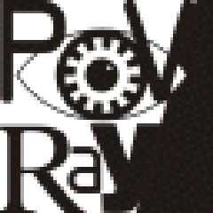
Download 'pov-logo03.gif' (3 KB)
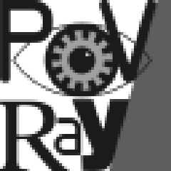
Download 'pov-logo02.gif' (3 KB)
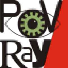
Download 'pov-logo01.gif' (3 KB)
Preview of image 'pov-logo03.gif'
Preview of image 'pov-logo02.gif'
Preview of image 'pov-logo01.gif'
|
|
| |
| |
|
|
|
|
| |
| |
|
|
Ugh. No offense, but the actual serious design training 've had recoils at
this. Too many fonts in one piece. I like the general design, but there are
what three or four fonts in this piece? Simplifiy it and It'll be a lot better
in my opinion.
Josh
Fabien Mosen wrote:
>
>
> ------------------------------------------------------------------------
> [Image] [Image] [Image]
--
Josh English
eng### [at] spiritone com
"May your hopes, dreams, and plans not be destroyed by a few zeros." com
"May your hopes, dreams, and plans not be destroyed by a few zeros."
Post a reply to this message
|
|
| |
| |
|
|
|
|
| |
| |
|
|
I really like that one. So much that I downloaded it for possible future
use, even if it doesn't become "official"...
Post a reply to this message
|
|
| |
| |
|
|
|
|
| |
| |
|
|
Josh English wrote:
>
> Ugh. No offense, but the actual serious design training 've had recoils at
> this.
Didn't see this before I replied to Fabien Mosen's design. I totally
disagree. I think the different fonts could represent the underlying
chaos surrounding us, and helps to convey the idea that POVray creates
order from such chaos. And it would probably appeal to the "alternative"
crowd as well. Sometimes it's good to ignore or "look beyond" your
training. (I put that in quotes because I don't mean to sound
patronizing or arrogant.)
That's MY opinion anyway... :)
Post a reply to this message
|
|
| |
| |
|
|
|
|
| |
| |
|
|
I don't kow, I kinda like to think that the visual arts are like the
aural arts, if it sounds good, it does not matter what training was
involved in it's production.... just my $0.02.
I like the design....
-paul
Josh English wrote:
>
> Ugh. No offense, but the actual serious design training 've had recoils at
> this. Too many fonts in one piece. I like the general design, but there are
> what three or four fonts in this piece? Simplifiy it and It'll be a lot better
> in my opinion.
>
> Josh
>
> Fabien Mosen wrote:
>
> >
> >
> > ------------------------------------------------------------------------
> > [Image] [Image] [Image]
>
> --
> Josh English
> eng### [at] spiritonecom
> "May your hopes, dreams, and plans not be destroyed by a few zeros."
--
Paul Daniel Jones
307 Chandlee Laboratory
Penn State Chemistry Dept.
pdj### [at] psuedu
http://glasssgi.chem.psu.edu
(814)-865-2090
C
/ \
N N
| O |
C C
/ \ / \
H3C C CH3
Post a reply to this message
|
|
| |
| |
|
|
|
|
| |
| |
|
|
Josh English wrote:
>
> Ugh. No offense, but the actual serious design training 've had recoils at
> this. Too many fonts in one piece. I like the general design, but there are
> what three or four fonts in this piece? Simplifiy it and It'll be a lot better
> in my opinion.
I am aware of the one-font-please issue, and I usually shout when
I see more than one font in a document (and when, in french, people
doesn't put accents on capitals, but that's another story :))).
However, this is a logo, not a document, and some fantaisist use
of font is not as prohibited as in a document. Basically, I intended
to use a single font, but the design implied that the "V" and the "y"
had the same angle; Since I didn't found a nice font who had this
requirement, I used a different font for "V" and "y". Once I had two
fonts in the design (wich has only 5 letters !), I thought that using
4 different fonts wouldn't hurt, and would become another system in
itself, with it's own coherence.
Yes, I think that one-font would be a good thing, but it has to be
THE right font, sober but interesting, with equal angle in V and y.
I'll do some more researching, and if I find that font, I'll give it
another try.
BTW, it could be nice if we had a specific, unique, Pov-Ray font, that
could become some kind of standard for everything related to pov...
Don't know...
Fabien.
Post a reply to this message
|
|
| |
| |
|
|
|
|
| |
| |
|
|
I'm not saying the design is bad, I love the design as well. Nor am I making a
comment on Fabien's training. I have done professional design work, and I find
having more than two fonts together distracting and ugly in general. In this piece,
it is so small that the inconsistancies between letterforms is very distracting to
me, that's all.
Paul Jones wrote:
> I don't kow, I kinda like to think that the visual arts are like the
> aural arts, if it sounds good, it does not matter what training was
> involved in it's production.... just my $0.02.
>
> I like the design....
>
> -paul
>
> Josh English wrote:
> >
> > Ugh. No offense, but the actual serious design training 've had recoils at
> > this. Too many fonts in one piece. I like the general design, but there are
> > what three or four fonts in this piece? Simplifiy it and It'll be a lot better
> > in my opinion.
> >
> > Josh
> >
> > Fabien Mosen wrote:
> >
> > >
> > >
> > > ------------------------------------------------------------------------
> > > [Image] [Image] [Image]
> >
> > --
> > Josh English
> > eng### [at] spiritonecom
> > "May your hopes, dreams, and plans not be destroyed by a few zeros."
>
> --
>
> Paul Daniel Jones
> 307 Chandlee Laboratory
> Penn State Chemistry Dept.
> pdj### [at] psuedu
> http://glasssgi.chem.psu.edu
> (814)-865-2090
>
> C
> / \
> N N
> | O |
> C C
> / \ / \
> H3C C CH3
--
Josh English
eng### [at] spiritonecom
"May your hopes, dreams, and plans not be destroyed by a few zeros."
Post a reply to this message
|
|
| |
| |
|
|
|
|
| |
| |
|
|
<snooty graphic designer talking>You want chaos? Use a fractal, not a
letter!</snooty graphci designer talking>
Now that I've got that out of the way, I think that the readablility goes away
when you try to do this. Unless youwant to make it a symbol of it's own which is
made up of the letterforms but meant to be read as a whole.
Scott Reid wrote:
> Josh English wrote:
> >
> > Ugh. No offense, but the actual serious design training 've had recoils at
> > this.
>
> Didn't see this before I replied to Fabien Mosen's design. I totally
> disagree. I think the different fonts could represent the underlying
> chaos surrounding us, and helps to convey the idea that POVray creates
> order from such chaos. And it would probably appeal to the "alternative"
> crowd as well. Sometimes it's good to ignore or "look beyond" your
> training. (I put that in quotes because I don't mean to sound
> patronizing or arrogant.)
>
> That's MY opinion anyway... :)
--
Josh English
eng### [at] spiritonecom
"May your hopes, dreams, and plans not be destroyed by a few zeros."
Post a reply to this message
|
|
| |
| |
|
|
|
|
| |
| |
|
|
Fabien Mosen wrote:
> Josh English wrote:
> ><SNIP>
> <SNIP>
> Yes, I think that one-font would be a good thing, but it has to be
> THE right font, sober but interesting, with equal angle in V and y.
> I'll do some more researching, and if I find that font, I'll give it
> another try.
I would design those letters independently, then. Not too difficult to do. And I'm
not saying it should be one font alone, either. Two is fine. It's just the severe
difference between the fonts you have.
I'll shut up now...
>
> BTW, it could be nice if we had a specific, unique, Pov-Ray font, that
> could become some kind of standard for everything related to pov...
> Don't know...
ps.
I always thought that "crystal" was, because I haven't seen it anywhere but in
POV-Ray
--
Josh English
eng### [at] spiritonecom
"May your hopes, dreams, and plans not be destroyed by a few zeros."
Post a reply to this message
|
|
| |
| |
|
|
|
|
| |
| |
|
|
Heh heh. It just goes to show you: The people who didn't create it can
yak all they want, but the artist is the only one who REALLY knows...
Post a reply to this message
|
|
| |
| |
|
|
|
|
| |
|
|

