|
|
|
|
|
|
| |
| |
|
|
From: Nicholas DePetrillo
Subject: New and improved POV-RAY OCEAN (give me your opinion!)
Date: 19 Apr 1999 18:59:54
Message: <371ba75a.0@news.povray.org>
|
|
|
| |
| |
|
|
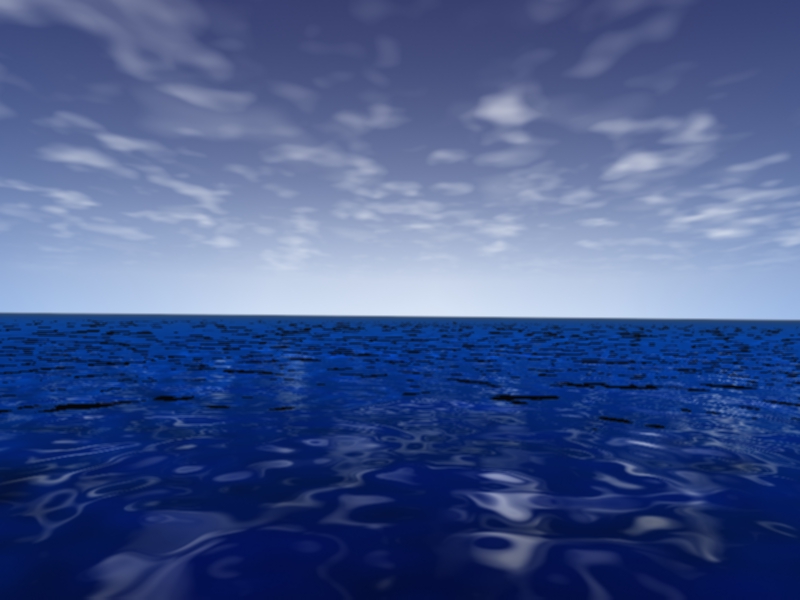
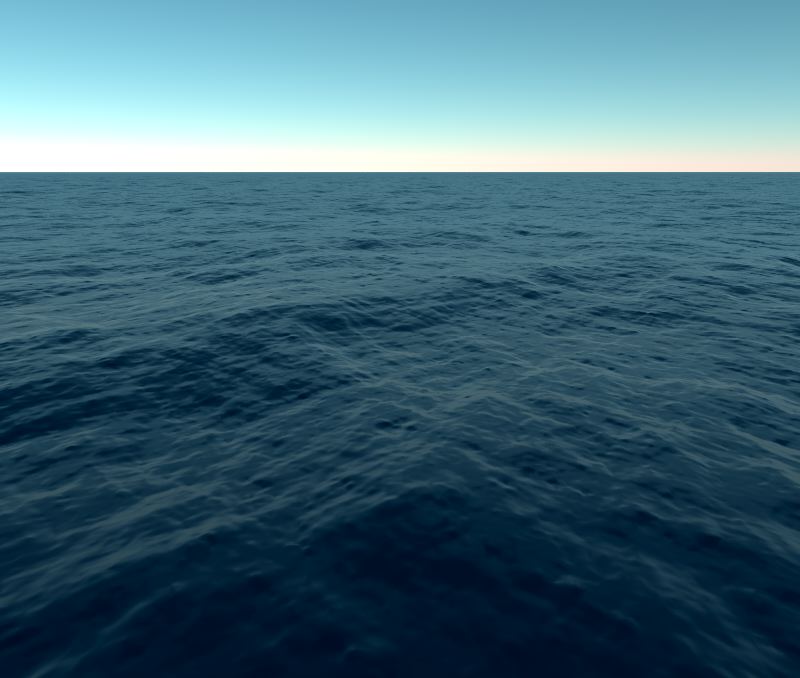
How do you like the new ocean? is it better or worse?
THe newer one is on the top and the older one (the one you can find a url
download site for the animation in a group below.
Anyway, the lighter one is new, darker one is my older one......which one is
more realistc? If you dont liek the new one ill go back to the old and try
to m,ake it look better...
thanks for your opinion!
Nicholas DePetrillo
n1h### [at] home com com
Post a reply to this message
Attachments:
Download 'newpococean.jpg' (186 KB)
Download 'POV_OCEAN.jpg' (54 KB)
Preview of image 'newpococean.jpg'

Preview of image 'POV_OCEAN.jpg'
|
|
| |
| |
|
|
|
|
| |
| |
|
|
Ok, I haven't even downloaded the whole package yet, but I'm already
complaining..
there is no need to add the old image again and again, i think I have three
copies of it here on my hdd now(I have a 15 day expire time for the files, keep
headers eternally).
You don't need to do it, just mention the old, post subject and date should be
enough, and then send it..
I'm downloading theese to at a speed of approx 100 bytes/second.
Please, don't spam like this.
Nicholas DePetrillo wrote:
>
> How do you like the new ocean? is it better or worse?
> THe newer one is on the top and the older one (the one you can find a url
> download site for the animation in a group below.
> Anyway, the lighter one is new, darker one is my older one......which one is
> more realistc? If you dont liek the new one ill go back to the old and try
> to m,ake it look better...
>
> thanks for your opinion!
>
> Nicholas DePetrillo
> n1h### [at] homecom
>
> [Image]
>
> [Image]
--
//Spider
[ spi### [at] bahnhofse ]-[ http://www.bahnhof.se/~spider/ ]
What I can do and what I could do, I just don't know anymore
"Marian"
By: "Sisters Of Mercy"
Post a reply to this message
|
|
| |
| |
|
|
|
|
| |
| |
|
|
To be honest, I liked the old one better. this one loooks to much "summer-sea"
for me, and is too clear blue.
take the original, keep the colour, add a dark, clouded sky, and add a specular
reflection. that should be a start..
Nicholas DePetrillo wrote:
>
> How do you like the new ocean? is it better or worse?
> THe newer one is on the top and the older one (the one you can find a url
> download site for the animation in a group below.
> Anyway, the lighter one is new, darker one is my older one......which one is
> more realistc? If you dont liek the new one ill go back to the old and try
> to m,ake it look better...
>
> thanks for your opinion!
>
> Nicholas DePetrillo
> n1h### [at] homecom
>
> [Image]
>
> [Image]
--
//Spider
[ spi### [at] bahnhofse ]-[ http://www.bahnhof.se/~spider/ ]
What I can do and what I could do, I just don't know anymore
"Marian"
By: "Sisters Of Mercy"
Post a reply to this message
|
|
| |
| |
|
|
From: Bob Hughes
Subject: Re: New and improved POV-RAY OCEAN (give me your opinion!)
Date: 19 Apr 1999 19:30:36
Message: <371BAE67.8ED04813@aol.com>
|
|
|
| |
| |
|
|
Glad to see I'm not alone in the d/l rate, well, actually I'm not happy
at all as to this fact.
Spider wrote:
>
> I'm downloading theese to at a speed of approx 100 bytes/second.
--
omniVERSE: beyond the universe
http://members.aol.com/inversez/homepage.htm
mailto:inv### [at] aolcom?Subject=PoV-News
Post a reply to this message
|
|
| |
| |
|
|
From: Bob Hughes
Subject: Re: New and improved POV-RAY OCEAN (give me your opinion!)
Date: 19 Apr 1999 19:40:13
Message: <371BB0A4.51AE8F3C@aol.com>
|
|
|
| |
| |
|
|
Yuck on the "new and improved". I for one was content enough with the
first ;)
Like Spider says though it appears to be beneath a sky of changing
weather at least to me too, I like the clouds and sky okay in the new
image. That would go better with the original water anyway. The
"specular" reflection referred to (unless wires are crossed about this)
would be like 'specular 0.3 roughness .02' I would say. Or 'phong 0.3
phong_size 150' maybe. All depends on the users wish for a more correct
look as they see fit.
The reflection itself would probably benifit greatly with the WyzPOV
patch or Super Patch which will do angle dependant reflection, instead
of relying upon a uniformity.
Spider wrote:
>
> To be honest, I liked the old one better. this one loooks to much "summer-sea"
> for me, and is too clear blue.
>
> take the original, keep the colour, add a dark, clouded sky, and add a specular
> reflection. that should be a start..
>
> Nicholas DePetrillo wrote:
> >
> > How do you like the new ocean? is it better or worse?
> > THe newer one is on the top and the older one (the one you can find a url
> > download site for the animation in a group below.
> > Anyway, the lighter one is new, darker one is my older one......which one is
> > more realistc? If you dont liek the new one ill go back to the old and try
> > to m,ake it look better...
> >
> > thanks for your opinion!
> >
> > Nicholas DePetrillo
> > n1h### [at] homecom
> >
> > [Image]
> >
> > [Image]
>
> --
> //Spider
> [ spi### [at] bahnhofse ]-[ http://www.bahnhof.se/~spider/ ]
> What I can do and what I could do, I just don't know anymore
> "Marian"
> By: "Sisters Of Mercy"
--
omniVERSE: beyond the universe
http://members.aol.com/inversez/homepage.htm
mailto:inv### [at] aolcom?Subject=PoV-News
Post a reply to this message
|
|
| |
| |
|
|
|
|
| |
| |
|
|
Post a reply to this message
|
|
| |
| |
|
|
From: Nicholas DePetrillo
Subject: Re: New and improved POV-RAY OCEAN (give me your opinion!)
Date: 19 Apr 1999 20:18:52
Message: <371bb9dc.0@news.povray.org>
|
|
|
| |
| |
|
|
hey uhhh...sorry about posting so much data........See i didnt think anyone
would even to bother to complain because its such a useless
complaint...anyway i will stop doing that. I for one have a cable modem and
sometimes i forget i had a 56 k ya know...
Sorry again!
Nick D
n1h### [at] homecom
Nicholas DePetrillo <N1h### [at] hotmailcom> wrote in message
news:371ba75a.0@news.povray.org...
> How do you like the new ocean? is it better or worse?
> THe newer one is on the top and the older one (the one you can find a url
> download site for the animation in a group below.
> Anyway, the lighter one is new, darker one is my older one......which one
is
> more realistc? If you dont liek the new one ill go back to the old and try
> to m,ake it look better...
>
> thanks for your opinion!
>
> Nicholas DePetrillo
> n1h### [at] homecom
>
>
>
>
Post a reply to this message
|
|
| |
| |
|
|
From: Margus Ramst
Subject: Re: New and improved POV-RAY OCEAN (give me your opinion!)
Date: 19 Apr 1999 20:44:30
Message: <371bbfde.0@news.povray.org>
|
|
|
| |
| |
|
|
Nicholas DePetrillo wrote in message <371bb9dc.0@news.povray.org>...
>hey uhhh...sorry about posting so much data........See i didnt think anyone
>would even to bother to complain because its such a useless
>complaint...anyway i will stop doing that. I for one have a cable modem and
>sometimes i forget i had a 56 k ya know...
>
>
>Sorry again!
>
I for one only have a 33.6K modem, and half of my ISP's modems are 14.4K
(and the rest are constantly occupied by sb. else)
I really should change providers, but with this one I only have to pay the
price of a local call, nothing more. So I'm cheap. Sue me.
Margus
Post a reply to this message
|
|
| |
| |
|
|
|
|
| |
| |
|
|
I think that the old ocean was much better. It had a very
realistic
look, aside from the sky. I agree that the ocean implies a
dark
sky, with clouds. I showed someone the image and they
thought
it was a picture, at first (the sky has a computer like
gradient).
The new image has a 'ray-traced' look with a 'plastic'
looking
ocean. The clouds are like pieces of ripped paper.
Hope my thoughts are some help,
David Young
Post a reply to this message
|
|
| |
| |
|
|
|
|
| |
| |
|
|
<!doctype html public "-//w3c//dtd html 4.0 transitional//en">
<html>
you do know how to render at a smaller size right? ;) and now it's
<br>TOO glossy and clear it just needed a little bit of both not much!
<p>Nicholas DePetrillo wrote:
<blockquote TYPE=CITE>How do you like the new ocean? is it better or worse?
<br>THe newer one is on the top and the older one (the one you can find
a url
<br>download site for the animation in a group below.
<br>Anyway, the lighter one is new, darker one is my older one......which
one is
<br>more realistc? If you dont liek the new one ill go back to the old
and try
<br>to m,ake it look better...
<p>thanks for your opinion!
<p>Nicholas DePetrillo
<br>n1h### [at] homecom
<p> [Image]
<p> [Image]</blockquote>
</html>
Post a reply to this message
|
|
| |
| |
|
|
|
|
| |