 |
 |
|
 |
|
 |
|  |
|  |
|
 |
|
 |
|  |
|  |
|
 |
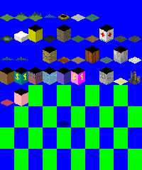
What lighting settings would you recommend to achieve the same lighting
as the large blocks in the attached big_terrain.png image? I think the
white block near the top left should be used as a guide. I have made
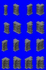
some efforts, as can be seen in wall_extra_a.png, but am not satisfied
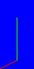
with the results. I also attached an image showing the coordinate axes
so you can see how things are oriented in space. Thanks.
Mike
Post a reply to this message
Attachments:
Download 'big_terrain.png' (88 KB)
Download 'walls_flat00.png' (1 KB)
Download 'wall_extra_a.png' (17 KB)
Preview of image 'big_terrain.png'

Preview of image 'walls_flat00.png'

Preview of image 'wall_extra_a.png'

|
 |
|  |
|  |
|
 |
|
 |
|  |
|  |
|
 |
On 08.02.2016 7:45, Mike Horvath wrote:
> What lighting settings would you recommend to achieve the same lighting
> as the large blocks in the attached big_terrain.png image?
for the flat shading use a "parallel" light source (although just
placing it distant enough probably works too). Relative brightness of
left / right / top can be tweaked with angle of incoming light. E.g.
#default {finish {ambient 0}}
global_settings
{
assumed_gamma 1.0
}
camera
{
orthographic
location <0.0, 4.0, -5.0>
look_at <0.0, 1.0, 0.0>
angle 90
}
light_source
{
<-15, 40, -30>
color rgb 2
parallel
}
box
{
0,2
pigment {color rgb 1}
translate -<1,0,1>
rotate 45*y
}
Post a reply to this message
|
 |
|  |
|  |
|
 |
|
 |
|  |
|  |
|
 |
Le 16-02-08 01:45, Mike Horvath a écrit :
> What lighting settings would you recommend to achieve the same lighting
> as the large blocks in the attached big_terrain.png image? I think the
> white block near the top left should be used as a guide. I have made
> some efforts, as can be seen in wall_extra_a.png, but am not satisfied
> with the results. I also attached an image showing the coordinate axes
> so you can see how things are oriented in space. Thanks.
>
>
> Mike
Use a parallel light, placed relatively far.
You want the plane passing by the light's location and normal to the
direction of the light to be in front of all objects in the scene. You
may get unexpected results with objects behind that plane.
Assuming that, for the axis, red is +x (front left), green is +y (up)
and blue is +z (front right).
Place the light in the general direction of <200, 400, 100>.
Do a test render and adjust the location if needed.
Finaly, you can multiply that direction by some value, like 10 or 100 to
ensure that there is no interference with the objects of the scene.
Alain
Post a reply to this message
|
 |
|  |
|  |
|
 |
|
 |
|  |
|  |
|
 |
Mike Horvath <mik### [at] gmail com> wrote:
> What lighting settings would you recommend to achieve the same lighting
> as the large blocks in the attached big_terrain.png image? I think the
> white block near the top left should be used as a guide. I have made
> some efforts, as can be seen in wall_extra_a.png, but am not satisfied
> with the results. I also attached an image showing the coordinate axes
> so you can see how things are oriented in space. Thanks.
>
>
> Mike
POV-Ray's lighting rule is: color of light_source * color of diffuse texture =
output color, when lighting is perpendicular to the surface.
So if you want a light gray output like rgb<0.8,0.8,0.8>, then you can put a
light_source{ color rgb <1,1,1>}
with texture{pigment{rgb <0.8,0.8,0.8>} finish{ambient 0 diffuse 1}} com> wrote:
> What lighting settings would you recommend to achieve the same lighting
> as the large blocks in the attached big_terrain.png image? I think the
> white block near the top left should be used as a guide. I have made
> some efforts, as can be seen in wall_extra_a.png, but am not satisfied
> with the results. I also attached an image showing the coordinate axes
> so you can see how things are oriented in space. Thanks.
>
>
> Mike
POV-Ray's lighting rule is: color of light_source * color of diffuse texture =
output color, when lighting is perpendicular to the surface.
So if you want a light gray output like rgb<0.8,0.8,0.8>, then you can put a
light_source{ color rgb <1,1,1>}
with texture{pigment{rgb <0.8,0.8,0.8>} finish{ambient 0 diffuse 1}}
Post a reply to this message
|
 |
|  |
|  |
|
 |
|
 |
|  |
|
 |


![]()