 |
|
|
|
|
|
| |
| |
|
|
|
|
| |
| |
|
|
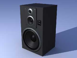
Hi there !
This is my first work with povray, so I decided to post it here to get some
feedback.
It's still in progress, but the speaker itself is almost done. I'm working
on the rest of the equipment at the moment.
any advice, hints or suggestions are welcome!
thanks,
Alex
Post a reply to this message
Attachments:
Download 'sony.png' (153 KB)
Preview of image 'sony.png'
|
|
| |
| |
|
|
|
|
| |
| |
|
|
This is looking really good already - it's great to see you've taken the
extra effort to make the cabinet have small rounded edges rather than
leaving them 100% sharp - it really adds to the realism to do that. The
only thing I can think of as an improvement is to add a tiny bit of
reflection blurring to the metal texture (by means of something like a
*very* small normal).
I can't wait to see the models of the other equipment, keep up the great
work!
Lance.
thezone - thezone.firewave.com.au
thehandle - www.thehandle.com
Post a reply to this message
|
|
| |
| |
|
|
|
|
| |
| |
|
|
Very nice proportions and sufficient details in the geometry to make a great
rendering. If you plan to add a few more objects, so much the better. If
you'd like the final rendering to be clearer and perhaps more
photo-realistic, I'd be happy to give some suggestions. This rendering is
slightly too dark for my taste. You don't have to sacrifice the black
material but using another light & enviroment would help.
Regards,
Hugo
Post a reply to this message
|
|
| |
| |
|
|
|
|
| |
| |
|
|
I'm running out of ideas on how to making it more photo-realistic, I think
the blurred reflection would give it a very nice touch, I'll start
experimenting with that... now about the darkness, it looked fine on my
monitor, but then I notice it's too dark here at the office, I just don't
know where to start:
1. using more brightness at the radiosity
2. giving textures more ambient
3. using lighter colors.
4. adding more lights
I think any of those would make the image brighter.. but I'm not sure which
is best, or maybe it's a good ballance of them all... well, as long as it
looks ok I think it doesn't really matter how do you achieve the goal,
right?
thanks for the feedback I'll keep working on it, and keep listening to tips
& hints, I'll repost more screens when I get better results.
Post a reply to this message
|
|
| |
| |
|
|
|
|
| |
| |
|
|
Alex wrote:
> I'm running out of ideas on how to making it more photo-realistic, I think
> the blurred reflection would give it a very nice touch, I'll start
> experimenting with that... now about the darkness, it looked fine on my
> monitor, but then I notice it's too dark here at the office, I just don't
> know where to start:
Every once in a while I come across a new secret to photorealism. Of
course, none of them are really secret, since most of them were showed
to me by other people, but at any rate you might want to keep these in
mind. There may be others as well, I just haven't learned them yet:
- Excruciating detail. Down to the last rivet.
- Real-world textures. If you look at it closely, nothing is really as
smooth as you think it is.
- Lighting. Others can explain it better than I, but apparently the
key is to use *really* high brightnesses (ie thousands) and extremely
short fade-distances.
I was quite impressed with the speaker when I saw it. Great attention to
detail already. The little Sony sticker is a great touch. :) Already a
nice work, even without further detailing. :) Can't wait to see the full
set.
~Mike
Post a reply to this message
|
|
| |
| |
|
|
|
|
| |
| |
|
|
"Alex" <ale### [at] quad comar> wrote:
> any advice, hints or suggestions are welcome!
Plug it in! Turn it up!
....oh, you mean about the rendering... no, looks great!
RG comar> wrote:
> any advice, hints or suggestions are welcome!
Plug it in! Turn it up!
....oh, you mean about the rendering... no, looks great!
RG
Post a reply to this message
|
|
| |
| |
|
|
|
|
| |
| |
|
|
"Alex" <ale### [at] quadcomar> wrote in message
news:web.41b89f2a17a60fa48c2d45480@news.povray.org...
> I'm running out of ideas on how to making it more photo-realistic, I think
> the blurred reflection would give it a very nice touch, I'll start
> experimenting with that... now about the darkness, it looked fine on my
> monitor, but then I notice it's too dark here at the office, I just don't
> know where to start:
>
> 1. using more brightness at the radiosity
> 2. giving textures more ambient
> 3. using lighter colors.
> 4. adding more lights
>
> I think any of those would make the image brighter.. but I'm not sure
which
> is best, or maybe it's a good ballance of them all... well, as long as it
> looks ok I think it doesn't really matter how do you achieve the goal,
> right?
>
> thanks for the feedback I'll keep working on it, and keep listening to
tips
> & hints, I'll repost more screens when I get better results.
Regarding the brightness - it looks perfect on my monitors (which have been
custom ICC profiled); viewing a histogram of the image shows a good spread
of luminance as well, so if it looks strangely dark on your work monitor,
it's due to your work monitor being poorly calibrated (not enough
brightness, not enough contrast, etc).
You can adjust the scene's gamma manually, but normally this isn't required
unless you're specifically creating the image to be displayed on another
platform (e.g. if you're on a Mac and are designing for display on a PC).
Check out 3.2.4 Global Settings in the help file - specifically the
assumed_gamma and display_gamma settings - for more information on this.
But like I said, if I were you I'd leave it as it is, because it looks fine
here.
Lance.
thezone - thezone.firewave.com.au
thehandle - www.thehandle.com
Post a reply to this message
|
|
| |
| |
|
|
|
|
| |
| |
|
|
> if I were you I'd leave it as it is, because it
> looks fine here.
I like my images to look good on every monitor out there. Personally I
think, better too bright than too dark. That way, everyone will be able to
see it, and usually I don't notice when images are "too bright". Anyway
it's usually possible to find a "perfect" balance, but that's not just a
matter of gamma-correction. Gamma correction is important but cannot fix a
rendering that isn't built with consideration of contrasts.
My guess is, the histogram shows a good spread of luminance because the blue
ground statistically covers up for the lack of contrast in the speaker.
It's tricky to achieve good looking, black materials, even more so in
computer renderings. But a good starting point would be to find some
reference photos of black things (possibly speakers) and work from there.
Alex suggested "using more brightness at the radiosity, giving textures more
ambient, using lighter colors, or adding more lights". I wouldn't do that,
except perhaps "adding more lights" but they should to be carefully
positioned. There are many approches to it, but here is my suggestion:
Turn off radiosity. You can activate it again later, but it's not strictly
needed. For an image of this kind of complexity (where there is only one,
or maybe a few objects in focus, in an empty room) you can usually fake the
radiosity without too much trouble. Doing so gives you even greater control
over contrast and highlights. But even if you decide to turn on radiosity
again, it's a good idea to first position your light_sources, and ensure
they work well.
There are many interesting things you can do with just the light. I won't go
into details here but you decide the mood of the image with light. For
example you can make it look "intense", "warm", "cold", or "natural". But I
assume that for now you'd like people to concentrate on the speaker itself,
when they see your image. You'd like to draw peoples attention to the
design and modelling of the speaker, rather than the enviroment.
So let's use something alone the lines of a "three point lighting system".
You can read lots about it, various places on the Internet, but here is a
simple approch:
The first light you set up, should be the strongest (brightest). This is
called the "key light". I suggest you position it to the left of the
speaker, let's say about 3 meters away. That should be well outside the
camera view. Then you can experiment a little, by moving the light in the Z
direction until you think the shadows from the speaker have a nice
"shape"... I would suggest moving the key-light in the direction *towards*
the camera, so it shines on the front of the speaker, still to the left...
The code should look something like this:
light_source { Position, Colour
fade_distance 1 fade_power 2
area_light { 3*x, 3*z, 4,4 circular orient }
I haven't tested but I hope it works. As you can see, I made it a spherical
area_light because I think, a soft shadow would be most flattering to the
speaker... You can adjust the softness to your liking. But fade_distance &
fade_power is best left alone... The colour should be white (or whatever
you desire) but you will need a value that goes well beyond 1.0. Try 50,
100, or more. This is due to the realistic fading I activated.
By the way, if you haven't done so already I suggest you add this line to
the top of your scene: global_settings { assumed_gamma 1 }
On my computer (and I assume lots of other standard PC's with a standard
installation of POV-Ray) this will result in images that use a standard 2.2
gamma correction. If you don't add this line, your rendering will probably
not use gamma correction at all ! Well, it's a long and confusing story.
But lets leave it at this.
Now, after specifying the assumed_gamma, you will probably have to adjust
the blue ground and the black materials, well ALL your materials, but it's
worth it. Another thing that is quite important, is that you should use
"ambient 0" in all your finish statements. Because you don't want the
speaker to EMIT light. Ambience is an old feature from the time when
computer were much slower. Today the feature is rarely used except for
objects that we want to EMIT light.
Back to the key-light: When you are satisfied with the position of your
key-light, the shadows it produces, and the intensity of the light - it is
time to turn it off temporarely, and start adding a so-called "fill light"
or two.
Basically you are using the same procedures as above, but position the
fill-light to the right of the speaker (opposing the key-light). Make it
more dim, and with much softer shadows. Try to make it look like, you're in
a room only lit by a large window, late in the evening. In such a room,
there are no highlights, just soft, dim light that bounces around the
walls. This is the mood you're after. Eventually you can add a colour to
the fill-light ..brown or blue.
When you are satisfied with the fill-light, turn on the key-light again and
see if they both work well together... Still satisfied? Good.
Now, it's time to fake the radiosity by adding another fill-light. But this
one will be placed beneath the ground, and in front of the speaker, so it
will give the impression that light is bouncing from the ground, up onto
the speaker. To achieve this effect (having a light_source beneath the
ground, without being blocked by the ground) you need to use a "light
group". It's very simple. You want the speaker and the ground-light wrapped
into a "light group like this:
light_group {
Speaker_Object
Ground_Light
}
Again you can adjust the intensity of the ground-light, the colour and the
soft shadows to your liking. If the ground is blue (as in the image you
posted earlier) I suggest you make the ground-light blue. Don't hesitate to
experiment with the position of the ground-light...
Well, I would be interested in seeing the rendering after this. There are
still a few things to do, but I realise this post is already too long and
I'll stop writing now... I hope you can use it somehow, for inspiration, at
least.
Regards,
Hugo
Post a reply to this message
|
|
| |
| |
|
|
|
|
| |
| |
|
|
Wow! I'm impressed by the suggestions! this newsgroup is so friendly! I
haven't seen such a collaborative community in a long time, I'll work on it
this weekend and let you all know how it went, posting new renders when I'm
done.. I've been trying the blurred reflections, now I'll try the lights
and all those hints hugo sent.. thanks a LOT !!
Alex Verstraeten.
Post a reply to this message
|
|
| |
| |
|
|
|
|
| |
| |
|
|
Hugo Asm" <nomail@nomail> wrote in message
news:web.41b99b1d17a60fa4ba17f4dc0@news.povray.org...> > if I were you I'd
leave it as it is, because it
> > looks fine here.
>
> I like my images to look good on every monitor out there.
Which, as you'd already know, isn't possible - if someone has the brightness
turned right down, good luck seeing all of the nice shadow detail you put
in. If they have it turned all the way up, the image is going to look
washed out. That's why the safest bet if you want it to look good on a
range of monitors is to make it look good when viewed on a monitor with a
2.2 gamma response curve. This is why my LCDs are calibrated using a
colorimeter to match a gamma of 2.2, which is why I was saying leave it as
it is - if it looks good on my monitor, which is set up to match a gamma of
2.2, then it should look good on "most" monitors that don't have their
calibration way out of whack.
Then again, most people have their monitors set to whitepoint of 9300 kelvin
*groan*.
> My guess is, the histogram shows a good spread of luminance because the
blue
> ground statistically covers up for the lack of contrast in the speaker.
I was talking about *just* the speaker - there's good luminance range even
when excluding all areas of the blue backdrop, in fact from 0% to nearly
100% (around 250/255 - i.e. ~98% luminance).
> It's tricky to achieve good looking, black materials, even more so in
> computer renderings. But a good starting point would be to find some
> reference photos of black things (possibly speakers) and work from there.
But his speaker cabinet isn't supposed to be black - I'd imagine, like most
Sony speaker units, it's probably "midnight grey". At least my Sony
speakers are like that. So, they shouldn't appear black (like the speaker
cones should, and do).
In my opinion, Alex's image already has very good contrast, and in this case
I think leaving radiosity on is a good idea - the cabinet is picking up a
subtle blue tint, and the area around the cabinet (e.g. at the front bottom
of the cabinet) is picking up a subtle grey tint. Removing radiosity would
lose this subtly and make the image not seem as realistic (as our brains
will subconsciously pick up on these missing cues and tell us something is
"wrong").
Lance.
thezone - thezone.firewave.com.au
thehandle - www.thehandle.com
Post a reply to this message
|
|
| |
| |
|
|
|
|
| |
|
|


