|
|
|
|
|
|
| |
| |
|
|
|
|
| |
| |
|
|
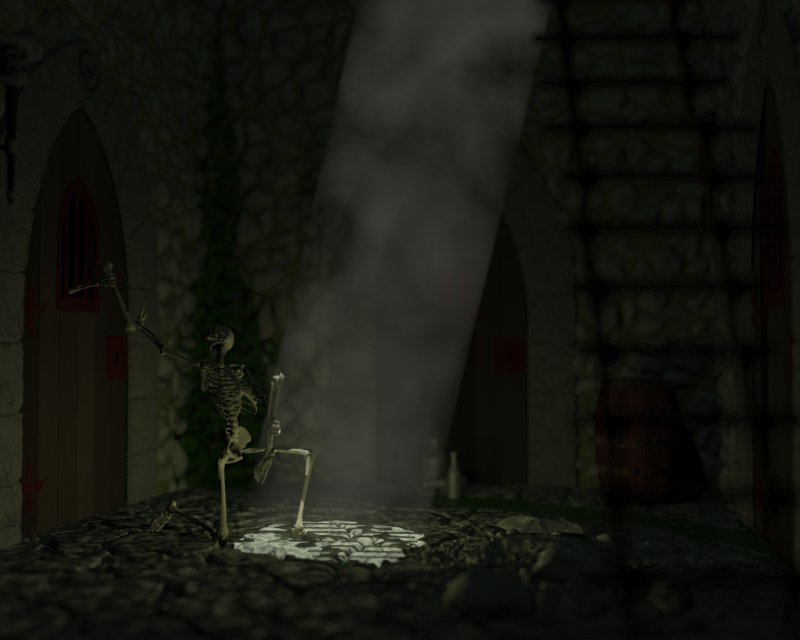
I've been working on this off and on for a while. I drop it when I think I've done
everything as well as my current knowledge permits, then pick it up again when I've
learned something new. Have a look, let me know what you think. I'm struggling with
the textures (too plain?) and doors (look too new). Any ideas on distressing the
edges randomly?
Thanks!
Rob
Post a reply to this message
Attachments:
Download 'ESCAPE.jpg' (40 KB)
Preview of image 'ESCAPE.jpg'
|
|
| |
| |
|
|
|
|
| |
| |
|
|
Robert Richens wrote:
> I've been working on this off and on for a while. I drop it when I think I've done
everything as well as my current knowledge permits, then pick it up again when I've
learned something new. Have a look, let me know what you think. I'm struggling with
the textures (too plain?) and doors (look too new). Any ideas on distressing the
edges randomly?
Awesome!
A bit dark -- if you own Photoshop, try this:
Menu Image : Adjustments : Levels
Slide the triangles to intersect the high and low points of the
luminosity histogram.
You can also use "Auto" which tries to do that to all histograms
automagically (it often works well, but sometimes it really changes the
colors).
Using that trick, you can usually balance most images and bring out
details much easier.
--
Respectfully,
Dan P
http://<broken link>
Post a reply to this message
|
|
| |
| |
|
|
|
|
| |
| |
|
|
Nice!
Dont ask me why, whats causes it, but looking closely at the image I get the
impression that its a photo (which is what we all want) of a small diarama
(perhaps not what we want). Now thats either very good or rather
disapointing depending on the look your after.
A bit more light might be nice, a flamingg brand in a scone might be a good
source of extra light in this scene.
Post a reply to this message
|
|
| |
| |
|
|
|
|
| |
| |
|
|
Thanks!
It's dark because I'm trying to give the feeling that the only light source
in this very dark/ancient dungeon is the small hole poked into the cieling.
Eventually it will be printed as a poster and I wanted the top of the rock
walls to be almost invisible... I may crank up the light or follow your
photoshop suggestion after the first test print...
Thanks for the comments!
Rob
Dan P <dan### [at] yahoo com> wrote:
> Robert Richens wrote:
>
> > I've been working on this off and on for a while. I drop it when I think I've
done everything as well as my current knowledge permits, then pick it up again when
I've learned something new. Have a look, let me know what you think. I'm struggling
with the textures (too plain?) and doors (look too new). Any ideas on distressing the
edges randomly?
>
> Awesome!
> A bit dark -- if you own Photoshop, try this:
>
> Menu Image : Adjustments : Levels
> Slide the triangles to intersect the high and low points of the
> luminosity histogram.
> You can also use "Auto" which tries to do that to all histograms
> automagically (it often works well, but sometimes it really changes the
> colors).
>
> Using that trick, you can usually balance most images and bring out
> details much easier.
> --
> Respectfully,
> Dan P
> http://<broken link> com> wrote:
> Robert Richens wrote:
>
> > I've been working on this off and on for a while. I drop it when I think I've
done everything as well as my current knowledge permits, then pick it up again when
I've learned something new. Have a look, let me know what you think. I'm struggling
with the textures (too plain?) and doors (look too new). Any ideas on distressing the
edges randomly?
>
> Awesome!
> A bit dark -- if you own Photoshop, try this:
>
> Menu Image : Adjustments : Levels
> Slide the triangles to intersect the high and low points of the
> luminosity histogram.
> You can also use "Auto" which tries to do that to all histograms
> automagically (it often works well, but sometimes it really changes the
> colors).
>
> Using that trick, you can usually balance most images and bring out
> details much easier.
> --
> Respectfully,
> Dan P
> http://<broken link>
Post a reply to this message
|
|
| |
| |
|
|
|
|
| |
| |
|
|
Thank you!
I've worked very hard on putting in details not centered on the main
subjects to give it that feel. Eventually it will be printed poster size
and I want the viewer to want to stop for a minute and look around the
image.
I'll think about the flaming brand. It's contrary to the original idea of
the image, but you're right it would go nicely.
Rob.
"Felbrigg" <som### [at] microsoftcom> wrote:
> Nice!
>
> Dont ask me why, whats causes it, but looking closely at the image I get the
> impression that its a photo (which is what we all want) of a small diarama
> (perhaps not what we want). Now thats either very good or rather
> disapointing depending on the look your after.
>
> A bit more light might be nice, a flamingg brand in a scone might be a good
> source of extra light in this scene.
Post a reply to this message
|
|
| |
| |
|
|
|
|
| |
| |
|
|
On Sat, 24 Apr 2004 16:37:47 -0600, Robert Richens
<Rob### [at] hscutahedu> wrote:
> I've been working on this off and on for a while. I drop it when I
> think I've done everything as well as my current knowledge permits, then
> pick it up again when I've learned something new. Have a look, let me
> know what you think. I'm struggling with the textures (too plain?) and
> doors (look too new). Any ideas on distressing the edges randomly?
>
I like it, it's the sort of style I enjoy. In keeping with the other
comments here about the light level and knowing the type of ambience
you're probably after, perhaps shifting the light source directly overhead
may bring out the surround without distorting the mood, like a deep-pit
dungeon with the door in the ceiling. I like the skull, bottom right.
Saying that I've just ramped up the brightness/contrast, on my monitor the
door is barely visible in the original and as to what they are doing:
didn't even see it. I like the floor texture it works well with the blur
and the bottles are a nice touch. I've just really ramped up the b/c hey
there's a barrel on the right and some more doors. I like the detailing on
the keystone. Hmm yeah the door texture is a bit plain but then again I
couldn't really see it originally so it depends on how visible its going
to be?
I couldn't see any of this until altering the brightness which is a shame
as there is obviously so much work gone into it.
Hmm if you switch to an overhead light pit-style you wouldn't need the
doors perhaps a floor-level grate that the other prisoner is reaching
through, might enhance the claustrophobia-feel. Damn I hate that; just had
an interesting image flash through my head, but I don't do people... yet,
just going to write it down for a rainy day :)
--
Phil Cook
--
All thoughts and comments are my own unless otherwise stated and I am
happy to be proven wrong.
Post a reply to this message
|
|
| |
| |
|
|
|
|
| |