 |
 |
|
 |
|
 |
|  |
|  |
|
 |
|
 |
|  |
|  |
|
 |
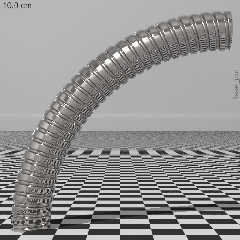
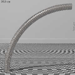
I figured out how to model a flexible lamp neck using an isosurface. It
is a perturbed pair of f_helix1 functions. The coil strip renders
slightly wider on the outside than the on inside, but as long as the
bending isn't extreme, this anomaly isn't too noticeable.
The main problem is that it takes forever when radiosity is used with
the reflective texture. Two pass radiosity shaved only 25% off the
render time.
Now all I have to do is figure out how to aim it at a point_at. The
trig is not straightforward because the light source is not at the tip
of the neck.
Post a reply to this message
Attachments:
Download 'flexed_poc1.jpg' (69 KB)
Download 'flexed_poc3.jpg' (65 KB)
Preview of image 'flexed_poc1.jpg'
Preview of image 'flexed_poc3.jpg'
|
 |
|  |
|  |
|
 |
|
 |
|  |
|  |
|
 |
Cousin Ricky <ric### [at] yahoo com> wrote:
> I figured out how to model a flexible lamp neck using an isosurface. It
> is a perturbed pair of f_helix1 functions. The coil strip renders
> slightly wider on the outside than the on inside, but as long as the
> bending isn't extreme, this anomaly isn't too noticeable.
>
> The main problem is that it takes forever when radiosity is used with
> the reflective texture. Two pass radiosity shaved only 25% off the
> render time.
>
> Now all I have to do is figure out how to aim it at a point_at. The
> trig is not straightforward because the light source is not at the tip
> of the neck.
This looks awesome. It can also make a ggreat shower tube com> wrote:
> I figured out how to model a flexible lamp neck using an isosurface. It
> is a perturbed pair of f_helix1 functions. The coil strip renders
> slightly wider on the outside than the on inside, but as long as the
> bending isn't extreme, this anomaly isn't too noticeable.
>
> The main problem is that it takes forever when radiosity is used with
> the reflective texture. Two pass radiosity shaved only 25% off the
> render time.
>
> Now all I have to do is figure out how to aim it at a point_at. The
> trig is not straightforward because the light source is not at the tip
> of the neck.
This looks awesome. It can also make a ggreat shower tube
Post a reply to this message
|
 |
|  |
|  |
|
 |
|
 |
|  |
|  |
|
 |
On 2021-02-10 6:58 PM (-4), Cousin Ricky wrote:
> I figured out how to model a flexible lamp neck using an isosurface. [SNIP]
>
> Now all I have to do is figure out how to aim it at a point_at. The
> trig is not straightforward because the light source is not at the tip
> of the neck.
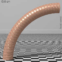
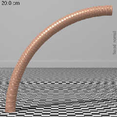
I created a normal for draft or low LOD renders. Compare the attached
images to the neck of the lamp I posted in the thread "Another CSG scene":
https://news.povray.org/web.517a15b185775d2078641e0c0%40news.povray.org
Notice that the texture does not spiral. I had created that lamp for my
3rd generation prefab render rig, and it has a few other deficiencies:
it depends on a private include file; the light bulb surface brightness
is too low; and to make the math easier, I let the light source location
determine the length of the neck instead of the other way around. I'm
now working on a more general lamp macro.
Post a reply to this message
Attachments:
Download 'flexed_normal1.jpg' (45 KB)
Download 'flexed_normal2.jpg' (44 KB)
Preview of image 'flexed_normal1.jpg'
Preview of image 'flexed_normal2.jpg'
|
 |
|  |
|  |
|
 |
|
 |
|  |
|  |
|
 |
Cousin Ricky <ric### [at] yahoo com> wrote:
> I created a normal for draft or low LOD renders.
Just so I fully understand what I'm looking at:
So, is what I'm looking at a 1/4 torus with a normal pattern applied?
If so, then you'd need to generate a new instance of the normal to match another
torus of a different radius?
What's the difference in render speed between the isosurface and the normal
pattern?
> Compare the attached
> images to the neck of the lamp I posted in the thread "Another CSG scene":
>
> https://news.povray.org/web.517a15b185775d2078641e0c0%40news.povray.org
>
> Notice that the texture does not spiral.
I ... can't. Maybe that render is too small, or I'm just not caffeinated
enough....
I probably still need more eye-training to pick up on certain things. com> wrote:
> I created a normal for draft or low LOD renders.
Just so I fully understand what I'm looking at:
So, is what I'm looking at a 1/4 torus with a normal pattern applied?
If so, then you'd need to generate a new instance of the normal to match another
torus of a different radius?
What's the difference in render speed between the isosurface and the normal
pattern?
> Compare the attached
> images to the neck of the lamp I posted in the thread "Another CSG scene":
>
> https://news.povray.org/web.517a15b185775d2078641e0c0%40news.povray.org
>
> Notice that the texture does not spiral.
I ... can't. Maybe that render is too small, or I'm just not caffeinated
enough....
I probably still need more eye-training to pick up on certain things.
Post a reply to this message
|
 |
|  |
|  |
|
 |
|
 |
|  |
|  |
|
 |
On 2021-02-18 7:48 AM (-4), Bald Eagle wrote:
> Cousin Ricky <ric### [at] yahoo com> wrote:
>
>> I created a normal for draft or low LOD renders.
>
> Just so I fully understand what I'm looking at:
> So, is what I'm looking at a 1/4 torus with a normal pattern applied?
> If so, then you'd need to generate a new instance of the normal to match another
> torus of a different radius?
Yes, and yes.
> What's the difference in render speed between the isosurface and the normal
> pattern?
A factor of 5 in a quick test. Maybe more when radiosity is turned on,
but I haven't checked. com> wrote:
>
>> I created a normal for draft or low LOD renders.
>
> Just so I fully understand what I'm looking at:
> So, is what I'm looking at a 1/4 torus with a normal pattern applied?
> If so, then you'd need to generate a new instance of the normal to match another
> torus of a different radius?
Yes, and yes.
> What's the difference in render speed between the isosurface and the normal
> pattern?
A factor of 5 in a quick test. Maybe more when radiosity is turned on,
but I haven't checked.
Post a reply to this message
|
 |
|  |
|  |
|
 |
|
 |
|  |
|  |
|
 |
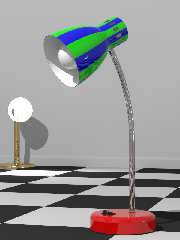
On 2021-02-10 6:58 PM (-4), Cousin Ricky wrote:
> I figured out how to model a flexible lamp neck [snip]
Sneak preview. The harlequin colors are there for testing.
That other lamp in the left background is a rudimentary place holder
that I've been using for the past 5 years.
Post a reply to this message
Attachments:
Download 'desklamp-sneak_preview.jpg' (63 KB)
Preview of image 'desklamp-sneak_preview.jpg'
|
 |
|  |
|  |
|
 |
|
 |
|  |
|  |
|
 |
Cousin Ricky <ric### [at] yahoo com> wrote:
> On 2021-02-10 6:58 PM (-4), Cousin Ricky wrote:
> > I figured out how to model a flexible lamp neck [snip]
>
> Sneak preview. The harlequin colors are there for testing.
>
> That other lamp in the left background is a rudimentary place holder
> that I've been using for the past 5 years.
It looks neat, as something out of toy story ! I find the neck a little too
uniformly reflective, is there conserve_energy with fresnel and IOR dependant
reflection? Some blurry reflections would really 'shine' here... but reflected
checker could of course be an artistic choice. com> wrote:
> On 2021-02-10 6:58 PM (-4), Cousin Ricky wrote:
> > I figured out how to model a flexible lamp neck [snip]
>
> Sneak preview. The harlequin colors are there for testing.
>
> That other lamp in the left background is a rudimentary place holder
> that I've been using for the past 5 years.
It looks neat, as something out of toy story ! I find the neck a little too
uniformly reflective, is there conserve_energy with fresnel and IOR dependant
reflection? Some blurry reflections would really 'shine' here... but reflected
checker could of course be an artistic choice.
Post a reply to this message
|
 |
|  |
|  |
|
 |
|
 |
|  |
|  |
|
 |
Cousin Ricky <ric### [at] yahoo com> wrote:
> On 2021-02-10 6:58 PM (-4), Cousin Ricky wrote:
> > I figured out how to model a flexible lamp neck [snip]
>
> Sneak preview. The harlequin colors are there for testing.
>
> That other lamp in the left background is a rudimentary place holder
> that I've been using for the past 5 years.
Well, you've certainly spent a lot of time honing this object.
The textures are very nice, and they really replicate the real thing.
The base just looks - real. The shape, the gloss, the texture on the toggle
switch, the press-fitting of the lamp neck. Even the little gap between the
base and the floor, where the felt pad presumably is.
The light bulb looks real as well. I looks like thin glass with a thin layer of
kaolin powder coated onto the inside.
It's neat that the texture on the outside of the shade "peeks out" a bit beyond
the inner white.
Should be interesting to see your power cord, and the lit final product.
Of course you're going to want to give the neck spline a bit of non-uniform
wiggle, and from a math and rigging perspective, one would have to define a
minimum radius that the FMC/Greenfield style neck can achieve and somehow
disallow sharper bends. Just a math/programming observation and a puzzle to
suggest. :)
Your placeholder has that antialiasing artifact that just got brought up.
The square in front of it is rather bright - a trick of the lighting and
falloff?
That thing is gonna look _real_ with an HDR environment. :O
As always, very nice, very meticulous work. com> wrote:
> On 2021-02-10 6:58 PM (-4), Cousin Ricky wrote:
> > I figured out how to model a flexible lamp neck [snip]
>
> Sneak preview. The harlequin colors are there for testing.
>
> That other lamp in the left background is a rudimentary place holder
> that I've been using for the past 5 years.
Well, you've certainly spent a lot of time honing this object.
The textures are very nice, and they really replicate the real thing.
The base just looks - real. The shape, the gloss, the texture on the toggle
switch, the press-fitting of the lamp neck. Even the little gap between the
base and the floor, where the felt pad presumably is.
The light bulb looks real as well. I looks like thin glass with a thin layer of
kaolin powder coated onto the inside.
It's neat that the texture on the outside of the shade "peeks out" a bit beyond
the inner white.
Should be interesting to see your power cord, and the lit final product.
Of course you're going to want to give the neck spline a bit of non-uniform
wiggle, and from a math and rigging perspective, one would have to define a
minimum radius that the FMC/Greenfield style neck can achieve and somehow
disallow sharper bends. Just a math/programming observation and a puzzle to
suggest. :)
Your placeholder has that antialiasing artifact that just got brought up.
The square in front of it is rather bright - a trick of the lighting and
falloff?
That thing is gonna look _real_ with an HDR environment. :O
As always, very nice, very meticulous work.
Post a reply to this message
|
 |
|  |
|  |
|
 |
|
 |
|  |
|  |
|
 |
On 2021-02-20 7:24 PM (-4), Bald Eagle wrote:
> Cousin Ricky <ric### [at] yahoo com> wrote:
>>
>> Sneak preview. The harlequin colors are there for testing.
>>
>> That other lamp in the left background is a rudimentary place holder
>> that I've been using for the past 5 years.
>
> Well, you've certainly spent a lot of time honing this object.
> The textures are very nice, and they really replicate the real thing.
>
> The base just looks - real. The shape, the gloss, the texture on the toggle
> switch, the press-fitting of the lamp neck. Even the little gap between the
> base and the floor, where the felt pad presumably is.
That _is_ the felt (or rubber) pad. It's just dark like a shadow.
> The light bulb looks real as well. I looks like thin glass with a thin layer of
> kaolin powder coated onto the inside.
This was a v3.7 render, so I used a layered texture in lieu of
finish-level Fresnel. The material macro autodetects v3.8 and would
just go straight for the finish-level Fresnel, but you have me wondering
if I should bother. When I look at a frosted bulb IRL (actually, an LED
lookalike), it looks like there's some SSLT going on there, but I wasn't
going to bother with it. Maybe the layered texture looks more realistic
than the finish-level Fresnel?
> It's neat that the texture on the outside of the shade "peeks out" a bit beyond
> the inner white.
That's a happy side effect of an attempt to avoid the radiosity
artifacts that would otherwise manifest when the lamp is switched on.
When I first coded the place holders, I ended up with nasty white spots
all over my render rig until I set no_radiosity on the fixtures. But I
only want to do this for the inside of the hood.
> Should be interesting to see your power cord, and the lit final product.
The power cord is still in my "future plans" bin. I'm thinking about
commandeering the Rope module from the object collection, as it may have
already solved the issues that will certainly turn up. My biggest
concern here is the plug: different countries have different standards,
and I'm wondering if the plug should be its own module with
international options.
> Of course you're going to want to give the neck spline a bit of non-uniform
> wiggle, and from a math and rigging perspective, one would have to define a
> minimum radius that the FMC/Greenfield style neck can achieve and somehow
> disallow sharper bends. Just a math/programming observation and a puzzle to
> suggest. :)
A minimum radius will naturally fall out of the constraints that I put
in the lamp macro. I'm glad you're going to work on the wiggle. ;)
> Your placeholder has that antialiasing artifact that just got brought up.
Yes, it is creepy, but I explained why I'd rather live with it.
> The square in front of it is rather bright - a trick of the lighting and
> falloff?
Yes, that's exactly what that is. The light source uses the bulb radius
as its fade distance, which results in very bright illumination near the
light, and a rapid falloff as the distance increases. If you look
carefully, you'll notice that the dark squares closest to the lamp are
also somewhat lighter.
> That thing is gonna look _real_ with an HDR environment. :O
That's half the intention.
Notice the flying saucer shaped reflection in the blue stripe of the
hood: that is the distorted reflection of a second place holder lamp
outside the right of the frame. Only with hyper-white illumination can
such a reflection be realistic. Even so, the light is only 10% of
normal brightness, because I'm only using it as a fill. (The visible
place holder is also a fill. The main light source happens not to be
reflected anywhere.)
One problem that concerns me is reflections of lit bulbs. If the
reflecting surface has a specular or Phong highlight, you end up with
twice the reflected light. For this render environment, I tentatively
solved this by setting no_reflection on the place holder's bulb, but
this results in a highlight that doesn't reflect the extent of the bulb.
When I release the source code for the lamp, there will be a parameter
to turn the reflection on or off, and let the user decide what to do
with highlights--unless someone has a better idea.
> As always, very nice, very meticulous work.
Thanks! com> wrote:
>>
>> Sneak preview. The harlequin colors are there for testing.
>>
>> That other lamp in the left background is a rudimentary place holder
>> that I've been using for the past 5 years.
>
> Well, you've certainly spent a lot of time honing this object.
> The textures are very nice, and they really replicate the real thing.
>
> The base just looks - real. The shape, the gloss, the texture on the toggle
> switch, the press-fitting of the lamp neck. Even the little gap between the
> base and the floor, where the felt pad presumably is.
That _is_ the felt (or rubber) pad. It's just dark like a shadow.
> The light bulb looks real as well. I looks like thin glass with a thin layer of
> kaolin powder coated onto the inside.
This was a v3.7 render, so I used a layered texture in lieu of
finish-level Fresnel. The material macro autodetects v3.8 and would
just go straight for the finish-level Fresnel, but you have me wondering
if I should bother. When I look at a frosted bulb IRL (actually, an LED
lookalike), it looks like there's some SSLT going on there, but I wasn't
going to bother with it. Maybe the layered texture looks more realistic
than the finish-level Fresnel?
> It's neat that the texture on the outside of the shade "peeks out" a bit beyond
> the inner white.
That's a happy side effect of an attempt to avoid the radiosity
artifacts that would otherwise manifest when the lamp is switched on.
When I first coded the place holders, I ended up with nasty white spots
all over my render rig until I set no_radiosity on the fixtures. But I
only want to do this for the inside of the hood.
> Should be interesting to see your power cord, and the lit final product.
The power cord is still in my "future plans" bin. I'm thinking about
commandeering the Rope module from the object collection, as it may have
already solved the issues that will certainly turn up. My biggest
concern here is the plug: different countries have different standards,
and I'm wondering if the plug should be its own module with
international options.
> Of course you're going to want to give the neck spline a bit of non-uniform
> wiggle, and from a math and rigging perspective, one would have to define a
> minimum radius that the FMC/Greenfield style neck can achieve and somehow
> disallow sharper bends. Just a math/programming observation and a puzzle to
> suggest. :)
A minimum radius will naturally fall out of the constraints that I put
in the lamp macro. I'm glad you're going to work on the wiggle. ;)
> Your placeholder has that antialiasing artifact that just got brought up.
Yes, it is creepy, but I explained why I'd rather live with it.
> The square in front of it is rather bright - a trick of the lighting and
> falloff?
Yes, that's exactly what that is. The light source uses the bulb radius
as its fade distance, which results in very bright illumination near the
light, and a rapid falloff as the distance increases. If you look
carefully, you'll notice that the dark squares closest to the lamp are
also somewhat lighter.
> That thing is gonna look _real_ with an HDR environment. :O
That's half the intention.
Notice the flying saucer shaped reflection in the blue stripe of the
hood: that is the distorted reflection of a second place holder lamp
outside the right of the frame. Only with hyper-white illumination can
such a reflection be realistic. Even so, the light is only 10% of
normal brightness, because I'm only using it as a fill. (The visible
place holder is also a fill. The main light source happens not to be
reflected anywhere.)
One problem that concerns me is reflections of lit bulbs. If the
reflecting surface has a specular or Phong highlight, you end up with
twice the reflected light. For this render environment, I tentatively
solved this by setting no_reflection on the place holder's bulb, but
this results in a highlight that doesn't reflect the extent of the bulb.
When I release the source code for the lamp, there will be a parameter
to turn the reflection on or off, and let the user decide what to do
with highlights--unless someone has a better idea.
> As always, very nice, very meticulous work.
Thanks!
Post a reply to this message
|
 |
|  |
|  |
|
 |
|
 |
|  |
|  |
|
 |
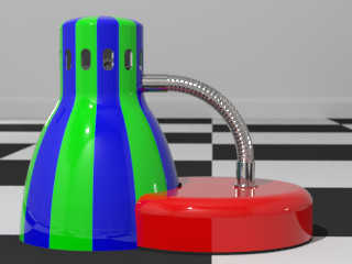
On 2021-02-20 7:24 PM (-4), Bald Eagle wrote:
>
> Of course you're going to want to give the neck spline a bit of non-uniform
> wiggle, and from a math and rigging perspective, one would have to define a
> minimum radius that the FMC/Greenfield style neck can achieve and somehow
> disallow sharper bends. Just a math/programming observation and a puzzle to
> suggest. :)
Not sure how to prevent this kind of accident.
Post a reply to this message
Attachments:
Download 'lamp-xtreme_bend.jpg' (21 KB)
Preview of image 'lamp-xtreme_bend.jpg'
|
 |
|  |
|  |
|
 |
|
 |
|  |


![]()