|
|
|
|
|
|
| |
| |
|
|
|
|
| |
| |
|
|
"nemesis" <nam### [at] gmail com> schreef in bericht
news:4ace301a@news.povray.org...
> Very nice scene. The architecture just fits the mood.
>
> though I have to say I don't quite see the effect of the proximity
> macro...
>
Thanks. The proximity on the building is very subtle but still there. I
found out that on these kind of objects, it is rather difficult to find a
satisfying range. It is much easier with irregular objects like the statue.
Thomas com> schreef in bericht
news:4ace301a@news.povray.org...
> Very nice scene. The architecture just fits the mood.
>
> though I have to say I don't quite see the effect of the proximity
> macro...
>
Thanks. The proximity on the building is very subtle but still there. I
found out that on these kind of objects, it is rather difficult to find a
satisfying range. It is much easier with irregular objects like the statue.
Thomas
Post a reply to this message
|
|
| |
| |
|
|
|
|
| |
| |
|
|
"Stephen" <mcavoysAT@aolDOTcom> schreef in bericht
news:u4fsc59i4rib7ljln0fe2nl2il9g1m16o4@4ax.com...
>
> Looks like a winner to me ;)
>
Hehe. That will depend on what is still to come... :-)
Thomas
Post a reply to this message
|
|
| |
| |
|
|
|
|
| |
| |
|
|
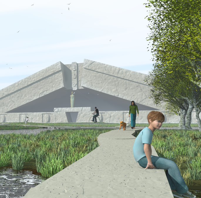
"Thomas de Groot" <tDOTdegroot@interDOTnlANOTHERDOTnet> wrote:
> Originally intended for the latest TC-RTC Challenge, this version did not
> make it. Still, I suppose you will appreciate it here :-)
>
> concept of "buried architecture" (architecture ensevelie). I made several
> uses of Edouard Poor's proximity macro in this scene. Most difficult for
> geometrical architectural forms, but easier for free forms like the statue.
>
> --
> All the best,
>
> Thomas
It seems a partial portrait of an ideal world.
I wish could live inside.
:-)
Post a reply to this message
|
|
| |
| |
|
|
|
|
| |
| |
|
|
Really nice one :-)
> Originally intended for the latest TC-RTC Challenge, this version did not
> make it. Still, I suppose you will appreciate it here :-)
>
> concept of "buried architecture" (architecture ensevelie). I made several
> uses of Edouard Poor's proximity macro in this scene. Most difficult for
> geometrical architectural forms, but easier for free forms like the statue.
>
>
Post a reply to this message
|
|
| |
| |
|
|
|
|
| |
| |
|
|
"Thomas de Groot" <tDOTdegroot@interDOTnlANOTHERDOTnet> wrote in message
news:4acdf64c@news.povray.org...
> Originally intended for the latest TC-RTC Challenge, this version did not
> make it. Still, I suppose you will appreciate it here :-)
Yes ... very nice. I've learned alot about depth queue's from your work. I
like how the sidewalk pulls the viewer into the scene!
Jim
Post a reply to this message
|
|
| |
| |
|
|
From: Christian Froeschlin
Subject: Re: Another Boullée_architecture
Date: 9 Oct 2009 06:47:04
Message: <4acf14a8@news.povray.org>
|
|
|
| |
| |
|
|
Thomas de Groot wrote:
> Ambient? No ambient. Only radiosity and some fog. Display gamma at 2.2. no
> assumed gamma. rendered in 3.7
Hmm it looks bright to be too. Funny thing is it seems to look
better to me when applying the inverse gamma correction of 0.45,
so I wonder if there is any way the correction is applied twice.
As far as I understand it, jpeg does not support gamma information
and contains the gamma corrected RGB values for your display gamma.
Can you post the unprocessed png output from POV for comparison?
Post a reply to this message
|
|
| |
| |
|
|
|
|
| |
| |
|
|
Christian Froeschlin <chr### [at] chrfrde> wrote:
> Thomas de Groot wrote:
>
> > Ambient? No ambient. Only radiosity and some fog. Display gamma at 2.2. no
> > assumed gamma. rendered in 3.7
>
> Hmm it looks bright to be too. Funny thing is it seems to look
> better to me when applying the inverse gamma correction of 0.45,
> so I wonder if there is any way the correction is applied twice.
I too have noticed this about your images, Thomas. I have come to think of it as
an aspect of your image style, your POV 'personality' as it were!
It usually looks as if your fog distance is a little small. However, juggling
fog distance to minimise washout and get the best depth cues (and/or sky
gradient) is not easy. I've got it wrong before - in an effort to get a hazy
atmosphere I think I overly washed out my chess-based RTC image from a while
back. (My main problem is that my laptop screen is damaged, so brightness is
uneven across its surface, and, coupled with the usual viewing-angle variations,
makes it difficult for me to judge image brightness.)
Bill
Post a reply to this message
|
|
| |
| |
|
|
|
|
| |
| |
|
|
"Christian Froeschlin" <chr### [at] chrfrde> schreef in bericht
news:4acf14a8@news.povray.org...
> Thomas de Groot wrote:
>
>> Ambient? No ambient. Only radiosity and some fog. Display gamma at 2.2.
>> no assumed gamma. rendered in 3.7
>
> Hmm it looks bright to be too. Funny thing is it seems to look
> better to me when applying the inverse gamma correction of 0.45,
> so I wonder if there is any way the correction is applied twice.
>
> As far as I understand it, jpeg does not support gamma information
> and contains the gamma corrected RGB values for your display gamma.
> Can you post the unprocessed png output from POV for comparison?
The png would be too large (>1 Mb) to post here.
What I wonder about: How do you see the immediate foreground? Too bright?
Normal? Because it may just be my fog used that is the cause.
Thomas
Post a reply to this message
|
|
| |
| |
|
|
From: Thomas de Groot
Subject: Re: Another =3D?ISO-8859-1?Q?Boull=3DE9e_architecture?=3D
Date: 9 Oct 2009 07:37:06
Message: <4acf2062$1@news.povray.org>
|
|
|
| |
| |
|
|
"Bill Pragnell" <bil### [at] hotmailcom> schreef in bericht
news:web.4acf17e085ed91266dd25f0b0@news.povray.org...
>
> I too have noticed this about your images, Thomas. I have come to think of
> it as
> an aspect of your image style, your POV 'personality' as it were!
>
> It usually looks as if your fog distance is a little small. However,
> juggling
> fog distance to minimise washout and get the best depth cues (and/or sky
> gradient) is not easy. I've got it wrong before - in an effort to get a
> hazy
> atmosphere I think I overly washed out my chess-based RTC image from a
> while
> back. (My main problem is that my laptop screen is damaged, so brightness
> is
> uneven across its surface, and, coupled with the usual viewing-angle
> variations,
> makes it difficult for me to judge image brightness.)
>
The fog distance may certainly be a bit too small, especially when looking
at the inside of the building. However, I do not feel that as a problem and
rather welcome the wash out there, so maybe this is about differences of
perception between observers :-)
My principal test when considering fog is how crisp the foreground is
compared to the background or the middle ground. I must admit too that media
works better than fog of course, but I do not always opt for that solution.
Thomas
Post a reply to this message
|
|
| |
| |
|
|
|
|
| |
| |
|
|
"Christian Froeschlin" <chr### [at] chrfrde> schreef in bericht
news:4acf14a8@news.povray.org...
> Can you post the unprocessed png output from POV for comparison?
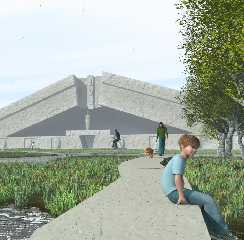
I post here a cropped part of the image.
Thomas
Post a reply to this message
Attachments:
Download 'boullee_architectureensevelie_var1_02_croped.png' (949 KB)
Preview of image 'boullee_architectureensevelie_var1_02_croped.png'
|
|
| |
| |
|
|
|
|
| |