|
|
|
|
|
|
| |
| |
|
|
|
|
| |
| |
|
|
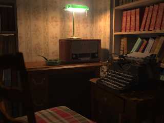
Jaime Vives Piqueres wrote:
>> The green lamp looks somewhat out of place there...
>
> You mean that it is badly placed? Or that is it the wrong choice of
> lamp? Or perhaps both? :)
Huh, the green looks brighter than the light itself. ;)
Post a reply to this message
|
|
| |
| |
|
|
|
|
| |
| |
|
|
"Christian Froeschlin" <chr### [at] chrfr de> wrote in message
news:49f885f3$1@news.povray.org...
> Very nice, although the decoration and preferred color
> scheme does not convince me he would embrace art deco lamps
> in poisonous green. Must have been a christmas present ;)
I'm assuming that was intended. That's why I'd prefer repositioning of the
camera for more explicit focus on the lamp. de> wrote in message
news:49f885f3$1@news.povray.org...
> Very nice, although the decoration and preferred color
> scheme does not convince me he would embrace art deco lamps
> in poisonous green. Must have been a christmas present ;)
I'm assuming that was intended. That's why I'd prefer repositioning of the
camera for more explicit focus on the lamp.
Post a reply to this message
|
|
| |
| |
|
|
|
|
| |
| |
|
|
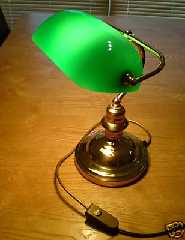
Le Thu, 30 Apr 2009 20:23:09 +0200, Jaime Vives Piqueres
>> You are definitely a master, Jaime! Congrats! Perhaps a little tweak on
>> the lamp, but all is breathtaking.
>>
>
> Thanks! ...but can you tell me what kind of tweaking you have in mind?
>
> --
> Jaime
The lamp seems too bright to me (so far I can remember how those banker
lamps glow). After a quick search on the web, I found this example but the
global lighting is different. Hope this helps.
Bruno
--
http://www.opera.com/mail/
Post a reply to this message
Attachments:
Download '8cf0_1.jpg' (17 KB)
Preview of image '8cf0_1.jpg'
|
|
| |
| |
|
|
From: Jaime Vives Piqueres
Subject: Re: Writing Corner [WIP] (114KB)
Date: 10 May 2009 15:52:26
Message: <4a07307a@news.povray.org>
|
|
|
| |
| |
|
|
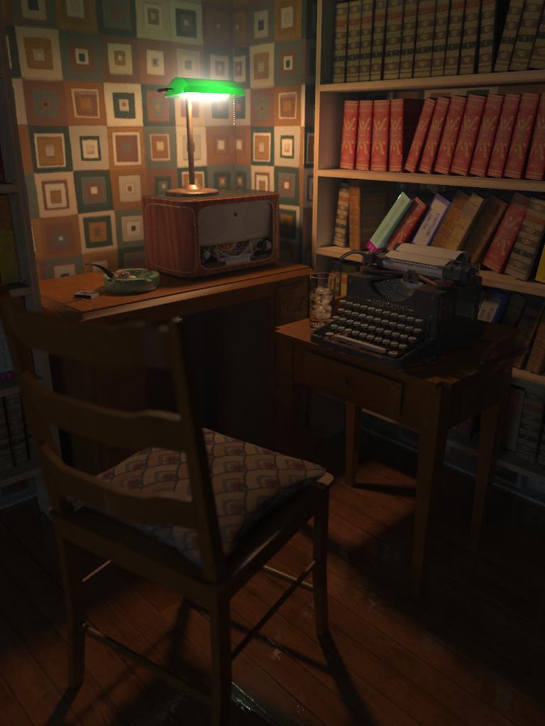
Here is an update on this one, trying to address some of the
suggestions/criticism: as always you all did a good job, thanks!
On the last one I changed the format to portrait, but I cannot decide which
approach one I like most... will surely stop there and just go onto
something else, as usual.
--
Jaime
Post a reply to this message
Attachments:
Download 'writing-corner-10.jpg' (50 KB)
Download 'writing-corner-13.jpg' (64 KB)
Preview of image 'writing-corner-10.jpg'
Preview of image 'writing-corner-13.jpg'
|
|
| |
| |
|
|
|
|
| |
| |
|
|
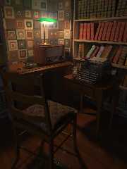
> Truly a splendid image! Thanks for sharing it. As for a suggestion... how
> about a bit of "dramatic tension" (in a whimsical vein) created by a pair
> of wire rim spectacles left on the seat of the chair?
Yes, that would have been very dramatic if I was able to model the
spectacles easily... I did a quick try with Wings3D, but quickly gave up.
Thanks anyhow, it was a nice suggestion... in a whimsical vein. :)
--
Jaime
Post a reply to this message
|
|
| |
| |
|
|
From: Jaime Vives Piqueres
Subject: Re: Writing Corner [WIP] (68KB)
Date: 10 May 2009 16:10:01
Message: <4a073499@news.povray.org>
|
|
|
| |
| |
|
|
> Very nice! Lovely nuances. I haven't smoked a pipe in some time, but I
> always appreciated hand carved briarwood pipes. Anyone who uses a pipe,
> usually has more than one and has a nice little pipe stand for them...
>
> Take a look at Boswell's pipes:
> http://www.boswellpipes.com/pipegallery.html
>
Thanks, very nice pipes... but I finally did a simple classic one and a
simple ashtray, with a matches box to complete the "smoking set".
--
Jaime
Post a reply to this message
|
|
| |
| |
|
|
From: Jaime Vives Piqueres
Subject: Re: Writing Corner [WIP] (68KB)
Date: 10 May 2009 16:13:42
Message: <4a073576@news.povray.org>
|
|
|
| |
| |
|
|
> I believe the typesetter's brand name is flipped or mirrored. Not sure,
> though...
Oops... you're right! In fact, the whole scene is mirrored because the
camera is the one exported from Chief Architect. But then I noticed that I
did a mistake when I modeled the typewriter years ago: the carriage return
is on the wrong side! ...so I just mirrored the brand name. ;)
--
Jaime
Post a reply to this message
|
|
| |
| |
|
|
|
|
| |
| |
|
|
Jaime Vives Piqueres wrote:
> the carriage return is on the wrong side!
On old typewriters, the carriage return was often on the left.
That said, nice picture! :-)
--
Darren New, San Diego CA, USA (PST)
There's no CD like OCD, there's no CD I knoooow!
Post a reply to this message
|
|
| |
| |
|
|
|
|
| |
| |
|
|
Jaime Vives Piqueres wrote:
> Here is an update on this one, trying to address some of the
> suggestions/criticism: as always you all did a good job, thanks!
Beautiful job!
>
> On the last one I changed the format to portrait, but I cannot decide which
> approach one I like most...
Oh I can. The first version without a doubt. I know why you are
tempted by the second and I can tell you it is because your brain is
getting in the way. Too much there. We don;t need that much to 'get' it.
Post a reply to this message
|
|
| |
| |
|
|
|
|
| |
| |
|
|
"Darren New" <dne### [at] sanrrcom> schreef in bericht
news:4a073fd8@news.povray.org...
> On old typewriters, the carriage return was often on the left.
'often'?! I would say 'always', as you have to push the carriage from the
end of the line (right side) to the start of a new line (left side) - at
least in western languages :-)
Now, it is true that the truly ancient typewriters had quixotic ways of
functioning, but at the time of the pictured one, I believe all carriage
returns were left-handed.
Thomas
Post a reply to this message
|
|
| |
| |
|
|
|
|
| |