|
|
|
|
|
|
| |
| |
|
|
|
|
| |
| |
|
|
Rune wrote:
> andrel wrote:
>> Rune wrote:
>>> What do you think?
>>>
>> That it, apart from aesthetics, would depend on things I don't know.
>> One is the printing process.
>
> I have yet to investigate the printing process for the posters for myself. I
> plan to have them made locally (by which I mean in this country), but after
> that I plan to put the designs on Zazzle. I also don't know the printing
> process on Zazzle...
>
>> My experiences with blueish backgrounds using professional CMYK
>> printers are not good. None of my book covers that have shades of
>> blue are any near the color that I specified.
>
> Worse than with private CMYK printers?
Yes much. BTW I meant the offset printers used for printing the covers
of books. Printers used in shops are probably closer to your private
printer. What we have in our department is essentially an big inkjet for A0.
> Because in my own print tests all the
> background colors I've tried have matched beautifully in the first try.
>
>> The other big question is the wall you will be hanging it on.
>
> White walls. (Or off-white or whatever it's called that means that it's not
> completely sterile white, but it looks white none the less.)
>
>> If the background color differs too much from the wall color, the first
>> impression would be the composition of the frames and not what is in it.
>
> Well, since this composition is part of the "art", that isn't completely
> undesired, but of course it should preferably be balanced.
>
>> I assumed that you were going for a white background
>> because you had a white wall. If the wall color is not white, using
>> the same color as a background immediately suggests that the picture
>> was designed specific for that wall. That would give the whole thing
>> another level. It might also lead to more people saying 'oh, can you
>> do something for me too?' If that is a good thing or not depends on
>> how you plan the rest of your career.
>
> White wall or not, I'm not sure I agree that the posters should preferably
> be the same color as the wall.
I didn't say that. I just wanted to point out that if they are too
different, in the real situation when you enter the room it might be
from such distance that the first impression is that of 6 rectangular
frames hanging on the wall. Also because you have a lot of background in
the images.
BTW how much time would it take to paint your background and the wall
e.g. mint green in the full room image (with different textures so there
is a small difference in color)?
> Part of the reason to put up images on the
> wall in the first place is to break the big plain surface IMO. If they
> should deviate little, some or much from the color of the wall is a matter
> of how strong an effect is desired. I agree though, that the more difference
> there's between the wall and main poster color, the stronger and more
> contrasted the motive must be to still shine through and make impact.
>
Post a reply to this message
|
|
| |
| |
|
|
|
|
| |
| |
|
|
"Rune" <new### [at] runevision com> wrote:
> I tried out a few more colors. I gave Christians suggested sky blue another
> chance and made a lighter less saturated blue. It looked better. Quite ok.
> Then I tried gold to see if really no colors with yellow in would work at
> all. Gold looks ok too actually. Not something I'd have on my walls myself,
> but it doesn't look wrong. Then, for some reason I tried an average of light
> blue and gold - and got a really nice color I thought first was called
> beige, but is actually called khaki (according to wikipedia). This is the
> first light color I really like as background. So now, I'm even more
> undecided... :/
>
I like the khaki or the blues best.
What would it look like if you tried to get almost the exact colour of the
wall it's being mounted on?
-tgq com> wrote:
> I tried out a few more colors. I gave Christians suggested sky blue another
> chance and made a lighter less saturated blue. It looked better. Quite ok.
> Then I tried gold to see if really no colors with yellow in would work at
> all. Gold looks ok too actually. Not something I'd have on my walls myself,
> but it doesn't look wrong. Then, for some reason I tried an average of light
> blue and gold - and got a really nice color I thought first was called
> beige, but is actually called khaki (according to wikipedia). This is the
> first light color I really like as background. So now, I'm even more
> undecided... :/
>
I like the khaki or the blues best.
What would it look like if you tried to get almost the exact colour of the
wall it's being mounted on?
-tgq
Post a reply to this message
|
|
| |
| |
|
|
|
|
| |
| |
|
|
andrel wrote:
> Rune wrote:
>> White wall or not, I'm not sure I agree that the posters should
>> preferably be the same color as the wall.
>
> I didn't say that. I just wanted to point out that if they are too
> different, in the real situation when you enter the room it might be
> from such distance that the first impression is that of 6 rectangular
> frames hanging on the wall. Also because you have a lot of background
> in the images.
Yes, I agree.
> BTW how much time would it take to paint your background and the wall
> e.g. mint green in the full room image (with different textures so
> there is a small difference in color)?
I'm not sure what you mean. I can easily make a preview with any color for
the image backgrounds and any color for the wall if you give me some color
vectors (it's easier than me having to guess what color you mean). I'm not
sure what you mean about "different textures so there is a small difference
in color".
Rune
--
http://runevision.com
Post a reply to this message
|
|
| |
| |
|
|
|
|
| |
| |
|
|
St. wrote:
> "Rune" <new### [at] runevisioncom> wrote in message
> news:46c86c63@news.povray.org...
>
>> Khaki is up at http://runevision.com/3d/metalandflowers/
>
> I like all variations Rune! Very small typo noticed - "motive"
> should be 'motif'.
Ah, thanks! The two words are pronounced and spelled the same in Danish, so
I often forget this difference.
Rune
--
http://runevision.com
Post a reply to this message
|
|
| |
| |
|
|
|
|
| |
| |
|
|
Trevor G Quayle wrote:
> "Rune" <new### [at] runevisioncom> wrote:
>> I tried out a few more colors. I gave Christians suggested sky blue
>> another chance and made a lighter less saturated blue. It looked
>> better. Quite ok. Then I tried gold to see if really no colors with
>> yellow in would work at all. Gold looks ok too actually. Not
>> something I'd have on my walls myself, but it doesn't look wrong.
>> Then, for some reason I tried an average of light blue and gold -
>> and got a really nice color I thought first was called beige, but is
>> actually called khaki (according to wikipedia). This is the first
>> light color I really like as background. So now, I'm even more
>> undecided... :/
>>
>
> I like the khaki or the blues best.
> What would it look like if you tried to get almost the exact colour
> of the wall it's being mounted on?
Well, the white version is already almost the same color as my white wall.
In the preview it's slighter lighter than the wall (I did this because paper
is lighter than my walls). However, later I've found out than the paper,
when put behind the glass of the framing, is actually slightly darker than
the walls, due to the tint and shadow of the glass. Note that the glass is
not colored; the tiny coloring of clear glass is enough to make this
difference.
If you meant for some other color than white, you can provide a color vector
for the background and for the wall, and I'll try to make a preview.
Rune
--
http://runevision.com
Post a reply to this message
|
|
| |
| |
|
|
|
|
| |
| |
|
|
These are all beautiful images and an interesting concept. Thanks for
posting.
I've seen some very nice photograph frames that use clear glass as the
mat. This allows the wall color to show through, and might be a good
choice here too. Do you think the technology exists to print onto a
transparent background?
Post a reply to this message
|
|
| |
| |
|
|
|
|
| |
| |
|
|
Interesting problem. I think one of the reasons you can end up chasing
your tail here is due to the number of factors involved. Different
people, and you at different times, are going to focus on the emphasis
of one thing or another as the most important, and the different choices
emphasize different things. What further complicates the problem is
that the different choices can strike more abstract, elusive, less
identifiable chords within the viewer. Like when you say words like
"cheap" or "tacky".
And the image, for all its simple appeal, does have enough elements such
that something suffers and something benefits from each color variation.
I don's see any choice that compliments each element perfectly. So it
reduces, as you said, to a kind of comprimise, which doesn't sit well
either when you are seeking that final piece which completes the puzzle.
The white, because it is neutral, gives a good general comprimise. And
has the huge benefit of not having to commit to a specific color.
Specific colors have specific associations and so will become more
quickly boring. But white is not without cost. For me, huge cost. One
cost, as you pointed out, is that it conflicts with the highlights on
the metal to create an overall harsh appearance. This is worsened by the
look of the shadows on the wall, they don't seem to 'stick' to the wall
to create space. Instead they meander and confuse the eye. But worst of
all for me about the white, it eats up the beautiful, delicate
highlights in the petals of the flowers, which give them such velvety
luminence. These highlights are shown off best by the dark blue
version. (look at the largest flower in particular)
These effects of the dark blue surprised me. In the postage stamp image
in your post, the blue did not seem to do well creating bleed problems
with the low vales of red, as one would expect. But in the larger
resolution version it does not have this problem at all! In fact it
sets off the edges of the petals crisply, while making the luminence of
the highlights visually pop. Likewise it shows off the metallic
highlights without confusion, and draws out the warm highlights of the
browns in the stem quite beautifully, but with a little more softness so
that they remain the secondary, harmonizing element to the flowers. And
finally, the shadows work better in concert with the deeper tone of the
blue, staying in place, and more subtly creating relief.
And the shallow, but distinct relief seems important. The dark, brown
version would have seemed the obvious choice. No conflicts, each of the
elements framed in an encompassing murk which allows the lighted forms
to emerge equally. It is neutral and so will always retain some mystery
without the specific associations of a saturated color. And to the
extent that it is a color it tends toward the warmth of the main
attraction of the picture, the flowers. Presumably this is one reason
the 'masters' preferred such a solution. The shadows on the background
are no longer a bother, compositionally or otherwise, all that remains
is a gentle, dampening, satisfying, play of form. And that is the main
problem, the lost of those other elements which gives the piece such
tension, visually and conceptually. That second wall.
The main problem with the dark blue may be that it works too well and
the blue/brown harmony is just too known and overworked as a 'sure
thing'. Also the deep tone is emotionally more comlicated perhaps. The
teal is really a different version of the blue, with the green providing
more contrast to the red as opposites along one color axis. This makes
it less of a neutral background element that the blue and it starts to
eat up the saturation of the red slighly and is not so harmonious with
the stems. But maybe this gives a bit of added tension.
The khaki is really a variation on the white but trying to make it less
harsh. The hue gives it the ability to set off the metal where a grey
would not and it sets off the dark undershadows of the stems and metal
where the deeper toned variations soften them. This is probably the
appeal for many viewers. But again it comes at some expense to the
delicacy of the petals.
My preference would be the khaki or the deep blue.
Post a reply to this message
|
|
| |
| |
|
|
|
|
| |
| |
|
|
Ooh, I'm sold on the khaki. Teal would be my second choice. :-)
--
William Tracy
afi### [at] gmailcom wtr### [at] calpolyedu
You know you've been raytracing too long when you dream of real-time
raytraced games and game engines.
Neil Clark
Post a reply to this message
|
|
| |
| |
|
|
|
|
| |
| |
|
|
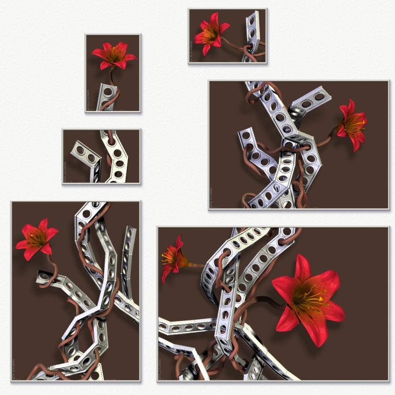
Jim Charter wrote:
> Interesting problem. I think one of the reasons you can end up
> chasing your tail here is due to the number of factors involved.
> Different people, and you at different times, are going to focus on
> the emphasis of one thing or another as the most important, and the
> different choices emphasize different things.
Yeah... The different versions have different feels and qualities. I like
them all, it's just a matter of which I want to have hanging on my wall, not
because it's the best (I don't think there's any "best"), but because it
evokes the feel i want in my room.
> And the shallow, but distinct relief seems important. The dark, brown
> version would have seemed the obvious choice. No conflicts, each of
> the elements framed in an encompassing murk which allows the lighted
> forms to emerge equally. It is neutral and so will always retain
> some mystery without the specific associations of a saturated color.
> And to the extent that it is a color it tends toward the warmth of
> the main attraction of the picture, the flowers.
Brown, like in the attached version? I agree that this looks quite good and
rather balanced.
> My preference would be the khaki or the deep blue.
Those two seem to be the preferences of many, and I must say that they are
the most hamonious. However, I've decided that I prefer for myself the
slightly more "playful" and "fresh" feel that the teal version evokes in me.
My original intention was for the flowers to not only be in harmony with the
rest of the image, but also be rather bold and almost vulgar in intensity.
The white version has this. The khaki and blue versions make the whole image
a bit more calm in my opinion (and in the green version the background sort
of competes with the flowers for attention), while the teak somehow
preserves the boldness and "attitude", though in a way that enhances the
flowers rather than competing with them.
Rune
--
http://runevision.com
Post a reply to this message
Attachments:
Download 'metal12_composition_brown.jpg' (171 KB)
Preview of image 'metal12_composition_brown.jpg'

|
|
| |
| |
|
|
|
|
| |
| |
|
|
Spock wrote:
> These are all beautiful images and an interesting concept. Thanks for
> posting.
Glad to. :)
> I've seen some very nice photograph frames that use clear glass as the
> mat. This allows the wall color to show through, and might be a good
> choice here too. Do you think the technology exists to print onto a
> transparent background?
Hmm, possibly? But I doubt it's a viable option for my wallet... :/
Also, I don't personally think that it's necessary good to aliminate the
difference between the background color and the color of the wall.
Rune
--
http://runevision.com
Post a reply to this message
|
|
| |
| |
|
|
|
|
| |
|
|