|
 |
Jim Charter wrote:
> Interesting problem. I think one of the reasons you can end up
> chasing your tail here is due to the number of factors involved.
> Different people, and you at different times, are going to focus on
> the emphasis of one thing or another as the most important, and the
> different choices emphasize different things.
Yeah... The different versions have different feels and qualities. I like
them all, it's just a matter of which I want to have hanging on my wall, not
because it's the best (I don't think there's any "best"), but because it
evokes the feel i want in my room.
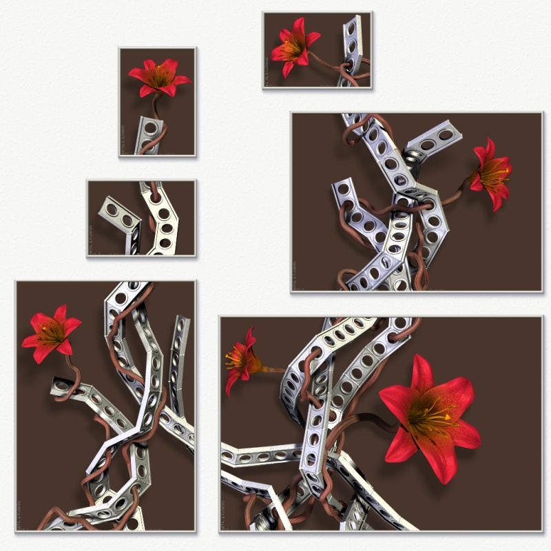
> And the shallow, but distinct relief seems important. The dark, brown
> version would have seemed the obvious choice. No conflicts, each of
> the elements framed in an encompassing murk which allows the lighted
> forms to emerge equally. It is neutral and so will always retain
> some mystery without the specific associations of a saturated color.
> And to the extent that it is a color it tends toward the warmth of
> the main attraction of the picture, the flowers.
Brown, like in the attached version? I agree that this looks quite good and
rather balanced.
> My preference would be the khaki or the deep blue.
Those two seem to be the preferences of many, and I must say that they are
the most hamonious. However, I've decided that I prefer for myself the
slightly more "playful" and "fresh" feel that the teal version evokes in me.
My original intention was for the flowers to not only be in harmony with the
rest of the image, but also be rather bold and almost vulgar in intensity.
The white version has this. The khaki and blue versions make the whole image
a bit more calm in my opinion (and in the green version the background sort
of competes with the flowers for attention), while the teak somehow
preserves the boldness and "attitude", though in a way that enhances the
flowers rather than competing with them.
Rune
--
http://runevision.com
Post a reply to this message
Attachments:
Download 'metal12_composition_brown.jpg' (171 KB)
Preview of image 'metal12_composition_brown.jpg'

|
|