|
|
|
|
|
|
| |
| |
|
|
|
|
| |
| |
|
|
PM 2Ring wrote:
> "gonzo" <rgo### [at] lanset com> wrote:
>
>>Jim Charter <jrc### [at] msncom> wrote:
>>
>>This is starting to look quite realistic. As Steve said, it looks like a
>>flash photo with backscatter from suspended particles in the water column.
>
>
> I see you've stolen Gilles Tran's program which converts photographs to
> scene files. :)
>
> This would have to be the most realistic POV underwater image I've ever
> seen.
>
That's quite a compliment! Thankyou. com> wrote:
>
>>Jim Charter <jrc### [at] msncom> wrote:
>>
>>This is starting to look quite realistic. As Steve said, it looks like a
>>flash photo with backscatter from suspended particles in the water column.
>
>
> I see you've stolen Gilles Tran's program which converts photographs to
> scene files. :)
>
> This would have to be the most realistic POV underwater image I've ever
> seen.
>
That's quite a compliment! Thankyou.
Post a reply to this message
|
|
| |
| |
|
|
|
|
| |
| |
|
|
Thomas de Groot wrote:
> "Jim Charter" <jrc### [at] msncom> schreef in bericht
> news:42dd4561@news.povray.org...
>
>>I have taken the approach of incrementally refining different aspects of
>> the scene rather than trying to perfect one thing, say the model,
>>before proceeding to the next. I am still tempted to use just a black
>>bg for the scene though.
>>
>
> Wow! Not only convincing, but terrifying! Very good job.
>
Thankyou. As usual, what started out to be an easy exercise has quickly
catapulted to the "edge" of my "envelop" of skills.
Post a reply to this message
|
|
| |
| |
|
|
|
|
| |
| |
|
|
Marneus Calgar wrote:
>
>> I have taken the approach of incrementally refining different aspects
>> of the scene rather than trying to perfect one thing, say the model,
>> before proceeding to the next. I am still tempted to use just a black
>> bg for the scene though.
>
>
> Looks very nice to me !
> Please don't put a black bg !!!!!
>
Okay, but I gotta say, the tests done with a black bg are colourful and
pretty in a way the media bg's are not. So maybe I'll comprimise and
promise not to post a black bg version without also doing a media version.
Post a reply to this message
|
|
| |
| |
|
|
|
|
| |
| |
|
|
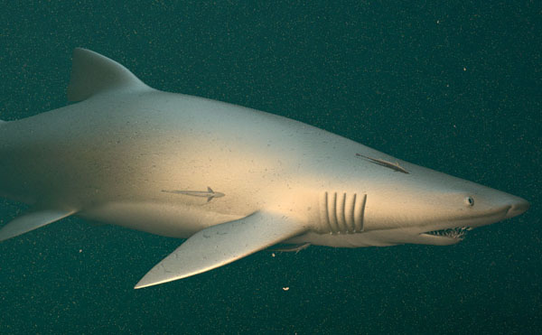
Rene Bui wrote:
> Jim Charter <jrc### [at] msncom> wrote:
>
> Why not try a black bg with a stronger and harsh light.
Many test runs are like that and it must be said they look very pretty.
The spot light with falloff alone gives a very nice sense of the fish
emerging from the gloom and the color looks clear and crisp.
In this latest test I reduced the degree of large flopsum, added a fine
grained pea and reduced the general scattering to almost black. I also
added real absorption to produce the color from the overhead light
(formerly it was just a colored light overhead.)
Also, in response to gonzo I adjusted the whole scene so that the camera
is now about 8 units from an 11 unit shark with a fade distance about 6
units, fade power 7 or so and a lens and spotlight angle of around 60
degrees. The overhead light is about 100 units up with fade at 50
units, power 4. I also used the Rune/Shay contrast trick
There is also enough modelling changes in this one, mostly to the eye
and vicinity and lower jaw, that I had to do a lot of work to fix the uv
map. But I am not entirely happy with the results so I attach a
downscaled shot of the test here.
Post a reply to this message
Attachments:
Download 'img.00111.jpg' (52 KB)
Preview of image 'img.00111.jpg'
|
|
| |
| |
|
|
|
|
| |
| |
|
|
bob wrote:
> Jim Charter wrote:
>
>> I have taken the approach of incrementally refining different aspects
>> of the scene rather than trying to perfect one thing, say the model,
>> before proceeding to the next. I am still tempted to use just a black
>> bg for the scene though.
>
>
> well, i'm not much into "lifelike" critters in tracing, but this is
> nice. i like the chunks.
>
> bob
Thanks. As I am sure you realize the chunks are just an added media
layer with a granite density pattern that's mostly black. Looks okay as
long as a "chunk" doesn't overlap the figure. Then the chunk looks
faded for reasons I am clueless about.
Post a reply to this message
|
|
| |
| |
|
|
|
|
| |
| |
|
|
Jim Charter <jrc### [at] msncom> wrote:
> map. But I am not entirely happy with the results so I attach a
> downscaled shot of the test here.
Jim, it's better and better. The environment, the lighting and modelling are
great and remoras add a life-like touch. The head is very convincing too.
But I think there is something wrong with the skin texture. It seems like a
sort of metallized plastic. Honnestly, I don't know how to fix it, maybe
with the normal-map (?). I think Grey-nurse (or Sand-tiger) skin have many
more spottings than you did. And also, the fins could be a bit darker with
color variations...etc.
http://www.dinosoria.com/diapo_requins/images/requin_taureau_jpg.jpg
http://www.dinosoria.com/diapo_requins/images/requin_taureau_002_jpg.jpg
Rene
http://rene.bui.free.fr - online portfolio
Post a reply to this message
|
|
| |
| |
|
|
|
|
| |
| |
|
|
Rene Bui wrote:
> Jim Charter <jrc### [at] msncom> wrote:
>
>>map. But I am not entirely happy with the results so I attach a
>>downscaled shot of the test here.
>
>
> Jim, it's better and better. The environment, the lighting and modelling are
> great and remoras add a life-like touch. The head is very convincing too.
> But I think there is something wrong with the skin texture. It seems like a
> sort of metallized plastic. Honnestly, I don't know how to fix it, maybe
> with the normal-map (?). I think Grey-nurse (or Sand-tiger) skin have many
> more spottings than you did. And also, the fins could be a bit darker with
> color variations...etc.
> http://www.dinosoria.com/diapo_requins/images/requin_taureau_jpg.jpg
> http://www.dinosoria.com/diapo_requins/images/requin_taureau_002_jpg.jpg
>
Hi Rene, I truly appreciate the support. It's at this late stage in a
work where the final 10% of quality seems to cost 90% of the effort that
my determination usually breaks down.
One thing I may need to do is look up a post someone recently made about
using jpeg's and their gamma adjustment, because in fact you wouldn't
believe how dark and contrasted this color image_map actually is. It's
to the extent that while editing it I can just barely see the markings I
am adding. Also, I am having some better success if I also average the
markings from the bump_map layer into the image_map layer so that some
darkness corresponds to the depressions. But it comes at a cost. That
merging process tends to soften the markings that were intended to show
the color changes alone. But you photos seem to show that I am getting
fairly close to the overall color.
Right now the bump_map is also being averaged with a procedural granite
normal. This is meant to show the overall skin texture under the random
gouges. I have spent several evenings experimenting with different brush
definitions when drawing the bump_map. It has resulted in improvements
but it is not yet "right" Though actually it shows up better at higher
resolutions.
As far as the finish goes, part of the problem is that the metallic
look, which is mostly do to the high specular I think, is close to how
it actually looks to me in different photo references and on some TV
documentaries I've been seeing. I tried to use a texture_map with a
slope pattern pointed at the camera to get the specular to fall off more
dramatically but unfortunately that increases the render time
exponentially. I also tried a layered texture to get more control over
the color markings you mentioned but that also makes the render time
untenable. Right now the little-sphere-over-the-camera trick is what I
am resorting to to increase the apparent contrast. Also, in the render
I showed you, I may not have adjusted the fade-power enough to
compensate for the lessening of scattering and extinction.
Anyway I am taking a break from the skin texture issues and writing a
macro to generate some little fishes in various random postures.
Thanks again for taking the time.
-Jim
Post a reply to this message
|
|
| |
| |
|
|
|
|
| |