|
|
|
|
|
|
| |
| |
|
|
From: John D Gwinner
Subject: WIP - Nice View 2 (Dome city on Mars, AA+Rad)
Date: 12 Feb 2005 21:50:56
Message: <420ec090@news.povray.org>
|
|
|
| |
| |
|
|
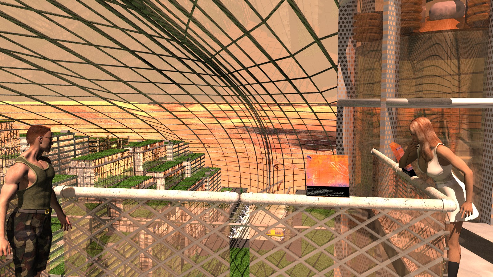
42 hrs later, here is the scene from WIP - Nice View (Dome City on Mars).
See previous thread for details.
AA 0.2 as requested
Things to do:
1) The ladies thigh sticks out of her boot slightly
2) Now that I look at it, the guy looks a little 'chunky'
3) not sure about the tilt of the guys head - the idea was that she was
checking out the view, he was checking out her view.
4) buildings on the right hand side of the train tubes are slightly missing
5) Even though the terrain has fog, the distance queues don't look good
The terrain is from MOLA images of mars, and is accurate to Valles
Marinaris, although it's not obvious (NO vertical scaling exaggeration)
6) The dome goes 'in' a little at the train station (1/4's of the
hemisphere) but from this view it just looks distorted)
7) The atmosphere needs some work, I think.
8) Daylight is a little too harsh.
9) Elevagor inside the 'tube' is a little too dark - combination of all the
glass I guess.\
10) Tram guide is rotated by 45 degrees
11) Maglev guides (silver bars going out of the city) go into the ground,
should be above ground the whole way
12) the city dome has a 'lip' that looks funny at the middle of the gap
between building sides
13) The 'you are here' sign is rotated oddly and needs more detail).
14) For random buildings, they all ended up almost the same building. Need
to add more building types
15) Gridwork on the railing needs to be smaller. Also, the gridwork seems
to be on the 'outside' not through the glass.
The image takes 1.34Meg, I think I need to figure out a way to make 3x3 city
blocks work out with less memory with a Colefax city.
See prev. image for details and credits, but briefly: Koz hair, DAZ3D Poser
images (Mike/Vicky3), Chris Colefax city modified (prev. thread for
details), Rune's grass texture on the top of the buidings, Tom Aust/Gena
Obukhov for POVTree and all of us taxpayers for sending Nasa/ESA to mars ...
Image (C) John D. Gwinner, 2005, all rights reserved (as if ...)
== John ==
Post a reply to this message
Attachments:
Download 'port-15SavedRadAA.jpg' (578 KB)
Preview of image 'port-15SavedRadAA.jpg'
|
|
| |
| |
|
|
From: Tim H
Subject: Re: WIP - Nice View 2 (Dome city on Mars, AA+Rad)
Date: 13 Feb 2005 02:09:38
Message: <420efd32@news.povray.org>
|
|
|
| |
| |
|
|
Nice image, but why does the guy seem like a very fit person with a big fat
but. There is something off between the guys upper and lower body. Just
me?
TH
Post a reply to this message
|
|
| |
| |
|
|
|
|
| |
| |
|
|
The anti-aliasing really helps. A few suggestions:
Think about the lighting. It looks like you have one bright light source
and you're relying on radiosity to do the rest of the work for you. This is
causing the image to look flat since there are no interesting shadows or
highlights, and some areas (particularly the railing) are very washed out.
The background could use work. Note that it alone takes up more than 50% of
your image, especially considering that it makes up most of the reflections
in the windows. For such an important part of the image, it's fairly bland,
and it's hard to make out shapes in it. I understand that it's a barren
planet, but there's more room for interesting features in the landscape
which could look interesting if well lit. (Canyons, mountains, hills and
valleys. Some of those are there but they're too hard to see right now.)
Don't worry too much about making it accurate to the real thing; worry first
about making it look good. The horizon isn't interesting, and the sky is
essentially a single, boring solid color; use your imagination to improve
these areas. You could put storm clouds in the distance, or beams of light
shining through the clouds into fog, or a strange swirly cloud pattern.
Since the whole city is underneath a huge protective dome, shouldn't the
outside atmosphere look dangerous? Be creative and experiment. Of course,
don't go overboard either if it's not the focus of the image.
You could increase the detail in the fence. What sort of material are those
diagonal bars made of? Should there be small screws or bolts holding things
together?
A lot of the textures are very reflective and it's causing distracting
patterns of lines all over the place, mostly from the dome's frame
structure. Maybe you should work on some of the textures (like in the
elevator) to rely less on reflection for a good appearance. Not all metal
has perfect reflections.
The windows are very bumpy. You could reduce the distortion a little.
Finally, a little variation in the buildings wouldn't hurt. Maybe some
different types of roofs (like some without plants) or windows would make
the city look less like it was all built at once.
Anyway, these are all my opinions and they may conflict with the vision you
have for your image, so simply take them however you want to. It's a great
image already.
- Slime
[ http://www.slimeland.com/ ]
Post a reply to this message
|
|
| |
| |
|
|
From: John D Gwinner
Subject: Re: WIP - Nice View 2 (Dome city on Mars, AA+Rad)
Date: 14 Feb 2005 02:52:10
Message: <421058aa@news.povray.org>
|
|
|
| |
| |
|
|
It's Daz3D's Mike (M3) with the muscular morph, same top and bottom. But
bullet 2) mentioned that he looked chunky, so I think I'll play with the
morphs. I could see on Mars the arms being bigger than the rear, or even
much much skinnier of course.
== John ==
"Tim H" <tim### [at] frontier netnospam> wrote in message
news:420efd32@news.povray.org...
> Nice image, but why does the guy seem like a very fit person with a big
> fat
> but. There is something off between the guys upper and lower body. Just
> me?
>
> TH netnospam> wrote in message
news:420efd32@news.povray.org...
> Nice image, but why does the guy seem like a very fit person with a big
> fat
> but. There is something off between the guys upper and lower body. Just
> me?
>
> TH
Post a reply to this message
|
|
| |
| |
|
|
From: John D Gwinner
Subject: Re: WIP - Nice View 2 (Dome city on Mars, AA+Rad)
Date: 14 Feb 2005 03:02:04
Message: <42105afc$1@news.povray.org>
|
|
|
| |
| |
|
|
"Slime" <fak### [at] emailaddress> wrote in message
news:42101020$1@news.povray.org...
> The anti-aliasing really helps. A few suggestions:
>
> Think about the lighting. It looks like you have one bright light source
> and you're relying on radiosity to do the rest of the work for you. This
> is
> causing the image to look flat since there are no interesting shadows or
> highlights, and some areas (particularly the railing) are very washed out.
I do have one area light, but it is true that the 'sun' is most of the
lighting. That's white *2, should I reduce that some?
I was trying for photons on the buildings but it didn't seem to do much -
that would make for more interesting light patters and it's pretty prevalent
in 'concrete canyons'.
> The background could use work. Note that it alone takes up more than 50%
> of
> your image, especially considering that it makes up most of the
> reflections
> in the windows.
True, although the platform is a little too 'high' - I could move it down
some so that there would be buildings behind reflected instead of the dome.
> For such an important part of the image, it's fairly bland,
> and it's hard to make out shapes in it. I understand that it's a barren
> planet, ...
It's actually Mars, Valles Marinaris, near the center. The colors are
'real' in that they are taken from Viking, plus a slope dependant texture.
I do agree it's washed out some, there was also supposed to be fog to show
the distant terrain. The terrain texture looks better up close, was having
issues with continous zoom, I think I need some kind of larger scale
differences. I'll fiddle with it.
> The horizon isn't interesting, and the sky is
> essentially a single, boring solid color; use your imagination to improve
> these areas.
I actually have some 'clouds' taken from real lander pictures but the RGB
values smeared out I think - I agree it needs work. Need to look at some of
the later images and fiddle with a gradient too.
> You could increase the detail in the fence. What sort of material are
> those
> diagonal bars made of? Should there be small screws or bolts holding
> things
> together?
Those fences will be on the buildings roof tops too, so was trying to keep
the detail to textures. It was supposed to look like wires in glass, but I
need to scale it some. I agree about the detail, I'll work on it.
> A lot of the textures are very reflective and it's causing distracting
> patterns of lines all over the place, mostly from the dome's frame
> structure. Maybe you should work on some of the textures (like in the
> elevator) to rely less on reflection for a good appearance. Not all metal
> has perfect reflections.
The animation version of this had no reflective metal, it just takes too
long. I also experimented with the copper being reflective and the metal
not. I could turn down the reflectivity of the 'vator glass too.
> The windows are very bumpy. You could reduce the distortion a little.
The dome or the building? Dome is made of triangles, can't do much with
that. The buildings I actually flattened some, they are from Chris
Colefax's city but heavily modified. Maybe if I had the dome diagonals
shown it wouldn't look so bumby, as the panes 'shift' in the middle without
a brace, which looks funny.
> Finally, a little variation in the buildings wouldn't hurt. Maybe some
> different types of roofs (like some without plants) or windows would make
> the city look less like it was all built at once.
Right, that's on my TTD.
> Anyway, these are all my opinions and they may conflict with the vision
> you
> have for your image, so simply take them however you want to. It's a great
> image already.
Thanks for the suggestions, I'll work on it.
== John ==
Post a reply to this message
|
|
| |
| |
|
|
From: Thomas de Groot
Subject: Re: WIP - Nice View 2 (Dome city on Mars, AA+Rad)
Date: 14 Feb 2005 03:40:55
Message: <42106417@news.povray.org>
|
|
|
| |
| |
|
|
"John D. Gwinner" <joh### [at] cornelledu> schreef in bericht
news:421058aa@news.povray.org...
> It's Daz3D's Mike (M3) with the muscular morph, same top and bottom. But
> bullet 2) mentioned that he looked chunky, so I think I'll play with the
> morphs. I could see on Mars the arms being bigger than the rear, or even
> much much skinnier of course.
>
I would like to comment on your new version, but somehow, I am unable to
download the image. Perhaps a smaller one would work?
Thomas
Post a reply to this message
|
|
| |
| |
|
|
From: John D Gwinner
Subject: Re: WIP - Nice View 2 (Dome city on Mars, AA+Rad)
Date: 14 Feb 2005 10:51:20
Message: <4210c8f8@news.povray.org>
|
|
|
| |
| |
|
|
"Thomas de Groot" <t.d### [at] internlnet> wrote in message
news:42106417@news.povray.org...
> Perhaps a smaller one would work?
There you go ... which reminds me, the 'paint' railing is actually one of
your Moray textures I think, heavily modified.
Resized with IRFanview, Lanczos filter, JPG 100%
== John ==
Post a reply to this message
Attachments:
Download 'port-15SavedRadAASmall.jpg' (375 KB)
Preview of image 'port-15SavedRadAASmall.jpg'

|
|
| |
| |
|
|
From: Thomas de Groot
Subject: Re: WIP - Nice View 2 (Dome city on Mars, AA+Rad)
Date: 15 Feb 2005 09:28:04
Message: <421206f4@news.povray.org>
|
|
|
| |
| |
|
|
"John D. Gwinner" <joh### [at] cornelledu> schreef in bericht
news:4210c8f8@news.povray.org...
>
> "Thomas de Groot" <t.d### [at] internlnet> wrote in message
> news:42106417@news.povray.org...
>
> > Perhaps a smaller one would work?
>
> There you go ... which reminds me, the 'paint' railing is actually one of
> your Moray textures I think, heavily modified.
>
Aaah! Thanks a lot! Much better with aa.
I do like Philippe Gibone's dome, as it is not a standard structure you
would expect. Something about the landscape outside troubles me though. We
are on the brink of Valles Marineris, right? There is an impression of the
dome going to slide down, to the right. Also, it is difficult to judge the
scale of the Valles... hmmm, perhaps some structure within the Valles would
give us a hint on that... another dome perhaps? just my 2 dimes worth idea,
though.
Otherwise, awsome image.
Oh yes, railing paint. yes, I seem to recognise that one. Nice modifications
too :-)
Thomas
Post a reply to this message
|
|
| |
| |
|
|
From: John D Gwinner
Subject: Re: WIP - Nice View 2 (Dome city on Mars, AA+Rad)
Date: 15 Feb 2005 12:04:11
Message: <42122b8b$1@news.povray.org>
|
|
|
| |
| |
|
|
> I do like Philippe Gibone's dome, as it is not a standard structure you
> would expect.
Exactly - it works out a lot better for the buildings too, I found that
Geodesic domes made the center buildings *way* too tall. I had to play with
the domes a lot to get a city with a good population density as well as a
decent view for some.
My theory is that with real estate being essentially priceless, they are
GOING to build right to the edge of the dome.
> Something about the landscape outside troubles me though. We
> are on the brink of Valles Marineris, right?
Correct.
> There is an impression of the
> dome going to slide down, to the right.
Interesting. My animation in the IRTC (whoot! Third prize) shows the same
landscape, but the dome is MUCH further inland. The problem I found was
that there was no view from the tram or the highest buildings.
Why go all that distance and go to the trouble of building a city and not
have a view?
So I had to successively move the dome closer and closer to the valley. I
layer height fields to make it blend right, I'll post some more images when
I get the outside finished again. Third time I've moved it, let's hope I
don't have to do all that again.
> Also, it is difficult to judge the
> scale of the Valles...
Scale is 'correct' without vertical exaggeration, but I agree with you. Fog
was supposed to help but didn't seem to much.
The terrain is a bit too flat; I got Leveller to 'curve' the height field
over a globe but that didn't work (the resulting mesh was too big). I'll
post some other images of it.
Render time was 42 hours, so I'm a little reluctant to use an iso surface
for the valley, but the real issue was I couldn't get it to work well with
high resolution height maps.
>hmmm, perhaps some structure within the Valles would
> give us a hint on that... another dome perhaps?
The 'train rails' were supposed to show scale but I need to work on them.
Another dome could be possible, hadn't thought of that. Maybe a road too.
My original concept was a space port, but I put that behind the dome on the
flatter area, so it can't be seen from this angle.
After further thinking about it, I put the space port behind a low set of
hills, as if there was an explosion on landing, you wouldn't want anything
to hit the dome.
> just my 2 dimes worth idea,
> though.
> Otherwise, awsome image.
Thanks! Was it funny though? Maybe no one gets it but me :) Someone at
work suggested changing the guys head angle slightly (and less chunky).
> Oh yes, railing paint. yes, I seem to recognize that one. Nice
> modifications
> too :-)
*lol*
Actually it was TdG_FlackedPaint_Horizontal_1 ... pretty heavily modified
Nothing might be left of the original but a normal ;-)
== John ==
Post a reply to this message
|
|
| |
| |
|
|
From: Thomas de Groot
Subject: Re: WIP - Nice View 2 (Dome city on Mars, AA+Rad)
Date: 16 Feb 2005 03:27:42
Message: <421303fe@news.povray.org>
|
|
|
| |
| |
|
|
"John D. Gwinner" <joh### [at] cornelledu> schreef in bericht
news:42122b8b$1@news.povray.org...
>
> Scale is 'correct' without vertical exaggeration, but I agree with you.
Fog
> was supposed to help but didn't seem to much.
>
Scale is a difficult topic because we are used to vertical exagerations. In
real life, I think 3D vision helps us to compensate and appreciate the true
dimensions, but in an image this is lost. On the other hand, I just realise
now what those dimensions of the Valles really are, and how it would look
like.
>
> Thanks! Was it funny though? Maybe no one gets it but me :) Someone at
> work suggested changing the guys head angle slightly (and less chunky).
>
Funny? Oh, I am afraid to miss something here I am afraid.
>
> Actually it was TdG_FlackedPaint_Horizontal_1 ... pretty heavily modified
> Nothing might be left of the original but a normal ;-)
>
Life is tough! ;-)
Thomas
Post a reply to this message
|
|
| |
| |
|
|
|
|
| |
|
|