|
|
|
|
|
|
| |
| |
|
|
|
|
| |
| |
|
|
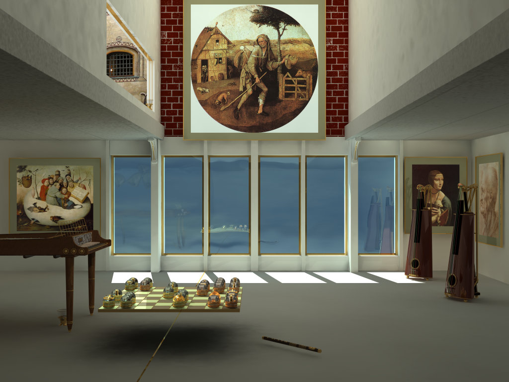
I had a 4400 x 3300 print made of the "final" version of Contemplation,
and some of the image maps looked really bad, almost as if I had applied
an ever so slight amount of focal blur -- the resolution of the original
digital photos wasn't high enough, and there was excessive noise. So I
started experimenting with isosurfaces and developed quite nice bricks,
but they were very slow to render with radiosity and I had to make some
compromises, and even then the rendering time increased from 40h to 58h
at 4400 x 3300, but IMHO the result looks reasonably good and doesn't
seem all too artificial -- or does it?
The other change was to cut a hole through the castle window image map
and to build behind the opening a small room with a light on the wall
and bars in the window. I had a lot of trouble with the illumination
because the full-size image doesn't match partial renders at a lower
resolution, probably due to the very complex radiosity illumination. I'm
not entirely happy with the present version, but after four full-size
renders past the window I gave up (it takes about 23 hours to get from
the top to the window sill, seven hours for the radiosity calculations
and sixteen to render).
Next week, I'll have another print made in order to see whether any
further changes need to be done, but in the meantime, there is a new
1920 x 1440 version at http://galeria.galactinus.org/vilva/room.html
Veijo
Post a reply to this message
Attachments:
Download 'contemplation.jpg' (134 KB)
Preview of image 'contemplation.jpg'
|
|
| |
| |
|
|
|
|
| |
| |
|
|
I must admit that I preferred the previous stone wall. This one is too
dominant and contrasting. Shouldn't it 'blend' somewhat more with the
overall texture of the surrounding walls? I am afraid that part of the
'contemplation' is diverted to the bricks now... Perhaps a very small color
difference (in light tints) between the bricks and the mortar...
I just realized that there is an invisible plainting refleted in the
leftmost window. It looks familiar, but I cannot put a name on it...
The castle window looks really good!
Thomas
Post a reply to this message
|
|
| |
| |
|
|
|
|
| |
| |
|
|
Thomas de Groot wrote:
> I must admit that I preferred the previous stone wall. This one is too
> dominant and contrasting. Shouldn't it 'blend' somewhat more with the
> overall texture of the surrounding walls? I am afraid that part of the
> 'contemplation' is diverted to the bricks now... Perhaps a very small color
> difference (in light tints) between the bricks and the mortar...
Thanks for your comments. The previous wall was rather good on screen,
but as a largish print it was disappointing, a mishmash. The present
wall is quite prominent, even dominating, and I myself am not quite sure
about my feelings concerning it. I have some ideas, but they'll have to
wait. OTOH, I've seen rather similar walls and contrasts in some
medieval Finnish churches, see e.g.
http://www.animal.helsinki.fi/people/vilva/aboa/1143.jpg
where the wall is slightly more irregular and the illumination is
different. If you look at the lower right corner of the brick wall
which is in the shadows, it is quite similar to my wall. Looking at my
picture, one might also say that the heavy brick wall above the rather
flimsy wall below it gives some extra weight to the statement made by
the Wayfarer painting.
> I just realized that there is an invisible plainting refleted in the
> leftmost window. It looks familiar, but I cannot put a name on it...
It isn't a painting but a group of four identical heads distorted by the
window pane. The heads are the result of two evenings spent getting
acquinted with Wings3D, see
http://galeria.galactinus.org/vilva/sculpting.html
There is a certain resemblance to "The Scream" by Munch or to some of
Los Caprichos by Goya.
> The castle window looks really good!
Thanks :) The bars are a little bit too regular, but I'll do something
about them if I decide to redo the brick wall.
Veijo
Post a reply to this message
|
|
| |
| |
|
|
|
|
| |
| |
|
|
"Veijo Vilva" <vei### [at] animal helsinkifi> schreef in bericht
news:4128db10@news.povray.org...
> Thanks for your comments. The previous wall was rather good on screen,
> but as a largish print it was disappointing, a mishmash. The present
> wall is quite prominent, even dominating, and I myself am not quite sure
> about my feelings concerning it. I have some ideas, but they'll have to
> wait. OTOH, I've seen rather similar walls and contrasts in some
> medieval Finnish churches, see e.g.
>
> http://www.animal.helsinki.fi/people/vilva/aboa/1143.jpg
>
> where the wall is slightly more irregular and the illumination is
> different. If you look at the lower right corner of the brick wall
> which is in the shadows, it is quite similar to my wall. Looking at my
> picture, one might also say that the heavy brick wall above the rather
> flimsy wall below it gives some extra weight to the statement made by
> the Wayfarer painting.
Yes, I agree with you, and the photograph is an excelent illustration.
However, note that in the church wall there are random bricks that have more
or less the color of the surroundings. They function like a kind of harmonic
counterpoint to the whole. Perhaps also, the size/ratio of your bricks could
be slightly smaller.
Oh well... These are just small things coming to my mind. Stays the fact
that you have created a fascinating scene.
> It isn't a painting but a group of four identical heads distorted by the
> window pane. The heads are the result of two evenings spent getting
> acquinted with Wings3D, see
>
> http://galeria.galactinus.org/vilva/sculpting.html
>
> There is a certain resemblance to "The Scream" by Munch or to some of
> Los Caprichos by Goya.
I truly like those sculptures! There is an echo there of Nordic sculptures I
believe. Very expressive.
Wings3D seems to become a "standard" with Povrayers! I am experimenting also
with it and it gives great results. I was fond of Hamapatch, but I think
Wings3D is going to supersede it...
Thomas helsinkifi> schreef in bericht
news:4128db10@news.povray.org...
> Thanks for your comments. The previous wall was rather good on screen,
> but as a largish print it was disappointing, a mishmash. The present
> wall is quite prominent, even dominating, and I myself am not quite sure
> about my feelings concerning it. I have some ideas, but they'll have to
> wait. OTOH, I've seen rather similar walls and contrasts in some
> medieval Finnish churches, see e.g.
>
> http://www.animal.helsinki.fi/people/vilva/aboa/1143.jpg
>
> where the wall is slightly more irregular and the illumination is
> different. If you look at the lower right corner of the brick wall
> which is in the shadows, it is quite similar to my wall. Looking at my
> picture, one might also say that the heavy brick wall above the rather
> flimsy wall below it gives some extra weight to the statement made by
> the Wayfarer painting.
Yes, I agree with you, and the photograph is an excelent illustration.
However, note that in the church wall there are random bricks that have more
or less the color of the surroundings. They function like a kind of harmonic
counterpoint to the whole. Perhaps also, the size/ratio of your bricks could
be slightly smaller.
Oh well... These are just small things coming to my mind. Stays the fact
that you have created a fascinating scene.
> It isn't a painting but a group of four identical heads distorted by the
> window pane. The heads are the result of two evenings spent getting
> acquinted with Wings3D, see
>
> http://galeria.galactinus.org/vilva/sculpting.html
>
> There is a certain resemblance to "The Scream" by Munch or to some of
> Los Caprichos by Goya.
I truly like those sculptures! There is an echo there of Nordic sculptures I
believe. Very expressive.
Wings3D seems to become a "standard" with Povrayers! I am experimenting also
with it and it gives great results. I was fond of Hamapatch, but I think
Wings3D is going to supersede it...
Thomas
Post a reply to this message
|
|
| |
| |
|
|
|
|
| |
|
|