|
|
|
|
|
|
| |
| |
|
|
|
|
| |
| |
|
|
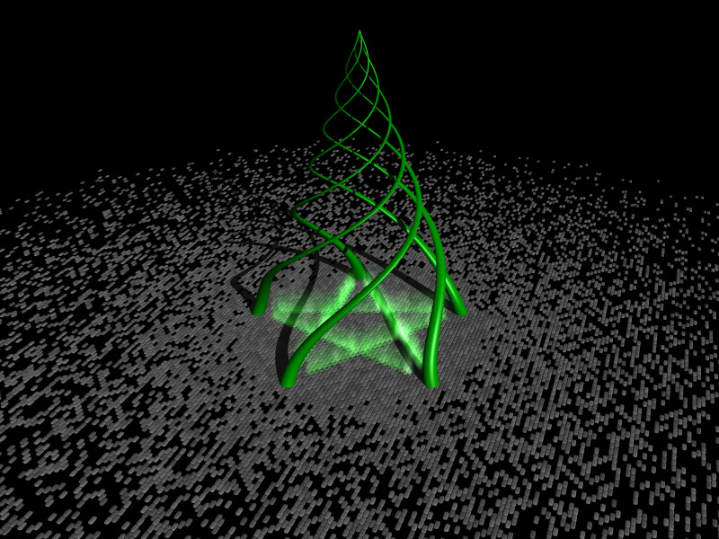
As an experiment in isosurfaces and media, I came up with the image below. I
like the idea of some wizard's experiment off in the ether, but I still
think it looks too bare. I'm hoping someone will have some suggestions for
something to add in to help add detail and little touches to the picture.
Thanks,
Mike
Post a reply to this message
Attachments:
Download 'magic.jpg' (142 KB)
Preview of image 'magic.jpg'
|
|
| |
| |
|
|
|
|
| |
| |
|
|
Skulls, worshippers, a demon in the center, dungeon/crypt walls, cobwebs,
torches, spellbooks, blood/scorch marks on the floor, a cauldron, a
dimensional door, experiment notes/designs. Also, the green tentacle things
look too much like christmas tree to me, maybe if you made those out of
glows instead...
I guess my suggestions are a bit "D&D-ish" but oh well.
"Mike Kost" <nomail@nomail> wrote in message
news:web.40bfa8aae026da105bf981ea0@news.povray.org...
> As an experiment in isosurfaces and media, I came up with the image below.
I
> like the idea of some wizard's experiment off in the ether, but I still
> think it looks too bare. I'm hoping someone will have some suggestions for
> something to add in to help add detail and little touches to the picture.
>
> Thanks,
>
> Mike
>
Post a reply to this message
|
|
| |
| |
|
|
|
|
| |
| |
|
|
"Mike Kost" <nomail@nomail> wrote in message
news:web.40bfa8aae026da105bf981ea0@news.povray.org...
> As an experiment in isosurfaces and media, I came up with the image below.
I
> like the idea of some wizard's experiment off in the ether, but I still
> think it looks too bare. I'm hoping someone will have some suggestions for
> something to add in to help add detail and little touches to the picture.
>
> Thanks,
>
> Mike
>
Perhaps if the tentacles didn't extend all the way up untill they meet, but
taper off before that. Also the lighting could be more evocative... perhaps
if the green flames were lighting the scene?
Ian.
Post a reply to this message
|
|
| |
| |
|
|
|
|
| |
| |
|
|
Mike Kost wrote:
> As an experiment in isosurfaces and media, I came up with the image
below. I
> like the idea of some wizard's experiment off in the ether, but I still
> think it looks too bare. I'm hoping someone will have some
suggestions for
> something to add in to help add detail and little touches to the picture.
>
> Thanks,
>
> Mike
>
>
> ------------------------------------------------------------------------
>
The parts that bug me:
The star has too many predetermined references for me. Sucks most of
the potential for mystery out of the picture. And the media treatment
does not really evoke the intended mystery. Not enough sense of
volumnity I suspect. The compositional placement of the star symbol
reductively inside the tentacles which are themselves centered within
the "circle" of pigmented tiles. Too static perhaps.
The strong parts are:
The ground plane. The texture and how the random coloring of the tiles
with its the radial falloff sets the scope of focus like a spotlight
on a stage. The satisfying scale of the tiles relative to the overall
image. The camera angle giving a slightly diagonal sweep of teh tiles
towards the lower left.**What if, instead of the translucent media
drawing an symbol on the top of the surface, a mysterious light was just
visible seeping through from underneath the tiles, an perhaps, ot not,
coloring a layer of media above the surface.**
The tenticle tower contruct at the center. The satisfying way the
tentacles meet at the top, the enigmatic way they intertwine.
**Suggestion here, you might increase the interest of the composition by
opposing the verticality of the center piece with a horizontally
oriented aspect in the image frame. Have the center item nearly span
the rectangle, dividing it, and try playing with that tension. Nice as
the radial falloff is, we don't need to see so much of it to get the
point.**
The maybe/maybe not parts are:
The colors. Green and grey are certainly one of the classicly pleasing
harmonies. And you are very smart to keep the colors minimal, nearly
monochrome, just just on saturated color and one monochrome. But it is
not quite working for me here. Maybe too warm?, Like a drift towards
cyan might help? Can you get something out of varying the saturation
more, maybe keep the media saturated by the solid objexts less so. Or
maybe reduce the saturation of the greens in general? Maybe symbolically
the color is just too predictable? Greenish light equals weird or
supernatural...is that really the best you can do? Or maybe confusing?
Greenish light equals supernatural, green textured tentacles equals
organic...which do you mean? It's not wrong, just don't think you are
getting the most out of it.
My suggetion would be for you to play with some of these design
elements, some (like cropping or saturation ) even in a graphics editor,
and further inspiration with the content may follow. It's an old trick
when stuck for inspiration.
-Jim
Post a reply to this message
|
|
| |
| |
|
|
|
|
| |
| |
|
|
"Mike Kost" <nomail@nomail> wrote in message
news:web.40bfa8aae026da105bf981ea0@news.povray.org...
| I'm hoping someone will have some suggestions for
| something to add in to help add detail and little
| touches to the picture.
The light source could be replaced. Whatever this is, it doesn't look
like the kind of thing which would be sitting on a table, which your
lighting suggests. The shadows also confuse the spiral and pentagram
patterns. Global illumination might work out better.
As far as little details. The stone-like appearance of the "floor" gives
the impression of something solid being formed. You could strengthen
this by showing some physical connection between the spiral and the
floor. Alternately, you could go with a more digital interpretation
(also suggested by some of your details) and change the pentagram from
six tubes to a group of lighted cells ("floor" tiles).
Unless you are attempting to show creation (*the* creation) itself,
consider constraining the scope of the "wizard's experiment" in some
way. A barely illuminated Stonehenge type structure around the
experiment would serve this purpose as well as add some mass to the
mostly empty space on the top of the picture and give the glowing
pentagram additional objects on which to cast "glow". A cliched idea, of
course, but just an example. I'm sure you can come up with something
better.
Remember, as always, that this advice comes from someone who has not yet
done a "scene".lol
-Shay
Post a reply to this message
|
|
| |
| |
|
|
|
|
| |
| |
|
|
Ian,
I've been having problems trying to get the isosurface algorithm to get the
tentacles to taper before they reach the peak. I'll probably look at it
again after a day or two away from the math. I did figure out that I had my
brightness/contrast way screwed up on the machine I was rendering so I'm
going back to the lighting and try again.
Thanks for your comments,
Mike
> Perhaps if the tentacles didn't extend all the way up untill they meet, but
> taper off before that. Also the lighting could be more evocative... perhaps
> if the green flames were lighting the scene?
>
> Ian.
Post a reply to this message
|
|
| |
| |
|
|
|
|
| |
|
|