|
|
|
|
|
|
| |
| |
|
|
|
|
| |
| |
|
|
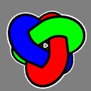
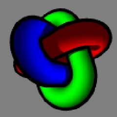
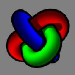
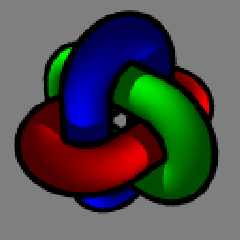
I've been overhauling my website lately, and I've decided to review the logo.
I'm still happy with the choice of pov object, based on this old image of mine:
http://www.evilsuperbrain.com/gallery/index.php?gallery=finished&image=lockw
But I'm starting to dislike the excessively bright and flat looking version of
it I've used for my website logo. So I've been playing with a couple of other
ideas. original.gif is the logo as it is now, the other images are some new
variations.
So what do you think? Stick or twist?
Any suggestions for other variations?
--
Tek
www.evilsuperbrain.com
Post a reply to this message
Attachments:
Download 'persp.jpg' (7 KB)
Download 'angle.jpg' (7 KB)
Download 'sidelit.jpg' (7 KB)
Download 'lighttrick.jpg' (6 KB)
Download 'original.gif' (3 KB)
Download 'shiny.jpg' (8 KB)
Preview of image 'persp.jpg'

Preview of image 'angle.jpg'

Preview of image 'sidelit.jpg'

Preview of image 'lighttrick.jpg'
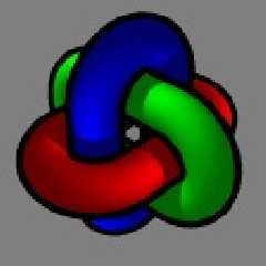
Preview of image 'original.gif'

Preview of image 'shiny.jpg'

|
|
| |
| |
|
|
|
|
| |
| |
|
|
I prefer the 4th but whis a little more bright lightning... The second is
good too.
Post a reply to this message
|
|
| |
| |
|
|
|
|
| |
| |
|
|
"LightBeam" <s.f### [at] tiscali fr> wrote in message
news:404a5c88$1@news.povray.org...
> I prefer the 4th but whis a little more bright lightning... The second is
> good too.
I'm with LightBeam on this one -- 4 is definitely to most professional
looking. And, a logo shouldn't detract from the rest of the page, so the one
right above it with the specular highlights might be too dominant. Just a
shmidgeon more contrast to 4 and it would be supa-sweet. fr> wrote in message
news:404a5c88$1@news.povray.org...
> I prefer the 4th but whis a little more bright lightning... The second is
> good too.
I'm with LightBeam on this one -- 4 is definitely to most professional
looking. And, a logo shouldn't detract from the rest of the page, so the one
right above it with the specular highlights might be too dominant. Just a
shmidgeon more contrast to 4 and it would be supa-sweet.
Post a reply to this message
|
|
| |
| |
|
|
|
|
| |
| |
|
|
Tek wrote:
> I've been overhauling my website lately, and I've decided to review the
> logo. I'm still happy with the choice of pov object, based on this old
> image of mine:
>
http://www.evilsuperbrain.com/gallery/index.php?gallery=finished&image=lockw
>
> But I'm starting to dislike the excessively bright and flat looking
> version of it I've used for my website logo. So I've been playing with a
> couple of other ideas. original.gif is the logo as it is now, the other
> images are some new variations.
>
> So what do you think? Stick or twist?
> Any suggestions for other variations?
>
I like no. 3 "sidelit.jpg" personally, the others all look too
"cartoony"
--
Bill Hails
Post a reply to this message
|
|
| |
| |
|
|
|
|
| |
| |
|
|
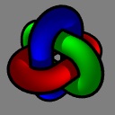
Okay, in light of a very obvious trend in opinion, here's a few other versions
that have a lot more in common.
Which ones do you prefer now?
(and thanks from the feedback so far!)
--
Tek
www.evilsuperbrain.com
Post a reply to this message
Attachments:
Download 'all.png' (15 KB)
Download 'angle.png' (8 KB)
Download 'off.png' (8 KB)
Download 'light.png' (8 KB)
Download 'ud.png' (8 KB)
Download 'cont.png' (8 KB)
Preview of image 'all.png'

Preview of image 'angle.png'
Preview of image 'off.png'
Preview of image 'light.png'

Preview of image 'ud.png'

Preview of image 'cont.png'
|
|
| |
| |
|
|
|
|
| |
| |
|
|
I second your opinion. 4th is the best, IMO.
Fernando
news:404a5c88$1@news.povray.org...
> I prefer the 4th but whis a little more bright lightning... The second is
> good too.
>
>
Post a reply to this message
|
|
| |
| |
|
|
|
|
| |
| |
|
|
On Sat, 06 Mar 2004 17:39:11 -0800, Tek wrote:
> Okay, in light of a very obvious trend in opinion, here's a few other versions
> that have a lot more in common.
>
> Which ones do you prefer now?
> (and thanks from the feedback so far!)
The first, if you remove that white border artifact.
Post a reply to this message
|
|
| |
| |
|
|
|
|
| |
| |
|
|
Tyler Eaves wrote:
> On Sat, 06 Mar 2004 17:39:11 -0800, Tek wrote:
>
>> Okay, in light of a very obvious trend in opinion, here's a few other
>> versions that have a lot more in common.
>>
>> Which ones do you prefer now?
>> (and thanks from the feedback so far!)
>
> The first, if you remove that white border artifact.
I agree, it's no. 1, but I like the white border.
--
Bill Hails
Post a reply to this message
|
|
| |
| |
|
|
|
|
| |
| |
|
|
"Bill Hails" <bil### [at] europeyahoo-inccom> wrote in message
news:404abd2f@news.povray.org...
> Tyler Eaves wrote:
> > The first, if you remove that white border artifact.
Artefact?! I went to some trouble to put that *feature* in there!
> I agree, it's no. 1, but I like the white border.
Me too, although after conversion to a gif with a transparent background the
lack of anti-aliasing on the white looked particularly bad.
Incidentally, I've already put number 1 on my site, but without the white
border. This is not my final decision but since I was sure it looked better than
the old logo I figured I should change it now. Though from the sound of it
number 1 is the best so it's probably gonna stay!
Still, I'll carry on listening to the feedback here, there might be some more
improvements that can be made...
--
Tek
www.evilsuperbrain.com
Post a reply to this message
|
|
| |
| |
|
|
|
|
| |
| |
|
|
Tek wrote:
> "Bill Hails" <bil### [at] europeyahoo-inccom> wrote in message
> news:404abd2f@news.povray.org...
>> Tyler Eaves wrote:
>> > The first, if you remove that white border artifact.
>
> Artefact?! I went to some trouble to put that *feature* in there!
>
>> I agree, it's no. 1, but I like the white border.
>
> Me too, although after conversion to a gif with a transparent background
> the lack of anti-aliasing on the white looked particularly bad.
>
One tiny thing, the white spot at the center is a little
distracting maybe?
--
Bill Hails
Post a reply to this message
|
|
| |
| |
|
|
|
|
| |