|
|
|
|
|
|
| |
| |
|
|
|
|
| |
| |
|
|
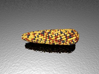
Working on the Indian corn.
Shape is a bit more realistic now ... color pattern more typical of real
corn.
Post a reply to this message
Attachments:
Download 'halloween.jpg' (22 KB)
Preview of image 'halloween.jpg'
|
|
| |
| |
|
|
|
|
| |
| |
|
|
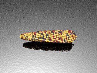
I don't think it's usually quite that twisty.
- Slime
[ http://www.slimeland.com/ ]
Post a reply to this message
|
|
| |
| |
|
|
|
|
| |
| |
|
|
Is this better?
My reference photo has slightly twisted ears:
http://www.dannysfalldecor.com/item_mini_indian_corn.jsp
"Slime" <fak### [at] email address> wrote in message
news:3f9f3744$1@news.povray.org...
> I don't think it's usually quite that twisty.
>
> - Slime
> [ http://www.slimeland.com/ ]
>
> address> wrote in message
news:3f9f3744$1@news.povray.org...
> I don't think it's usually quite that twisty.
>
> - Slime
> [ http://www.slimeland.com/ ]
>
>
Post a reply to this message
Attachments:
Download 'halloween.jpg' (21 KB)
Preview of image 'halloween.jpg'

|
|
| |
| |
|
|
|
|
| |
| |
|
|
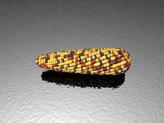
> Is this better?
I guess... maybe you should get a second opinion, but it still looks like
the twisting is a little exaggerated to me.
- Slime
[ http://www.slimeland.com/ ]
Post a reply to this message
|
|
| |
| |
|
|
|
|
| |
| |
|
|
I think Slime is right, corn is not twisted like sunflowers, I had a
look on goog and grabed a few examples which show it's mostly straight :
http://pubs.acs.org/cen/images/8031/8031notw4.corn.jpg
http://www.netseeds.com/assets/images/nav-corn-2002-5-gaucho.gif
http://www.aracornproducts.com.mx/images/corn.jpg
I'd also say that the cylindrical part is longer.
I'm looking forward to the finished image,
JC
Slime wrote:
>>Is this better?
>
>
> I guess... maybe you should get a second opinion, but it still looks like
> the twisting is a little exaggerated to me.
>
> - Slime
> [ http://www.slimeland.com/ ]
>
>
Post a reply to this message
|
|
| |
| |
|
|
|
|
| |
| |
|
|
That is incredibly cool. I hope you plan to share the source...
--
Jeremy
Post a reply to this message
|
|
| |
| |
|
|
|
|
| |
| |
|
|
I disagree. I've been shelling hundreds of ears of corn over the last few
weeks. Some is straight, some is twisty, and some barely has any rows at
all. There is quite a bit of variation in most types of corn. If this is
too straight, it will look less realistic.
I also think the length is just right as well. If I took photos of the
popcorn I grew this year, many ears would look exactly like that (except
that the color is more uniform [duh]).
That being said... On the fat end (the base), the kernels seem to be
growing too close to the base of the cob. The kernels near the base would
be flatter, and there would be about 2 fewer rows. The cob would be visible
at the base.
--
Jeremy
Post a reply to this message
|
|
| |
| |
|
|
|
|
| |
| |
|
|
A couple more reference links, as well...
http://www.jeannepasero.com/indcorn.html
http://www.dannysfalldecor.com/product_indian_corn.jsp
--
Jeremy
Post a reply to this message
|
|
| |
| |
|
|
|
|
| |
| |
|
|
Hmmm, you're also right.
Funny that raytracing comes to a debate about corn varieties :-)
JC
Jeremy M. Praay wrote:
> A couple more reference links, as well...
>
> http://www.jeannepasero.com/indcorn.html
> http://www.dannysfalldecor.com/product_indian_corn.jsp
>
Post a reply to this message
|
|
| |
| |
|
|
|
|
| |
| |
|
|
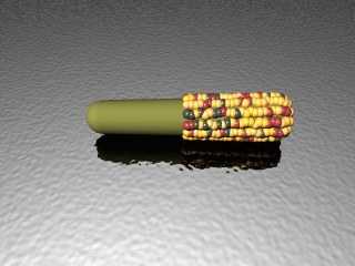
Jeremy:
I will share the technique with an image that shows how
it is done. I think that this will be better than my messy code.
First, I made a cob out of a cone with a sphere at each end.
The cob tapers slightly. I played around a lot with how much
it tapers, etc.
Then, I went row by row, using the trace() function to find the
surface vector. I put a kernel on the surface of the cob,
using SRand() to introduce variations in the size and placement.
I also adjusted the size of the kernel so that they are bigger
at the widest areas of the cob and smaller where the cob
grows smaller in radius. I made a "palette" using an array of rgb vectors
and then used RRand() to randomly select colors from the palette for each
kernel.
And that is pretty much it. :)
Post a reply to this message
Attachments:
Download 'halloween.jpg' (19 KB)
Preview of image 'halloween.jpg'
|
|
| |
| |
|
|
|
|
| |