|
|
|
|
|
|
| |
| |
|
|
|
|
| |
| |
|
|
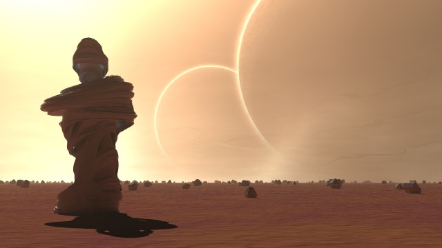
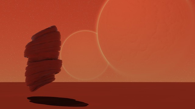
This will be my entry for the current round of the irtc. But, the problem is
that I can't decide whether or not a real early WIP looks better than the
"final" image! I like the simplicity of the early one, but the newer one
obviously has had a lot more work put into it (a few days work, compared to 2
hours for the first image!)
The WIP is the red picture, and the newest version is the golden one.
So, which one should I submit?
They're quite different from each other, but I suspect I'd get marked down if I
submit both.
Thanks in advance for your advice and comments :)
--
Tek
http://www.evilsuperbrain.com
Post a reply to this message
Attachments:
Download 'sentinel3.jpg' (26 KB)
Download 'sentinel.jpg' (20 KB)
Preview of image 'sentinel3.jpg'
Preview of image 'sentinel.jpg'
|
|
| |
| |
|
|
|
|
| |
| |
|
|
I like much more the golden one. The red one loses too many details, I
think.
Fernando.
FernanTek wrote:
> This will be my entry for the current round of the irtc. But, the problem is
> that I can't decide whether or not a real early WIP looks better than the
> "final" image! I like the simplicity of the early one, but the newer one
> obviously has had a lot more work put into it (a few days work, compared to 2
> hours for the first image!)
>
> The WIP is the red picture, and the newest version is the golden one.
>
> So, which one should I submit?
>
> They're quite different from each other, but I suspect I'd get marked down if I
> submit both.
>
> Thanks in advance for your advice and comments :)
>
> --
> Tek
> http://www.evilsuperbrain.com
>
>
>
>
Post a reply to this message
|
|
| |
| |
|
|
|
|
| |
| |
|
|
I really like both of them.
I think I would submit the top one, just because it seems a little more real
looking, but I like the very abstract yet still real red one.
--
#macro Q(A,E,W)box{-A/2,A/2pigment{rgb 9*W}translate E*A+W/1000}#end#macro
M(D,E)#local A=1/pow(3,D);#if(D<3)#local C=D+1;union{M(C,1)M(C,x+y)M(C,x+z)
M(C,y+z)M(C,x+y-z)M(C,x+z-y)M(C,y+z-x)M(C,x-y)M(C,z-x)M(C,y-z)M(C,y-x)M(C,
x-z)M(C,z-y)M(C,x-y-z)M(C,y-x-z)M(C,z-x-y)translate A*E}#else Q(A,E,x)Q(A,E
,y)Q(A,E,z)#end#end union{M(0,0)rotate<45,145,0>translate z*2}//Andrew
Post a reply to this message
|
|
| |
| |
|
|
|
|
| |
| |
|
|
Tek wrote:
> This will be my entry for the current round of the irtc. But, the problem is
> that I can't decide whether or not a real early WIP looks better than the
> "final" image! I like the simplicity of the early one, but the newer one
> obviously has had a lot more work put into it (a few days work, compared to 2
> hours for the first image!)
>
> The WIP is the red picture, and the newest version is the golden one.
>
> So, which one should I submit?
>
> They're quite different from each other, but I suspect I'd get marked down if I
> submit both.
>
> Thanks in advance for your advice and comments :)
>
> --
> Tek
> http://www.evilsuperbrain.com
>
>
>
>
The golden one has a greater sense of space which answers the topic better
Post a reply to this message
|
|
| |
| |
|
|
|
|
| |
| |
|
|
"Tek" <tek### [at] evilsuperbrain com> wrote in message
news:3d6d16f1@news.povray.org...
> This will be my entry for the current round of the irtc. But, the problem
is
> that I can't decide whether or not a real early WIP looks better than the
> "final" image! I like the simplicity of the early one, but the newer one
> obviously has had a lot more work put into it (a few days work, compared
to 2
> hours for the first image!)
>
The newer one is very nice. The older one is still nice but it's a bit
simplistic
Gail
--
#macro G(H,S)disc{0z.4pigment{onion color_map{[0rgb<sin(H/pi)cos(S/pi)*(H<6)
cos(S/pi)*(H>6)>*18][.4rgb 0]}}translate<H-5S-3,9>}#end G(3,5)G(2,5.5)G(1,5)
G(.6,4)G(.5,3)G(.6,2)G(1,1)G(2,.5)G(3,.7)G(3.2,1.6)G(3.1,2.5)G(2.2,2.5)G(9,5
)G(8,5.5)G(7,5)G(7,4)G(7.7,3.3)G(8.3,2.7)G(9,2)G(9,1)G(8,.5)G(7,1)///GS com> wrote in message
news:3d6d16f1@news.povray.org...
> This will be my entry for the current round of the irtc. But, the problem
is
> that I can't decide whether or not a real early WIP looks better than the
> "final" image! I like the simplicity of the early one, but the newer one
> obviously has had a lot more work put into it (a few days work, compared
to 2
> hours for the first image!)
>
The newer one is very nice. The older one is still nice but it's a bit
simplistic
Gail
--
#macro G(H,S)disc{0z.4pigment{onion color_map{[0rgb<sin(H/pi)cos(S/pi)*(H<6)
cos(S/pi)*(H>6)>*18][.4rgb 0]}}translate<H-5S-3,9>}#end G(3,5)G(2,5.5)G(1,5)
G(.6,4)G(.5,3)G(.6,2)G(1,1)G(2,.5)G(3,.7)G(3.2,1.6)G(3.1,2.5)G(2.2,2.5)G(9,5
)G(8,5.5)G(7,5)G(7,4)G(7.7,3.3)G(8.3,2.7)G(9,2)G(9,1)G(8,.5)G(7,1)///GS
Post a reply to this message
|
|
| |
| |
|
|
|
|
| |
| |
|
|
Not sure about sending in two instead of one, should only be seen as more
choices.
If I were to narrow down a catagory for these to I'd call the golden one
surrealistic and the red one minimalistic. I favor surrealism. Although you
could just about call both of them either kind. If the red picture isn't
going to go further then the other would be the only one to submit if I had
to choose. Those are all facetted boulders scattered around, aren't they. If
so it really makes for a clear distinction from the curving swirl-thing. A
sort of organic versus inorganic matter on a orb like the others in space
amid some lifegiving light.
Post a reply to this message
|
|
| |
| |
|
|
|
|
| |
| |
|
|
I'd say the golden one too.
It's not lonely if you're a rock, though, is it?
:-)
All the best,
Andy Cocker
"Tek" <tek### [at] evilsuperbraincom> wrote in message news:3d6d16f1@news.povray.org...
> This will be my entry for the current round of the irtc. But, the problem is
> that I can't decide whether or not a real early WIP looks better than the
> "final" image! I like the simplicity of the early one, but the newer one
> obviously has had a lot more work put into it (a few days work, compared to 2
> hours for the first image!)
>
> The WIP is the red picture, and the newest version is the golden one.
>
> So, which one should I submit?
>
> They're quite different from each other, but I suspect I'd get marked down if I
> submit both.
>
> Thanks in advance for your advice and comments :)
>
> --
> Tek
> http://www.evilsuperbrain.com
>
>
>
>
Post a reply to this message
|
|
| |
| |
|
|
|
|
| |
| |
|
|
Definitely the top one.
Wolfox
Tek wrote:
> This will be my entry for the current round of the irtc. But, the problem is
> that I can't decide whether or not a real early WIP looks better than the
> "final" image! I like the simplicity of the early one, but the newer one
> obviously has had a lot more work put into it (a few days work, compared to 2
> hours for the first image!)
>
> The WIP is the red picture, and the newest version is the golden one.
>
> So, which one should I submit?
>
> They're quite different from each other, but I suspect I'd get marked down if I
> submit both.
>
> Thanks in advance for your advice and comments :)
>
> --
> Tek
> http://www.evilsuperbrain.com
Post a reply to this message
|
|
| |
| |
|
|
|
|
| |
| |
|
|
"Andrew Cocker" <mai### [at] mariner9net> wrote in message
news:3d6d2f46$1@news.povray.org...
> It's not lonely if you're a rock, though, is it?
>
> :-)
lol!
:-D
Thanks for the advice folks, looks like a unanimous decision that all my
hard work was worth it!
--
Tek
http://www.evilsuperbrain.com
Post a reply to this message
|
|
| |
| |
|
|
|
|
| |
| |
|
|
"hughes b" <omn### [at] charternet> wrote in message
news:3d6d29b0@news.povray.org...
> If I were to narrow down a catagory for these to I'd call the golden one
> surrealistic and the red one minimalistic. I favor surrealism. Although
you
> could just about call both of them either kind. If the red picture isn't
> going to go further then the other would be the only one to submit if I
had
> to choose. Those are all facetted boulders scattered around, aren't they.
If
> so it really makes for a clear distinction from the curving swirl-thing. A
> sort of organic versus inorganic matter on a orb like the others in space
> amid some lifegiving light.
That's a great analysis of the images :)
I hadn't really thought about the organic/inorganic thing, I just did
faceted rocks 'cause it "felt right" in the scene, but I think you're right
about why they work. I might have to borrow your description for the text
with my entry ;)
--
Tek
http://www.evilsuperbrain.com
Post a reply to this message
|
|
| |
| |
|
|
|
|
| |
|
|