|
|
|
|
|
|
| |
| |
|
|
|
|
| |
| |
|
|
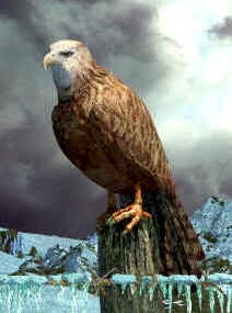
I like everything about this scene except the eyes. I don't have a
reference handy but I keep thinking they should be darker with larger
pupils. Of course I could be wrong, but I suggest you dig up a couple of
photos to make sure I'm wrong.
"Mick Hazelgrove" <mic### [at] mhazelgrove fsnetcouk> wrote in message
news:3d5b6d52@news.povray.org...
> Hi
>
> Here's a whiter version of my bird pic. I'm curious to know which version
people prefer.
>
> Mick
>
>
> fsnetcouk> wrote in message
news:3d5b6d52@news.povray.org...
> Hi
>
> Here's a whiter version of my bird pic. I'm curious to know which version
people prefer.
>
> Mick
>
>
>
Post a reply to this message
|
|
| |
| |
|
|
|
|
| |
| |
|
|
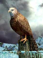
Mick Hazelgrove wrote:
> Hi
>
> Here's a whiter version of my bird pic. I'm curious to know which version people
prefer.
>
This one.
--
/*Francois Labreque*/#local a=x+y;#local b=x+a;#local c=a+b;#macro P(F//
/* flabreque */L)polygon{5,F,F+z,L+z,L,F pigment{rgb 9}}#end union
/* @ */{P(0,a)P(a,b)P(b,c)P(2*a,2*b)P(2*b,b+c)P(b+c,<2,3>)
/* videotron.ca */}camera{orthographic location<6,1.25,-6>look_at a }
Post a reply to this message
|
|
| |
| |
|
|
|
|
| |
| |
|
|
In article <3d5b6d52@news.povray.org>,
"Mick Hazelgrove" <mic### [at] mhazelgrovefsnetcouk> wrote:
> Here's a whiter version of my bird pic. I'm curious to know which version
> people prefer.
This is very nice...just a couple things:
The barbed wire looks like it is supposed to be rusty, but looks too
orange and even. I'd suggest a dark gray with areas that are closer to
the color of those tail feathers. It also looks too thick and the barbs
too long, but that could be the kind of wire.
The feathers don't seem very "fluffy" to me. It looks kind of like a
painted carving. Maybe if you could make a couple stray feathers poke
out...
I think the eyes should be more orange.
--
Christopher James Huff <cja### [at] earthlinknet>
http://home.earthlink.net/~cjameshuff/
POV-Ray TAG: chr### [at] tagpovrayorg
http://tag.povray.org/
Post a reply to this message
|
|
| |
| |
|
|
|
|
| |
| |
|
|
Absolutely fantastic!
No criticism this, but why not try a version with a bit of focul blur to
bring out the bitd/post/wire/icicles a bit.
Top notch stuff, Mick!
Post a reply to this message
|
|
| |
| |
|
|
|
|
| |
| |
|
|
wow ... this one is great ...
looks like a painted one ... great ...
Post a reply to this message
|
|
| |
| |
|
|
|
|
| |
| |
|
|
There are some small features that could make the head of the bird more
realistic:
1. the eye looks now a bit like a fish eye, laying on the surface of the
head.
2. the "eyebrow" should be directly above the eye, without a gap.
3. the beak of the bird has a nostril. the lower part of the beak ends below
the eye.
For the little image editing, this photo was used:
http://www.tpwd.state.tx.us/birdingtrails/images/eagle.jpg
This are small details, I think the bird pic looks great as it is now.
"Mick Hazelgrove" <mic### [at] mhazelgrovefsnetcouk> wrote in message
news:3d5b6d52@news.povray.org...
> Hi
>
> Here's a whiter version of my bird pic. I'm curious to know which version
people prefer.
>
> Mick
>
>
>
Post a reply to this message
Attachments:
Download 'that_bird3.jpg' (9 KB)
Preview of image 'that_bird3.jpg'
|
|
| |
| |
|
|
|
|
| |
| |
|
|
wich wrote:
>
Although your birdhead is much more realistic I preferred the
original one even though the eye seems a bit odd. It does stare
at you in an uncanny way which adds to the image.
Remco
Post a reply to this message
|
|
| |
| |
|
|
|
|
| |
| |
|
|
On Thu, 15 Aug 2002 09:57:34 +0100, Mick Hazelgrove wrote:
> Hi
>
> Here's a whiter version of my bird pic. I'm curious to know which version people
prefer.
>
All versions have been fantastic Mick but I think this one is the best.
As someone else mentioned a couple of ruffled/sticking out featheres would
look great, and maybe thinner wire.
--
#local i=.1;#local I=(i/i)/i;#local l=(i+i)/i;#local ll=(I/i)/l;box{<-ll,
-((I/I)+l),-ll><ll,-l,ll>pigment{checker scale l}finish{ambient((I/l)/I)+
(l/I)}}sphere{<i-i,l-l,(I/l)>l/l pigment{rgb((I/l)/I)}finish{reflection((
I/l)/I)-(l/I)specular(I/l)/I}}light_source{<I-l,I+I,(I-l)/l>l/l} // Steve
Post a reply to this message
|
|
| |
| |
|
|
|
|
| |
| |
|
|
The head was based on a photo of a Red Kite and is correct. Your eye is nearer that of
an eagle. The problem is due to the lighting
which tends to hide the eyelid and perhaps to the specular highlight which makes it
look as though it is sticking out. However I
probably won't change it as it gives the bird a fierce expression.
You are correct about the nostril I will add that.
Mick
Post a reply to this message
|
|
| |
| |
|
|
|
|
| |
| |
|
|
I like this one much better as well, but only partly because of the color
change. FWIW: The sunlight and the strong blue rocky outcropping in the other
version, competed with each other too much for my attention, at the expense of
the bird. That may be partly just me since I'm in love with your textures and,
that streaming sunlight is just awesome. I'm glad to see you haven't lost that
here.
--
light_source{0,1}#macro c(J,a)sphere{0,1pigment{rgb z}scale a translate J+O}
#end#macro B(R,V,O)c(0,4)intersection{c(V,R)difference{c(-z*4x+10)c(-z*4.1x+
10)c(0<7.5,45,5>)}}#end B(12,0z*25)B(8y*4<0,12,50>) // Batronyx ^"^
Post a reply to this message
|
|
| |
| |
|
|
|
|
| |