|
|
|
|
|
|
| |
| |
|
|
|
|
| |
| |
|
|
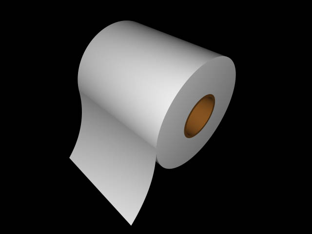
For some reason, whenever I render this scene, it looks kind of crappy.
#include "colors.inc"
#include "math.inc"
camera {
location <5,5,-5>
look_at <1,0,-1>
}
light_source {
<5,5,-5>
color rgb 1
}
difference {
cylinder {
<-2,0,0>,<2,0,0>, 2
pigment {color rgb 1.5}
}
cylinder {
<-3,0,0>,<3,0,0>,.8
pigment { Gold }
}
}
difference {
cylinder {
<-2,0,0>,<2,0,0>, .8
pigment { Gold}
}
cylinder {
<-3,0,0>,<3,0,0>,.7
pigment { Gold }
}
}
#declare lv = 0;
mesh {
#while (lv <= 45)
triangle { < -2,sind(-lv)*4,cosd(-lv)*4 >,< 2,sind(-lv)*4,cosd(-lv)*4
>,< -2,sind(-lv+1)*4,cosd(-lv+1)*4 > }
triangle { < 2,sind(-lv+1)*4,cosd(-lv+1)*4 >,< 2,sind(-lv)*4,cosd(-lv)*4
>,< -2,sind(-lv+1)*4,cosd(-lv+1)*4 > }
#declare lv = lv + 1;
#end
pigment { rgb 1.5 }
translate <0,0,-6>
}
-DJ
PS. Sorry for the bad pun.
--
"There's no joy greater that soaring high on the wings of your dreams,
except maybe the joy of watching a dreamer who has nowhere to land but the
ocean of reality."
Post a reply to this message
Attachments:
Download 'crappy.jpg' (18 KB)
Preview of image 'crappy.jpg'
|
|
| |
| |
|
|
|
|
| |
| |
|
|
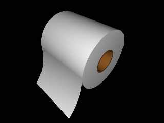
Well, you're only using pigments to describe your object. Maybe you should
add full texture descriptions (like finish and normals) to them. Also, gold
is probably not the best color for the inside of the roll; it's too bright.
Try a dark brown/gray.
But, the shape of the roll looks great!
-Ed
"DJ Wiza" <Kil### [at] TRIMBRAKESgeocities com> wrote in message
news:3bf0dd9e@news.povray.org...
> For some reason, whenever I render this scene, it looks kind of crappy.
>
> #include "colors.inc"
> #include "math.inc"
>
> camera {
> location <5,5,-5>
> look_at <1,0,-1>
> }
>
> light_source {
> <5,5,-5>
> color rgb 1
> }
>
> difference {
> cylinder {
> <-2,0,0>,<2,0,0>, 2
> pigment {color rgb 1.5}
> }
> cylinder {
> <-3,0,0>,<3,0,0>,.8
> pigment { Gold }
> }
> }
>
> difference {
> cylinder {
> <-2,0,0>,<2,0,0>, .8
> pigment { Gold}
> }
> cylinder {
> <-3,0,0>,<3,0,0>,.7
> pigment { Gold }
> }
> }
>
> #declare lv = 0;
> mesh {
> #while (lv <= 45)
> triangle { < -2,sind(-lv)*4,cosd(-lv)*4 >,< 2,sind(-lv)*4,cosd(-lv)*4
> >,< -2,sind(-lv+1)*4,cosd(-lv+1)*4 > }
> triangle { < 2,sind(-lv+1)*4,cosd(-lv+1)*4 >,< 2,sind(-lv)*4,cosd(-lv)*4
> >,< -2,sind(-lv+1)*4,cosd(-lv+1)*4 > }
> #declare lv = lv + 1;
> #end
> pigment { rgb 1.5 }
> translate <0,0,-6>
> }
>
>
> -DJ
>
> PS. Sorry for the bad pun.
>
> --
> "There's no joy greater that soaring high on the wings of your dreams,
> except maybe the joy of watching a dreamer who has nowhere to land but the
> ocean of reality."
>
>
> com> wrote in message
news:3bf0dd9e@news.povray.org...
> For some reason, whenever I render this scene, it looks kind of crappy.
>
> #include "colors.inc"
> #include "math.inc"
>
> camera {
> location <5,5,-5>
> look_at <1,0,-1>
> }
>
> light_source {
> <5,5,-5>
> color rgb 1
> }
>
> difference {
> cylinder {
> <-2,0,0>,<2,0,0>, 2
> pigment {color rgb 1.5}
> }
> cylinder {
> <-3,0,0>,<3,0,0>,.8
> pigment { Gold }
> }
> }
>
> difference {
> cylinder {
> <-2,0,0>,<2,0,0>, .8
> pigment { Gold}
> }
> cylinder {
> <-3,0,0>,<3,0,0>,.7
> pigment { Gold }
> }
> }
>
> #declare lv = 0;
> mesh {
> #while (lv <= 45)
> triangle { < -2,sind(-lv)*4,cosd(-lv)*4 >,< 2,sind(-lv)*4,cosd(-lv)*4
> >,< -2,sind(-lv+1)*4,cosd(-lv+1)*4 > }
> triangle { < 2,sind(-lv+1)*4,cosd(-lv+1)*4 >,< 2,sind(-lv)*4,cosd(-lv)*4
> >,< -2,sind(-lv+1)*4,cosd(-lv+1)*4 > }
> #declare lv = lv + 1;
> #end
> pigment { rgb 1.5 }
> translate <0,0,-6>
> }
>
>
> -DJ
>
> PS. Sorry for the bad pun.
>
> --
> "There's no joy greater that soaring high on the wings of your dreams,
> except maybe the joy of watching a dreamer who has nowhere to land but the
> ocean of reality."
>
>
>
Post a reply to this message
|
|
| |
| |
|
|
|
|
| |
| |
|
|
Edward Wedig <doc### [at] sumeritechnet> wrote in article
<3bf125b1$1@news.povray.org>...
> Well, you're only using pigments to describe your object. Maybe you
should
> add full texture descriptions (like finish and normals) to them. Also,
gold
> is probably not the best color for the inside of the roll; it's too
bright.
> Try a dark brown/gray.
>
> But, the shape of the roll looks great!
I think it would still look "crappy" after that. ;-)
Nice design...
--
Lennard "Lenny" van Ingen
lenny_SPAMSUX_@vestingbar.nl
UIN: 87008669
Post a reply to this message
|
|
| |
| |
|
|
|
|
| |
| |
|
|
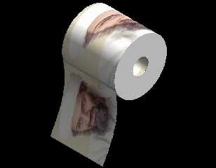
Reminds me of a Bin Laden joke someone sent me with bad texture mapping.
Needs some UV Mapping perhaps?
--
Skip
DJ Wiza <Kil### [at] TRIMBRAKESgeocitiescom> wrote in message
news:3bf0dd9e@news.povray.org...
> For some reason, whenever I render this scene, it looks kind of crappy.
>
> #include "colors.inc"
> #include "math.inc"
>
> camera {
> location <5,5,-5>
> look_at <1,0,-1>
> }
>
> light_source {
> <5,5,-5>
> color rgb 1
> }
>
> difference {
> cylinder {
> <-2,0,0>,<2,0,0>, 2
> pigment {color rgb 1.5}
> }
> cylinder {
> <-3,0,0>,<3,0,0>,.8
> pigment { Gold }
> }
> }
>
> difference {
> cylinder {
> <-2,0,0>,<2,0,0>, .8
> pigment { Gold}
> }
> cylinder {
> <-3,0,0>,<3,0,0>,.7
> pigment { Gold }
> }
> }
>
> #declare lv = 0;
> mesh {
> #while (lv <= 45)
> triangle { < -2,sind(-lv)*4,cosd(-lv)*4 >,< 2,sind(-lv)*4,cosd(-lv)*4
> >,< -2,sind(-lv+1)*4,cosd(-lv+1)*4 > }
> triangle { < 2,sind(-lv+1)*4,cosd(-lv+1)*4 >,< 2,sind(-lv)*4,cosd(-lv)*4
> >,< -2,sind(-lv+1)*4,cosd(-lv+1)*4 > }
> #declare lv = lv + 1;
> #end
> pigment { rgb 1.5 }
> translate <0,0,-6>
> }
>
>
> -DJ
>
> PS. Sorry for the bad pun.
>
> --
> "There's no joy greater that soaring high on the wings of your dreams,
> except maybe the joy of watching a dreamer who has nowhere to land but the
> ocean of reality."
>
>
>
Post a reply to this message
Attachments:
Download 'paperwork.jpg' (24 KB)
Preview of image 'paperwork.jpg'
|
|
| |
| |
|
|
|
|
| |
| |
|
|
Well, when I used Brown, it actually appeared more of a dark red than a
brown.
Also, I'll probably replace the mesh with a hollow cylinder CSG'ed with a
box. It'd probably be a bit faster.
As for textures, I suppose I could make a texture to give it the quilted
look.
-DJ
--
"There's no joy greater that soaring high on the wings of your dreams,
except maybe the joy of watching a dreamer who has nowhere to land but the
ocean of reality."
"Edward Wedig" <doc### [at] sumeritechnet> wrote in message
news:3bf125b1$1@news.povray.org...
> Well, you're only using pigments to describe your object. Maybe you should
> add full texture descriptions (like finish and normals) to them. Also,
gold
> is probably not the best color for the inside of the roll; it's too
bright.
> Try a dark brown/gray.
>
> But, the shape of the roll looks great!
>
> -Ed
Post a reply to this message
|
|
| |
| |
|
|
|
|
| |
| |
|
|
DJ Wiza wrote:
>
> Well, when I used Brown, it actually appeared more of a dark red than a
> brown.
Yes, "brown" is not really brown... try one of the ones with "wood" in
the name.
--
David Fontaine <dav### [at] faricynet> ICQ 55354965
My raytracing gallery: http://davidf.faricy.net/
Post a reply to this message
|
|
| |
| |
|
|
|
|
| |
|
|