|
 |
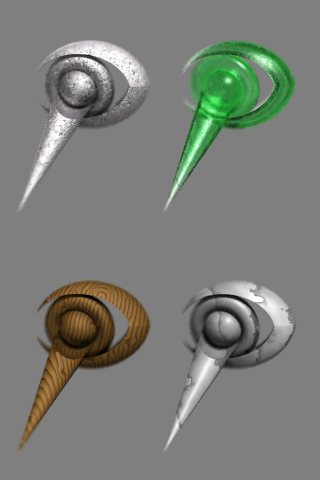
Not a whole lot different, I was making new icons for myself and this was
the changed CSG for it. Since I haven't posted much lately I figured I
needed the practice.
BTW, anybody care for the icons (24 bit, 64x64 res.)? I have to admit that
they don't plainly express the "P" for POV-Ray like the original so I'm
still considering further changes. They do however try and show a P and R
both.
Bob H.
--
http://webpages.charter.net/omniverse/omniverse.htm
Post a reply to this message
Attachments:
Download 'povlogo35mod4t.jpg' (14 KB)
Preview of image 'povlogo35mod4t.jpg'
|
|
|
|
"Jari Juslin" <zds### [at] matchem com> wrote in message
news:3BCC54F0.8FF439D5@matchem.com...
> "Bob H." wrote:
> > Not a whole lot different, I was making new icons for myself
>
> What are the textures you are using? Especially the ones on the first
> row look really good.
I just threw them together over the original ones in
..\scenes\incdemo\logo.pov file.
Bob H.
Are as follows:
#declare Silver_Metal =
texture {
pigment {color <.97,0.94,0.96>*.67}
normal {bozo 3 scallop_wave turbulence 1 scale .03}
finish {
ambient 0 diffuse 0.9 brilliance 2
specular 2 roughness 0.01 phong .5 phong_size 2 conserve_energy
reflection {0.3,0.9 falloff 2 metallic exponent .9}
}
}
#declare Green_Glass =
material {
texture {
pigment {color transmit 1}
normal {marble .15 ramp_wave turbulence .6 scale .08}
finish {
ambient 0 diffuse .2 specular 1 roughness 0.01
reflection {0.2,0.8 falloff 1 fresnel exponent .8}
}
}
interior {
ior 1.5
fade_distance 0.1 fade_power 2 fade_color <0.1,0.7,0.2>
}
}
#declare Wood_Wood =
texture {
pigment {wood octaves 3 omega .6 lambda .9
color_map {
[0 color rgb <.75,.33,.1>]
[.15 color rgb <.9,.5,.125>]
[.4 color rgb <1.2,.8,.4>]
[1 color rgb <1.3,1,.3>]
} ramp_wave turbulence .025
warp
{
black_hole <-3,-3,-3>, 2
strength 3 falloff 2
repeat <.3,.6,.1>*.5 turbulence <.1,.2,.3>
}
scale .05}
normal {wood .1 ramp_wave turbulence .025 scale .05}
finish {
ambient .2 diffuse .4 brilliance 1
specular .1 roughness .1 phong .05 phong_size 1 crand .1
reflection {0.03,0.09 falloff 2}
} rotate <70,-5,-10>
}
#declare Marble_Stone =
texture {
pigment {
marble
color_map {
[0 color rgbf <.67,.67,.67,.01>]
[.1 color rgbf <.75,.75,.75,.02>]
[.2 color rgbf <.95,.95,.95,.03>]
[1 color rgbf <1.2,1.2,1.2,.07>]
} ramp_wave turbulence .8 scale .4
}
normal {marble .05 ramp_wave turbulence .8 scale .4}
finish {
ambient .3 diffuse .7 specular .3 roughness 0.01 phong .1
phong_size 5 crand .05 conserve_energy
reflection {0.05,0.15 falloff 2}
}
} com> wrote in message
news:3BCC54F0.8FF439D5@matchem.com...
> "Bob H." wrote:
> > Not a whole lot different, I was making new icons for myself
>
> What are the textures you are using? Especially the ones on the first
> row look really good.
I just threw them together over the original ones in
..\scenes\incdemo\logo.pov file.
Bob H.
Are as follows:
#declare Silver_Metal =
texture {
pigment {color <.97,0.94,0.96>*.67}
normal {bozo 3 scallop_wave turbulence 1 scale .03}
finish {
ambient 0 diffuse 0.9 brilliance 2
specular 2 roughness 0.01 phong .5 phong_size 2 conserve_energy
reflection {0.3,0.9 falloff 2 metallic exponent .9}
}
}
#declare Green_Glass =
material {
texture {
pigment {color transmit 1}
normal {marble .15 ramp_wave turbulence .6 scale .08}
finish {
ambient 0 diffuse .2 specular 1 roughness 0.01
reflection {0.2,0.8 falloff 1 fresnel exponent .8}
}
}
interior {
ior 1.5
fade_distance 0.1 fade_power 2 fade_color <0.1,0.7,0.2>
}
}
#declare Wood_Wood =
texture {
pigment {wood octaves 3 omega .6 lambda .9
color_map {
[0 color rgb <.75,.33,.1>]
[.15 color rgb <.9,.5,.125>]
[.4 color rgb <1.2,.8,.4>]
[1 color rgb <1.3,1,.3>]
} ramp_wave turbulence .025
warp
{
black_hole <-3,-3,-3>, 2
strength 3 falloff 2
repeat <.3,.6,.1>*.5 turbulence <.1,.2,.3>
}
scale .05}
normal {wood .1 ramp_wave turbulence .025 scale .05}
finish {
ambient .2 diffuse .4 brilliance 1
specular .1 roughness .1 phong .05 phong_size 1 crand .1
reflection {0.03,0.09 falloff 2}
} rotate <70,-5,-10>
}
#declare Marble_Stone =
texture {
pigment {
marble
color_map {
[0 color rgbf <.67,.67,.67,.01>]
[.1 color rgbf <.75,.75,.75,.02>]
[.2 color rgbf <.95,.95,.95,.03>]
[1 color rgbf <1.2,1.2,1.2,.07>]
} ramp_wave turbulence .8 scale .4
}
normal {marble .05 ramp_wave turbulence .8 scale .4}
finish {
ambient .3 diffuse .7 specular .3 roughness 0.01 phong .1
phong_size 5 crand .05 conserve_energy
reflection {0.05,0.15 falloff 2}
}
}
Post a reply to this message
|
|
|
|
Sometimes you want to use both sharp and smooth highlights, but just for
artistic needs.
I always use specular too, even if you can get serious problems at glancing
angles with it...
--
Jonathan.
"Lutz-Peter Hooge" <lpv### [at] gmxde> ha scritto nel messaggio
news:MPG.1636e742f4c6406b9896a1@news.povray.org...
> In article <3bcc8e58@news.povray.org>, omn### [at] msncom says...
>
> > specular 2 roughness 0.01 phong .5 phong_size 2 conserve_energy
> I've seen it several times now, that people use both phong AND specular
> in the same texture.
> What is the reason for it? I thought they are 2 different ways to
> simlulate the same thing. And since the POV Documentation says specular
> is the more realistic one, I alway used only specular.
>
> Lutz-Peter
Post a reply to this message
|
|
|
|
"JRG" <jrg### [at] hotmailcom> wrote in message
news:3bcde755@news.povray.org...
> Sometimes you want to use both sharp and smooth highlights, but just for
> artistic needs.
> I always use specular too, even if you can get serious problems at
glancing
> angles with it...
Yep, specular is my first choice then if I want two different amounts/sizes
of highlights I'll add phong as the broader and less obvious of the two.
Mostly just for effect, since phong has that unique sort of boundary which
can make the texture look as though there's a dual surface skin. That's how
I see it anyway.
Bob H.
Post a reply to this message
|
|