|
|
|
|
|
|
| |
| |
|
|
|
|
| |
| |
|
|
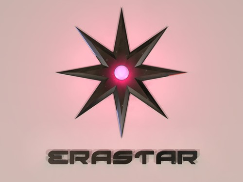
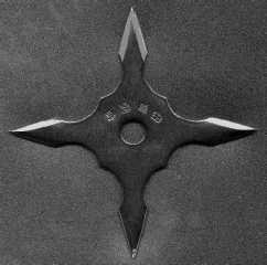
Hello everybody,
I'm new with POV and here is my first image.
It's a logo (splash screen) for the software I am working on.
doesn't it look a little bit empty ?
I'm waiting for your suggestion
megaPov 0.6
with radiosity
1024x768 = 10h25mn
----------------------------------------------------------------------------
--------
Olivier Rougeron - ErawarE
Network admin and webmaster
Tel : (33/0) 1 30 49 09 55 - Fax : (33/0) 1 30 49 09 56
email:oro### [at] eraware-soft com - http://www.eraware-soft.com
----------------------------------------------------------------------------
-------- com - http://www.eraware-soft.com
----------------------------------------------------------------------------
--------
Post a reply to this message
Attachments:
Download 'shuriken 1.5.jpg' (20 KB)
Preview of image 'shuriken 1.5.jpg'
|
|
| |
| |
|
|
|
|
| |
| |
|
|
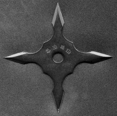
A little empty, yes. Current form would look better on a building.
Also, why has the Shuriken more than 4 points? My real ones have four,
because of the way they are to be used; held in the hand and not throwing.
I think they look better; here is an example.
ian
Olivier Rougeron wrote in message <39dc60e1@news.povray.org>...
>Hello everybody,
>
>I'm new with POV and here is my first image.
>
>It's a logo (splash screen) for the software I am working on.
>doesn't it look a little bit empty ?
Post a reply to this message
Attachments:
Download 'shuriken.png' (19 KB)
Preview of image 'shuriken.png'
|
|
| |
| |
|
|
|
|
| |
| |
|
|
Hi and welcome to the group.
I think it looks great as it is, considering people will only see it
for a few seconds at a time. It'll give the software an identity
that can't be mistaken. Nice work.
--
Cheers
Steve email mailto:ste### [at] zeroppsuklinuxnet
%HAV-A-NICEDAY Error not enough coffee 0 pps.
web http://www.zeropps.uklinux.net/
or http://start.at/zero-pps
1:08pm up 6 days, 15:28, 2 users, load average: 2.06, 2.55, 3.29
Post a reply to this message
|
|
| |
| |
|
|
|
|
| |
| |
|
|
"ian" <ian### [at] aolcom> wrote :
>
> Also, why has the Shuriken more than 4 points? My real ones have four,
> because of the way they are to be used; held in the hand and not throwing.
I've seen and made real ones with any number of blades, including one.
IIRC, shuriken is any throwing blade. A more proper term might be shuriken
star. there is another term that I can't call to mind right now that means a
held blade that is not a sword.
That said, I think the name and the web-site shows that this is not a
weapon, but a stylized star.
Post a reply to this message
|
|
| |
| |
|
|
|
|
| |
| |
|
|
As a logo it is fine. It doesn't need anything else to enhance it. Logos should
be simple, clear to read, and instantly recognizable. This succeeds in all
three. Of course, you can play with it a lot, too, but it removes itself from
being a logo in that usage.
Thus spoke the one time graphic designer.
Josh
Olivier Rougeron wrote:
> Hello everybody,
>
> I'm new with POV and here is my first image.
>
> It's a logo (splash screen) for the software I am working on.
> doesn't it look a little bit empty ?
>
> I'm waiting for your suggestion
>
> megaPov 0.6
> with radiosity
> 1024x768 = 10h25mn
>
> ----------------------------------------------------------------------------
> --------
> Olivier Rougeron - ErawarE
> Network admin and webmaster
> Tel : (33/0) 1 30 49 09 55 - Fax : (33/0) 1 30 49 09 56
> email:oro### [at] eraware-softcom - http://www.eraware-soft.com
> ----------------------------------------------------------------------------
> --------
>
> [Image]
--
Josh English -- Lexiphanic Lethomaniac
eng### [at] spiritonecom
The POV-Ray Cyclopedia http://www.spiritone.com/~english/cyclopedia/
Post a reply to this message
|
|
| |
| |
|
|
|
|
| |
| |
|
|
Looks great - maybe a normal on the lettering and/or the star? (and
therefore a slightly lighter colour to show it off).
Might be worth trying no_shadow on the lettering?
Post a reply to this message
|
|
| |
| |
|
|
|
|
| |
| |
|
|
"Olivier Rougeron" <oro### [at] eraware-softcom> wrote in message
news:39dc60e1@news.povray.org...
|
| It's a logo (splash screen) for the software I am working on.
| doesn't it look a little bit empty ?
|
| I'm waiting for your suggestion
Although the shadows are a nice 3D touch it doesn't seem clean enough with
them as is. Could be the double-shadowing making me think so, or that there
isn't enough of a shadow to make the objects prominent. Something about it
anyway.
I agree with the other replies that this is all you need, complexity in a
logo isn't a good idea, however for a splash screen it could be more I
suppose. Won't there be additional wording on this if used as such? If so
this might be best then.
How about a deeper red outer glow (fading fast) with this bright pinkish
color only in the center of the light object. I think that would seem more
dramatic. Since you're new to POV-Ray keywords fade_distance D (D being how
far before fading) and fade_power 2 or 3 should do well. Of course it all
depends on what type of look you are wanting.
Bob
Post a reply to this message
|
|
| |
| |
|
|
|
|
| |
| |
|
|
> Hello everybody,
>
> I'm new with POV and here is my first image.
>
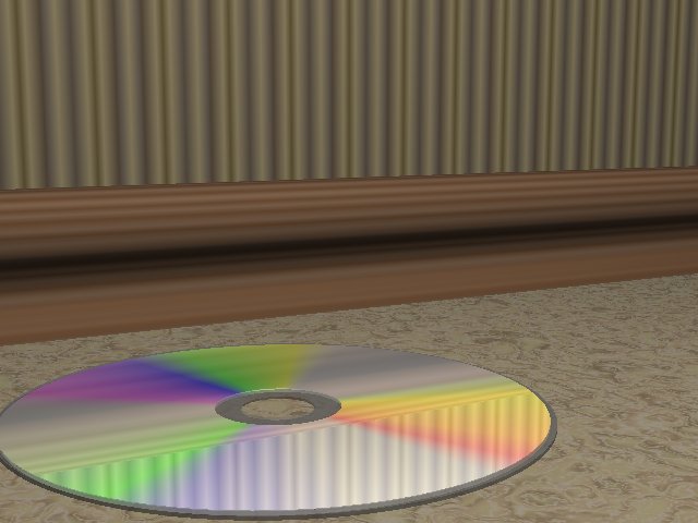
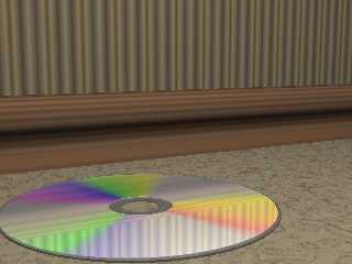
you lie! :)
everyone's first images are ten fold better than my first image. here.. let
me find it.
note that this isn't really the first version. the first had a very flat
tori as the CD (laugh) because I didn't know how to do CSG. and the cd
texture isn't "real" of course, it's some gradient texture i think.
only in a raytrace would you find such ugly wallpaper and carpet :)
ross
Post a reply to this message
Attachments:
Download 'ross_4.jpg' (40 KB)
Preview of image 'ross_4.jpg'
|
|
| |
| |
|
|
|
|
| |
| |
|
|
That's right ! I ommit some precisions
It's not the first render of this scene (if you have noticed the name of the
file it's shuriken1.5).
In fact it's the first image I am proud enough to show you ;-)
But it's really my first scene mades in POV and there were about thirty
tries before this rendering.
Therefore, is there a way to make a bevel effect on the text ?
39dcaac6@news.povray.org...
> > Hello everybody,
> >
> > I'm new with POV and here is my first image.
> >
>
>
> you lie! :)
>
> everyone's first images are ten fold better than my first image. here..
let
> me find it.
>
> note that this isn't really the first version. the first had a very flat
> tori as the CD (laugh) because I didn't know how to do CSG. and the cd
> texture isn't "real" of course, it's some gradient texture i think.
>
> only in a raytrace would you find such ugly wallpaper and carpet :)
>
> ross
>
>
>
Post a reply to this message
|
|
| |
| |
|
|
|
|
| |
| |
|
|
On Thu, 5 Oct 2000 09:27:54 -0400, Bill DeWitt wrote...
> "ian" <ian### [at] aolcom> wrote :
> >
> > Also, why has the Shuriken more than 4 points? My real ones have four,
> > because of the way they are to be used; held in the hand and not throwing.
>
> I've seen and made real ones with any number of blades, including one.
> IIRC, shuriken is any throwing blade. A more proper term might be shuriken
> star. there is another term that I can't call to mind right now that means a
> held blade that is not a sword.
IIRC, a shuriken is a single pointed throwing weapon, and the name for a
multi pointed throwing weapon is a Shaken. Of course this being an
english translation of Japanese, it's easily open to confusion.
Bye for now,
Jamie.
Post a reply to this message
|
|
| |
| |
|
|
|
|
| |