|
|
|
|
|
|
| |
| |
|
|
|
|
| |
| |
|
|
Hi all,
well, nothing exciting, I'm afraid. I have a recycle bin full of
piccies now! :o) There's quite a bit of PhotoDeluxe 2.0 and PS5 in the
biggy. And I think the B+W stands out quite well. The 'line' is supposed to
be a 'ray', but, having never seen one, (or have I?), I don't know what they
look like! ;o) Any advice on lasers will be most welcome.
What do you think?
~Steve~
Post a reply to this message
Attachments:
Download 'Pov Logo Colour 420x305.(N copy.JPG' (31 KB)
Download 'PovLogoB+W,35X29(New).jpg' (5 KB)
Preview of image 'Pov Logo Colour 420x305.(N copy.JPG'

Preview of image 'PovLogoB+W,35X29(New).jpg'
|
|
| |
| |
|
|
|
|
| |
| |
|
|
Wow! I really like this one. When we used chalk dust to make a laser beam
visible, it did not look solid.
Brendan
25ct wrote:
> Hi all,
> well, nothing exciting, I'm afraid. I have a recycle bin full of
> piccies now! :o) There's quite a bit of PhotoDeluxe 2.0 and PS5 in the
> biggy. And I think the B+W stands out quite well. The 'line' is supposed to
> be a 'ray', but, having never seen one, (or have I?), I don't know what they
> look like! ;o) Any advice on lasers will be most welcome.
>
> What do you think?
>
> ~Steve~
>
> [Image]
>
> [Image]
Post a reply to this message
|
|
| |
| |
|
|
|
|
| |
| |
|
|
"25ct" wrote:
> What do you think?
Your logo is very nice, but I'm afraid it doesn't quite follow the rules in
its current state. Some small changes might help it though! :-)
The logo must work well in just black and white, with no shades of grey
(except for anti-aliasing).
Your logo seems to be quite reliant on the shades of grey (and the small b/w
version you posted had indeed shades of grey). How does it look in just
black and white?
It seems to me like you have made a logo in 3D with some nice effects, and
then made a 2D black and white version afterwards. But generally when making
logos it's better to start with making the simple 2D black and white logo,
and then add all the interesting effects afterwards.
I have just updated the logo section of my website. You can find more info
there.
http://rsj.mobilixnet.dk/logo/logo.html
or if the above link doesn't work, try
http://hjem.get2net.dk/rsj/logo/logo.html
Here are some suggestions:
The basic design idea is fine, but try to simplify the design.
Instead of using a lens-flare (which require shades of grey), try using a
simple star-shape, or maybe a simple sphere will even do. Something simple
that works in black and white.
The depth to the letters doesn't work well when they're completely white
anyway (in the b/w version), Try making the letters 2D.
A starry background is not very good in a logo. Stars are small details that
easily disappear at small resolutions. Also, with a starry BG, the logo has
a kind of science fiction feeling to it. It would be better if it was more
neutral so the logo could be given many different "feelings".
Remove the rectangular frame around the logo. Logos are not fine pieces that
should be framed, they are simple symbols that should float independently in
the air! :-)
All of the suggestions are of course my personal opinions only. Hope you can
use them...
Greetings,
Rune
--
\ Include files, tutorials, 3D images, raytracing jokes,
/ The POV Desktop Theme, and The POV-Ray Logo Contest can
\ all be found at http://rsj.mobilixnet.dk (updated July 23)
/ Also visit http://www.povrayusers.org
Post a reply to this message
|
|
| |
| |
|
|
|
|
| |
| |
|
|
This one is the nicest logo I've seen so far! It's easy to know what program
is referred to, and it's easy to read the small bw-version.
I'd like to make the borders in the bw-version transparent (GIF), since I'd
prefer to use a round logo on my pics.
--
Peter
http://hertel.no/bigone
25ct <25c### [at] lineone net> wrote in message news:39ba77e7@news.povray.org...
> Hi all,
> well, nothing exciting, I'm afraid. I have a recycle bin full of
> piccies now! :o) There's quite a bit of PhotoDeluxe 2.0 and PS5 in the
> biggy. And I think the B+W stands out quite well. The 'line' is supposed
to
> be a 'ray', but, having never seen one, (or have I?), I don't know what
they
> look like! ;o) Any advice on lasers will be most welcome.
>
> What do you think?
>
> ~Steve~
>
>
>
>
> net> wrote in message news:39ba77e7@news.povray.org...
> Hi all,
> well, nothing exciting, I'm afraid. I have a recycle bin full of
> piccies now! :o) There's quite a bit of PhotoDeluxe 2.0 and PS5 in the
> biggy. And I think the B+W stands out quite well. The 'line' is supposed
to
> be a 'ray', but, having never seen one, (or have I?), I don't know what
they
> look like! ;o) Any advice on lasers will be most welcome.
>
> What do you think?
>
> ~Steve~
>
>
>
>
>
Post a reply to this message
|
|
| |
| |
|
|
|
|
| |
| |
|
|
"Rune" <run### [at] inamecom> wrote in message
news:39baa2ed@news.povray.org...
> "25ct" wrote:
> > What do you think?
>
> Your logo is very nice, but I'm afraid it doesn't quite follow the rules
in
> its current state. Some small changes might help it though! :-)
>
> The logo must work well in just black and white, with no shades of grey
> (except for anti-aliasing).
> Your logo seems to be quite reliant on the shades of grey (and the small
b/w
> version you posted had indeed shades of grey). How does it look in just
> black and white?
Terrible!
Yes Rune. It has shades of grey because I didn't know that a lens
flare did this. However, after looking at the image again, you are right. So
the lens flare is out.
>
> It seems to me like you have made a logo in 3D with some nice effects, and
> then made a 2D black and white version afterwards. But generally when
making
> logos it's better to start with making the simple 2D black and white logo,
> and then add all the interesting effects afterwards.
I tried it your way and found it harder. Because I'm not used to PoV yet
;o)
>
> I have just updated the logo section of my website. You can find more info
> there.
> http://rsj.mobilixnet.dk/logo/logo.html
> or if the above link doesn't work, try
> http://hjem.get2net.dk/rsj/logo/logo.html
>
> Here are some suggestions:
>
> The basic design idea is fine, but try to simplify the design.
I'm sorry Rune, I thought it was a 'basically simple' design?
>
> Instead of using a lens-flare (which require shades of grey), try using a
> simple star-shape, or maybe a simple sphere will even do. Something simple
> that works in black and white.
I tried a simple star shape, and it loses all the details when reduced
to 32x32. And a simple sphere loses the definition of being a 'ray'. It
looks more like a majestic mace at that size, and not like a ray.
>
> The depth to the letters doesn't work well when they're completely white
> anyway (in the b/w version), Try making the letters 2D.
This, I agree with. But 2d looks boring. It's got to have some depth
to it, but not as much as in the original.
>
> A starry background is not very good in a logo. Stars are small details
that
> easily disappear at small resolutions.
Although my stars are still there at 35x29 ;o)
Also, with a starry BG, the logo has
> a kind of science fiction feeling to it. It would be better if it was more
> neutral so the logo could be given many different "feelings".
Well, I wasn't trying to give it a 'science fiction' feeling, more of a
"PoV-Ray belongs in the future" feeling.
Also, I believe that it is very hard indeed to produce many different
"feelings" from one image. I must try it one day.
>
> Remove the rectangular frame around the logo. Logos are not fine pieces
that
> should be framed, they are simple symbols that should float independently
in
> the air! :-)
Sorry Rune. Out of the many millions of logo's out in the business
world - they all float in the air? I understand what you are saying. The
logos that you are talking about are there, but so are many other forms,
ranging from very simple to the extremely hard to recognise ones.
>
> All of the suggestions are of course my personal opinions only. Hope you
can
> use them...
All of my answers are of course my personal opinions only. ;o)
I have taken on board everything that you have said, and I am at
present working on something else. Hopefully, all PoV.
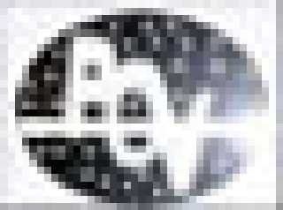
I have attached for you, a 35x29 B+W version of what I'm working on at
the moment.
>
> Greetings,
>
> Rune
~Steve~
> --
> \ Include files, tutorials, 3D images, raytracing jokes,
> / The POV Desktop Theme, and The POV-Ray Logo Contest can
> \ all be found at http://rsj.mobilixnet.dk (updated July 23)
> / Also visit http://www.povrayusers.org
>
>
Post a reply to this message
Attachments:
Download '35x29B+WPoV Logo..jpg' (42 KB)
Preview of image '35x29B+WPoV Logo..jpg'

|
|
| |
| |
|
|
|
|
| |
| |
|
|
Many thanks Pete. Your good advice taken on board. I'm going to try a
different approach now, probably without a laser beam in it. So look out
for something similar but better, (I hope ;o)
~Steve~ (Very nice images on your site, btw. I certainly like the
'Golden Chair' images)
"Peter Hertel" <pet### [at] hertelno> wrote in message
news:39baa665@news.povray.org...
> This one is the nicest logo I've seen so far! It's easy to know what
program
> is referred to, and it's easy to read the small bw-version.
> I'd like to make the borders in the bw-version transparent (GIF), since
I'd
> prefer to use a round logo on my pics.
>
> --
> Peter
> http://hertel.no/bigone
>
> 25ct <25c### [at] lineonenet> wrote in message news:39ba77e7@news.povray.org...
> > Hi all,
> > well, nothing exciting, I'm afraid. I have a recycle bin full
of
> > piccies now! :o) There's quite a bit of PhotoDeluxe 2.0 and PS5 in the
> > biggy. And I think the B+W stands out quite well. The 'line' is supposed
> to
> > be a 'ray', but, having never seen one, (or have I?), I don't know what
> they
> > look like! ;o) Any advice on lasers will be most welcome.
> >
> > What do you think?
> >
> > ~Steve~
> >
> >
> >
> >
> >
>
>
Post a reply to this message
|
|
| |
| |
|
|
|
|
| |
| |
|
|
Thanks Brendan. I've tried out your advice, and it works. But it won't
work in the comp. because the 'fogging' of the ray will turn out as a grey
shadow on the B+W's. So laser beams are out, I'm afraid.
Thanks again, ~Steve~ :o)
"Andrea Ryan" <ary### [at] global2000net> wrote in message
news:39BA7DA7.20FB37DB@global2000.net...
> Wow! I really like this one. When we used chalk dust to make a laser
beam
> visible, it did not look solid.
> Brendan
>
> 25ct wrote:
>
> > Hi all,
> > well, nothing exciting, I'm afraid. I have a recycle bin full
of
> > piccies now! :o) There's quite a bit of PhotoDeluxe 2.0 and PS5 in the
> > biggy. And I think the B+W stands out quite well. The 'line' is supposed
to
> > be a 'ray', but, having never seen one, (or have I?), I don't know what
they
> > look like! ;o) Any advice on lasers will be most welcome.
> >
> > What do you think?
> >
> > ~Steve~
> >
> > [Image]
> >
> > [Image]
>
Post a reply to this message
|
|
| |
| |
|
|
|
|
| |
| |
|
|
"25ct" wrote:
>
> "Rune" wrote:
> > The basic design idea is fine, but try to simplify the design.
>
> I'm sorry Rune, I thought it was a 'basically simple' design?
The new version you sent is more simple, and I think it looks more like a
real logo.
> > Also, with a starry BG, the logo has a kind of science fiction
> > feeling to it. It would be better if it was more neutral so the
> > logo could be given many different "feelings".
>
> Well, I wasn't trying to give it a 'science fiction' feeling,
> more of a "PoV-Ray belongs in the future" feeling.
Um, what is the connection between stars and the future? :-)
Don't answer, I know it's a matter of how you see it...
> Also, I believe that it is very hard indeed to produce
> many different "feelings" from one image. I must try it one day.
I think you misunderstood me. I mean it should be possible to make many
different *versions* of the logo that has different feelings. Look at the
logos already submitted to see what I mean.
If you included a starry background in your core logo design, it would have
to be a part of the logo in *all* the versions, and that would make it less
flexible. It would be more difficult to give the logo different "feelings"
when the stars always had to be there.
> > Remove the rectangular frame around the logo. Logos are not
> > fine pieces that should be framed, they are simple symbols
> > that should float independently in the air! :-)
>
> Sorry Rune. Out of the many millions of logo's out in the
> business world - they all float in the air?
No, not all - it was just a suggestion anyway. I think logos look more
dynamic and artistic when they are not being framed by a "boring"
rectangular (or square) frame.
> I am at present working on something else. Hopefully, all PoV.
> I have attached for you, a 35x29 B+W version of what I'm
> working on at the moment.
As I said, this looks much more like an actual logo. Much more simple and
much more flexible. Very good, keep it up! :-)
Rune
--
\ Include files, tutorials, 3D images, raytracing jokes,
/ The POV Desktop Theme, and The POV-Ray Logo Contest can
\ all be found at http://rsj.mobilixnet.dk (updated July 23)
/ Also visit http://www.povrayusers.org
Post a reply to this message
|
|
| |
| |
|
|
|
|
| |
| |
|
|
"Rune" <run### [at] inamecom> wrote in message
news:39bd2dbb@news.povray.org...
> If you included a starry background in your core logo design, it would
have
> to be a part of the logo in *all* the versions, and that would make it
less
> flexible. It would be more difficult to give the logo different "feelings"
> when the stars always had to be there.
Understood. :o)
>
> As I said, this looks much more like an actual logo. Much more simple and
> much more flexible. Very good, keep it up! :-)
Thanks. :o)
>
> Rune
~Steve~ ;o)
> --
> \ Include files, tutorials, 3D images, raytracing jokes,
> / The POV Desktop Theme, and The POV-Ray Logo Contest can
> \ all be found at http://rsj.mobilixnet.dk (updated July 23)
> / Also visit http://www.povrayusers.org
>
>
Post a reply to this message
|
|
| |
| |
|
|
|
|
| |
|
|