|
 |
"Rune" <run### [at] iname com> wrote in message
news:39baa2ed@news.povray.org...
> "25ct" wrote:
> > What do you think?
>
> Your logo is very nice, but I'm afraid it doesn't quite follow the rules
in
> its current state. Some small changes might help it though! :-)
>
> The logo must work well in just black and white, with no shades of grey
> (except for anti-aliasing).
> Your logo seems to be quite reliant on the shades of grey (and the small
b/w
> version you posted had indeed shades of grey). How does it look in just
> black and white?
Terrible!
Yes Rune. It has shades of grey because I didn't know that a lens
flare did this. However, after looking at the image again, you are right. So
the lens flare is out.
>
> It seems to me like you have made a logo in 3D with some nice effects, and
> then made a 2D black and white version afterwards. But generally when
making
> logos it's better to start with making the simple 2D black and white logo,
> and then add all the interesting effects afterwards.
I tried it your way and found it harder. Because I'm not used to PoV yet
;o)
>
> I have just updated the logo section of my website. You can find more info
> there.
> http://rsj.mobilixnet.dk/logo/logo.html
> or if the above link doesn't work, try
> http://hjem.get2net.dk/rsj/logo/logo.html
>
> Here are some suggestions:
>
> The basic design idea is fine, but try to simplify the design.
I'm sorry Rune, I thought it was a 'basically simple' design?
>
> Instead of using a lens-flare (which require shades of grey), try using a
> simple star-shape, or maybe a simple sphere will even do. Something simple
> that works in black and white.
I tried a simple star shape, and it loses all the details when reduced
to 32x32. And a simple sphere loses the definition of being a 'ray'. It
looks more like a majestic mace at that size, and not like a ray.
>
> The depth to the letters doesn't work well when they're completely white
> anyway (in the b/w version), Try making the letters 2D.
This, I agree with. But 2d looks boring. It's got to have some depth
to it, but not as much as in the original.
>
> A starry background is not very good in a logo. Stars are small details
that
> easily disappear at small resolutions.
Although my stars are still there at 35x29 ;o)
Also, with a starry BG, the logo has
> a kind of science fiction feeling to it. It would be better if it was more
> neutral so the logo could be given many different "feelings".
Well, I wasn't trying to give it a 'science fiction' feeling, more of a
"PoV-Ray belongs in the future" feeling.
Also, I believe that it is very hard indeed to produce many different
"feelings" from one image. I must try it one day.
>
> Remove the rectangular frame around the logo. Logos are not fine pieces
that
> should be framed, they are simple symbols that should float independently
in
> the air! :-)
Sorry Rune. Out of the many millions of logo's out in the business
world - they all float in the air? I understand what you are saying. The
logos that you are talking about are there, but so are many other forms,
ranging from very simple to the extremely hard to recognise ones.
>
> All of the suggestions are of course my personal opinions only. Hope you
can
> use them...
All of my answers are of course my personal opinions only. ;o)
I have taken on board everything that you have said, and I am at
present working on something else. Hopefully, all PoV.
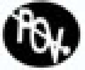
I have attached for you, a 35x29 B+W version of what I'm working on at
the moment.
>
> Greetings,
>
> Rune
~Steve~
> --
> \ Include files, tutorials, 3D images, raytracing jokes,
> / The POV Desktop Theme, and The POV-Ray Logo Contest can
> \ all be found at http://rsj.mobilixnet.dk (updated July 23)
> / Also visit http://www.povrayusers.org
>
> com> wrote in message
news:39baa2ed@news.povray.org...
> "25ct" wrote:
> > What do you think?
>
> Your logo is very nice, but I'm afraid it doesn't quite follow the rules
in
> its current state. Some small changes might help it though! :-)
>
> The logo must work well in just black and white, with no shades of grey
> (except for anti-aliasing).
> Your logo seems to be quite reliant on the shades of grey (and the small
b/w
> version you posted had indeed shades of grey). How does it look in just
> black and white?
Terrible!
Yes Rune. It has shades of grey because I didn't know that a lens
flare did this. However, after looking at the image again, you are right. So
the lens flare is out.
>
> It seems to me like you have made a logo in 3D with some nice effects, and
> then made a 2D black and white version afterwards. But generally when
making
> logos it's better to start with making the simple 2D black and white logo,
> and then add all the interesting effects afterwards.
I tried it your way and found it harder. Because I'm not used to PoV yet
;o)
>
> I have just updated the logo section of my website. You can find more info
> there.
> http://rsj.mobilixnet.dk/logo/logo.html
> or if the above link doesn't work, try
> http://hjem.get2net.dk/rsj/logo/logo.html
>
> Here are some suggestions:
>
> The basic design idea is fine, but try to simplify the design.
I'm sorry Rune, I thought it was a 'basically simple' design?
>
> Instead of using a lens-flare (which require shades of grey), try using a
> simple star-shape, or maybe a simple sphere will even do. Something simple
> that works in black and white.
I tried a simple star shape, and it loses all the details when reduced
to 32x32. And a simple sphere loses the definition of being a 'ray'. It
looks more like a majestic mace at that size, and not like a ray.
>
> The depth to the letters doesn't work well when they're completely white
> anyway (in the b/w version), Try making the letters 2D.
This, I agree with. But 2d looks boring. It's got to have some depth
to it, but not as much as in the original.
>
> A starry background is not very good in a logo. Stars are small details
that
> easily disappear at small resolutions.
Although my stars are still there at 35x29 ;o)
Also, with a starry BG, the logo has
> a kind of science fiction feeling to it. It would be better if it was more
> neutral so the logo could be given many different "feelings".
Well, I wasn't trying to give it a 'science fiction' feeling, more of a
"PoV-Ray belongs in the future" feeling.
Also, I believe that it is very hard indeed to produce many different
"feelings" from one image. I must try it one day.
>
> Remove the rectangular frame around the logo. Logos are not fine pieces
that
> should be framed, they are simple symbols that should float independently
in
> the air! :-)
Sorry Rune. Out of the many millions of logo's out in the business
world - they all float in the air? I understand what you are saying. The
logos that you are talking about are there, but so are many other forms,
ranging from very simple to the extremely hard to recognise ones.
>
> All of the suggestions are of course my personal opinions only. Hope you
can
> use them...
All of my answers are of course my personal opinions only. ;o)
I have taken on board everything that you have said, and I am at
present working on something else. Hopefully, all PoV.
I have attached for you, a 35x29 B+W version of what I'm working on at
the moment.
>
> Greetings,
>
> Rune
~Steve~
> --
> \ Include files, tutorials, 3D images, raytracing jokes,
> / The POV Desktop Theme, and The POV-Ray Logo Contest can
> \ all be found at http://rsj.mobilixnet.dk (updated July 23)
> / Also visit http://www.povrayusers.org
>
>
Post a reply to this message
Attachments:
Download '35x29B+WPoV Logo..jpg' (42 KB)
Preview of image '35x29B+WPoV Logo..jpg'
|
|


