 |
 |
|
 |
|
 |
|  |
|  |
|
 |
|
 |
|  |
|  |
|
 |
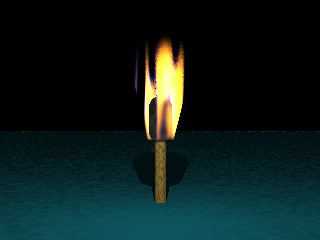
Well, after a little digging and playing around It's a little better,
I still think it looks like a match...
Anyway I like the feedback from this group. Comments anyone?
Alan
Post a reply to this message
Attachments:
Download 'torch.jpg' (7 KB)
Preview of image 'torch.jpg'

|
 |
|  |
|  |
|
 |
From: Tom Melly
Subject: Re: Torch (WIP), still needs a better flame...
Date: 26 Jul 2000 08:55:51
Message: <397edfd7@news.povray.org>
|
|
 |
|  |
|  |
|
 |
"Alan Nickerson" <ani### [at] mathsoft com> wrote in message
news:397edc26$1@news.povray.org...
> Well, after a little digging and playing around It's a little better,
> I still think it looks like a match...
>
> Anyway I like the feedback from this group. Comments anyone?
>
> Alan
>
That's getting there - however, the gaps in the lower flame look a little
odd.
Now try rendering with a white background ;) com> wrote in message
news:397edc26$1@news.povray.org...
> Well, after a little digging and playing around It's a little better,
> I still think it looks like a match...
>
> Anyway I like the feedback from this group. Comments anyone?
>
> Alan
>
That's getting there - however, the gaps in the lower flame look a little
odd.
Now try rendering with a white background ;)
Post a reply to this message
|
 |
|  |
|  |
|
 |
From: Gail Shaw
Subject: Re: Torch (WIP), still needs a better flame...
Date: 26 Jul 2000 09:55:29
Message: <397eedd1@news.povray.org>
|
|
 |
|  |
|  |
|
 |
Alan Nickerson wrote in message <397edc26$1@news.povray.org>...
>Well, after a little digging and playing around It's a little better,
>I still think it looks like a match...
>
>Anyway I like the feedback from this group. Comments anyone?
>
I used this (with a small amout of success) for a torch in a dungeon scene
media {
emission 0.5
absorption 0.5
intervals 1
samples 1, 10
confidence 0.9
variance 1/1000
method 3
density {
cylindrical
turbulence 0.9
color_map {
[0.0 color rgb <0, 0, 0>]
[0.25 color rgb <1,1,0.1>]
[0.5 color rgb <1,0.2,0.1>]
[0.75 color rgbf <1,1,0.5,0.2>]
[1.0 color rgbf <1,1,0.7,0.8>]
}
rotate 90*x
}
}
It's not fantastic. If you're using official pov remove the line
"method 3" and push the intervals up.
Gail
********************************************************************
* gsh### [at] monotix co co za * Reality.dat not found *
* http://www.rucus.ru.ac.za/~gail/ * Attempting to reboot universe *
********************************************************************
* The best way to accelerate Windows NT is at 9.8 m/s^2 *
******************************************************************** za * Reality.dat not found *
* http://www.rucus.ru.ac.za/~gail/ * Attempting to reboot universe *
********************************************************************
* The best way to accelerate Windows NT is at 9.8 m/s^2 *
********************************************************************
Post a reply to this message
|
 |
|  |
|  |
|
 |
From: Bill DeWitt
Subject: Re: Torch (WIP), still needs a better flame...
Date: 26 Jul 2000 10:47:46
Message: <397efa12@news.povray.org>
|
|
 |
|  |
|  |
|
 |
"Alan Nickerson" <ani### [at] mathsoft com> wrote :
>
> I still think it looks like a match...
It would look a lot less like a match if you put something in the scene
to give it scale. com> wrote :
>
> I still think it looks like a match...
It would look a lot less like a match if you put something in the scene
to give it scale.
Post a reply to this message
|
 |
|  |
|  |
|
 |
|
 |
|  |
|  |
|
 |
Alan Nickerson wrote:
>
> Well, after a little digging and playing around It's a little better,
> I still think it looks like a match...
>
> Anyway I like the feedback from this group. Comments anyone?
>
> Alan
>
> [Image]
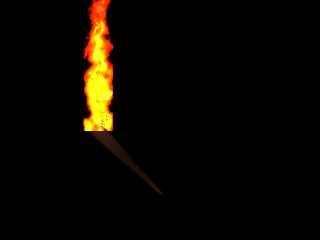
Some time back, I did this for a torch (since it was a
small part of the picture I didn't need more details and the
bad bottom of the flame wasn't an issue...)
Jerome
--
* Doctor Jekyll had something * mailto:ber### [at] iname com
* to Hyde... * http://www.enst.fr/~jberger
******************************* com
* to Hyde... * http://www.enst.fr/~jberger
*******************************
Post a reply to this message
Attachments:
Download 'test.jpg' (10 KB)
Download 'us-ascii' (2 KB)
Preview of image 'test.jpg'

|
 |
|  |
|  |
|
 |
From: Zeger Knaepen
Subject: Re: Torch (WIP), still needs a better flame...
Date: 26 Jul 2000 12:41:50
Message: <397f14ce@news.povray.org>
|
|
 |
|  |
|  |
|
 |
I think it those colors are a bit oversaturated (?), but it's a nice shape!
ZK
http://www.povplace.be.tf
Jerome <ber### [at] iname com> schreef in berichtnieuws
397F00E5.6AE0FBEC@iname.com...
> Alan Nickerson wrote:
> >
> > Well, after a little digging and playing around It's a little better,
> > I still think it looks like a match...
> >
> > Anyway I like the feedback from this group. Comments anyone?
> >
> > Alan
> >
> > [Image]
> Some time back, I did this for a torch (since it was a
> small part of the picture I didn't need more details and the
> bad bottom of the flame wasn't an issue...)
>
> Jerome
> --
> * Doctor Jekyll had something * mailto:ber### [at] iname com> schreef in berichtnieuws
397F00E5.6AE0FBEC@iname.com...
> Alan Nickerson wrote:
> >
> > Well, after a little digging and playing around It's a little better,
> > I still think it looks like a match...
> >
> > Anyway I like the feedback from this group. Comments anyone?
> >
> > Alan
> >
> > [Image]
> Some time back, I did this for a torch (since it was a
> small part of the picture I didn't need more details and the
> bad bottom of the flame wasn't an issue...)
>
> Jerome
> --
> * Doctor Jekyll had something * mailto:ber### [at] iname com
> * to Hyde... * http://www.enst.fr/~jberger
> *******************************
----------------------------------------------------------------------------
----
----------------------------------------------------------------------------
----
> #declare Torch = union {
> union {
> cone {
> -30*cm*y, 1*cm, 30*cm*y, 5*cm
> }
> sphere {
> -30*cm*y, 1*cm
> }
> sphere {
> 31*cm*y, 5*cm
> }
> pigment {
> DMFDarkOak
> scale 30*cm
> rotate 90*x
> }
> }
> cylinder {
> 0, 30*cm*z, 2*cm
> pigment { color Black }
> rotate 45*x
> }
> union {
> cylinder {
> 0, 100*cm*y, 10*cm
> pigment { color rgbf 1 }
> hollow
> interior {
> media {
> emission 100
> density {
> cylindrical
> color_map {
> [ 0.00 color rgb <0.0, 0.0, 0.0> ]
> [ 0.20 color rgb <0.0, 0.0, 0.0> ]
> [ 0.50 color rgb <1.0, 0.1, 0.0> ]
> [ 0.80 color rgb <1.0, 0.2, 0.0> ]
> [ 1.00 color rgb <1.0, 0.9, 0.2> ]
> }
> turbulence 1.0
> scale 10*cm
> }
> density {
> gradient y
> color_map {
> [ 0.00 color rgb 1 ]
> [ 1.00 color rgb 0 ]
> }
> scale 100*cm
> }
> }
> }
> }
> light_source {
> 10*cm*y
> color rgb <1.0, 0.9, 0.2>/3
> media_interaction off
> fade_distance 3*m
> fade_power 2
> }
> rotate 45*x
> translate 30*cm*y
> }
> translate 30*cm*y
> rotate -45*x
> }
> com
> * to Hyde... * http://www.enst.fr/~jberger
> *******************************
----------------------------------------------------------------------------
----
----------------------------------------------------------------------------
----
> #declare Torch = union {
> union {
> cone {
> -30*cm*y, 1*cm, 30*cm*y, 5*cm
> }
> sphere {
> -30*cm*y, 1*cm
> }
> sphere {
> 31*cm*y, 5*cm
> }
> pigment {
> DMFDarkOak
> scale 30*cm
> rotate 90*x
> }
> }
> cylinder {
> 0, 30*cm*z, 2*cm
> pigment { color Black }
> rotate 45*x
> }
> union {
> cylinder {
> 0, 100*cm*y, 10*cm
> pigment { color rgbf 1 }
> hollow
> interior {
> media {
> emission 100
> density {
> cylindrical
> color_map {
> [ 0.00 color rgb <0.0, 0.0, 0.0> ]
> [ 0.20 color rgb <0.0, 0.0, 0.0> ]
> [ 0.50 color rgb <1.0, 0.1, 0.0> ]
> [ 0.80 color rgb <1.0, 0.2, 0.0> ]
> [ 1.00 color rgb <1.0, 0.9, 0.2> ]
> }
> turbulence 1.0
> scale 10*cm
> }
> density {
> gradient y
> color_map {
> [ 0.00 color rgb 1 ]
> [ 1.00 color rgb 0 ]
> }
> scale 100*cm
> }
> }
> }
> }
> light_source {
> 10*cm*y
> color rgb <1.0, 0.9, 0.2>/3
> media_interaction off
> fade_distance 3*m
> fade_power 2
> }
> rotate 45*x
> translate 30*cm*y
> }
> translate 30*cm*y
> rotate -45*x
> }
>
Post a reply to this message
|
 |
|  |
|  |
|
 |
|
 |
|  |
|  |
|
 |
Looks ominous... =o
Alan Nickerson wrote:
> Well, after a little digging and playing around It's a little better,
> I still think it looks like a match...
>
> Anyway I like the feedback from this group. Comments anyone?
>
> Alan
>
> [Image]
Post a reply to this message
|
 |
|  |
|  |
|
 |
|
 |
|  |
|  |
|
 |
Tom Melly wrote:
>
> Now try rendering with a white background ;)
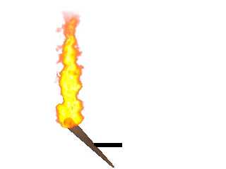
You had to said that! And then of course, I just had to
take you up on it...
Jerome
--
* Doctor Jekyll had something * mailto:ber### [at] iname com
* to Hyde... * http://www.enst.fr/~jberger
******************************* com
* to Hyde... * http://www.enst.fr/~jberger
*******************************
Post a reply to this message
Attachments:
Download 'test.jpg' (12 KB)
Preview of image 'test.jpg'

|
 |
|  |
|  |
|
 |
|
 |
|  |
|  |
|
 |
"Jerome" <ber### [at] iname com> wrote in message
news:397FEBC6.9CAE3B2B@iname.com...
> Tom Melly wrote:
> >
> > Now try rendering with a white background ;)
> You had to said that! And then of course, I just had to
> take you up on it...
>
> Jerome
Hey, you're not Alan ;) com> wrote in message
news:397FEBC6.9CAE3B2B@iname.com...
> Tom Melly wrote:
> >
> > Now try rendering with a white background ;)
> You had to said that! And then of course, I just had to
> take you up on it...
>
> Jerome
Hey, you're not Alan ;)
Post a reply to this message
|
 |
|  |
|  |
|
 |
From: Bob Hughes
Subject: Re: Torch (WIP), still needs a better flame...
Date: 27 Jul 2000 07:47:27
Message: <3980214f@news.povray.org>
|
|
 |
|  |
|  |
|
 |
"Tom Melly" <tom### [at] tomandlu f9 f9 co co uk> wrote in message
news:397ff77f$1@news.povray.org...
|
| Hey, you're not Alan ;)
Yeah, gee, Jerome's nice torch flame is going to be lost in another persons
thread.
Surprisingly simple flame for it to look so good (I saw the pov script). I
think about half that height would be better though.
Bob uk> wrote in message
news:397ff77f$1@news.povray.org...
|
| Hey, you're not Alan ;)
Yeah, gee, Jerome's nice torch flame is going to be lost in another persons
thread.
Surprisingly simple flame for it to look so good (I saw the pov script). I
think about half that height would be better though.
Bob
Post a reply to this message
|
 |
|  |
|  |
|
 |
|
 |
|  |


![]()