|
|
|
|
|
|
| |
| |
|
|
|
|
| |
| |
|
|
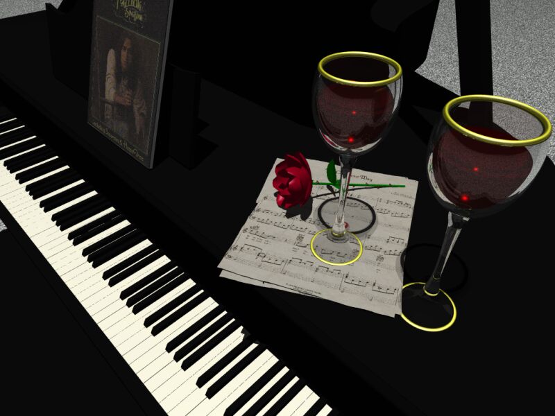
Heres a picture I've been working on...thought I'd post it and see what you
all think...looking for suggestions, opinions etc.
Post a reply to this message
Attachments:
Download 'piano.jpg' (65 KB)
Preview of image 'piano.jpg'
|
|
| |
| |
|
|
|
|
| |
| |
|
|
kane wrote:
>
> Heres a picture I've been working on...thought I'd post it and see what you
> all think...looking for suggestions, opinions etc.
Interesting -tough quite classical- scene setup. Improvements ?
I'll say :
- keys are too long (or too thin), if you have access to a full-size
keyboard, measure it.
- use a soft and dim "fill light" in the back, it will help give depth
and get rid of the undiscerning darkness.
- add slight reflection to the piano black finish, to get the
varnished look (use blurred refl. if you use MegaPov)
- use a better gold texture (there are plenty) for the
rings, try something like T_Gold4C...
- scale the scores image_map so a white border appear
around the staffs, and be careful about the size of the score
book standing, it seems too small.
I've made a good-looking piano keyboard macro some time ago,
I'll try to find it back and re-publish it here.
Fabien.
Post a reply to this message
|
|
| |
| |
|
|
|
|
| |
| |
|
|
overall i like it.
my gamma may be off, but i can't see any edges of the piano. also,
there doesn't seem to be enough white space around the edges of the
pages and the wall texture... well, doesn't look like a wall. perhaps a
white wall with a normal similar to real walls might do better. add
some flex to the rose stem and flatten the rose a little in the
direction of gravity. i believe the petals would lie closer in the
vertical direction and spread out (as they are) in the horizontal. the
gold seems to eminate light (ambient on?) instead of reflect it. these
are all minor but add up.
good models though. and composition is pretty good. nothing seems to
be "lined up" as is too common in raytraced images; so good job. you
didn't use an area light did you? try one.
i'm eager to see what more you do on this.
kane wrote:
>
> Heres a picture I've been working on...thought I'd post it and see what you
> all think...looking for suggestions, opinions etc.
>
> [Image]
Post a reply to this message
|
|
| |
| |
|
|
|
|
| |
| |
|
|
Beyond the other things already said: wine colored shadow. There isn't any,
like an empty glass instead. Not using 'filter' for the wine? The "gold"
seems more a yellow-green to me, often the color for such things is redder or
browner so it looks kind of like a brass as is.
Good scene going there.
Bob
Post a reply to this message
|
|
| |
| |
|
|
|
|
| |
| |
|
|
Ikane wrote:
>
> Heres a picture I've been working on...thought I'd post it and see what you
> all think...looking for suggestions, opinions etc.
>
> [Image]
Nice image, but I think the golden rings on top of the glasses are to
big.
Remco Poelstra
Post a reply to this message
|
|
| |
| |
|
|
|
|
| |
| |
|
|
I'd change the size and texture of the gold rings, and brighten up the piano.
If you're making it black, try maybe a 10% gray or something.
Nice pic so far.
--
David Fontaine <dav### [at] faricy net> ICQ 55354965
Please visit my website: http://www.faricy.net/~davidf/ net> ICQ 55354965
Please visit my website: http://www.faricy.net/~davidf/
Post a reply to this message
|
|
| |
| |
|
|
|
|
| |
| |
|
|
On Fri, 30 Jun 2000 22:08:50 -0600, kane wrote:
>Heres a picture I've been working on...thought I'd post it and see what you
>all think...looking for suggestions, opinions etc.
This is a real good start, as others have said do some experimentation
with the shade of gold on the rings, and the wine isn't casting much of
a shadow, the glasses look a bit too thick. The image strikes me as
being very flat, something offten caused by using too much ambient light,
and where you do have shadows they're very harsh, try using a few more
lights but make them dimmer say rgb 0.5 and see what that does then lower
or higher various lights as required. A good url to read on lighting
(originally posted by Bob [thanks Bob]).
http://www.pcgv.com/3d_lighting.htm
I think it was David who mentioned that the wall doesn't look like a wall,
I must say that I felt the same about that.
This is great work so far, keep us posted.
--
Cheers
Steve email mailto:ste### [at] zeroppsuklinuxnet
%HAV-A-NICEDAY Error not enough coffee 0 pps.
web http://www.zeropps.uklinux.net/
or http://start.at/zero-pps
11:35pm up 2 days, 23:16, 2 users, load average: 1.52, 1.15, 1.05
Post a reply to this message
|
|
| |
| |
|
|
|
|
| |
| |
|
|
I measured the keys of my chord organ. The black ones are 7 cm long and 7 mm
wide. The white ones are 11 cm long and 2 cm wide. Hope this helps.
Brendan Ryan
kane wrote:
> Heres a picture I've been working on...thought I'd post it and see what you
> all think...looking for suggestions, opinions etc.
>
> [Image]
Post a reply to this message
|
|
| |
| |
|
|
|
|
| |
| |
|
|
Fabien Mosen wrote:
> I've made a good-looking piano keyboard macro some time ago,
> I'll try to find it back and re-publish it here.
OK, found it back, published in .text.scene-files
Fabien.
Post a reply to this message
|
|
| |
| |
|
|
|
|
| |
| |
|
|
The image is a little too dark, and the gold trim on the glasses is too think
IMO, but it's a good layout. The placment of everything would help it the piano
were lighter or had a highlight to it, since most piano's do get polished, then
we would be able to see the shape of the surface.
Josh
kane wrote:
> Heres a picture I've been working on...thought I'd post it and see what you
> all think...looking for suggestions, opinions etc.
>
> [Image]
--
Josh English
eng### [at] spiritonecom
"May your hopes, dreams, and plans not be destroyed by a few zeros."
Post a reply to this message
|
|
| |
| |
|
|
|
|
| |