|
|
|
|
|
|
| |
| |
|
|
|
|
| |
| |
|
|
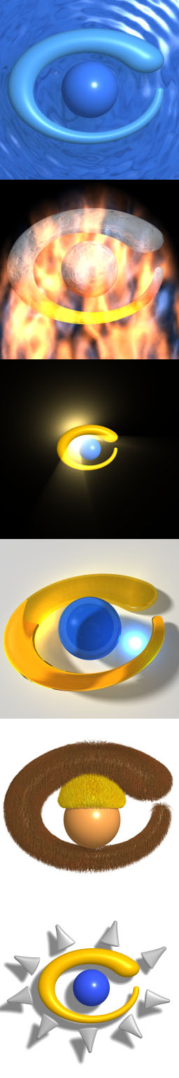
This was finished about 3 weeks ago. It wasn't posted before because I had
trouble getting Photoshop 5.5 installed in Win2K. Now that things are
running smoothly, and now that the computer is fixed (after the 'incident'),
I give to you my presentations of my eyelogo. I wish Chris had done this.
He's better than me. I don't like my fire. I think the fur sucks. But,
anyway, I tried. Enjoy it. :)
The first one is the classic "pool" version. The second is the "fire/metal"
version (ugly, isn't it?). The third one is my attempt at a "glory" kind of
look. The fourth one ("glass") features my complete lack of decent control
over photons. I need help here. The fifth one is the "furry" version. The
last one is my "Lightwave" imitation version. I was trying to improve the
eyelogo, and made it look so much like the Lightwave logo (unconsciously),
that I just left it as a presentation.
Post a reply to this message
Attachments:
Download '6eyelogos.jpg' (60 KB)
Preview of image '6eyelogos.jpg'
|
|
| |
| |
|
|
|
|
| |
| |
|
|
Are they that ugly? :(
Post a reply to this message
|
|
| |
| |
|
|
|
|
| |
| |
|
|
"Tony[B]" wrote:
> I give to you my presentations of my eyelogo.
Great! I've been looking forward to this!
> The first one is the classic "pool" version.
Generally nice enough. But is the logo floating on the surface of the water,
a part of the water, or hovering above it? One way or another, try to adopt
the logo better as an actual part of the scene. Also, try to place the
camera slightly at an angle, instead of straight from above. Try a little
more originality, if possible, and try to make it more like a real scene
(maybe more details).
> The second is the "fire/metal" version (ugly, isn't it?).
Generally nice too, but try to add some red or yellow bright light from
below, and try to improve the texture of the logo, and the fire. I know,
it's easier said than done, and if I did an attempt myself it would probably
be a lousy one...
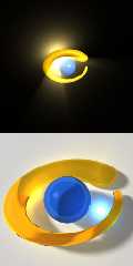
> The third one is my attempt at a "glory" kind of look.
Hmm, the light is behind the logo, and yet it is brightly lit from in front
of it. Maybe try more of a silhouette feel? Also experiment with other
locations for the light.
> The fourth one ("glass") features my complete lack of decent
> control over photons. I need help here.
Nice! This has potential.
> The fifth one is the "furry" version.
Umm, this is... original...
I'm not sure what it's supposed to be. Is it a head with a hat in the
middle???
Anyway, keep experimenting with it! Maybe make it part of an actual scene.
> The last one is my "Lightwave" imitation version.
Nice!
If I were to say something general about all your presentations it would be
that they could use some more details, and something that makes them look
more like complete scenes. But everything I write here is my personal
opinion only, of course.
Keep up the good work! :-)
Rune
--
Updated June 12: http://rsj.mobilixnet.dk
3D images, include files, stereograms, tutorials,
The POV Desktop Theme, The POV-Ray Logo Contest,
music, 350+ raytracing jokes, and much more!
Post a reply to this message
|
|
| |
| |
|
|
|
|
| |
| |
|
|
"Tony[B]" wrote:
> Are they that ugly? :(
Maybe people are just getting tired of this whole contest.
Or maybe it's the other way around. They didn't know it was about the
contest because you didn't include the word "logo" or "PLC" in the header...
Anyway, hope you get some more comments!
Greetings,
Rune
--
Updated June 12: http://rsj.mobilixnet.dk
3D images, include files, stereograms, tutorials,
The POV Desktop Theme, The POV-Ray Logo Contest,
music, 350+ raytracing jokes, and much more!
Post a reply to this message
|
|
| |
| |
|
|
|
|
| |
| |
|
|
Not bad. Not bad at all.
You know.. This logo really cries out to be animated. :{)
David
Post a reply to this message
|
|
| |
| |
|
|
|
|
| |
| |
|
|
I was just afraid to say how I liked the "ugly" one which you seemed to like
the least.
Bob
"Rune" <run### [at] iname com> wrote in message
news:395290a6@news.povray.org...
| "Tony[B]" wrote:
| > Are they that ugly? :(
|
| Maybe people are just getting tired of this whole contest.
|
| Or maybe it's the other way around. They didn't know it was about the
| contest because you didn't include the word "logo" or "PLC" in the header... com> wrote in message
news:395290a6@news.povray.org...
| "Tony[B]" wrote:
| > Are they that ugly? :(
|
| Maybe people are just getting tired of this whole contest.
|
| Or maybe it's the other way around. They didn't know it was about the
| contest because you didn't include the word "logo" or "PLC" in the header...
Post a reply to this message
|
|
| |
| |
|
|
|
|
| |
| |
|
|
The "photons" version is very nice. With a little more work, it could be
perfect. The "Lightwave" version is also very good.
Mark
Post a reply to this message
|
|
| |
| |
|
|
|
|
| |
| |
|
|
The last looks real professional... Clothing company, Multimedia design, Or
other conceptual company feel to it... =)
"Tony[B]" wrote:
> This was finished about 3 weeks ago. It wasn't posted before because I had
> trouble getting Photoshop 5.5 installed in Win2K. Now that things are
> running smoothly, and now that the computer is fixed (after the 'incident'),
> I give to you my presentations of my eyelogo. I wish Chris had done this.
> He's better than me. I don't like my fire. I think the fur sucks. But,
> anyway, I tried. Enjoy it. :)
>
> The first one is the classic "pool" version. The second is the "fire/metal"
> version (ugly, isn't it?). The third one is my attempt at a "glory" kind of
> look. The fourth one ("glass") features my complete lack of decent control
> over photons. I need help here. The fifth one is the "furry" version. The
> last one is my "Lightwave" imitation version. I was trying to improve the
> eyelogo, and made it look so much like the Lightwave logo (unconsciously),
> that I just left it as a presentation.
>
> [Image]
Post a reply to this message
|
|
| |
| |
|
|
|
|
| |
| |
|
|
"Bob Hughes" wrote:
> I was just afraid to say how I liked the "ugly" one which
> you seemed to like the least.
Your opinion is as good as mine.
Greetings,
Rune
--
Updated June 12: http://rsj.mobilixnet.dk
3D images, include files, stereograms, tutorials,
The POV Desktop Theme, The POV-Ray Logo Contest,
music, 350+ raytracing jokes, and much more!
Post a reply to this message
|
|
| |
| |
|
|
|
|
| |
| |
|
|
Don't be so hard on yourself.
Chris may be better at presenting his, but actually IMHO your logo seems like it
would be easier to integrate into a scene.
--
David Fontaine <dav### [at] faricynet> ICQ 55354965
Please visit my website: http://www.faricy.net/~davidf/
Post a reply to this message
|
|
| |
| |
|
|
|
|
| |