|
|
|
|
|
|
| |
| |
|
|
|
|
| |
| |
|
|
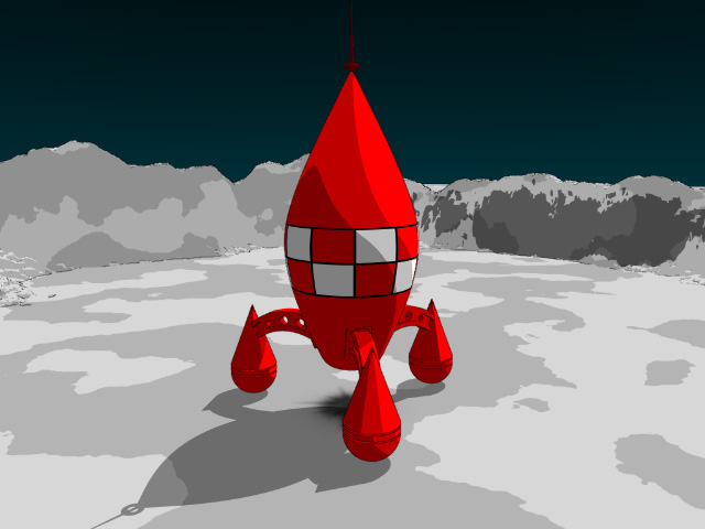
Hey all,
Though I've been quite busy lately, I got a chance this evening to do some
Pov stuff, and I thought that I would try out the method that H.E. Day
(thanks H.E., a great technique) posted for getting CEL-esque renders. I
decided to try it out on Tintin's Moon rocket (a simple, geometric and
already a cartoon shape, that uses bright colours). So here it is. I
rendered at 1024x768, so the border lines are more visible than they appear
here.
Oh, and I used a negative light (my first one!) to get the dark colours
around the far side o the ship.
Equiprawn
Post a reply to this message
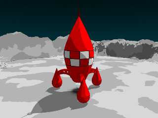
Attachments:
Download 'tintincartoon.jpg' (59 KB)
Preview of image 'tintincartoon.jpg'
|
|
| |
| |
|
|
|
|
| |
| |
|
|
Very nice! One note, you might want to increase the line_width to 1.125 or
some such. The lines don't seem to be very noticeable.
--
H.E. Day
Post a reply to this message
|
|
| |
| |
|
|
|
|
| |
| |
|
|
Some times less is more...
Where is the post mentioned for this technique...???
"H.E. Day" wrote:
> Very nice! One note, you might want to increase the line_width to 1.125 or
> some such. The lines don't seem to be very noticeable.
>
> --
> H.E. Day
Post a reply to this message
|
|
| |
| |
|
|
|
|
| |
| |
|
|
Hey,
It's in the povray.text.tutorials group.
Equiprawn
Moon47 <rdm### [at] earthlink net> wrote in message
news:39317E6E.2796A60B@earthlink.net...
> Some times less is more...
>
> Where is the post mentioned for this technique...???
>
> "H.E. Day" wrote:
>
> > Very nice! One note, you might want to increase the line_width to 1.125
or
> > some such. The lines don't seem to be very noticeable.
> >
> > --
> > H.E. Day
> net> wrote in message
news:39317E6E.2796A60B@earthlink.net...
> Some times less is more...
>
> Where is the post mentioned for this technique...???
>
> "H.E. Day" wrote:
>
> > Very nice! One note, you might want to increase the line_width to 1.125
or
> > some such. The lines don't seem to be very noticeable.
> >
> > --
> > H.E. Day
>
Post a reply to this message
|
|
| |
| |
|
|
|
|
| |
| |
|
|
I thought you had siad in your post that if the line thickness was set to
anything over one that you got these big thick lines? I tried it and I did
(they were far too thick, and I only used 2). Did you find a work around for
this problem?
Alos I noticed that if I try to render my scene in 1600x1200, MegaPov
crashes when it tries to apply the filter. A bug?
Equiprawn
H.E. Day <The### [at] hedayfreeserverscom> wrote in message
news:3932BFD7.C7D6F9CE@heday.freeservers.com...
> Very nice! One note, you might want to increase the line_width to 1.125
or
> some such. The lines don't seem to be very noticeable.
>
> --
> H.E. Day
>
>
Post a reply to this message
|
|
| |
| |
|
|
|
|
| |
| |
|
|
Nice start. By negative light do you mean the dark bit underneath the
ship, it looks cool, I'm trying to think of ways to use it in my
current scene.
--
Cheers
Steve email mailto:sjl### [at] ndirectcouk
%HAV-A-NICEDAY Error not enough coffee 0 pps.
web http://www.ndirect.co.uk/~sjlen/
or http://start.at/zero-pps
10:19pm up 4 days, 9:13, 1 user, load average: 2.00, 2.00, 2.00
Post a reply to this message
|
|
| |
| |
|
|
|
|
| |
| |
|
|
> I thought you had siad in your post that if the line thickness was set to
> anything over one that you got these big thick lines? I tried it and I did
> (they were far too thick, and I only used 2). Did you find a work around for
> this problem?
Yes, I was speaking in the sense of a 320x240 animation. Basically, I was
recommending that you use the next largest line width: 1.01. (with a sharpness
of 8 this can look really good)
--
H.E. Day
Post a reply to this message
|
|
| |
| |
|
|
|
|
| |
| |
|
|
Thanks... =)
Kool lookin' stuff... ;)
Equiprawn wrote:
> Hey,
>
> It's in the povray.text.tutorials group.
>
> Equiprawn
>
> Moon47 <rdm### [at] earthlinknet> wrote in message
> news:39317E6E.2796A60B@earthlink.net...
> > Some times less is more...
> >
> > Where is the post mentioned for this technique...???
> >
> > "H.E. Day" wrote:
> >
> > > Very nice! One note, you might want to increase the line_width to 1.125
> or
> > > some such. The lines don't seem to be very noticeable.
> > >
> > > --
> > > H.E. Day
> >
Post a reply to this message
|
|
| |
| |
|
|
|
|
| |
| |
|
|
Good work. Want to see Tintin, Milou et Capitan Haddock modeled with POV
ray <g>.
style. His drawings are almost absolutely flat. And the rocket is too
'fat'.
But IMHO the black outlines are O.K. if compared to the drawings of
Karl
Post a reply to this message
|
|
| |
| |
|
|
|
|
| |