 |
|
|
|
|
|
| |
| |
|
|
|
|
| |
| |
|
|
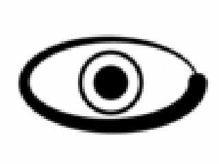
>From version 2 to version 3 you changed the pupil. That was not good I
>think. You should change it back to being a simple sphere. That seems to be
>what others say too.
OK, I'll change it back (luckily, all it involves is commenting two lines
and uncommenting another. :)
>Since version 1 you have also changed the colors.
>However, it seems that many others prefer the gradient.
If it makes the people happy, I've got to leave it that way. Besides, it's
not a really fancy gradient, and gives it a little more style without
increasing complexity, don't you think?
>I think you should keep it that way. It's more like an eye-brow this way,
>than if the edge ended in a perfect half circle. Not that anybody said that
>you should change it, it was just a comment.
A good one, I must add. It gave it that edge it was missing. Thanks. :)
>By the way, I don't think the black and white version should have those
>white highlights. I liked your own version better.
I don't think there should be any problem with providing both versions for
people to use officially, right?
Post a reply to this message
|
|
| |
| |
|
|
|
|
| |
| |
|
|
>Somehow I don't like the shape of it. What bothers me is the contour
>of the eye. To me, it seems too thick and the thickness itself could
>decrease in a more visually appealing way. Sorry for being picky.
Could you be a little more specific on the "could decrease in a more
visually appealing way" part?
Post a reply to this message
|
|
| |
| |
|
|
|
|
| |
| |
|
|
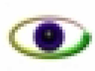
>I like it...but I think the eye needs to be closed a little more, so the
>top and bottom are closer to the outer rim of the iris.
What say the rest of you to this? I'll change (if neccessary) it as soon as
I get more opinions.
>And maybe make
>the radius of the small end of the outer part a bit smaller, maybe half
>it's current size.
I'll give it a try, and see what happens. The end is supposed to represent
the lacrimal gland, hence the red color.
>And the color...the yellow part on the left looks
>kind of drab, maybe you could brighten it a little.
I only established the first part (green) and the last part (red), the rest
is interpolated by the blobs. I have no control over the intensity of the
yellow. If you could give me any ideas on how to do this, I would appreciate
it.
>And the iris is a
>bit more purple than I was thinking of, but it looks nice.
I wasn't able to find the color you used. If you can give me the RGB of it,
I'd be greatful.
>The black-white version doesn't look right though, the center is still a
>black dot. I would suggest a smaller black dot within a black circle.
How do I do that?
>Don't you have a calculator program on your computer? (I have at least 5)
I forgot... hehe...
>A chihuahua wouldn't last 5 minutes in our house...it would either get
>chewed up like a dog toy by our gordon setter puppy or our doberman, or
>one of the cats would get it and you would never see it again...
Mine's ankle seems to be broken... <grumble> stupid little cousins playing
with the dog like it's a toy... <mumble>
Post a reply to this message
|
|
| |
| |
|
|
|
|
| |
| |
|
|
In article <3918a8d0@news.povray.org>, "TonyB"
<ben### [at] panama c-comnet> wrote:
> I'll give it a try, and see what happens. The end is supposed to
> represent the lacrimal gland, hence the red color.
And people are worried about giving it an iris... :-)
> I only established the first part (green) and the last part (red),
> the rest is interpolated by the blobs. I have no control over the
> intensity of the yellow. If you could give me any ideas on how to do
> this, I would appreciate it.
Ah, I used a radial pigment ranging from red to yellow to green in my
version. I had to rotate it a bit to get it aligned right, but it works
and is easily adjustable.
> >And the iris is a
> >bit more purple than I was thinking of, but it looks nice.
>
> I wasn't able to find the color you used. If you can give me the RGB
> of it, I'd be greatful.
color rgb < 0.3, 0, 0.8>
> How do I do that?
Ah, I will attach an image instead of making another attempt at an
explanation.(I seem to be pretty bad at explanations)
In fact, I will make an icon version as well, and a "fancy" version, to
show something of what could be done with the logo.(BTW, the small
number of spheres in the outer curve is intentional.)
You could even make a version where the "pupil" is a distorted image of
a checkered plane. :-)
--
Christopher James Huff - Personal e-mail: chr### [at] yahoocom
TAG(Technical Assistance Group) e-mail: chr### [at] tagpovrayorg
Personal Web page: http://chrishuff.dhs.org/
TAG Web page: http://tag.povray.org/ c-comnet> wrote:
> I'll give it a try, and see what happens. The end is supposed to
> represent the lacrimal gland, hence the red color.
And people are worried about giving it an iris... :-)
> I only established the first part (green) and the last part (red),
> the rest is interpolated by the blobs. I have no control over the
> intensity of the yellow. If you could give me any ideas on how to do
> this, I would appreciate it.
Ah, I used a radial pigment ranging from red to yellow to green in my
version. I had to rotate it a bit to get it aligned right, but it works
and is easily adjustable.
> >And the iris is a
> >bit more purple than I was thinking of, but it looks nice.
>
> I wasn't able to find the color you used. If you can give me the RGB
> of it, I'd be greatful.
color rgb < 0.3, 0, 0.8>
> How do I do that?
Ah, I will attach an image instead of making another attempt at an
explanation.(I seem to be pretty bad at explanations)
In fact, I will make an icon version as well, and a "fancy" version, to
show something of what could be done with the logo.(BTW, the small
number of spheres in the outer curve is intentional.)
You could even make a version where the "pupil" is a distorted image of
a checkered plane. :-)
--
Christopher James Huff - Personal e-mail: chr### [at] yahoocom
TAG(Technical Assistance Group) e-mail: chr### [at] tagpovrayorg
Personal Web page: http://chrishuff.dhs.org/
TAG Web page: http://tag.povray.org/
Post a reply to this message
Attachments:
Download 'BW POV Logo.jpg' (5 KB)
Download 'POV Icon.jpg' (2 KB)
Download 'POV Logo.jpg' (20 KB)
Preview of image 'BW POV Logo.jpg'
Preview of image 'POV Icon.jpg'
Preview of image 'POV Logo.jpg'

|
|
| |
| |
|
|
|
|
| |
| |
|
|
Conclusion: I would have to design 3 separate versions of the logo to
satisfy you. One "regular", one "fancy" (for large versions), and one "black
and white".
I really need to know if others like your ideas. If they don't, then I'm
sorry, I can't change it just for you. OK? Thanks for your support and
suggestions. :)
Post a reply to this message
|
|
| |
| |
|
|
|
|
| |
| |
|
|
Post a reply to this message
|
|
| |
| |
|
|
|
|
| |
| |
|
|
On Tue, 09 May 2000 21:21:09 -0500, Chris Huff
<chr### [at] yahoocom> wrote:
>Ah, I will attach an image instead of making another attempt at an
>explanation.(I seem to be pretty bad at explanations)
I like your third image attachment, as an extrapolation of Tony's
logo. It would sometimes be useful to have a more elaborate
illustration that echoed the logo.
Later,
Glen Berry
( Remove the "7" from 7no### [at] ezwvcom to email me. )
Post a reply to this message
|
|
| |
| |
|
|
|
|
| |
| |
|
|
On Tue, 9 May 2000 19:00:28 -0400, "TonyB" <ben### [at] panamac-comnet>
wrote:
>>Somehow I don't like the shape of it. What bothers me is the contour
>>of the eye. To me, it seems too thick and the thickness itself could
>>decrease in a more visually appealing way. Sorry for being picky.
>
>Could you be a little more specific on the "could decrease in a more
>visually appealing way" part?
>
I know, bad wording on my side, sorry.
The left part is too thick, and it might look better if the swoosh
ended in a point instead of a sphere. The thick end of the swoosh
could use some work, it looks to me too heavy and maybe a bit sloppy.
I'll try to come up with a sketch which illustrates what I mean.
Peter Popov ICQ : 15002700
Personal e-mail : pet### [at] usanet
TAG e-mail : pet### [at] tagpovrayorg
Post a reply to this message
|
|
| |
| |
|
|
|
|
| |
| |
|
|
"TonyB" wrote:
> > it seems that many prefer the gradient.
>
> If it makes the people happy, I've got
> to leave it that way.
Or... we could make several versions!
> Besides, it's not a really fancy gradient,
> and gives it a little more style without
> increasing complexity, don't you think?
Well, no, as I said I think it gives it *less* style, but that's just me I
guess.
> > By the way, I don't think the black and
> > white version should have those white
> > highlights. I liked your own version better.
>
> I don't think there should be any problem
> with providing both versions for people to
> use officially, right?
Right! Likewise with the colors I think...
Greetings,
Rune
---
Updated April 25: http://rsj.mobilixnet.dk
Containing 3D images, stereograms, tutorials,
The POV Desktop Theme, 350+ raytracing jokes,
miscellaneous other things, and a lot of fun!
Post a reply to this message
|
|
| |
| |
|
|
|
|
| |
| |
|
|
I prefer v2 which looks more balanced (to my eyes that is). The added
details are unecessary and work against the "logoness" of the shape. V2
looks professional while v3 looks more amateurish.
Keep on the good work
Philippe
Post a reply to this message
|
|
| |
| |
|
|
|
|
| |


